
UI Lesson 🔖
The search input might not be that easy as you think.
Here are some tips and tricks on how to properly make it.
🧵👇
The search input might not be that easy as you think.
Here are some tips and tricks on how to properly make it.
🧵👇
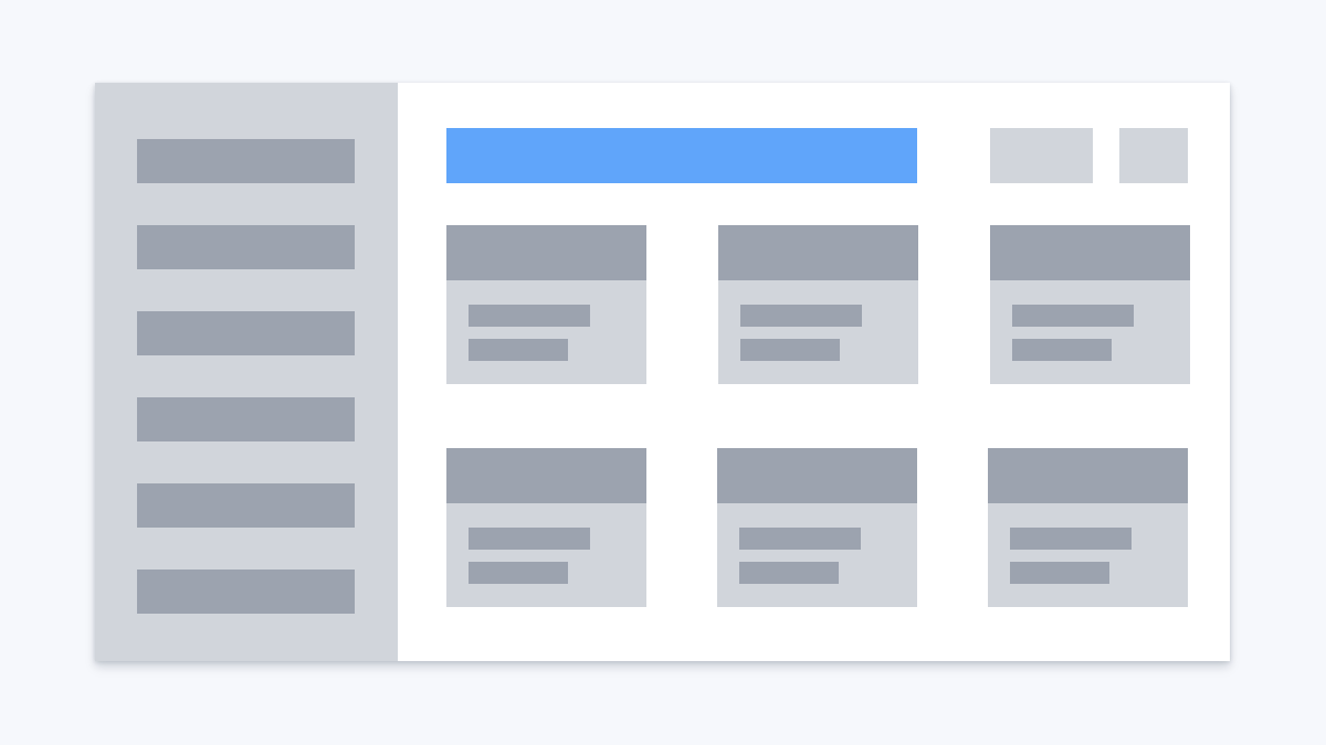
1. Place the search input in a reasonable place.
The most common place is somewhere in the header. Users should be able to easily find it.
The most common place is somewhere in the header. Users should be able to easily find it.
2. Do not hide it under an icon.
❌ It makes it harder for users to find where the search input is
❌ It requires an additional click for revealing the input
❌ It makes it harder for users to find where the search input is
❌ It requires an additional click for revealing the input

3. Don't leave the input without a placeholder
The placeholder gives two advantages.
1. It'll be even easier to find the search input
2. You can provide context. E.g. if your site is an e-commerce shop, you can use "Search products" as a placeholder text.
The placeholder gives two advantages.
1. It'll be even easier to find the search input
2. You can provide context. E.g. if your site is an e-commerce shop, you can use "Search products" as a placeholder text.

4. Use magnifying glass icon.
This is one of the most powerful indicators that the input is a search input.
It's just a convention, everybody knows what the icon means.
This is one of the most powerful indicators that the input is a search input.
It's just a convention, everybody knows what the icon means.

5. Make sure your search input has enough width.
It should be wide enough for common search queries.
It should be wide enough for common search queries.

6. Consider enhancing search with the following techniques
1. Autocomplete - you complete the user sentence with possible outcomes
2. Auto-suggest - you provide the user options BEFORE they start typing
3. Recent search - you show users shortcuts with their latest searches
1. Autocomplete - you complete the user sentence with possible outcomes
2. Auto-suggest - you provide the user options BEFORE they start typing
3. Recent search - you show users shortcuts with their latest searches

• • •
Missing some Tweet in this thread? You can try to
force a refresh


