Personal income fell 2% in May. Spending flat. But both above prepandemic levels.
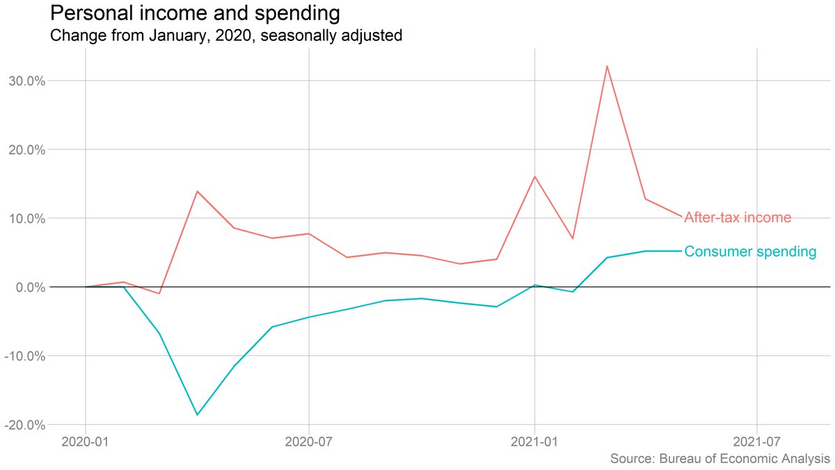
The drop in income was driven by a decline in government transfers (mostly the end of the direct checks under the American Rescue Plan). Wage and salary income rose, though more slowly than in April.
Spending on goods fell and spending on services rose, but we still haven't seen anything close to a wholesale reversal of the big pandemic shifts in spending. Have to see what happens this summer.
Sharper drop in spending on durable goods, which probably at least partly reflects the end of the ARP checks.
Personal saving fell in May, and is way down from March (when most relief checks arrived), but still well above prepandemic levels. The caveat, as always: These savings are nothing close to evenly distributed.
OK, inflation (you knew I'd get there eventually): The PCE price index rose 3.9% from a year earlier, the fastest pace since 2008. Excluding food and energy, prices were up 3.4%.
BUT
The year-over-year number is inflated by base effects (the drop in overall prices in the worst of the pandemic a year ago). The month-to-month increase in prices actually slowed. (Note chart shows annualized monthly change.)
It's interesting to look at spending in some of the most pandemic-affected categories. Restaurants (including fast food, delivery, etc) have bounced back, but everything else is still way down. Movies, live entertainment have barely even begun to recover.
Interesting to think through how much of this is capacity constraints vs health concerns vs behavior shifts (and, to the extent it's the latter, how long those last). Obviously varies substantially by category.
• • •
Missing some Tweet in this thread? You can try to
force a refresh
A few quick #JOLTS 📈:
Starting with: Job openings are way down from their peak, but they've fallen slowly if at all in recent months. No obvious sign that labor demand is falling off a cliff.
But it IS getting harder to find a job. There is now less than one job opening per unemployed worker. Not a low rate by historical standards, but definitely weaker than just before the pandemic (and way weaker than at the peak of the reopening boom).
The hiring rate (gross hiring, not the net job change we measure in the Friday jobs reports) has been below its long-run average for more than a year. It had seemed like it was leveling off, but might be falling again now, though hard to say definitively just yet.
President Trump didn't like the jobs numbers, so he fired the person responsible for producing them.
It's a move that has been tried before, by leaders of countries from Argentina to Greece to the Soviet Union. It rarely ends well.
(Link at end of thread)
Janet Yellen, not a person prone to hyperbole, put it this way: “This is the kind of thing you would only expect to see in a banana republic."
Key point from Andreas Georgiou, who was criminally prosecuted for insisting on reporting accurate deficit figures when he was head of Greece's statistical agency: Reliable data is essential for democracy.
CBO is out with its final cost estimate of the tax-and-spending bill passed by the House.
- Revenue ⬇️ by $3.7 trillion over 10 years
- Spending ⬇️ by $1.3 trillion
- Debt ⬆️ by $2.4 trillion over 10 years
- Uninsured pop. ⬆️ by 10.9 million in 2034
Full analysis: cbo.gov/publication/61…
The spending cuts mostly come from Medicaid ($344 billion over 10 years), food stamps and related programs ($295 billion) and the Affordable Care Act ($132 billion).
Note that these estimates don't take into account the macroeconomic impacts of the policy changes (it is not "dynamic" in wonk parlance). So to the extent tax/spending cuts affect economic growth, that will also affect revenues. CBO is working on an analysis that estimates these effects.
So this was an interesting finding from @NateSilver538, but one I found odd because @BLS_gov publishes CPI for regions (and for some metro areas) but not for states. So I dug into it a bit, and there's less here than meets the eye.
Nate's data is coming from this tracker from the @JECRepublicans. They don't have a state-level inflation estimate either, though. They just use BLS's estimate of regional inflation and apply it to an estimate of household spending when Biden took office. jec.senate.gov/public/index.c…
You can see this if you hover over their map (or download their data). States in the same region all have the same cumulative rates of inflation. But they differ in the amount of inflation experienced in dollar terms because some states have higher avg household incomes.
I hate that @ellawinthrop is leaving us, but I'm so glad I got to work with her on her last piece for @nytimesbusiness. She's the best, most collaborative, most creative visual journalist I've ever worked with. A thread with a few of my favorite Ben-and-Ella collabs:
Good news on inflation! U.S. consumer prices FELL 0.1 percent in June, and were up just 3 percent from a year earlier. "Core" prices, stripping out volatile food and fuel, were up 0.1 percent from May and 3.3 percent from last June. Data: …Live coverage: bls.gov/news.release/c… nytimes.com/live/2024/07/1…
This is the second straight month where there has been effectively no inflation on a month-to-month basis. Prices were flat in May, and down in June.
If you take a longer view here: At 3% year-over-year, inflation is no longer outside historical norms (though it is still higher than immediately prepandemic). And over the past three months, rents have risen at an annual rate of ***just 1.1%.***