
1. Gonna do an OATH post-mortem here. My concept was that this was a spectrum made of taking one thing from 7 different spectrums. The Sword (Order) was not the opposite of Sorcery (Arcane), have different progressions in each cultural category would flavor the world.
https://twitter.com/colewehrle/status/1410607628779098122
2. A world with an emphasis in the sword and the wastes would look much different than a world with an emphasis in demons and sorcery. Any combo had to be thematic. Names changed but all of this thinking made it into the final product! (RIP Clockwork suit)
3. It was interesting to hear @Jam_sponge talk about the suits like a progression in their stream 2 days ago because that was definitely unintended on my part. I just wanted Hearth Beast cultures and Discord Beast cultures and playgroups to feel out what they liked best.
4. It lets play groups say "I don't like how this feels" or "I really like this" and they have a chance within the mechanics of the game to change it instead of house-ruling "no halflings" or something.
5. A couple more things that had to change! The original black player pawn was intended to be goblin-esqe and I needed a different meeple shape than the ones I was using already. Unfortunately that meant that I stumbled into some uncomfortable stereotypes. 


6. People pointed it out to me and I changed the design. I think it could have been altered to be more sensitive in subtle ways but I'd rather change it dramatically and not have to worry about it. The new design is one of my favorites so ¯\_(ツ)_/¯

7. Because we were already using 5 colors it became a tricky problem to ALSO have (at that time) 7 suits of cards. That's a lot of colors. (We are also running into this problem with Root Factions.) I'm always up for a challenge!
8. I try to be sensitive to color-blind individuals so we include secondary information with colors: Icons, Meeple shape, etc. But for OATH I wanted to try something. Could we use secondary *colors* and get combinations that would work with common kinds of colorblindness?
9. This was tricky, but the basic concept was combining Light, Medium and Dark values with secondary colors that were Light, Medium, Dark, Warm and Cool. And a lot of checking it with an app camera.


10. What I ended up with was this. 5 colors for players and 7 suits that you could tell apart by shape AND color. Whew! I was happy with it and I hope if it's effective enough we can start seeing this sort of thing more in board games in general.

11. I've even got @PatrickLeder begrudgingly using it in his prototypes, lol
It's not always wonderful aesthetically. That yellow/green is AGGRESSIVE.
It's not always wonderful aesthetically. That yellow/green is AGGRESSIVE.

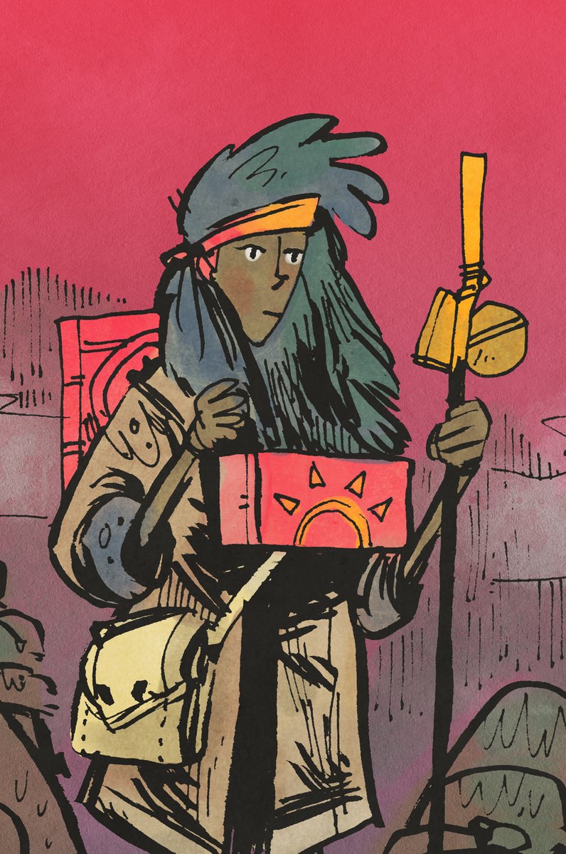
12. You may have noticed these above. The warbands in OATH used to be suited. Essentially if these meeples were laid flat they were Favor/Coin and upright they were troops. This got worked out of the design but I still like symbols that could also conceivably be people shaped

13. Let's talk card art. If you saw early prototypes or my inktober drawings from 2019 you know that OATH went through a few different directions.


14. I knew early on that fantasy was going to be the setting for us to accomplish the scope we were going for. @colewehrle and I discussed it at length over cheesesteaks at a convention back when there were conventions and I could eat cheesesteaks.
15. My very first doodles were of a setting inspired by Paul Bonner's art (look him up) and a kind of a bronze-age fantasy/folklore. I have Swedish ancestry and was enjoying the Trudvang RPG books. I thought we could riff on that and take some loose inspiration from it.

16. This was always a big MAYBE until CMON and @eric_lang literally just made a Trudvang game, haha. Their concept handled a part of what we wanted to do, change the map with cards. It wasn't how we wanted to do it, and we didn't want to invite comparisons. No dwarves this time.
17. So we made our own world, taking some inspiration from the kind of nebulous/Welsh mythology of the Chronicles of Prydain series, taking a lot of liberties. @colewehrle told me there would be 200+ unique cards so I came up with a plan that would streamline my process...
18. I thought I'd do cards with no backgrounds, and limit my color pallet to black, white, and the suited colors.


19. This looked great in concept but made the prototypes look unfinished. A side effect was that some components like site cards looked washed out. By themselves they were fine but juxtaposed with the cards they looked more like printer errors than an intentional choice.

20. I tried to make this work for an embarrassingly long time.

21. The next issue was that Escape from Dark Tower had started to publish promotional images online of their game artwork. Honestly I was looking at my work on OATH and saying "This is not good enough." I was looking at Root and saying "Oath doesn't look good enough yet."
22. So it was time for another pivot. Change the art style. Change my tools. I took my cartoonish drawings and I took a different approach with brush pens. I was still using the limited color pallet. Wrestlers.jpg became Wrestlers_variant.jpg


23. I did A LOT of these.


24. This is the most important part of being prolific. I wasn't going to think my way through this problem. I had to WORK my way through it. The team was fully committed to letting me do the rest of the game this way. When we launched this KS it was this art on the mockups.

25. I finally got to a card that made me think, "Actually, I don't like how this makes the game feel." It was Tavern Songs. Look at this garbage, haha. I guess 25 is my limit so I'll start another thread with the stunning conclusion...

Here's the rest of the thread:
https://twitter.com/d20plusmodifier/status/1410644142506483725?s=20
• • •
Missing some Tweet in this thread? You can try to
force a refresh


