Solar has had remarkable success making clean energy cheap. But in California its increasingly a victim of its own success. In a major new report we find solar value in CA fell 37% since 2014, and explore race between value deflation and cost declines: thebreakthrough.org/articles/quant…
1/
1/

California leads the world in solar installation. In 2019 it generated 19.2% of all of its electricity from solar, with 13% from utility scale solar and the remainder from distributed rooftop solar: 2/

Solar is intermittent, but predictably so. It always generates electricity when the sun is shining, and in sunny California does not experience that much day-to-day variability. Heres what California Independent System Operator (CAISO) gen looks like in a typical spring week: 3/

However, there are major variations between summer and winter in California. Solar produces approximately twice as much electricity in the summer months as in the winter months (even though demand is only 20% lower in the winter): 4/

When more solar is available, it is primarily used to displace imports from other states (which are mostly natural gas generation) and in-state natural gas generation. Nuclear, geothermal, wind, and hydro output does not change that much with more solar on the grid: 5/

However, high levels of solar generation drive down wholesale prices. When 50% or more of California's electricity generation comings from solar, prices are often zero or negative. Here are hourly wholesale electricity prices in 2019 as a function of solar penetration. 6/

This creates a phenomenon known as value deflation. The more solar generation you have, the lower wholesale prices become when solar is producing power, and the worse the economics for solar become. Here is the average monthly price paid to different generation types over time 7/

Back in 2014, the average wholesale price paid to solar was around $50 per MWh, similar to non-solar generation on the grid. Today the value of solar has fallen by 37% compared to non-solar generation. 8/

We built a model to examine how the value of solar might change going forward under current grid conditions, essentially asking what would happen if solar was 13%, 20%, 30%, 40%, or 50% of utility scale generation in 2019: 9/

The model does a good job of reproducing the monthly pattern of observed value deflation (black line), which is largest in lower-demand spring months and lowest in the summer when cooling demand tends to well-align with solar generation. 10/
As solar penetration increases, spring and fall months experience rapid value deflation, with the relative value of solar falling by around 70% at 20% solar, 90% at 30% solar, and 95% at 40%+ solar. However, summer and winter months continue to see lower value deflation. 11/
We can also see how the annual value of solar (relative to other source) changes as a function of solar penetration (though note that this is utility-scale only; add 7% to these numbers for total solar generation): 12/

This value deflation sounds bad – and is a real challenge – but there is a silver lining. Solar's cost has been falling rapidly, and has kept up with value deflation to-date. This race between value deflation and cost declines will determine if solar can keep growing. 13/
Modeling done by the CEC for California's SB100 decarbonization goals anticipates that around 60% of electricity generation will come from solar by 2045. 14/

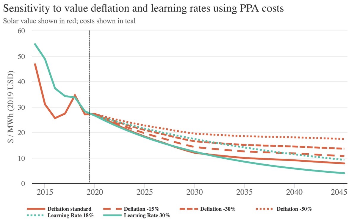
Based on different learning rates – e.g. how much solar costs will fall when global installation doubles – we model how the race between cost declines and value deflation might evolve in the future: 15/

If solar continues the 30% learning rate that characterized the 2010-2020 period, it may keep pace with value deflation despite California's aggressive deployment. Under the 18% learning rate over the full 1970-2020 period, however, a gap would emerge in coming years. 16/
This bakes in current solar subsidies – which effectively reduce the actual cost of solar by 40%. If we look at levelized costs of energy there is a much larger gap between solar's cost and wholesale price/value: 17/

Subsidies are there for a reason – they reflect the non-market benefits of solar such as its lack of CO2 emissions in a world that does not have a carbon price. These subsidies end up amounting to a quite reasonable $37 per ton CO2-eq. 18/
Solar value deflation is not a fait accompli. While it cannot be fully eliminated, it can be mitigated through storage (e.g. batteries), expanded transmission, and demand response. We look at how the picture might change if we can reduce value deflation by 15%, 30%, or 50%: 19/
Solar has huge potential, but also ongoing challenges. For a somewhat clearer discussion of value deflation and our new results, @jtemple has an excellent story over at @techreview: technologyreview.com/2021/07/14/102… 20/
• • •
Missing some Tweet in this thread? You can try to
force a refresh