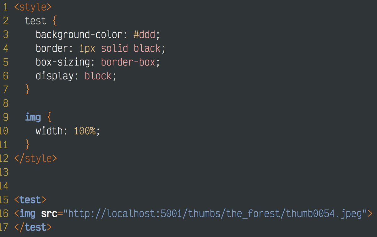
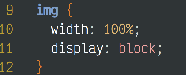
Spent the last hour or so trying to fix something that was broken forever. For some reason any img wrapped with *any* container added a 6px bottom. No CSS changes got rid of it, nothing I set added it, it came from nowhere.
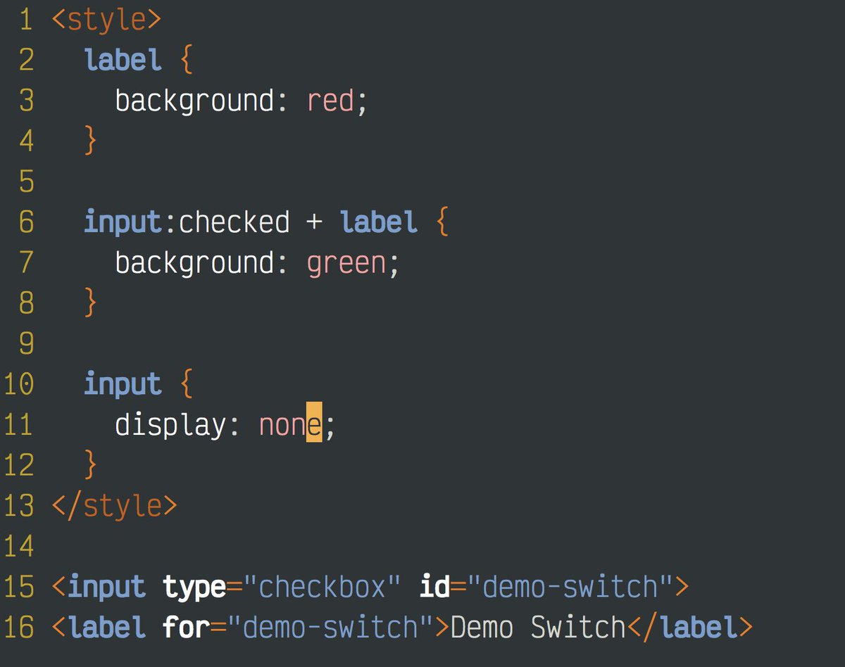
I ripped out *all* of the code down to this.
I finally stumble onto the magic google words "css img 6 pixel bottom" which leads me to this:
Apparently, browsers add this absolute trash nobody wants to the bottom of *any* image in another container to display "alt text".
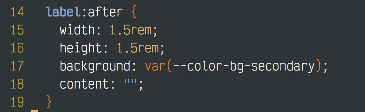
I make a single line change to add display:block, and POOF, the image displays exactly the way every human on the planet wants an image to display. Nobody *anywhere* who is sane wants phantom pixels added *anywhere* without a clear explanation.
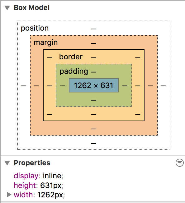
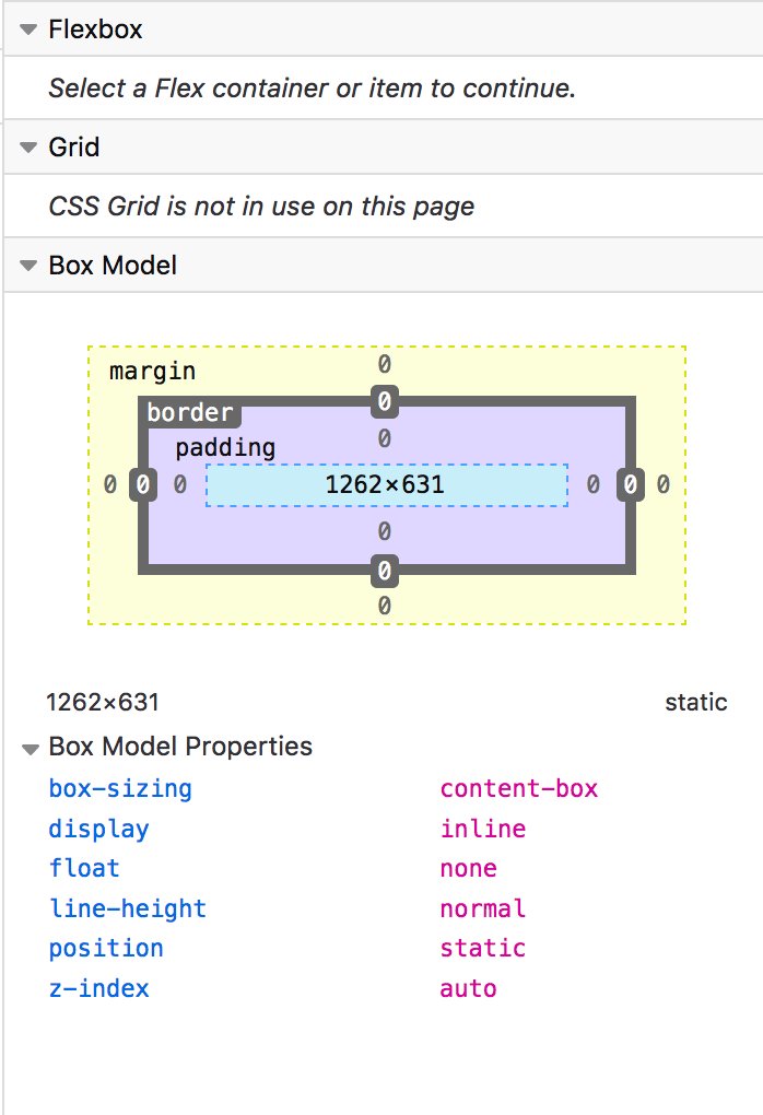
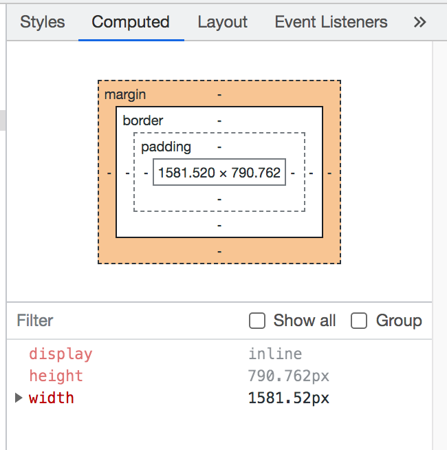
Now, I thought I would see this being added in the dev tools for the browsers. Here's Safari, Firefox, and Chrome. Not a single browser shows me these phantom pixels added even though this *is* part of the computed layout and it *is* something I need to see.
This kind of BS is completely unforgivable. It's another example of browser bugs being encoded in the standard even if they make zero rational sense to any sane person. If I put down an image, I only see the image. I never want an image to pretend to be "text".
So why do images behave this way? Way back in the early days of HTML images were "flowed" into the text the way you might do a chart in a research paper. This meant the rendering engines had to treat images as if they were part of the text, so fonts and line heights mattered.
Fast forward 1 million years in technology time and *nobody* thinks of images as "part of the text" anymore. Images are their own thing that they want to behave like they do on every single other computing device that shows an image. But, browsers still default to "it's text".
• • •
Missing some Tweet in this thread? You can try to
force a refresh
I'll use this to do a running commentary on a "style checkbox" in CSS. First trick is to put the label *after* the checkbox so you can use + to select it if the checkbox is :checked. Clicking the label activates the hidden input, so the label changes red/green.
Here's a demo of that first part working. Now to make the label look like a checked/unchecked box that's different.
The next trick is to use the :after to add content, *but* if you give an :after that has no content it still creates a block you can style. Here I'm just making a little square.
I think the other thing that infuriates me about this kind of crap is how it happens randomly. Other places images showed just fine. Drop it in a random div somewhere else and suddenly I get phantom pixels I can't debug.
My biggest fix would be:
No more contextual footguns.
If I have an image, and in one place that image has no space on the bottom, then that image has no space *everywhere*.
If I set a position:absolute, then it's contained in its parent *everywhere*, no matter what the parent's position is.
I think the best way to describe the "anti-rote" camp is with a painting class I took years ago. The teacher was a very good painter, and clearly did a ton of practice (rote), but in this beginner class she wanted us to "be free", just "express yourself, don't think!"
The class was setup to have a nude model every session, then shine various color lights on the subject. Now, if you don't know how a green light interacts with white skin then you'll flail around. Your brain will trick you into *seeing* flesh tones when it's actually green.
So I flail around, express myself, don't think about it just like she says. Don't worry about drawing, accuracy, color, or anything, "just paint."
Then, it comes time for critiques. This is where you, the teacher, and the students take apart your paintings and give advice.
I have a couple of new gotchas for people doing Svelte:
1. fade:out, or almost any "out" transition effect is death. Avoid at all costs.
2. {#await} on a promise is great, but if you update the promise it reloads the *entire* DOM at that point. Put it into a component.
For #1, the demo involves this fade:out on the Spinner I use to show the video is loading. Seems harmless *until* you want to transition to an entire new page/component, say with svelte-spa-router.
You can see it happen here. I click the link for a related video, and you can see the current video has to "fade out", preventing that page from leaving the DOM, so it looks like both pages load at the same time. I'm at a point now where I don't use *any* out transitions.
For all you youngins who never used VHS tapes, Sony Walkmans, a film real, or loaded your video games into your C-64 with a tape, then it's kind of like if someone wrote 1s and 0s on a roll of toilet paper as they rolled it onto another roll, so to read it you have to unroll it.
The tape dominates all concepts of computing. You wrote data and read to tapes. You printed output to rolls of paper on giant typewriters (printers), which is basically a paper tape. There were even paper tapes. Their defining characteristic is they are: LINEAR.
I've been playing different Ark islands to see what I like, but I still can't figure out why people like this game. I get it, you have dinos and it's got a lot to it, but it's incredibly unbalanced almost to the point of being unplayable without excessive cheats. For example:
In playthrough on Aberration I had a Basilisk (ark.fandom.com/wiki/Basilisk) find my base in the *beginner easiest zone* and camp out there. To kill one you need to be about level 100 and have another creature called a Rock Drake (ark.fandom.com/wiki/Rock_Drake) plus Hazmat gear.
I was a little level 20 newbie who had only built a base and tamed one dino, so what the hell kind of game has the most powerful creature in the game killing starting players? I ended up having to use god mode to kill the thing and it still took about 20 minutes at my level.