Gripe I just can't get over: 'Corporate Memphis' as a name for that annoying 'Exaggerated Proportions Tech People' style doesn't make sense. 


First of all, 'Corporate Memphis' was already a thing, in the 1980s.
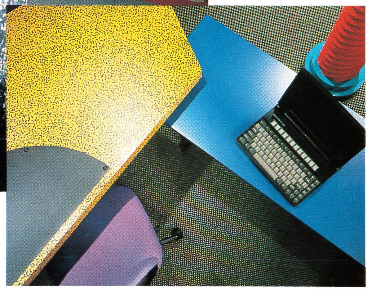
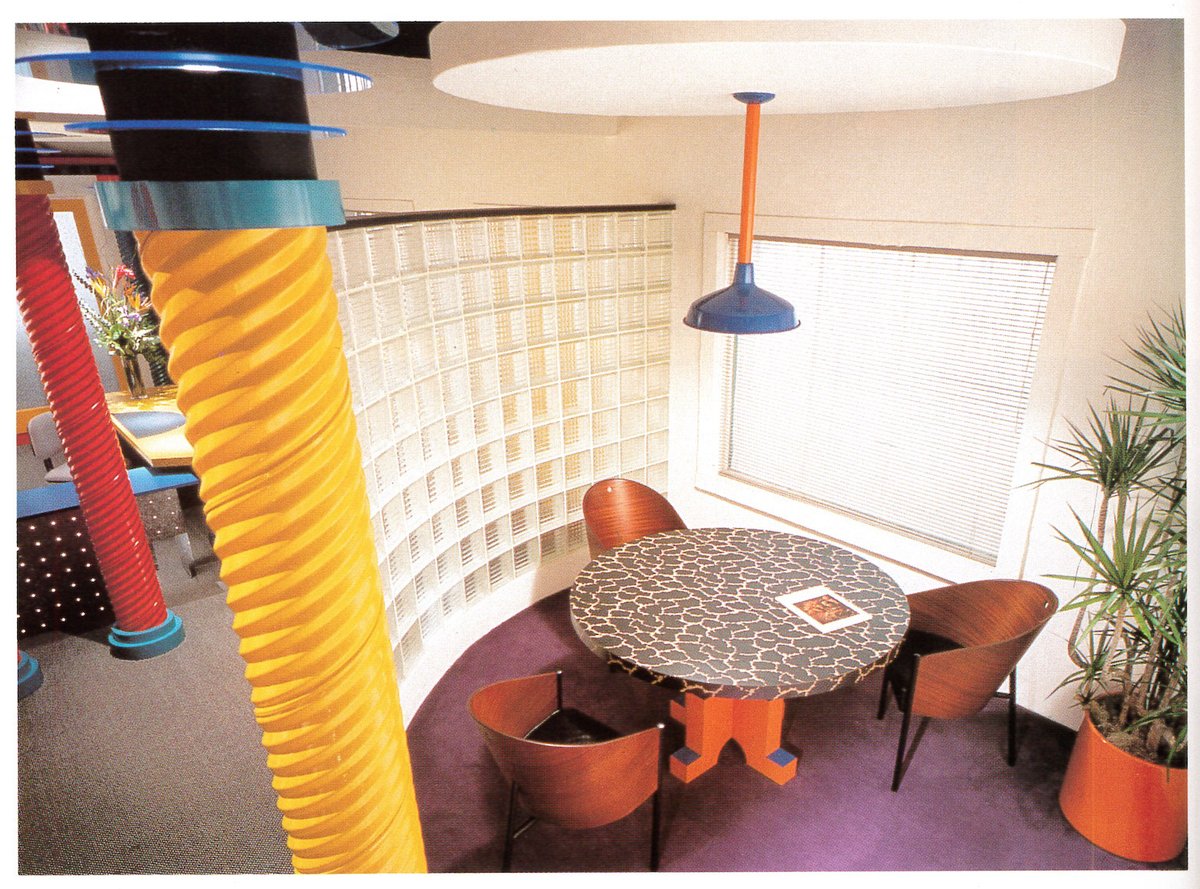
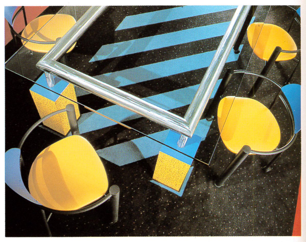
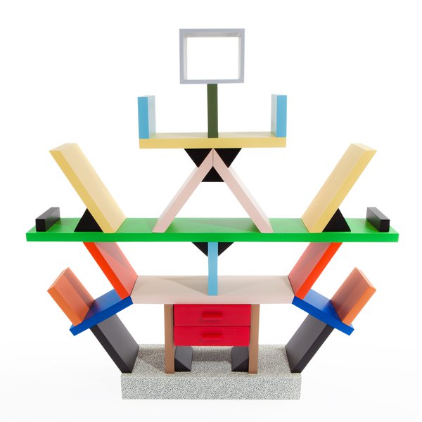
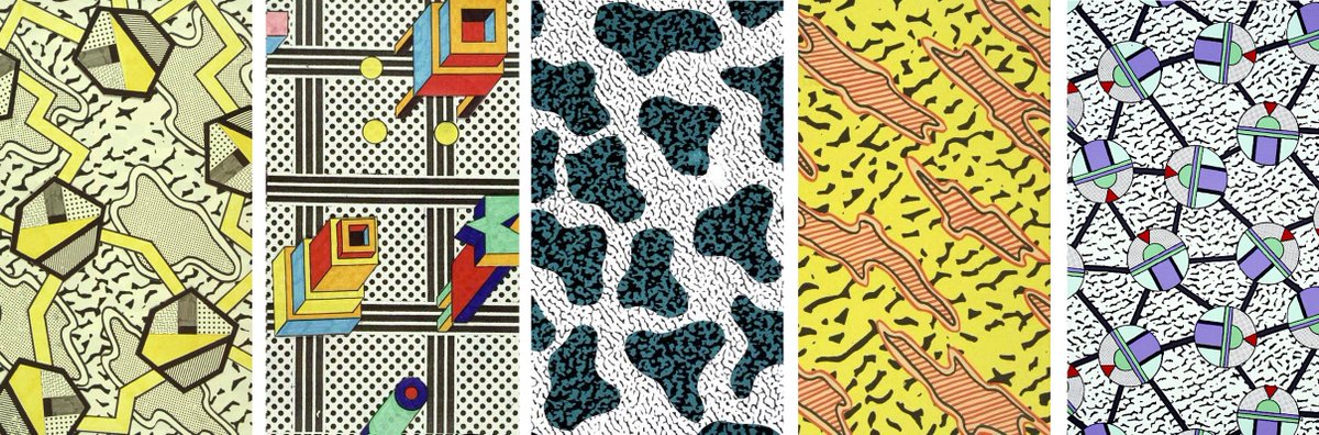
The Memphis Group, a small collective in Italy, burst onto the scene in 1981 with their wonderfully wild patterns, furniture, and interiors. With anything exciting, it was imitated endlessly once arriving.
The Memphis Group, a small collective in Italy, burst onto the scene in 1981 with their wonderfully wild patterns, furniture, and interiors. With anything exciting, it was imitated endlessly once arriving.
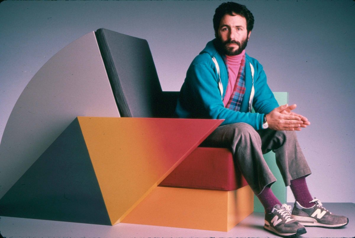

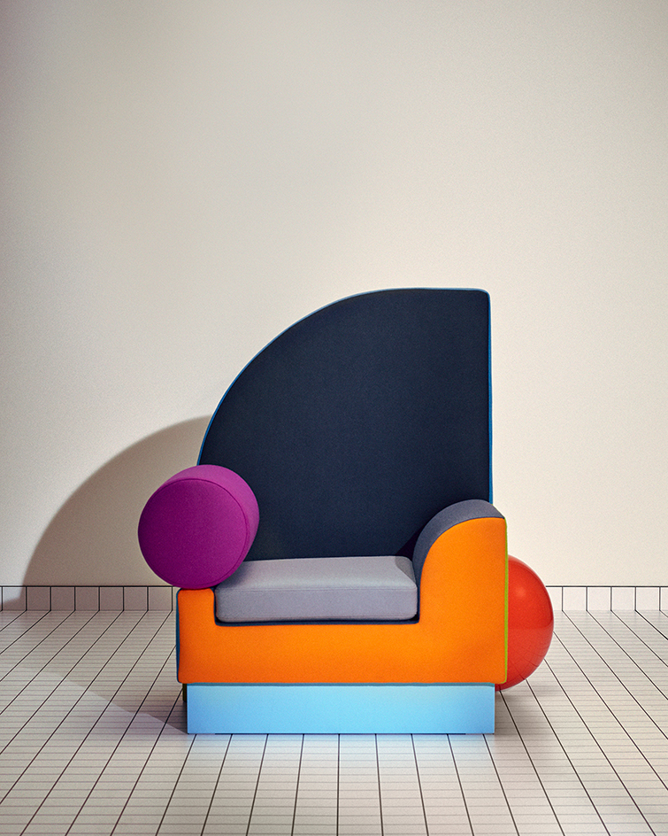
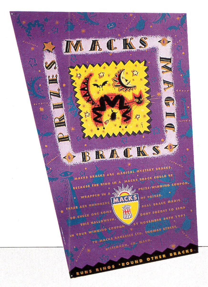
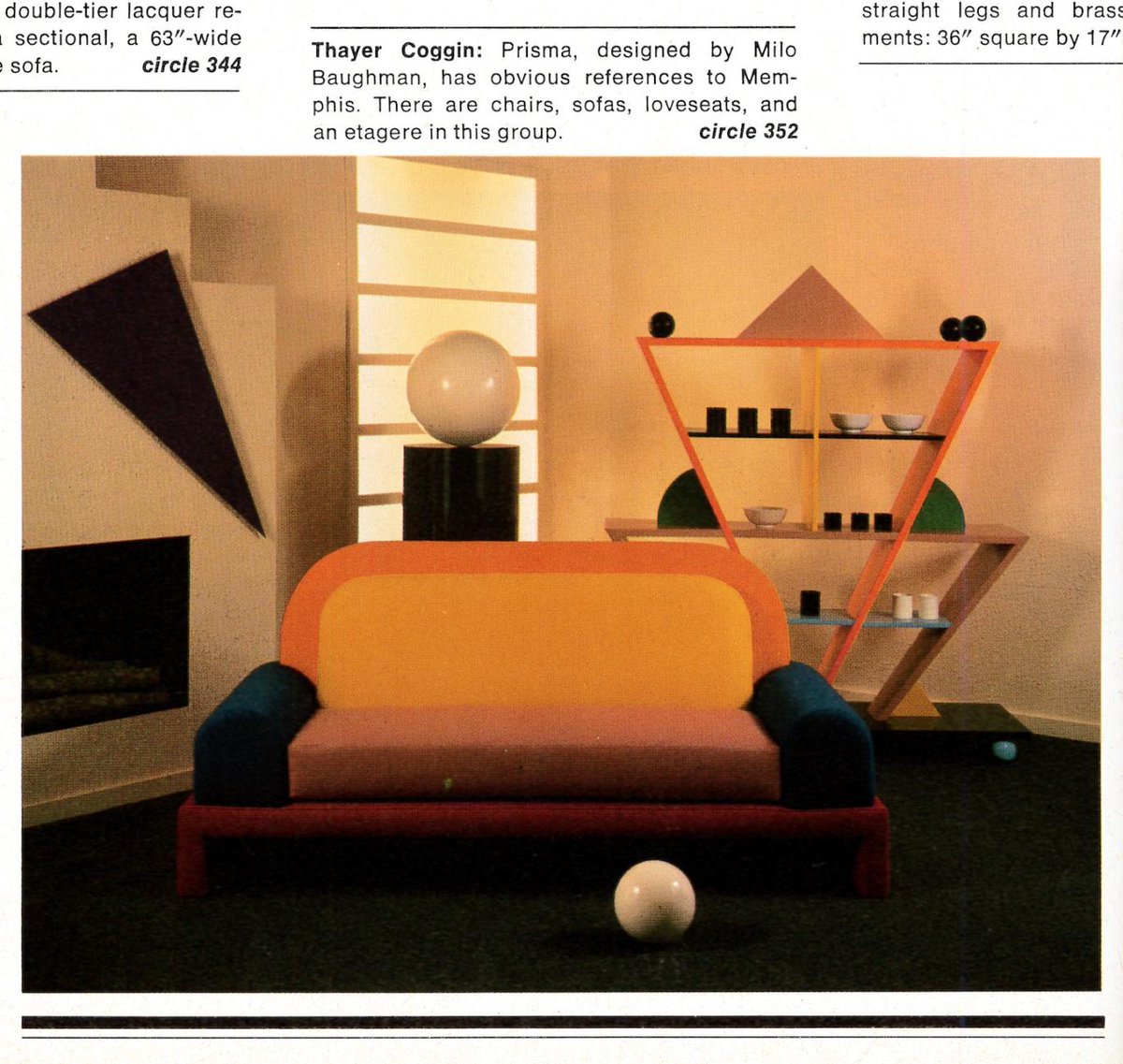
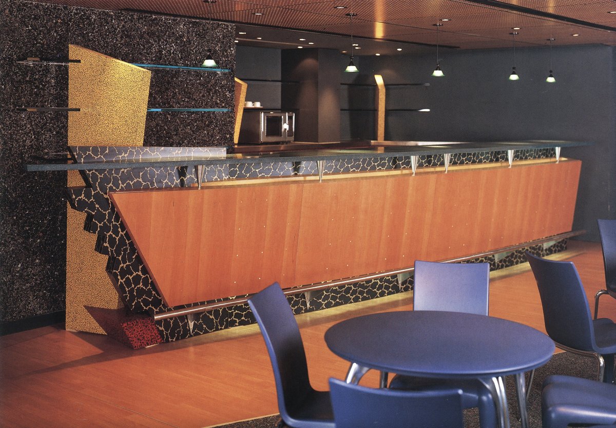
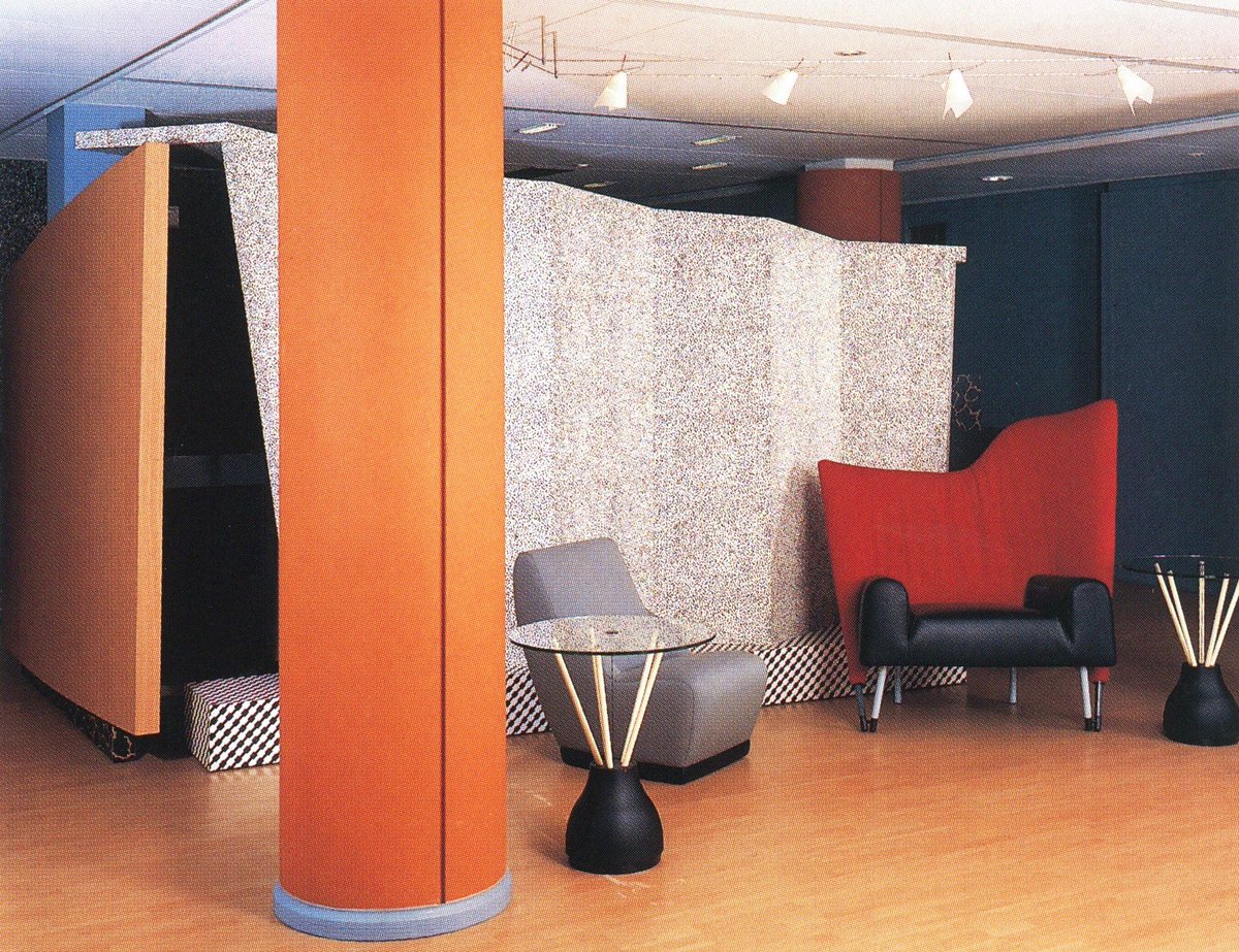
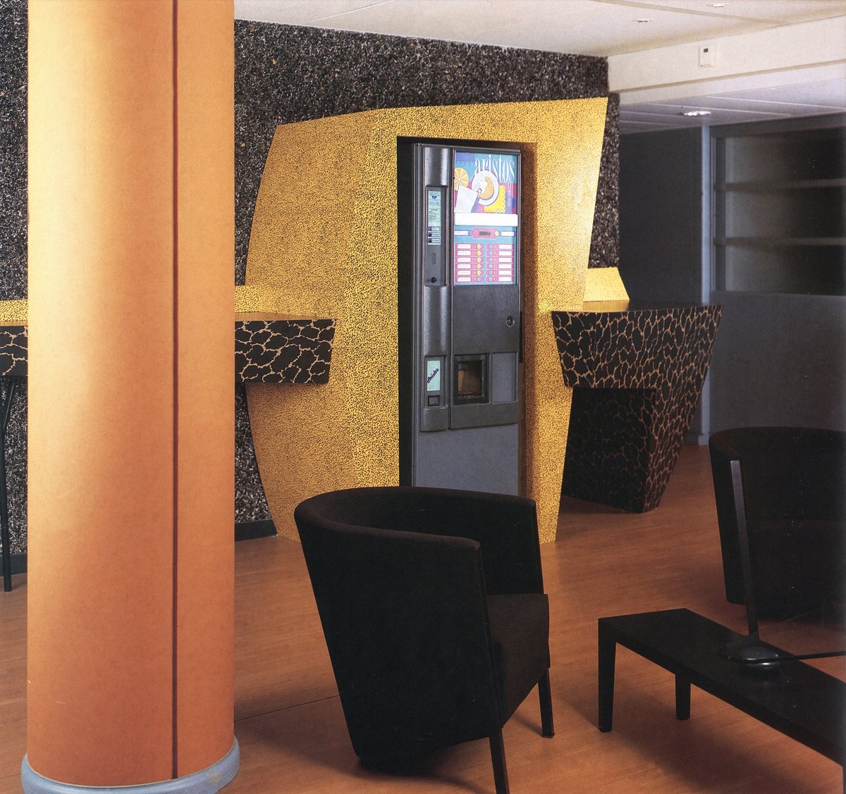
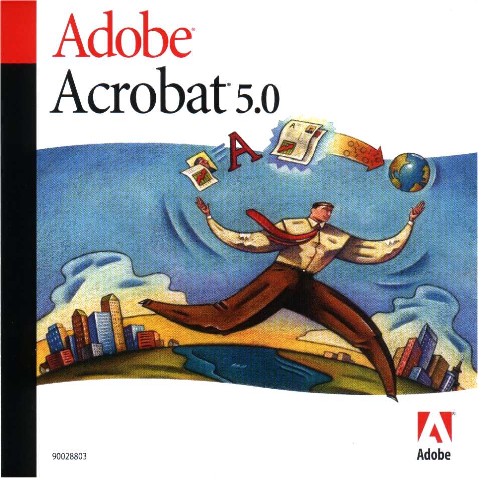
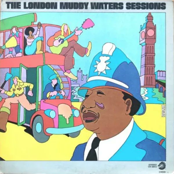
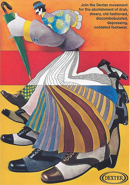
Designers literally copied Memphis Group, eg. this example of the 'Prisma Collection' by Milo Baughman' from the mid 80s. Additionally, it was used in corp. interiors like this one for Quatre Plus (1994).
Memphis Group didn't really even have human forms in their works that I've found; it was more just abstract forms & patterns.
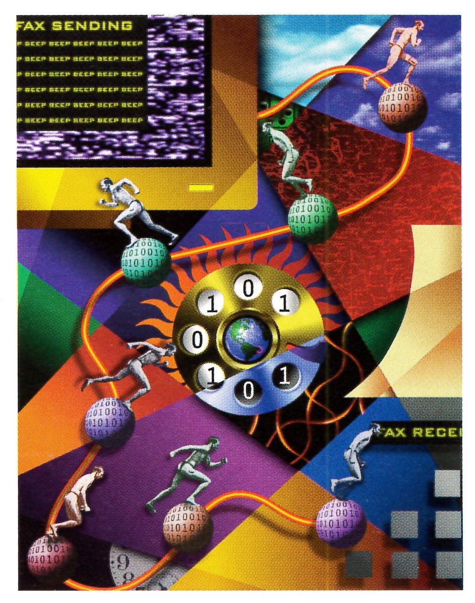
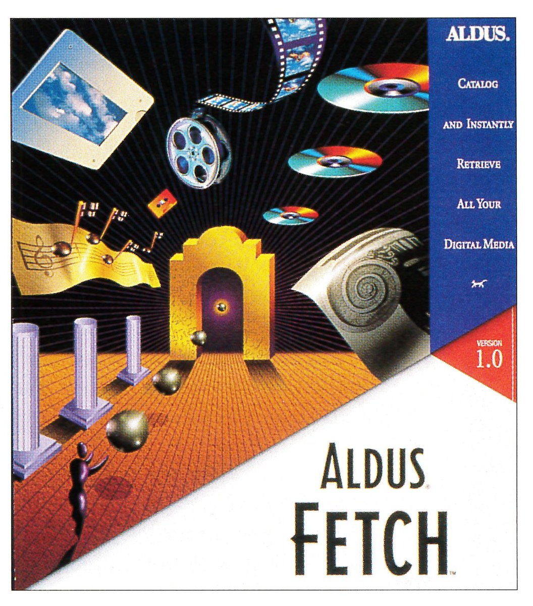
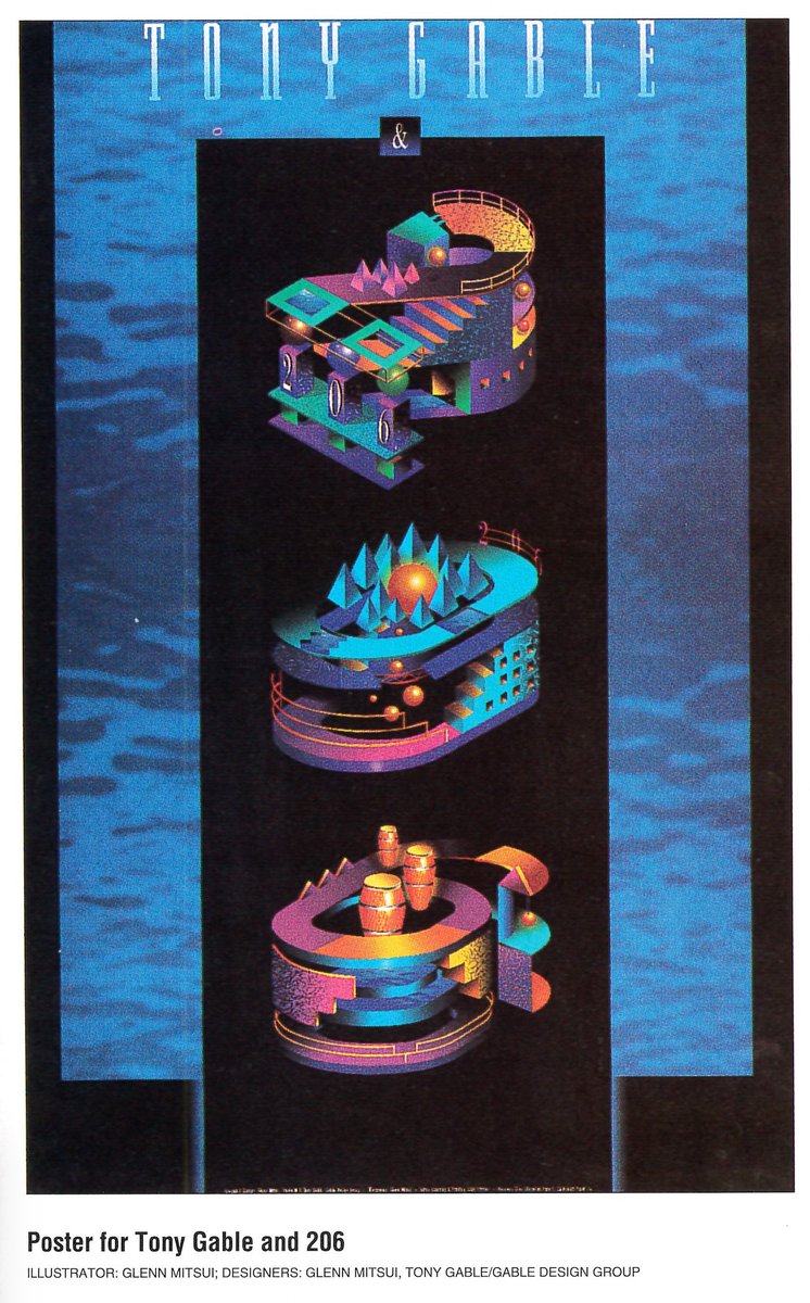
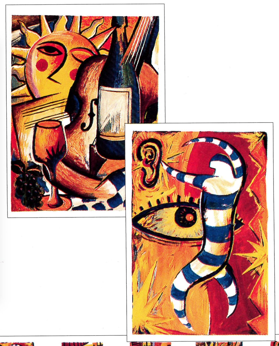
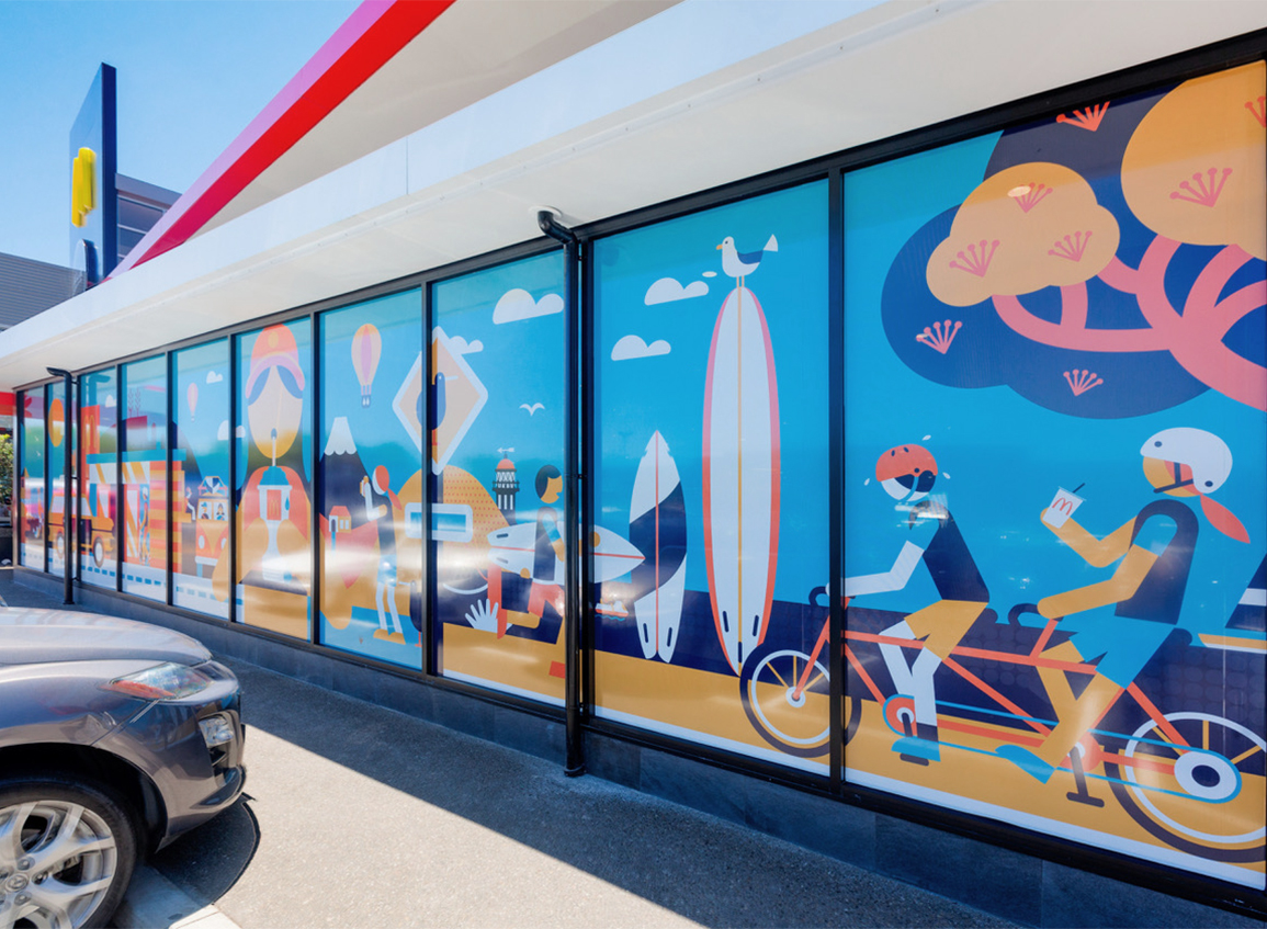
Oddly, I have found that maybe that 2010s style has some origins in this 1990s 'odd proportion' corporate illustration people.
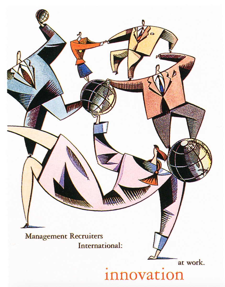


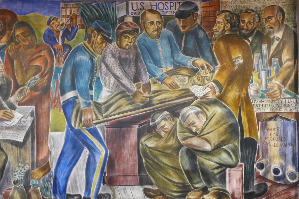
Which itself may have been inspired by Art Deco/WPA/ Mural styles of the 1930s-1940s.


I kinda think they're really just a more freeform/exaggerated/playful offshoot of an existing style popular in the 'flat graphics' of the early 2010s, Neoliberal Vector Minimalism.
cari.institute/aesthetics/neo…
cari.institute/aesthetics/neo…


I think the confusion in terms may have come from the Memphis 'revival' that appeared in the early-mid 2010s. That style did actually have some hallmarks of original Memphis Group work, like the geometric compositions, bright colors & certain similar patterns.


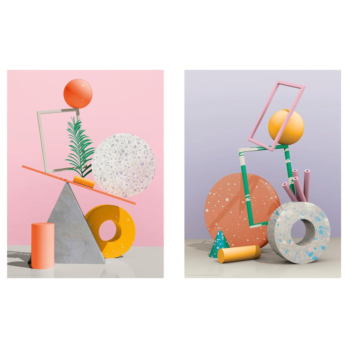
That Memphis revival kinda mushed together with other design trends at the time, as usually happens, to form something that was wholly new... We have it termed Bougie Design currently.
cari.institute/aesthetics/bou…
cari.institute/aesthetics/bou…


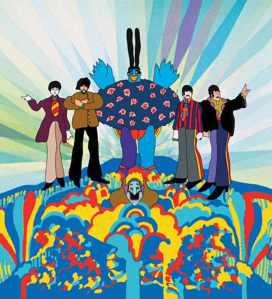
Just an add-on note; I hadn't realized that Hippie, and 'Corporate Hippie' styles (late 1960s-mid 1970s) also seem to have similar 'exaggerated proportion' flat people in some instances.

• • •
Missing some Tweet in this thread? You can try to
force a refresh