💡Have you ever wondered why the WCAG colour contrast ratio doesn't always seem to work?💡
Well it actually has to do with how we calculate colour contrast and is super interesting.
Hold on to your butts, this is a 🧵
Well it actually has to do with how we calculate colour contrast and is super interesting.
Hold on to your butts, this is a 🧵

Before we dive deeper, we should remind ourselves how colour actually works.
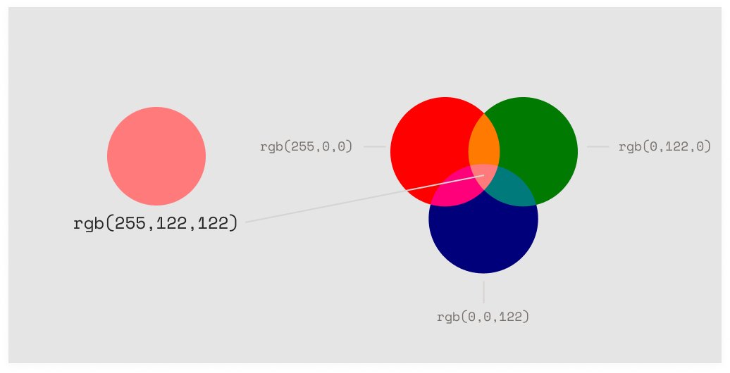
On screens we build a colour by adding together three different colours, Red, Green and Blue.
This is called additive colour.
On screens we build a colour by adding together three different colours, Red, Green and Blue.
This is called additive colour.

For instance, this peachy colour is:
100% 🔴 + 50% 🟢 + 50% 🔵
On the web, we can get 16.7 million combinations of these values - so 16.7 million different colours.
100% 🔴 + 50% 🟢 + 50% 🔵
On the web, we can get 16.7 million combinations of these values - so 16.7 million different colours.
Back to contrast... what is it actually?
Well, it's the difference in relative luminance of two colours.
Relative luminance is how bright a colour is relative to pure white, the brightest colour.
Well, it's the difference in relative luminance of two colours.
Relative luminance is how bright a colour is relative to pure white, the brightest colour.

The way we calculate this is simple:
1. Get the luminance values of our colours.
A value between 0% (black) and 100%(white).
2. Divide the two values.
This gives us a ratio with a max of 21:1 and a min of 1:1
1. Get the luminance values of our colours.
A value between 0% (black) and 100%(white).
2. Divide the two values.
This gives us a ratio with a max of 21:1 and a min of 1:1
Okay, that's cool and all but why does this goof up in some cases?
Well the first problem is the way we figure out how bright a particular RGB colour is, using this equation:
Luminance = 0.2126*R + 0.7152*G + 0.0722*B
Well the first problem is the way we figure out how bright a particular RGB colour is, using this equation:
Luminance = 0.2126*R + 0.7152*G + 0.0722*B
Notice how we multiply every channel by a slightly different value?
That's to accommodate for the way we perceive the brightness of the red, green and blue spectrums.
We perceive green as brighter than blue, for instance, and the equation compensates for this.
That's to accommodate for the way we perceive the brightness of the red, green and blue spectrums.
We perceive green as brighter than blue, for instance, and the equation compensates for this.

BUT, there's some dispute over how we should correct for this.
Some alternative algorithms weight the channels differently to better accommodate for human perception.
A new WCAG working draft uses this weighting:
Luminance = 0.299*R + 0.587*G + 0.114*B
Some alternative algorithms weight the channels differently to better accommodate for human perception.
A new WCAG working draft uses this weighting:
Luminance = 0.299*R + 0.587*G + 0.114*B

Given the same colour these two approaches will produce quite different luminance values which has knock on effects for the contrast calculation:

The second problem is the contrast calculation itself, which looks like this:
Contrast = (L1 + 0.05) / (L2 + 0.05)
Where L1 and L2 are the luminance values of the respective colours.
(the +0.05 is a gamma correction thing which I don't get 100%)
Contrast = (L1 + 0.05) / (L2 + 0.05)
Where L1 and L2 are the luminance values of the respective colours.
(the +0.05 is a gamma correction thing which I don't get 100%)
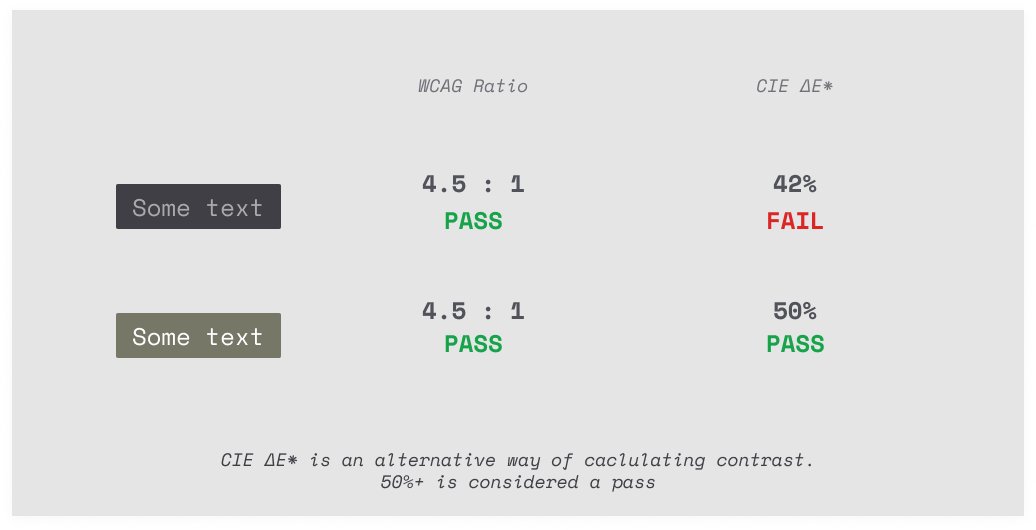
The problem here is that human perception of contrast isn't linear.
For example, these two sets of colours have the same contrast but we perceive the one on the right as having more contrast than the one on the left.
For example, these two sets of colours have the same contrast but we perceive the one on the right as having more contrast than the one on the left.

This is because we have a tendency to perceive higher contrast between brighter colours than between darker colours.
Modelling our perception accurately is super tricky but there are a few other ways to calculate contrast.
Here's how one of them (CIE ∆E*) effects these results
Modelling our perception accurately is super tricky but there are a few other ways to calculate contrast.
Here's how one of them (CIE ∆E*) effects these results
This is all compounded when you consider how old these specs are.
The sRGB spec uses an 80 nit monitor as a reference but modern displays can easily be 300 nits.
(By the way, the Pro XDR is 1000nits, 1600nits peak 🤯)
The sRGB spec uses an 80 nit monitor as a reference but modern displays can easily be 300 nits.
(By the way, the Pro XDR is 1000nits, 1600nits peak 🤯)
So where does this leave us?
Well the good news is lots of smarter people than you and I are working to make this better.
But it's going to take a while. Standards are difficult to change for a reason.
Well the good news is lots of smarter people than you and I are working to make this better.
But it's going to take a while. Standards are difficult to change for a reason.
It's also worth pointing out that you shouldn't just ignore the WCAG contrast guidelines completely.
They are still really useful.
They just don't get it right 100% of the time.
They are still really useful.
They just don't get it right 100% of the time.
If you want to learn more, there is an incredibly in depth discussion on the WCAG GitHub:
github.com/w3c/wcag/issue…
github.com/w3c/wcag/issue…
• • •
Missing some Tweet in this thread? You can try to
force a refresh