Today I would like to do a thread about 'counterforms.' They are a critical building block of typeface design... but what are they? How do they work?
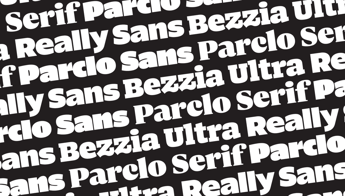
I'll also talk about how I thought of the counterforms in Really Sans.
I'll also talk about how I thought of the counterforms in Really Sans.
This thread won't be about science. It will be about observable logic, practical experience, and some ideas to think about.
Put simply, counterforms are negative spaces. One way to think about it is: all positive shapes exist purely to create negative shapes, and vice versa. 

When I first was made aware of the importance of negative space in typeface design I felt like... surely this can't be true? I was already focusing so hard on drawing positive shapes correctly, how was I supposed to also keep track of negative shapes?
For anyone who has played piano, it felt much like those early days where you aren't quite sure you'll be able to convince your hands to carry on such different assignments. Gradually it becomes easier, and eventually it is second nature.

Let's imagine this blob is our 'positive shape.' What is the simplest modification I can possibly make, to turn this into an 's'?

It turns out subtraction is the quickest way. It's relatively simple; subtracting these two negative 'counterforms' or 'counters' from our positive shape has made this an 's.' Our brain wants to see the 's' here, based on the previous reading we've done in our lives.
Using the same positive shape, I can subtract some counterforms and turn it into a lowercase 'a.'
What does it mean to make a 'bold' letter? Perhaps I can make this letter bolder without changing the positive shape at all — I can just reduce the size of the negative shapes.

I can make a very light-weight letter by allowing the negative shapes to be as large as possible.

Then some illusions come into play. You would swear the lighter letter was larger, right? Even though they use the exact same positive shape?

For this reason, lowercase letters tend to get taller as they get bolder, so the counterforms can combat that 'wrong height' illusion. Here's that effect at work in Really Sans.

By drawing different counter shapes, I can make many letters appear without changing the positive shape at all. This is shown here to illustrate the importance of the counterforms, and how they impact our perception of letter shapes.
Typically lettering artists and typeface designers practice the art of balancing these spaces inside letters, so that they feel cohesive. If a letter feels 'too wide,' that's usually because the counters contain too much negative space.
If, while designing a typeface, we notice that a letter feels 'too light,' it is usually that the counters are too large, as compared to other letters.
A balanced word will typically be made of letters where the counterforms are approximately equal in their overall mass or volume. I've sometimes pictured it as candle wax; if I melted these counters down, would they each be about the same amount of wax?
Another simple exercise: pixel fonts. When you have such little material to work with, how do you draw an irrefutable ‘s’ or ‘e’? If the letters shown here are successful, perhaps it is because of their ‘counter pixels’, and the balance in their positive and negative space.

Many typefaces have a rational construction that tries to make the counterforms as similar (in their shape) to each other as possible. This makes rational sense, but it turns out that it doesn’t produce the most pleasant result for reading.
To my eye, the typefaces that are most pleasant to read (in the text of a novel, for instance) are the ones that make the counterspaces distinctly different from each other. They are still balanced, but they are easy to tell apart.
We call this 'disambiguation.’ As an example — try finding the 'c's amongst the 'o's in this image.

For comparison — where are the ‘c’s in this image? Were they easier to find?

If so, perhaps the reason was the disambiguation of counterforms. The less similar the 'c' counterform is to an 'o' counterform, the faster it may be discovered in context. Here's how that detail is handled in Really Sans.
Some have theorized that if counterforms are easier to tell apart, and if they are large and clear in shape, that the resulting words, sentences, and paragraphs may function better at smaller sizes.
One way to visualize the importance of counterforms is a 'blur test.' Adrian Frutiger did tests like this in the 1970s when designing his eponymous typeface (originally for a French airport). See how one set of drawings is easier to distinguish, in these harsh conditions of blur?
The concept here is that blur is a stand-in for lots of reading conditions that may ‘fight against’ letterforms. Signage that is placed far away from a reader. Very small text on a page. The bleeding ink of a printing press. The coarse grid of a low resolution pixel display.
That's part of why I wanted Really Sans to have 'open terminations' that let the counterforms breathe. I wanted to give the Really Sans Small fonts their best possible chance to be legible at small sizes, by protecting counterforms.
I think there is something to be said about the word ‘simple.’ I sense that many designers share this ambition to make their work ‘simple to perceive.’ Easy to understand.
But do we mean the system that created the design is simple? Or do we mean that the results of that system feel simple to perceive?
Web designers and developers will be very aware of the idea of the ‘responsive’ web. If this were approached with a ‘simple system,’ you’d just show the same website on all devices, right? That’s the simplest approach.
Whereas we have learned that a ‘simple to perceive result’ on the web is actually achieved by a more complicated responsive system that changes the design based on screen size. This more complicated system gets us closer to a ‘simple to perceive result.’
Typeface design strikes me as working this same way. We have an instinct to make the letters rationally similar, and develop a ‘simple system’ for how they are assembled. But we’ve learned over time that it takes a more complicated system to make a typeface feel ‘simple’ to read.

I sometimes wonder if there is an inverse relationship between the complexity of a system, and the perceived simplicity of the result.
For instance, chess has relatively few rules (most of which are often explained in a single sitting), but chess players are still playing never-before-seen games 1500 years later.

Music theory, in comparison, is a sprawling complicated system that seems to strive to document what we perceive to be beautiful, pleasant music.

Typography feels this way to me — there are things we find typographically pleasant, and we’re trying our best to document the complicated systems that produce those results.
Much of the challenge in typeface design involves counterforms, and an awareness of how they work across a typeface. Thanks for listening about how the counterforms were handled in Really Sans, and try it for yourself here!
lettermatic.com/fonts/really-s…
lettermatic.com/fonts/really-s…
And thank you to @danellecheney and @heather_cran at @lettermatic_abc for helping me with the imagery for this thread. 😀
• • •
Missing some Tweet in this thread? You can try to
force a refresh