Typeface Designer | I make fonts at Lettermatic (@lettermatic_abc) Co-founder of Lost Type | 🔠 He/Him 🔤 @rileycran@peoplemaking.games
May 25, 2022 • 30 tweets • 9 min read
It's tempting to think that simpler letterforms = more legibility. But in my experience, that's not true. Typefaces are design systems too, and they need a certain level of complexity to work well. Here's why
(thread) 🧵
Humans love patterns. We see patterns in everything we do, and it is in our nature to organize and categorize things. Naturally, we try to do this with the Latin writing system.
Jan 14, 2022 • 37 tweets • 17 min read
Today I am 30 years old. To celebrate, I’m going to do something I wouldn’t normally do: I’m going to talk about the work I made in the last 10 years. I’m honestly a bit shy to share all of this older work, but frankly I’d like to remind myself of how I spent that time.
One of the primary reasons I want to do this is… that I normally wouldn’t do it? I want to be better at embracing what I’ve made, and appreciating the journey I’ve been on. I want to understand self editing and self criticism as separate things.
Sep 21, 2021 • 36 tweets • 12 min read
What exactly is kerning? What is spacing? How are they different? Let’s talk about it!
THREAD 🧵:
Spacing and kerning are two separate things, and both are crucial to the experience of reading type. When done correctly they are intended to be practically invisible. In this thread I will attempt to make that ‘invisible’ part a bit easier to observe.
Sep 8, 2021 • 29 tweets • 10 min read
A recent #fontSunday topic of ‘bold headlines’ made me want to talk about bold letters a bit.
THREAD:
I have been a fan of very bold letters for a long time. With the Lettermatic catalog, I think it has essentially been a self-imposed rule that all of our designs get taken to a very bold extreme. Because… it’s fun!
Aug 4, 2021 • 33 tweets • 11 min read
NEW 🧵: Did you know we only started mixing Sans and Serif typefaces in the last 200 years? One genre is much older than the other.
Let’s discuss the birth of sans serif typefaces.
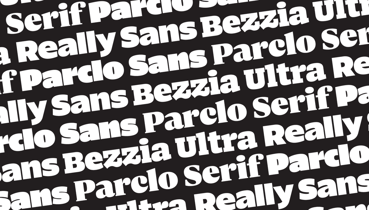
I’ll use @lettermatic_abc fonts for some visuals: Parclo Sans & Serif.
lettermatic.com/fonts
Put simply: serifs are these little barb things on the ends of strokes. A ‘sans serif’ typeface means a typeface in which these are omitted, usually resulting in a blunt ending like this.
Jul 27, 2021 • 37 tweets • 10 min read
Today I would like to do a thread about 'counterforms.' They are a critical building block of typeface design... but what are they? How do they work?
I'll also talk about how I thought of the counterforms in Really Sans.
This thread won't be about science. It will be about observable logic, practical experience, and some ideas to think about.
Jul 19, 2021 • 25 tweets • 10 min read
I started designing a typeface called Really Sans about 2 years ago. It is now available at @lettermatic_abc.
I am going to try something new today: a twitter thread about the underlaying ideas in Really Sans.
What goes into a typeface design?
There are a lot of Sans Serif typefaces. Why does the world need another one? This question is asked of any new entry to the genre.
There is a very clear reason, for me, as to why Really Sans exists.