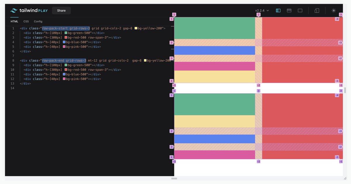
Is there any way with CSS grid to say "all rows should have size 'auto', except the last one which should be '1fr'" while relying on implicit rows?
I want every row as short as possible, with the last row taking up the rest of the space, but with an unknown number of rows π€
The image above is the outcome I want, but I don't want to have to use `grid-template-rows: auto auto 1fr`, because that breaks if I need another row. Any way to do it without knowing the number of rows?
Put another way, it's easy to make the first row different than the rest:
grid-template-rows: 1fr;
grid-auto-rows: auto;
But how can you make the _last_ row different than the rest?
Experimenting with an API in Tailwind to handle this case but nervous it might be a bit too specific π€
`row-pack-start` = Dump any extra space in the last row
`row-pack-end` = Dump any extra space in the first row
Building really great stuff takes a lot more time, attention, and focus than is really possible to understand up front.
It's hard but I've had to learn to say no to even my own best ideas if they mean spinning another plate, or I eventually resent them for getting in the way.
If you want to do a lot of things, focus on things that can be finished.
Write a book, record an album, organize an event, produce a video, give a talk β you can build a rich catalog of work if you are deliberate about doing things that can actually be *done*.
But if you want to do things that can't really be finished (like software), I think the right way to be ambitious is to focus on one thing and make it great.
The sacrifice of saying no to a few fun ideas is not as bad as the sacrifice of never feeling awesome about your work.
It's a set of extensions for REAPER (DAW software) for editing live drum performances super efficiently + a bunch of other productivity helpers.
Although I'd been programming in some capacity since I was 10-11 and had good exposure to basic concepts like variables, loops, etc., I had no idea that "software design" was a concept, and it never even occurred to me that code could have "quality" π
I just had a bunch of feature ideas and had been messing around with some Python scripts, when Tim (the author of the bigger project) saw potential in me, took me under his wing in IRC, taught me C++, and created this stupid `Adam.cpp` file for me to go nuts in β€οΈ
π€ What's the best way to structure your classes and markup when building UIs with Tailwind CSS?
Here are some of the rules I follow to build things that are consistent, easy to understand, and straightforward to componentize π
Sort classes generally from the outside in (in terms of the box model) putting things that affect layout before things that don't, while also trying to group related classes.
This lets you see the things that are going to have the biggest impact quickly.
βοΈThis is a bit of an art, but hoping to automate in the near future!
I've been working on nailing the recommended class order a bit lately β check out my list so far on GitHub:
Maintaining open-source is brutal, and feeling obligated to acknowledge, review, and respond to every attempt to contribute is a huge burden to carry.
When I saw this tweet from @dhh the other day I couldn't help but s/email/open source contribution/, but it makes me feel horribly guilty to suggest that anyone should feel anything but grateful for unsolicited free work from contributors.
But the reality is even though folks are generally trying to help by contributing, those contributions still cost the maintainer more than they cost the contributor, in terms of time to review, stress worrying about making time to review, and long term maintenance.
This is a great example of why you need more control when implementing dark mode than just reversing the color scheme or overriding basic variables like "--color-primary" or similar.
Short thread pointing out some of the neat design decisions here π
1. The top banner β the background color changes a bit and so does the link, but it doesn't *invert*, it's still light on dark in both versions.
Dark sections shouldn't be inverted to light in dark mode, you'd get a blinding light block β bad in dark environments.
2. The background switches from light to dark, but in the light design it's a solid color, and in the dark design it's a gradient. You can't do this by changing a color variable.
.@bradlc who built the entire website. I absolutely did not expect us to have time for all the insane interactions and animations. He managed to do everything I ever dreamed of plus more, and the APIs he created for it are a delight to work with.
.@malfaitrobin who worked side-by-side with me to develop all of the new features in Tailwind CSS v2.0, and took on the massive job of updating Tailwind UI to take advantage of all the new features. He built an entire automated system that can idempotently update our templates π€―