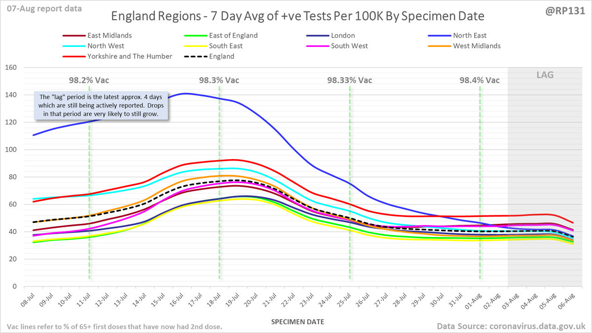
#covid19uk - Detailed positive tests thread. The majority of this thread is a set of views of rolling 7 day average positives per 100K by specimen date. Starting with England regions:
Some of the more detailed content from this thread has been moved to an external page to try and make the twitter updates a bit more manageable. You can still see the full version here: …ddatashare.s3-eu-west-1.amazonaws.com/Detail/Detail_…
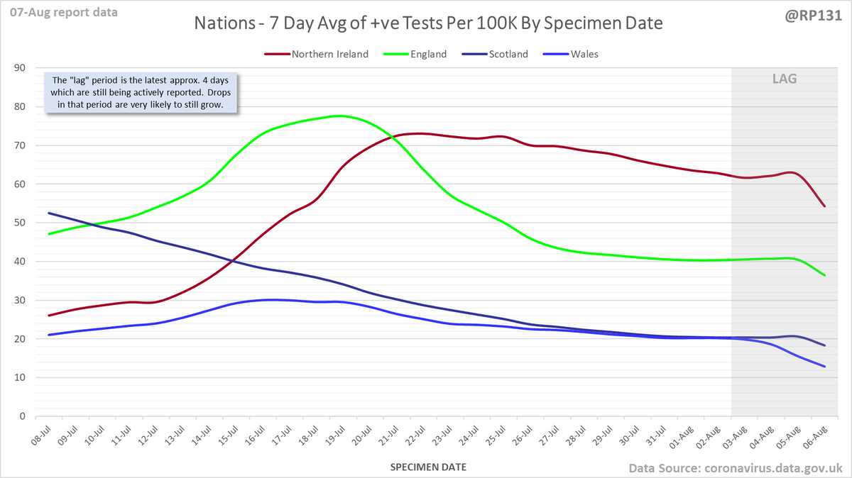
UK nations:
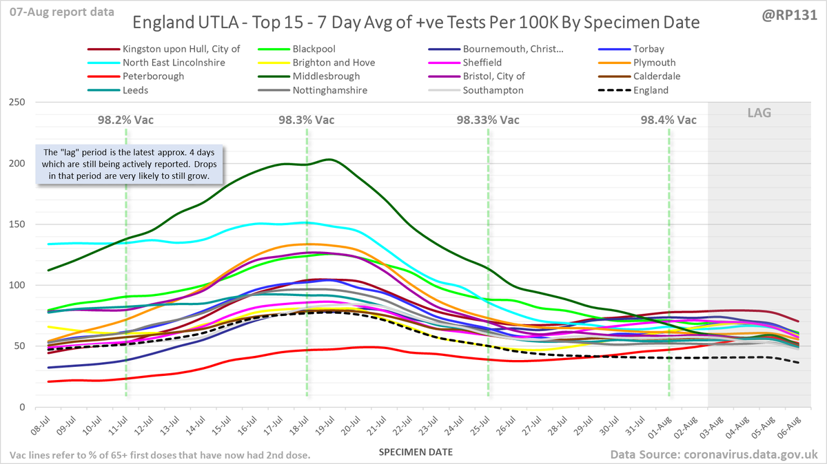
Top 15 of just Upper Tier Local Authorities in England:
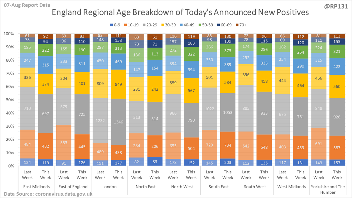
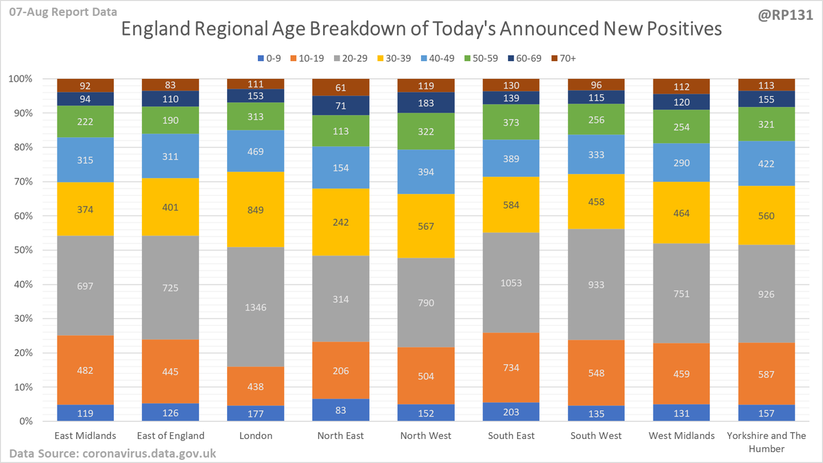
Regional / age distribution of today's newly announced positives for England.
Plus to see how it's shifting, here's the same values but with the same day last week for comparison:
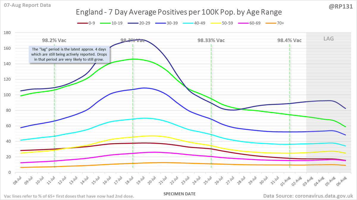
England rolling average positives (per 100K population) by age range:
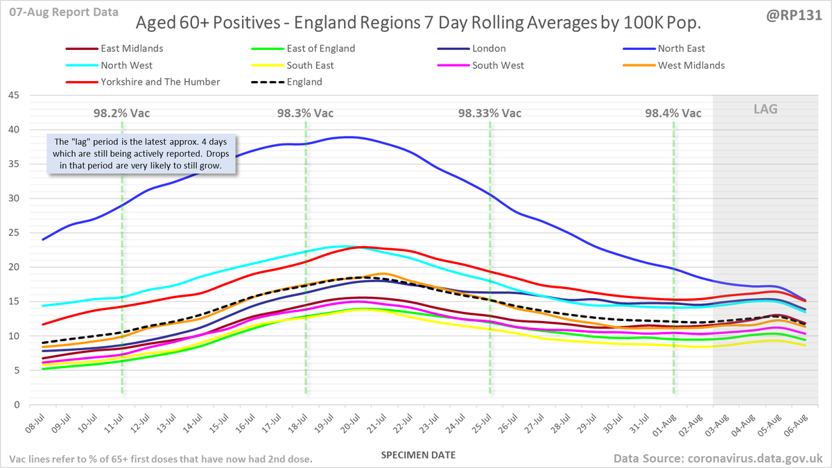
England regional rolling average positives (per 100K population) in the 60+ age range:
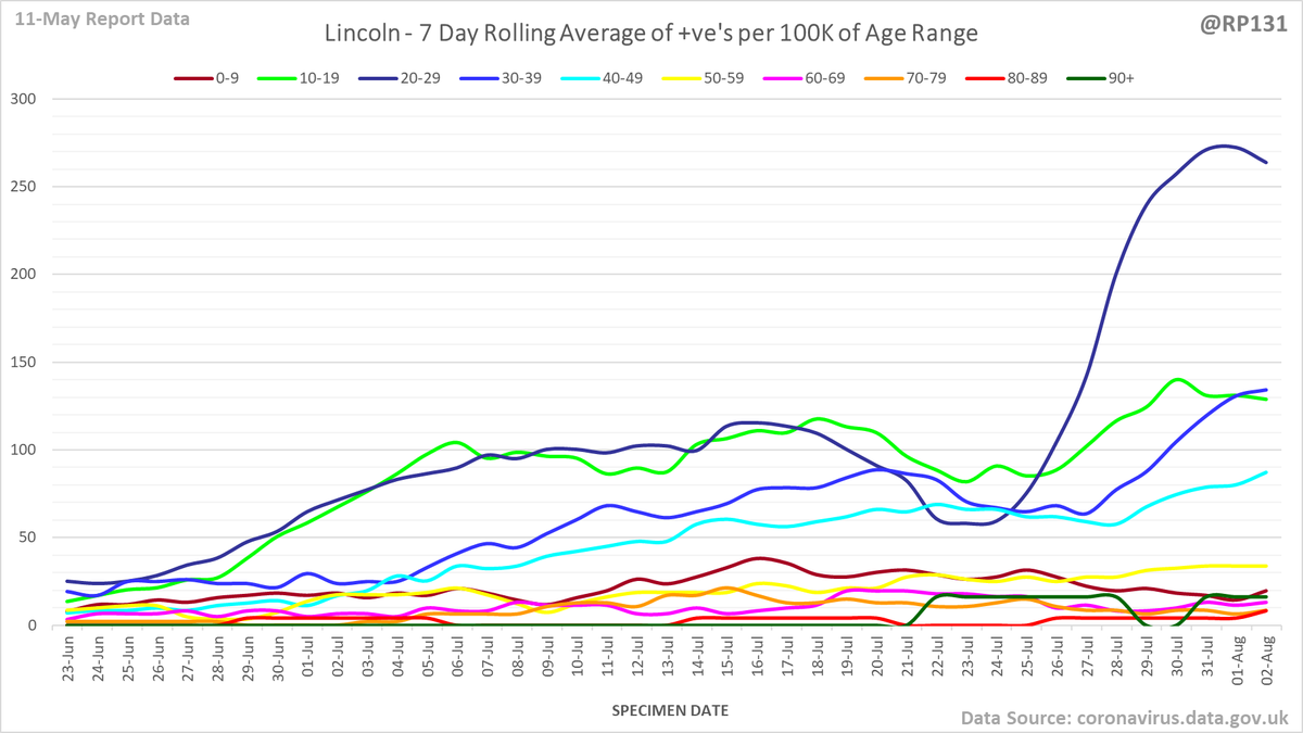
Age breakdown chart for Lincoln (current top LA). Rolling average of positive tests by specimen date per 100K population of each age range.
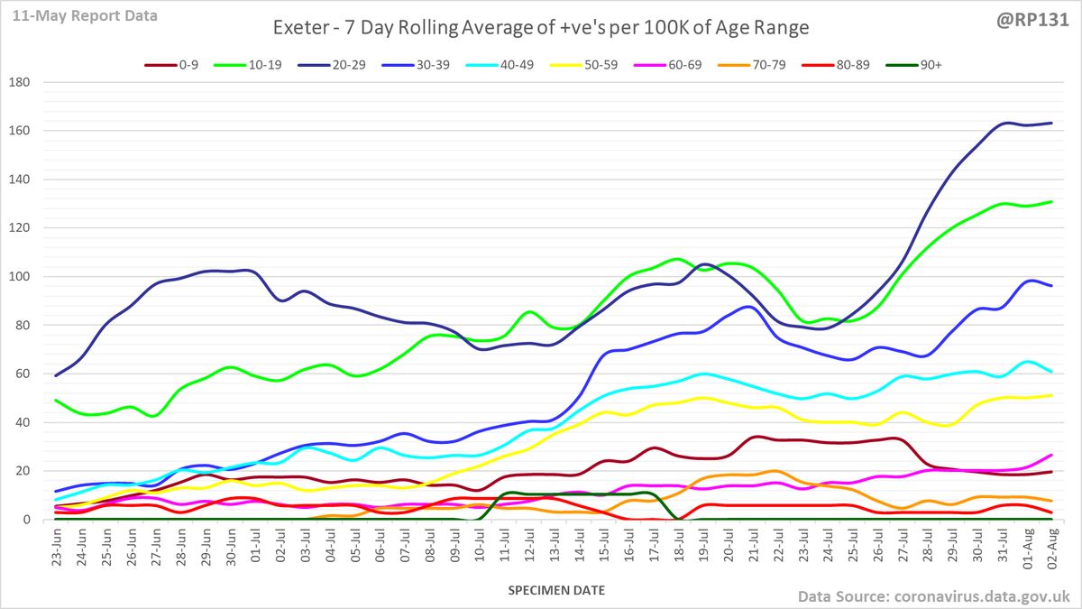
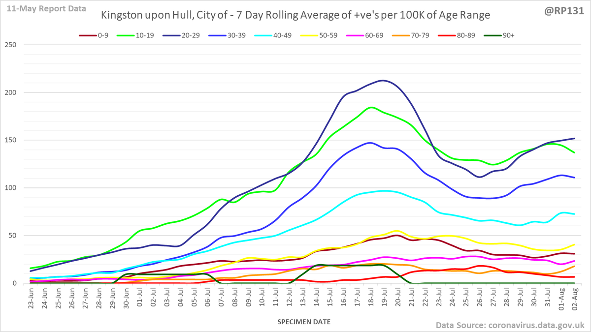
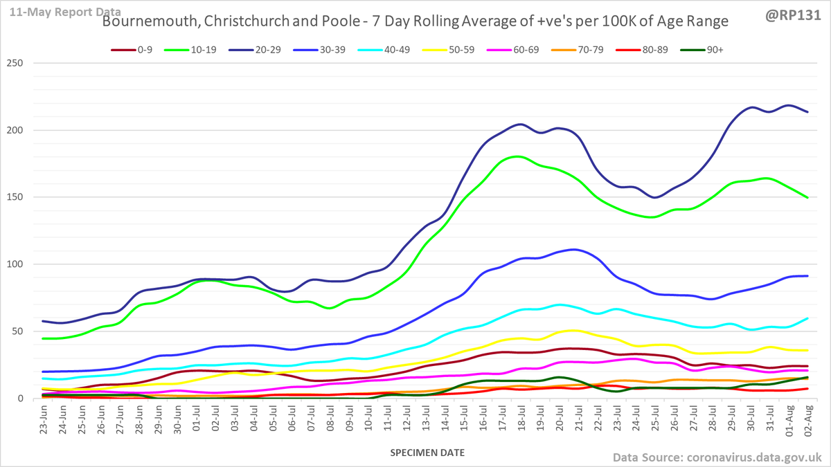
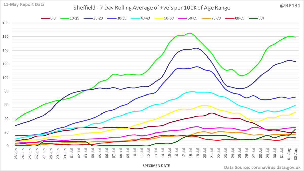
Also age breakdown charts for rest of top 5: Exeter, Kingston upon Hull, City of, Bournemouth, Christchurch and Poole and Sheffield.
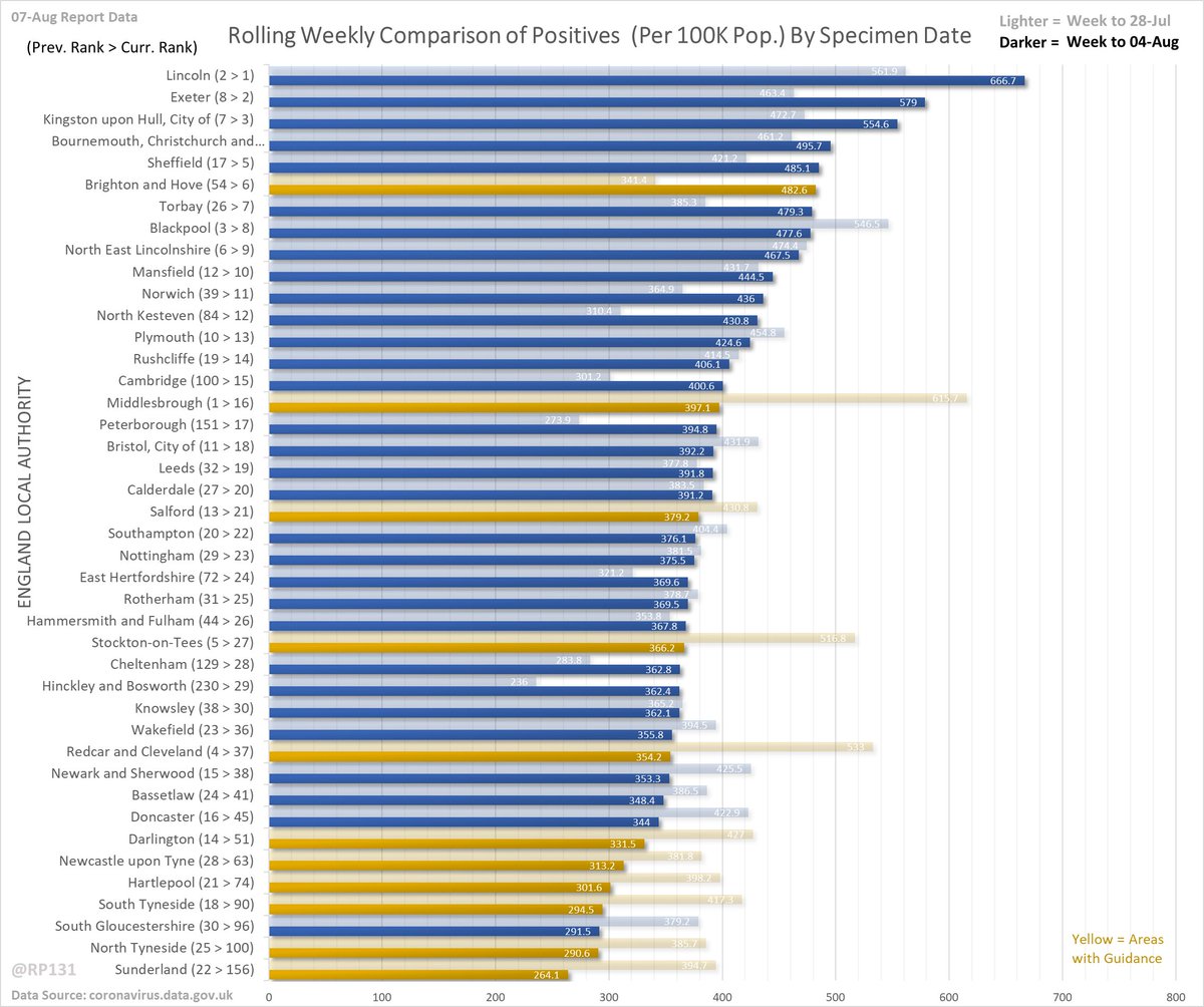
Rolling weekly comparison of totals up to 3 days ago. This chart is useful to see the relative movements of the local authorities towards the top of the list.

• • •

Missing some Tweet in this thread? You can try to force a refresh
 

Keep Current with Richard 📊📉

Richard 📊📉 Profile picture

Stay in touch and get notified when new unrolls are available from this author!

Read all threads

This Thread may be Removed Anytime!

PDF

Twitter may remove this content at anytime! Save it as PDF for later use!

Try unrolling a thread yourself!

how to unroll video
  1. Follow @ThreadReaderApp to mention us!

  2. From a Twitter thread mention us with a keyword "unroll"
@threadreaderapp unroll

Practice here first or read more on our help page!

More from @RP131

7 Aug
Pinned index post linking to a simple table of contents page to make it easier to find my normal daily posts.

Old style links also inclued in replies below for people who don't like new table of contents...

…ddatashare.s3-eu-west-1.amazonaws.com/index.html
Hospital data: Not updated today
Positives test additions:
Death additions:
Bubble:
Delay: Not updated today
Mirror: Not updated today

Not updated today
Read 4 tweets
7 Aug
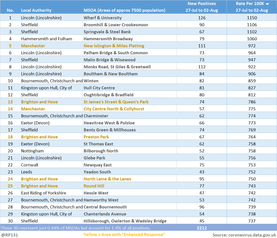
Updated (07-Aug) table of top 30 MSOAs (by rate) based on latest numbers in today's report.

This table often feels a bit out of date because by the time these local figures filter through, the LA has already peaked.
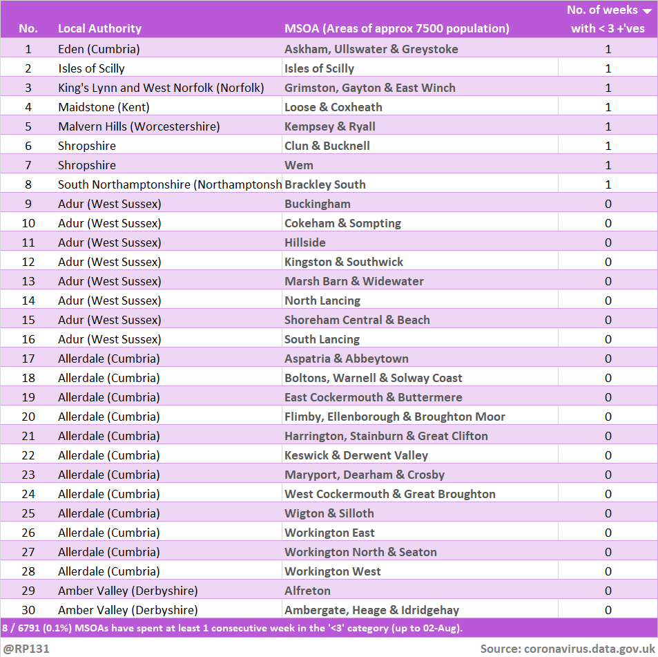
Bringing back the view of how many weeks the MSOAs have been in the suppressed 'less then 3 +ves in the last week' category. Since they don't allow us to distinguish between zero / 1 / 2, we generally consider it to mean zero. Link to full table in reply below.
Read 6 tweets
7 Aug
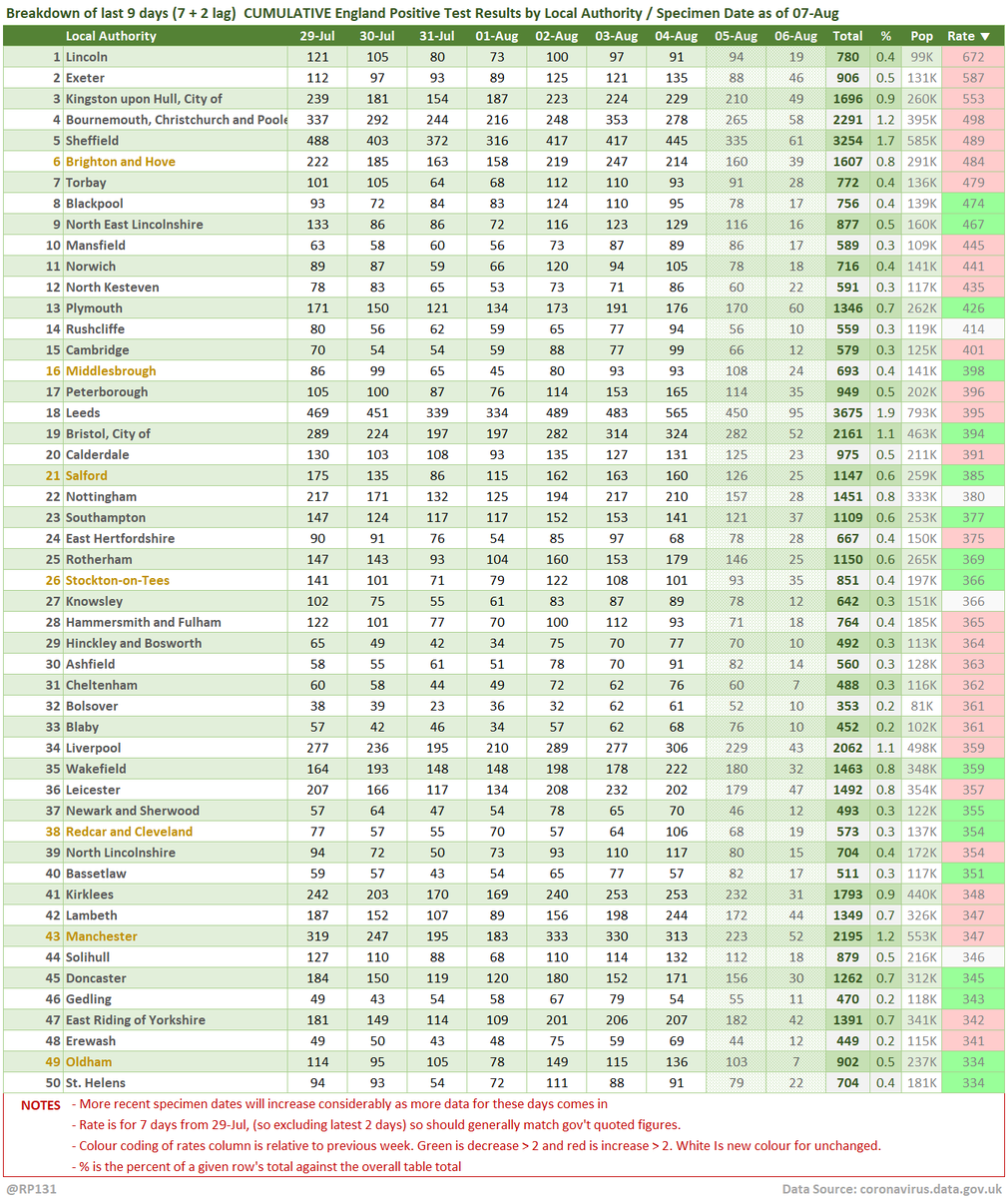
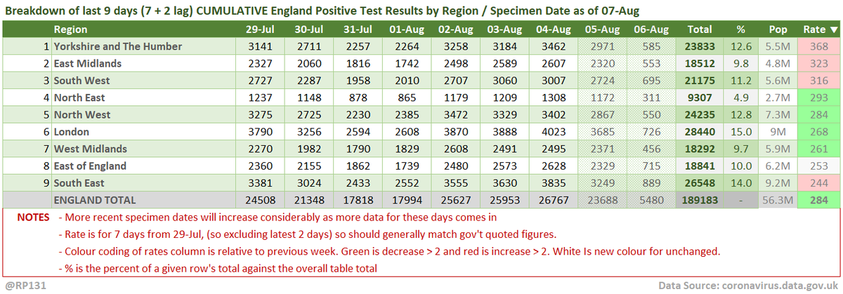
#covid19uk - Tables thread. Starting with the top 50 England Local Authorities by positives per 100K population in last 7 days, up to 3 days ago. Bright green means lower than previous period.
Cumulative summary view by regions.
Read 6 tweets
7 Aug
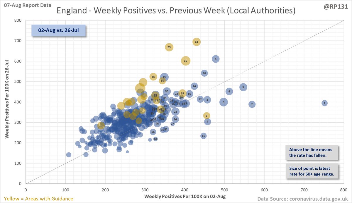
Bubble chart thread for England local authorities. This type of chart allows us to quickly visualise week on week changes by seeing if the points are above or below the dotted line. The size of the dot is the relative level of positives in the 60+ age range.
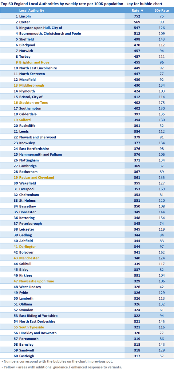
Key for the chart in the above tweet.
Link to the interactive version of this bubble chart: …ddatashare.s3-eu-west-1.amazonaws.com/Bubble.html
Read 4 tweets
7 Aug
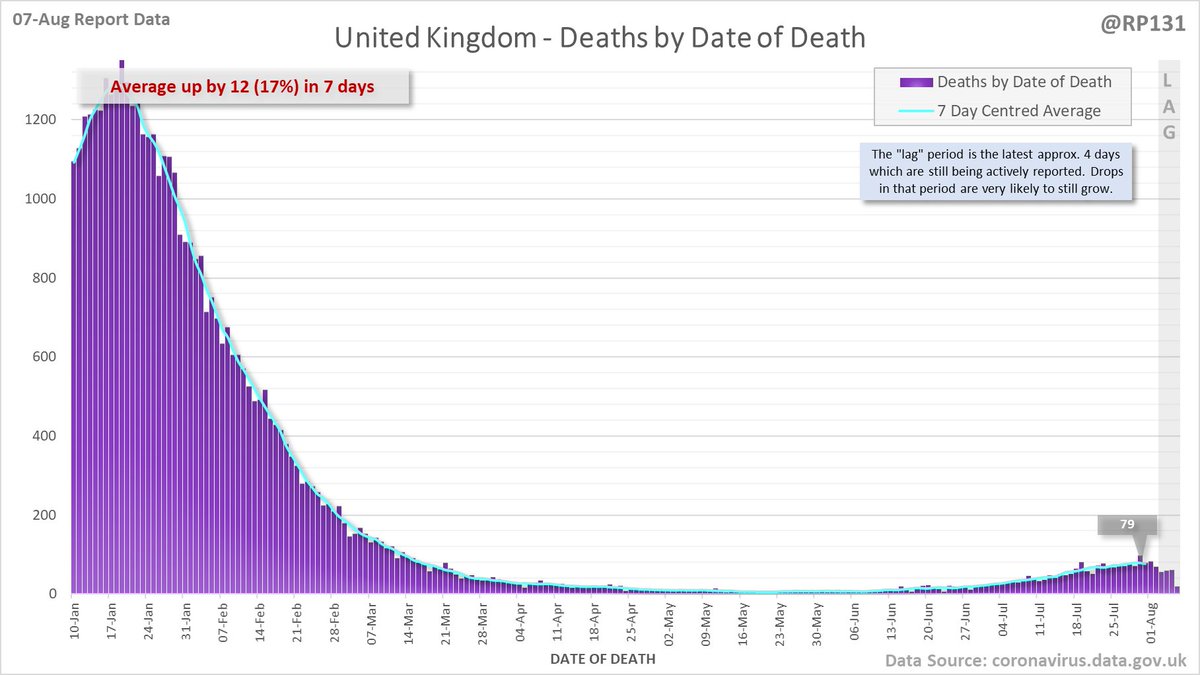
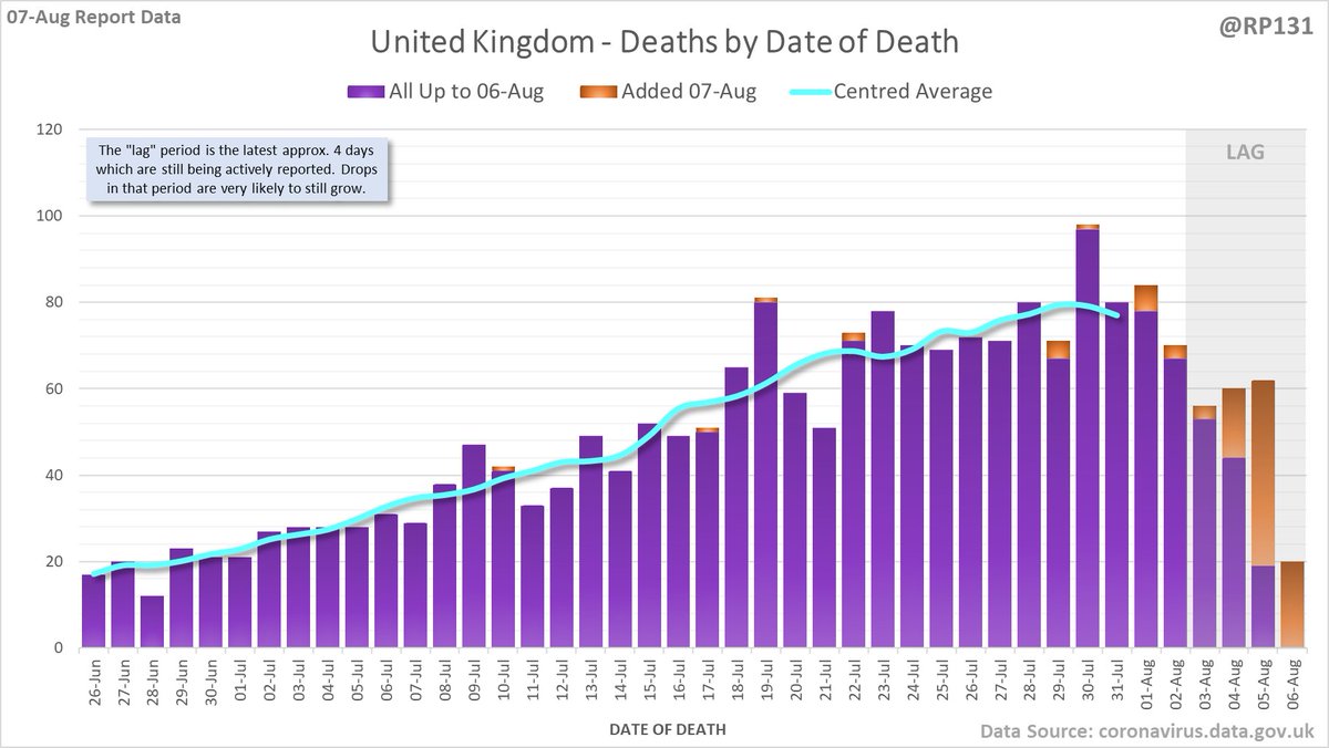
103 new #covid19uk deaths reported today (07-Aug). This brings the rolling average by date of death (allowing 4 days for lag) to 79, an increase of 12 (17%) in the last week.
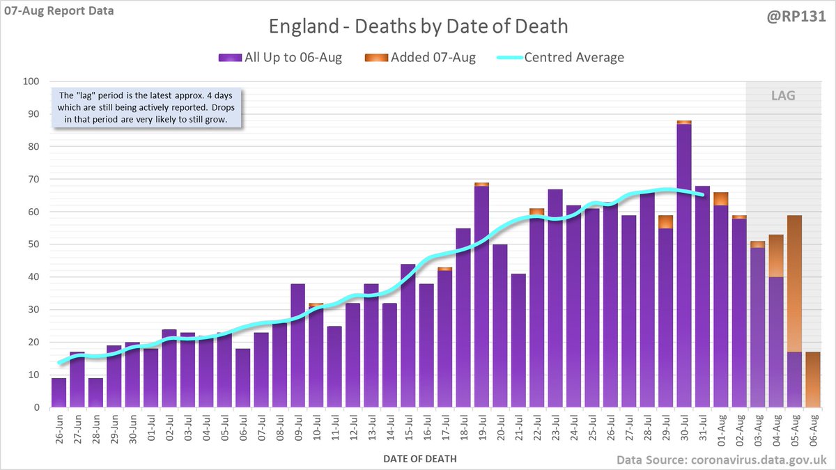
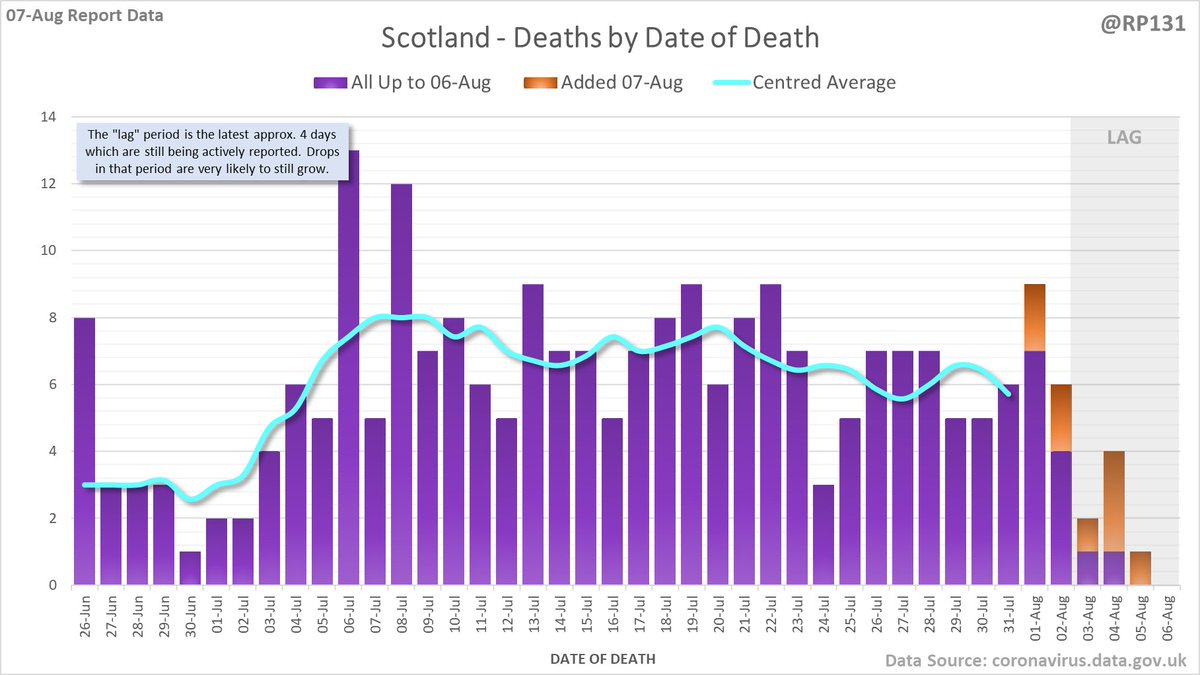
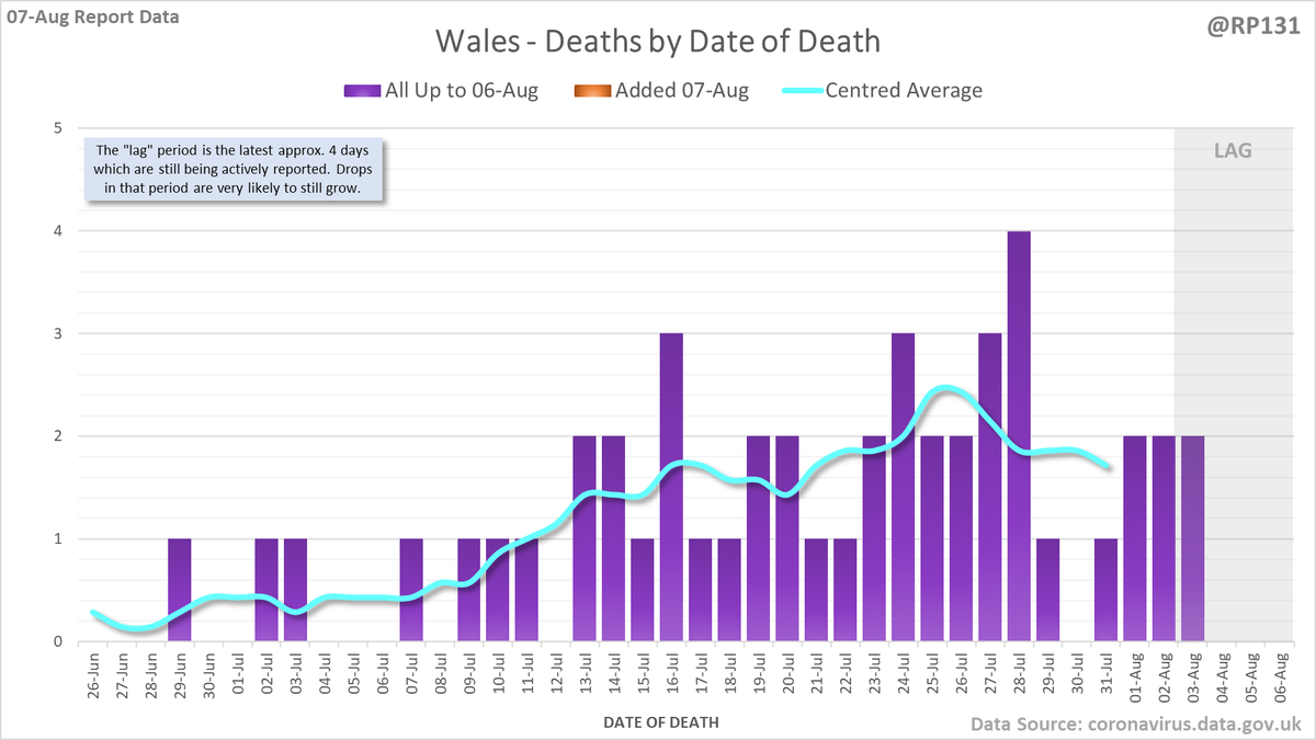
Closer look at the latest 45 days, with today's added numbers highlighted in orange. Individual nations and animated England charts further down the thread.
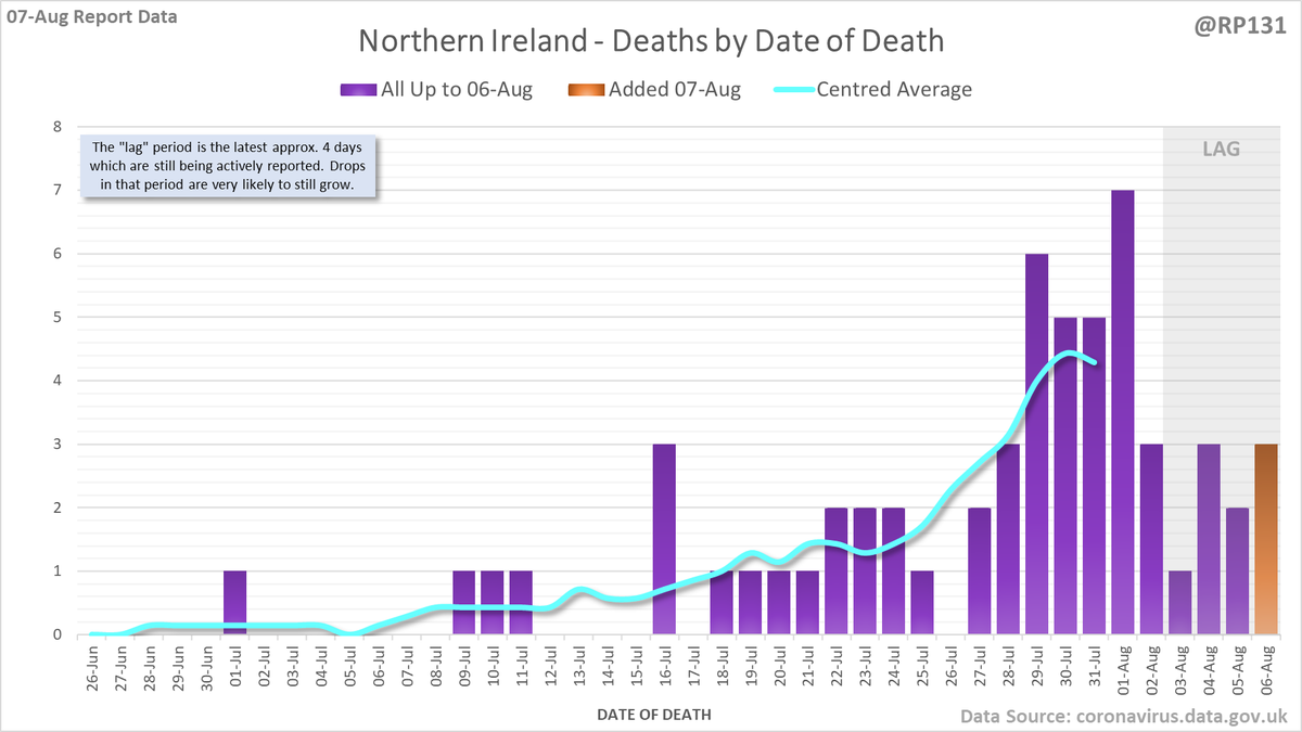
Separate charts for England (88) Scotland (9) Wales (0) and Northern Ireland (6). Note the different scales. Also on certain days the date-of-death data for Scotland/Wales/NI doesn't get updated so the orange bars may be mising or include multiple day's numbers.
Read 5 tweets
7 Aug
Dashboard for 07-Aug to explain the #covid19uk total death increase figure of 103.

For England, NHS data is merged by PHE for a net total of 88.

This moves the UK 7 day rolling average up by 4.6 to 89.6.
Date of death chart for England regions drawn with 7 day rolling averages of deaths per 1M population.
Date of death chart for UK nations drawn with 7 day rolling averages of deaths per 1M population.
Read 8 tweets

Did Thread Reader help you today?

Support us! We are indie developers!


This site is made by just two indie developers on a laptop doing marketing, support and development! Read more about the story.

Become a Premium Member ($3/month or $30/year) and get exclusive features!

Become Premium

Too expensive? Make a small donation by buying us coffee ($5) or help with server cost ($10)

Donate via Paypal Become our Patreon

Thank you for your support!

Follow Us on Twitter!

:(