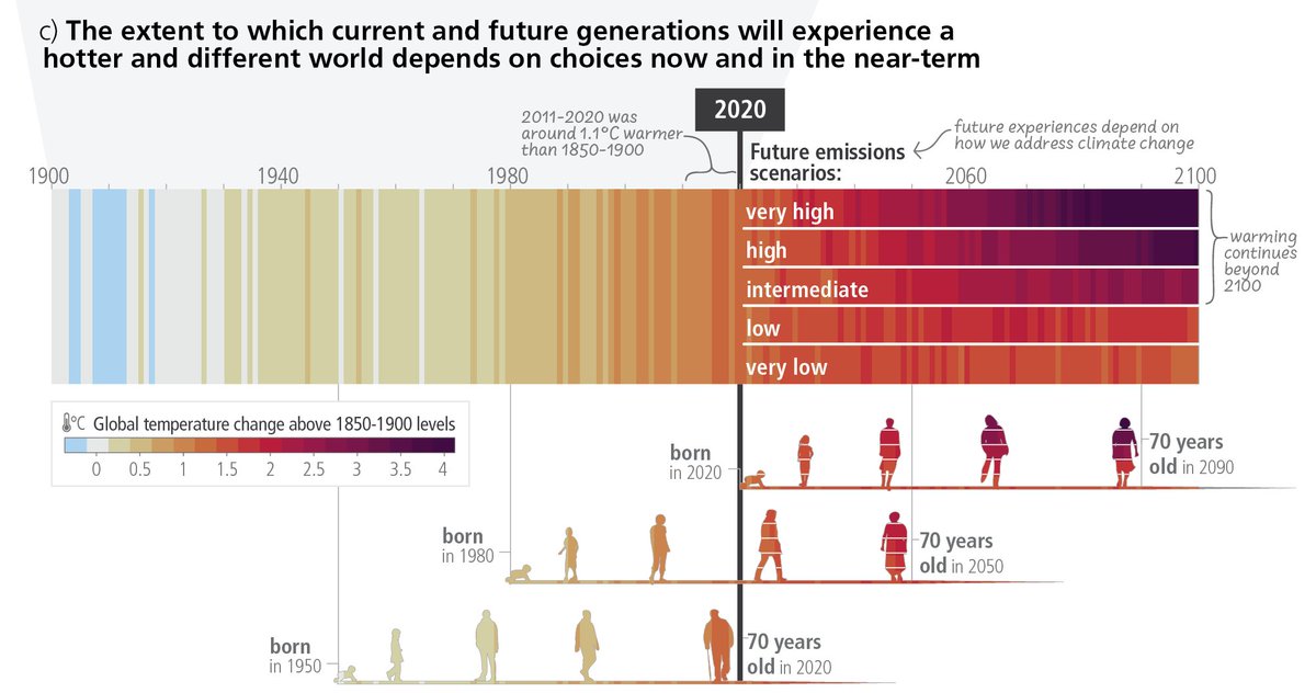
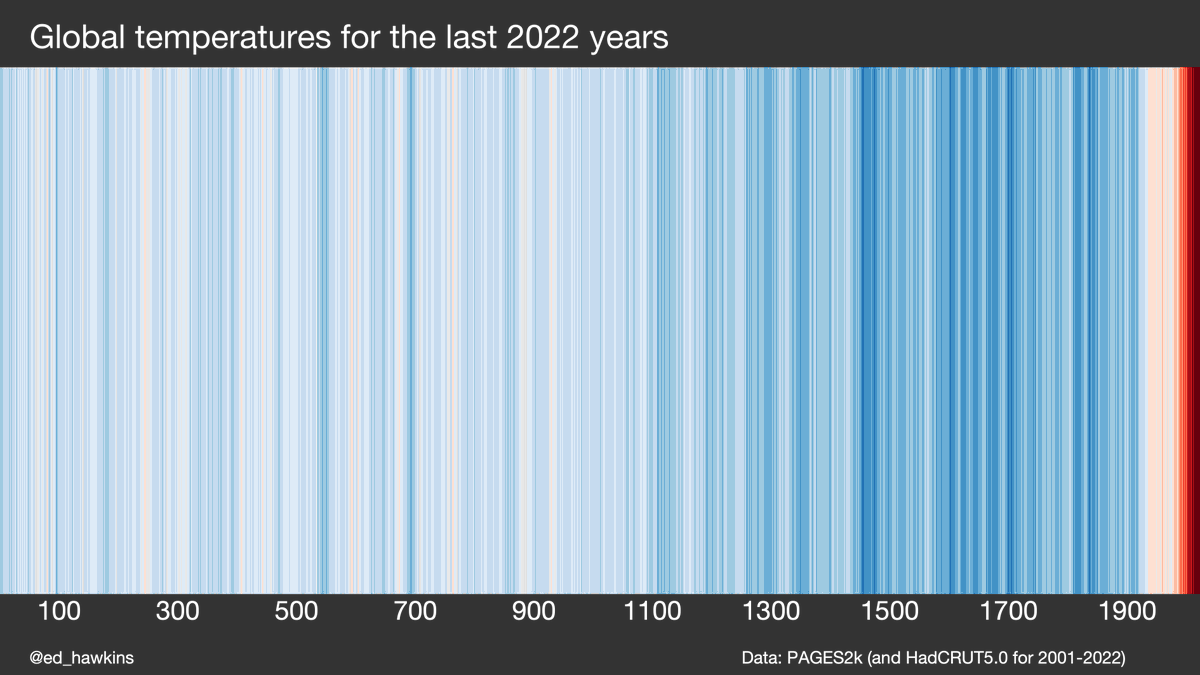
Some figures from Chapter 1 of the new IPCC AR6 physical climate science report: ipcc.ch/report/ar6/wg1…
1/ Baselines and reference periods. Ever been confused about different climate baselines? Figures 1.11 and 1.12 may help, along with the discussion in Section 1.4.1.

1/ Baselines and reference periods. Ever been confused about different climate baselines? Figures 1.11 and 1.12 may help, along with the discussion in Section 1.4.1.


2/ Climate variability. Short term fluctuations in the climate can temporarily obscure or enhance longer term trends. The size of the fluctuations depends on the variable of interest and spatial scale.
Figure 1.13 and Section 1.4.2 may help explain this.
Figure 1.13 and Section 1.4.2 may help explain this.

3/ Emergence. Both the rate of change & the size of climate fluctuations matter for how climate change is experienced. The tropics tends to warm less but has smaller variations so has a larger 'signal-to-noise' ratio; the change is more apparent.
See Figure 1.14 & Section 1.4.2.
See Figure 1.14 & Section 1.4.2.

4/ Possible futures. Running from 1750 to 2100, an extended set of 'warming stripes' shows how global temperatures have already changed, and are projected to change under different emission scenarios, with the uncertainty range shown. See Figure 1.25 & Section 1.6.1 for details. 

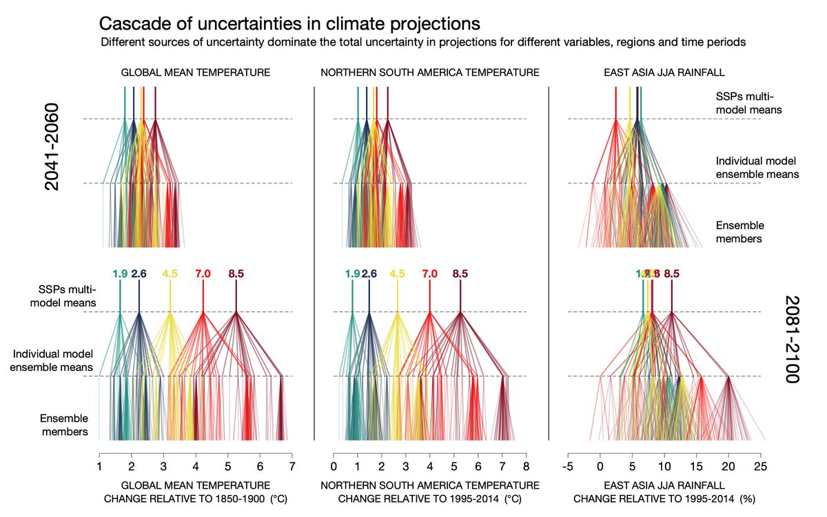
5/ Sources of uncertainty. A complex figure highlights the size of different components of uncertainty in future projections of temperature & rainfall, i.e. choice of scenario, which climate model is used, and internal climate variations. Details in Figure 1.15 & Section 1.4.3. 
6/ Low-likelihood high impact outcomes. A new focus for AR6 highlights the risks that would occur if warming was outside the expected likely ranges. These outcomes are unlikely but plausible and need to be considered in risk assessments. Described in Figure 1.16 & Section 1.4.4. 

7/ Milestones in climate science. A timeline of how climate science has advanced since the early 1800s. Section 1.3 describes this long history of improving understanding and Figure 1.6 gives some key developments. 
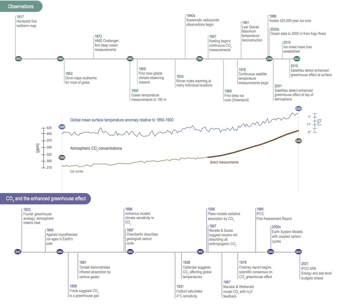
8/ The first attribution of global warming. One key milestone is the 1938 study by @GuyCallendar - the first estimate of variations in global temperature & the effect of observed increases in CO₂. Figure 1.8 also compares his global temperature variations with modern estimates. 

9/ Availability of observations and paleodata. We have varying amounts of instrumental measurements for many different parts of the climate system for decades or centuries, and proxy information for millennia and beyond. Figure 1.7 & Sections 1.3.1 and 1.3.2 have the details. 

10/ Performance of past projections. We have made projections of future climate for decades & can now test those projections against what subsequently happened, both globally & regionally. The agreement is striking. Figures 1.9 & 1.10 and Section 1.3.6 discuss the issues. 


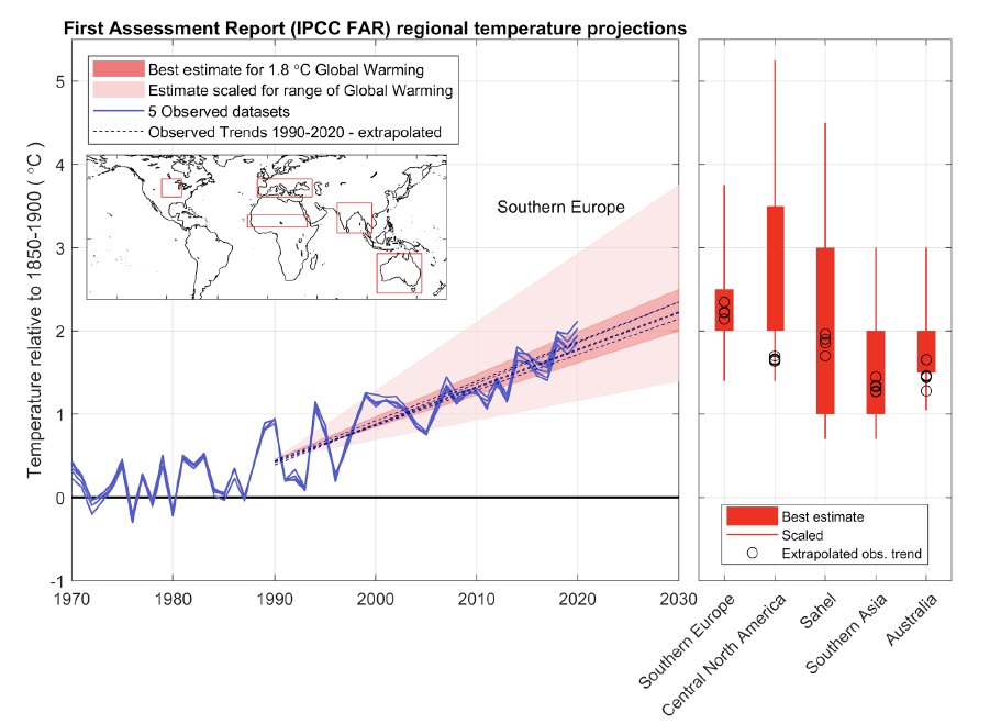
11/ Changes in climate before 1850. Cross-Chapter Box 1.2 discusses the natural & human factors which influenced the climate since 1750. Humans likely caused a radiative forcing of 0.0-0.3W/m² before the approximate pre-industrial global temperature baseline (1850-1900). 

12/ State of the climate. A range of 'climate stripes' highlight changes across every component of the climate system. Figure 1.4 and Section 1.2.1 discuss the changes observed. 

13/ Different types of climate model ensemble. A schematic in Figure 1.21 highlights the different ways that climate models are used to produce an ensemble. Section 1.5.4 discusses the details. 

These and other figures in Chapter 1 were designed to be widely useful and are thanks to an amazing author team, including: @Maisa_Rojas, @bjornhs, @AVastMachine, @coralsncaves, @ADNiang2201, @meinshausen, @PandoraKHope et al, with contributors: @hausfath, @ClimateGrose, @coxypm.
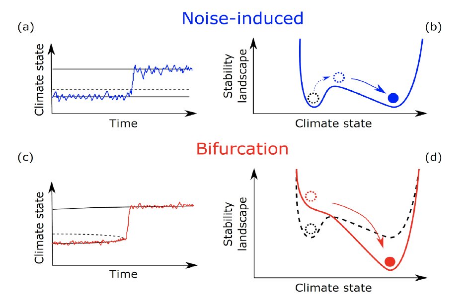
14/ Tipping points. Section 1.4.4 introduces the concepts of tipping points (Figure 1.17), abrupt changes, low-likelihood outcomes (Figure 1.16), storylines and surprises. Some of these are new for the IPCC and are used throughout AR6. 
• • •
Missing some Tweet in this thread? You can try to
force a refresh


