
People seemed to like the Tolkien art thread yesterday, so here's a another one.
The international editions of the Hobbit are funny things. Fantasy conventions haven't yet been established. Each illustrator filters the translated terms through their national fairy tale lens.
The international editions of the Hobbit are funny things. Fantasy conventions haven't yet been established. Each illustrator filters the translated terms through their national fairy tale lens.

The result is bizarre but charming.
What did fantasy look like before Tolkien? How did people picture elves, dwarves, dragons, goblins?
Tove Jansson, who made my beloved Moomin, pictured Gollum as some sort of huge lily-pad wearing giant
What did fantasy look like before Tolkien? How did people picture elves, dwarves, dragons, goblins?
Tove Jansson, who made my beloved Moomin, pictured Gollum as some sort of huge lily-pad wearing giant

The Japanese edition pictures Gollum as a more Creature of the Black Lagoon monster.

The French version of Bilbo is like a little Disney character. Lookit him. Lookit how cute he is.

The Latvian artist's style is great. Bilbo looks chill. The dwarves have these pastel colors that make them look like little lanterns in Mirkwood. Gollum looks truly miserable.


The Swedish conception of goblnis is....
...not great.
...not great.

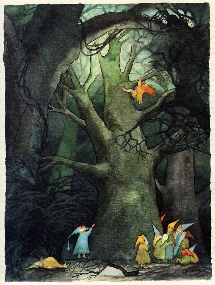
The Estonian version of Elves is like...what? Are elves just "dudes"?

The Russian version looks dope. Again, the sleeping elves are "just dudes."


The Portuguese version is cute, again. Goblins look like neckbeards. Gollum looks like the King of Portland. Bilbo is cute as hell.


Oh, I forgot this above - the reason that Bilbo's LEGS are so hairy in the Russian edition is the way they translated the word. Instead of just having "hairy" feet, the translators used a word that could mean animal's feet or even "trotters." Thus, hobbits look like fauns.

• • •
Missing some Tweet in this thread? You can try to
force a refresh


