It's time to stop making t-SNE & UMAP plots. In a new preprint w/ Tara Chari we show that while they display some correlation with the underlying high-dimension data, they don't preserve local or global structure & are misleading. They're also arbitrary.🧵 https://t.co/dmFzD5RR6Rbiorxiv.org/content/10.110…

On t-SNE & UMAP preserving structure: 1) we show massive distortion by examining what happens to equidistant cells and cell types. 2) neighbors aren't preserved. 3) Biologically meaningful metrics are distorted. E.g., see below:
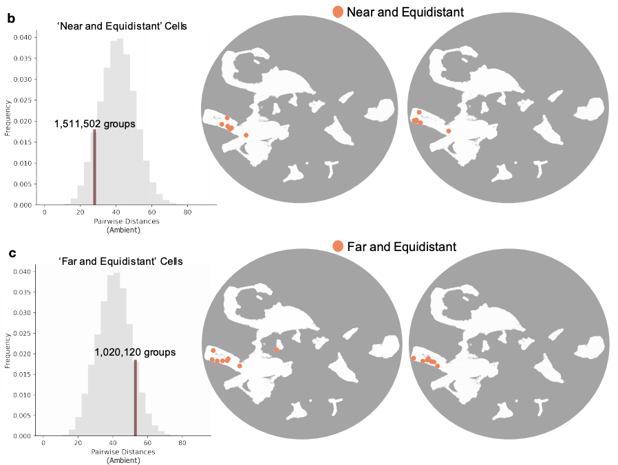
These distortions are inevitable. Cells or cell types that are equidistant in high dimension must exhibit increasing distortion as they increase in number. Actually, UMAP and t-SNE distortions are even worse (much worse!) than the lower bounds from theory.


We find evidence of massive distortion in numerous datasets (we make the tools for this available). In practice, this means you can't make claims about datasets being the same or different based on a t-SNE or UMAP alone. We took a close look at this case:
https://twitter.com/satijalab/status/1372243222223806468?s=20
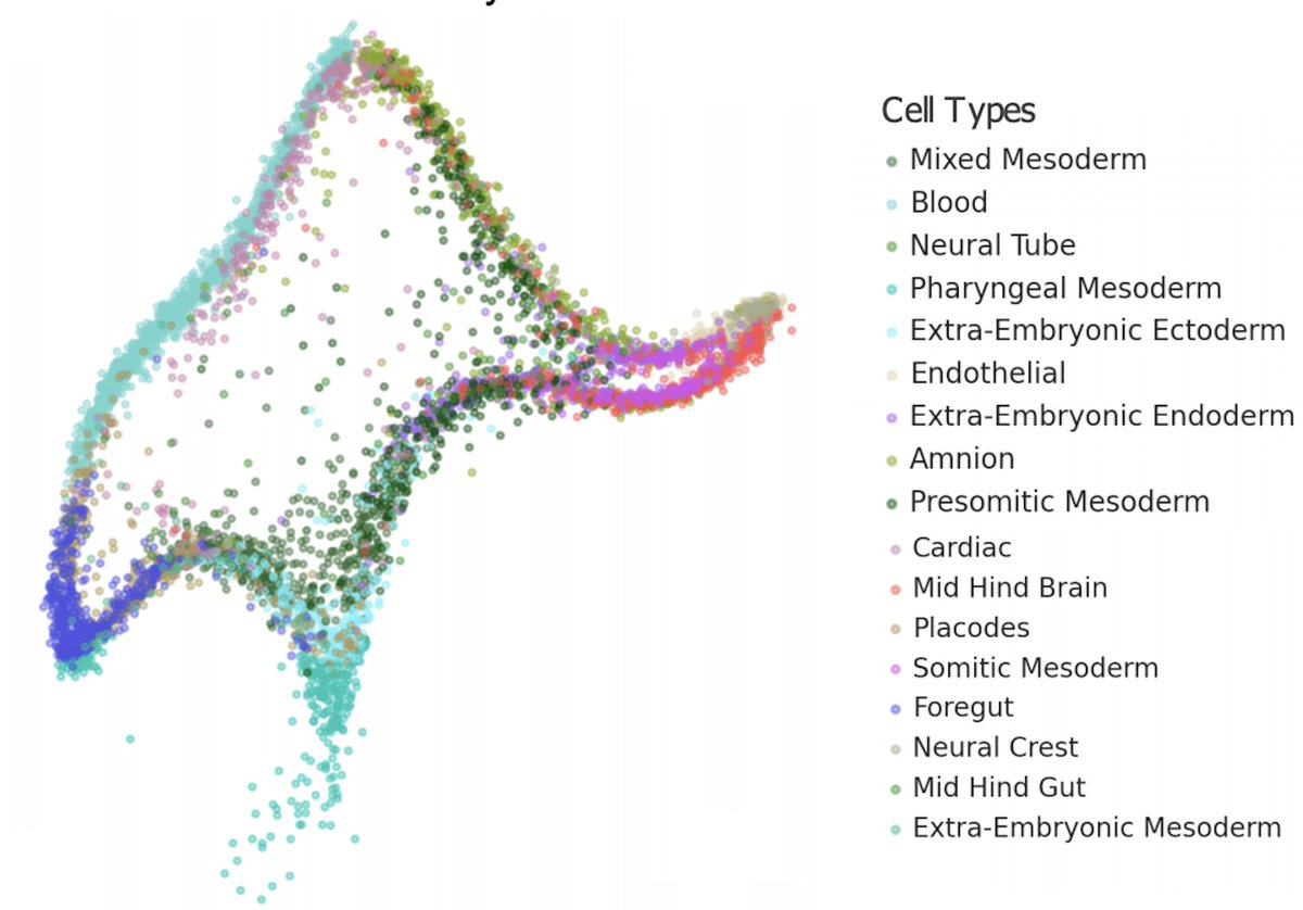
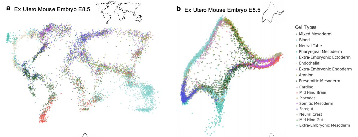
UMAP applied to integrated data can make the data look more or less mixed than it actually is. The effect can go both ways! This is a result with recent data from the @jacob_hanna lab on recapitulating mouse embryogenesis ex utero:

None of this is a surprise. The Johnson-Lindenstrauss Lemma provides bounds for dimensions where low-distortion is possible: for 10,000 points you need >= 1,842 dimensions. There is a constant factor that gives some wiggle room... but it's far from 2!
https://twitter.com/gabrielpeyre/status/1348147560565846018?s=20
Ok.. but.. maybe t-SNE & UMAP (or your favorite 2D viz) aren't perfect, but they are "canonical" and not arbitrary. Nope. They're just art. We developed Picasso for embedding your data into any shape, with less distortion than t-SNE & UMAP (see elephant at the start of the🧵)

This elephant is from an anecdote by Enrico Fermi, who once critiqued the complexity of a Freeman Dyson model by quoting John von Neumann: “With four parameters I can fit an elephant, and with five I can make him wiggle his trunk.” We had more than that! https://t.co/ywRDBlNyxffermatslibrary.com/s/drawing-an-e…

Picasso can produce quantitatively similar plots that are qualitatively very different- here is the same dataset as a world map and as von Neumann's elephant:
And here are two entirely different datasets both looking like von Neumann's elephant. These visualizations have similar properties to t-SNE and UMAP in terms of their fidelity to the high-dimensional distances.

Picasso is available via @GoogleColab so you can experiment with turning any dataset you like into any shape you want...while producing a better representation of the data than w/ t-SNE or UMAP. No more Rorschach testing necessary! Make your own elephant!
https://twitter.com/aralbright93/status/1409981623836180484?s=20
BTW, you don't even need to train the model (!) Picasso is based on a neural network, whose initialization with the Kaiming He method produces pretty good embeddings (see "no training" below). How is this possible?

We explain this in Supp. Note 4. Kaiming He is an adaptation of random linear projection using fixed Gaussians, which is a projection that can be used to prove the Johnson-Lindenstrauss Lemma. So even a neural-net w/o training is competitive w/ t-SNE/UMAP! openreview.net/forum?id=BJbXZ…
If t-SNE and UMAP et al. are just specious art, what should one do instead? We argue that instead of focusing on 2D visualizations, we should perform semi-supervised dimension reduction to higher dimension, customized to hypotheses / problems of interest.

We develop MCML (multi-class multi-label) dimensionality reduction for this purpose. We're far from the first to argue for semi-supervised learning for single-cell genomics applications, we're just jumping on the (right) train. See, e.g. @bidumit et al. nature.com/articles/s4146…
MCML is more general than existing approaches, and can be used with both discrete and continuous features. On a deeper level, we believe semi-supervised approaches can help us understand what the dimensions of transcriptomes, truly are. An important direction for future work.

This project was motivated by several recent papers, tweets we saw online, discussions, and prior projects in our lab. We started thinking about how "canonical" t-SNE & UMAP are after seeing this "map of Europe" styled picture of brain #scRNAseq.
https://twitter.com/slinnarsson/status/1279099367325138949?s=20
2D planar maps of geometry on the sphere have some distortion, but they are also canonical w/ respect to a specific projection, i.e. there is a ground truth they represent in a canonical way.

But after exploring NCA for (supervised) dimensionality reduction to visualize cells with respect to a clustering in @sinabooeshaghi et al., we realized that 2D plots could be made to look much "cleaner" if one wanted, and were in a sense arbitrary. biorxiv.org/content/10.110…
It seemed that the "map of Europe" rendering of the brain was, in fact, arbitrary, and could easily be presented differently. Which is to say, this kind of comment about its "informative" value didn't ring true.
https://twitter.com/blsabatini/status/1279241974168633345?s=20
This ultimately led us in two directions: exploring the fidelity of t-SNE & UMAP visualizations, and separately the development of Picasso for making a point: single-cell genomics art is beautiful to look at, a good enough reason to make it, but it's art.
https://twitter.com/coletrapnell/status/1327314261551443968?s=20
And this important paper by @jcjray and colleagues should be required reading:
https://twitter.com/jcjray/status/1146265356757020672?s=20
Perhaps it's time for everyone to say out loud what we've all known for some time, but have had difficulty admitting: t-SNE, UMAP and relatives are just specious art and we risk fooling ourselves when we start to believe in the mirages they present.
@KeithComplexity It's still very far from been quantitative in the way in which people would like to think it is, and it is very much arbitrary if Picasso can outperform it on biologically motivated metrics.
@akshaykagrawal @KeithComplexity There is a theorem to go along with t-SNE and I had hopes for it (in terms of practice) but while it's an interesting theorem revealing connections to spectral clustering methods, this situation in practice is, well, see our preprint...
https://twitter.com/lpachter/status/1058017200886476800?s=20
@akshaykagrawal @KeithComplexity I'm not aware of one. And in lieu of such a theorem, the kind of empirical analysis in our preprint, where we look carefully at biologically meaningful metrics, as well as difficult cases (e.g. equidistant points), makes sense as a way to get a handle on performance of a method.
@KenjiEricLee @TAH_Sci @sam_power_825 This is not to be flippant. We measured the distortion among neighbors, i.e. local structure, in the UMAP and it was very large. That's not good. Maybe the biological datasets don't satisfy the UMAP requirements. Maybe the UMAP heuristics are failing. I don't really know.

@KenjiEricLee @TAH_Sci @sam_power_825 But at the end of the day what we asked is not how much mathematics the UMAP developers mastered, or what their intention was. The question we looked at is whether UMAP is outputting what biologists think it is, and whether its output is suitable for the way they are using it.
@KenjiEricLee @TAH_Sci @sam_power_825 Unfortunately it isn't. And yet it has become ubiquitous. 🤷♂️
@KenjiEricLee @TAH_Sci @sam_power_825 Meanwhile not only is UMAP used quantitatively (e.g. see the mixing example in the thread), it has become the basis for applying other algorithms on top of it. See below:
https://twitter.com/GorinGennady/status/1431720888009826306?s=20
@TAH_Sci @KenjiEricLee @sam_power_825 Of course UMAP may do perfectly fine for datasets with low intrinsic dimension, or that are just much simpler than what is encountered in biology, MNIST being a good example where I think the visualization is fine. But are we really trying to learn new things about MNIST?
@TAH_Sci @KenjiEricLee @sam_power_825 I think classifiers have achieved a 0.17% error rate on the dataset.
@KenjiEricLee @TAH_Sci @sam_power_825 @theosysbio This (from that paper) shows that even 10 nearest neighbors cannot be preserved.

@KenjiEricLee @TAH_Sci @sam_power_825 @theosysbio From the paper: "KNN is the fraction of 𝑘-nearest neighbours in the original high-dimensional data that are preserved as 𝑘-nearest neighbours in the embedding. We used 𝑘=10.. KNN quantifies preservation of the local, or microscopic structure."
@adamgayoso In fact one person critiqued us for doing PCA in the first place. It seems a good benchmark would be to vary PCA reduction from zero -> ambient and assess distortion between the embedding and the PCA reduced space, and PCA and ambient, in addition to what we're doing.
@adamgayoso Thanks for the feedback, btw. We'll look at some of this as we add to our initial results from all the comments we got.
The preprint is now published (with substantial reorganization, improvements, extensions in response to feedback from here and from reviewers) @PLOSCompBiol: journals.plos.org/ploscompbiol/a…
• • •
Missing some Tweet in this thread? You can try to
force a refresh