We mostly studied US covid cases last year Fall-Winter time. We found that there is a certain indoor wet bulb temp which is more contagious than the others. This calculation is approximately accurate when people are supposed to use heaters or do not use indoor ACs.
However, during cooling time calculation and prediction is far more complicated. Therefore, I checked US COVID cases for weather conditions from March 20th 2021 to March 28th 2021 when US had a plateau or slight increase in cases. My calculation includes 1532 US counties.
I found exactly the same pattern as what I found from last year's case studies. There is an existence of a virus fav indoor climate. Here is my validation argument- you can get a low number of cases for any indoor condition because there may have multiple factors involved in it.
However, cases must go high only for a certain wet bulb temperature. If any data show up in a non-virus fav climate, my argument is invalid. Therefore, you can see 3 outliers in this plot where cases were high in non-virus fav indoor conditions (marked by arrows).
From the 'error bar', you can see that indoor WBT varied significantly during those 9 days periods. Let's look at Chattahoochee County, GA (top arrow). The red rectangle is the weather-analyzed window. 7-day average covid data is shifted 10 days towards left.
4 days were in virus fav condition (black dots) and covid cases went up. Then it was plateaued in non-virus fav cond. Next Matagorda, TX (shown by bottom arrow). You can see a similar pattern. Another dot (next to the same arrow) is the nearby county- Karnes, TX.
It is difficult to locate the exact indoor WBT from this vast number of data analyses. There are uncertainties for different reasons. For example, indoor WBT is calculated considering that people lived indoors at 21C. Virus variant may add uncertainty too. nrel.gov/docs/fy17osti/…
Here, I have shown that indoor WBT modulates COVID cases (in fact all respiratory illnesses). Now, it's time to do some controlled experiment to figure out the exact temp at which people may get sick. It may differ from people's age and height too. researchgate.net/publication/34…
Here is the same plot with 339 counties (only those counties which reported more than 100 cases during that time.
The same plot for those counties whose population density is more than 100 (number of data points 423)
• • •
Missing some Tweet in this thread? You can try to
force a refresh
Previously I showed that cases are growing faster in highly vaccinated (fully vaxd) counties in recent days. Here, you can see that correlation is very similar for booster dosed percentage. That means, counties with higher booster dose percentages have higher caseload.
This plot tells me that areas, where more people remained double dosed without boosters, are more likely to spread the virus.
so far positive correlation
-with fully vaxd %
-with booster dose %
-with fully vaxd without booster dose %
The population of booster dose percentage is relatively higher in California. Case and booster dose map match quite well!
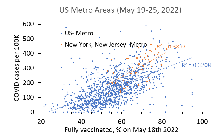
COVID trend in US Metro areas compared to COVID trend in New York and New Jersey metro areas. Each dot represents COVID cases in one week per 100K people.
COVID cases in North Dakota, South Dakota, Wyoming, and Montana metro areas (counties) compared to US metro areas.
I am thinking to quit covid tweet (or minimally active). We are in the phase that there are never ending arguments.
For example, vaccinated someone got COVID and subsequently got heart disease. Science folks will tell you that vaccine saved that person from death.
For example, highly vaccinated areas are getting COVID at a higher rate compared to unvaxd areas within a certain locality. Imagine 72 high level people got COVID from DC dinner (one single gathering). Is there any such incidence before vaccination?
But if you look at individual level, unvaxd COVID rate could be higher. Say (hypothetical example), 200 people attended that dinner while 15 were unvaxd. Perhaps, 12 unvaxd got COVID while rest are vaxd. If you divide each COVID # by population, you will see unvax rate is higher.
Case surge is driven by vaccination. USA is currently experiencing a case surge almost in every state. Here, you can see last 7 days' cases are positively correlated with the vaccination rate. It is more obvious in Metro areas.
This is supported by Walgreen's positivity report by vaccination status. If you are vaccinated, you should be scared. If you are unvaccinated but live in highly vaccinated areas, you should be scared too.
You cannot expect this type of correlation when multivariable factors are in effect such as climate differences (one of the important variables). Despite those multivariable effects, the correlation tells something important.
Some people think that the situation regarding vaccination has changed since Omicron. This is not true. It happened from the very beginning. Back then, it happened for partially vaxd and now people have taken many doses where so-called breakthrough cases are seen.
Another factor here. In earlier times there was much emphasis on vaccine effectiveness. Here, you can see from raw data that vaccine is clearly doing bad job after first dose, but VE shows quite a high number: 31.8%. It should be -ve. How it became +ve and a quite high number?
They did some adjustments (see AOR: Adjusted odd ratio). Only experts are eligible to do that! It's been more than 2 years now, still, I do not understand how this adjustment can be made unless you make up your own assumption. Perhaps they believe that vax people are risk group.
Unfortunately, I am the only person who is talking about the virus favorable climate. It is the climate at which the virus replicates faster and can make people more sick. The weather has nothing to do with the virus, rather weather plays role in how virus invades the cells.
Once we would know how exactly weather plays role in cell membrane fusion process, we would know how vaccine effectiveness and vaccine side effects differ based on climate. We would know when & how mask works. We would know why lockdown is better sometimes while worse other times
I had good intentions to get answers to all those questions, to get a better understanding of the cell membrane fusion process from the evidence of liquid interface merging. But the door is closed for me because of the vaccine mandate.