Norwegian statistics bureau throws cold water on emissions-driven global warming hysteria.
"We find that the effect of man-made CO2 emissions does not appear to be strong enough to cause systematic changes in the temperature fluctuations during the last 200 years."
More from the Norwegian statistics bureau:
All four previous interglacial periods were warmer than today, while CO2 at pre-industrial levels.
The Red Pope swings and misses at the origin of warming and emissions:
1. The current warming trend began at the bottom of the Little Ice Age in the late 1600s.
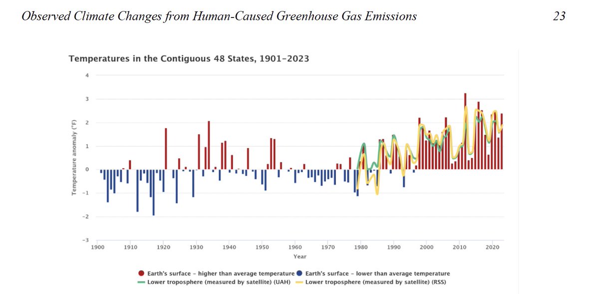
2. Recent warming began with the series of El Ninos that began in 1980.
3. We are in an El Nino year now.
4. As to emissions, warming precedes emissions. It gooses the natural carbon cycle. See Vostok ice cores and this -
5. Only 12% or so of atmospheric CO2 is manmade. 8/
The Red Pope just makes it up:
1. There is no way to say that the temperature rise since the 1970s is the fastest in 2,000 years.
2. There was little if any urban heat island effect 2,000 years ago and no satellites.
3. Then there's this: "Dansgaard-Oeschger events are rapid N. Hemisphere temp jumps of up to 15°C in Greenland that repeatedly occurred w/i a few decades during the last ice age."
4. Climategate revealed that temperature targets like 1.5°C are just 'plucked out of thin air' and are not science.
5. No one knows what the global temperature in 1850 was.
6. 'Ocean acidification' is a myth. The oceans may have become slightly less basic, but that is not more acidic. Two is not more negative than three.'
7. There is no evidence of any effects from any ocean pH change.
8. Norther Hemisphere snow cover is trending up. 9/
The Red Pope imagines the fake 97% 'climate consensus' is science and attacks capitalism.
1. Recent warming correlates with El Ninos, not emissions.
2. Consensus is not science. And the 97% consensus is bogus.
@USAToday recently ran this opinion piece raving about deaths from heat waves.
Note the cite to the Lancet Planetary Health🙄 study. 1/
Here's a chart from the Lancet Planetary Health🙄 study.
Note how the chart is made to look as if heat deaths are as big or even a bigger problem than deaths from cold in some countries.
Can you spot the deception? Even I initially missed it. 2/
Now here's the Lancet Planetary Health🙄chart (A) vs. the chart re-made by the @CO2Coalition (B) with the same death rate (X-axis) scale for cold and hot.
Look at how the Lancet chart misleads viewers by barring out cold deaths in units of 50 vs. only 10 for heat deaths...… https://t.co/7W8C8H3oFUtwitter.com/i/web/status/1…