Here
What happens if we use this with scrolling content?
What is your solution for it?
Do you have the perfect one? Let us know!
https://twitter.com/biz84/status/1445400059894542337?s=20#FlutterDev connoisseur @biz84 showed us how to make a #Flutter web body like layout, that is centered and width constrained.
What happens if we use this with scrolling content?
What is your solution for it?
Do you have the perfect one? Let us know!

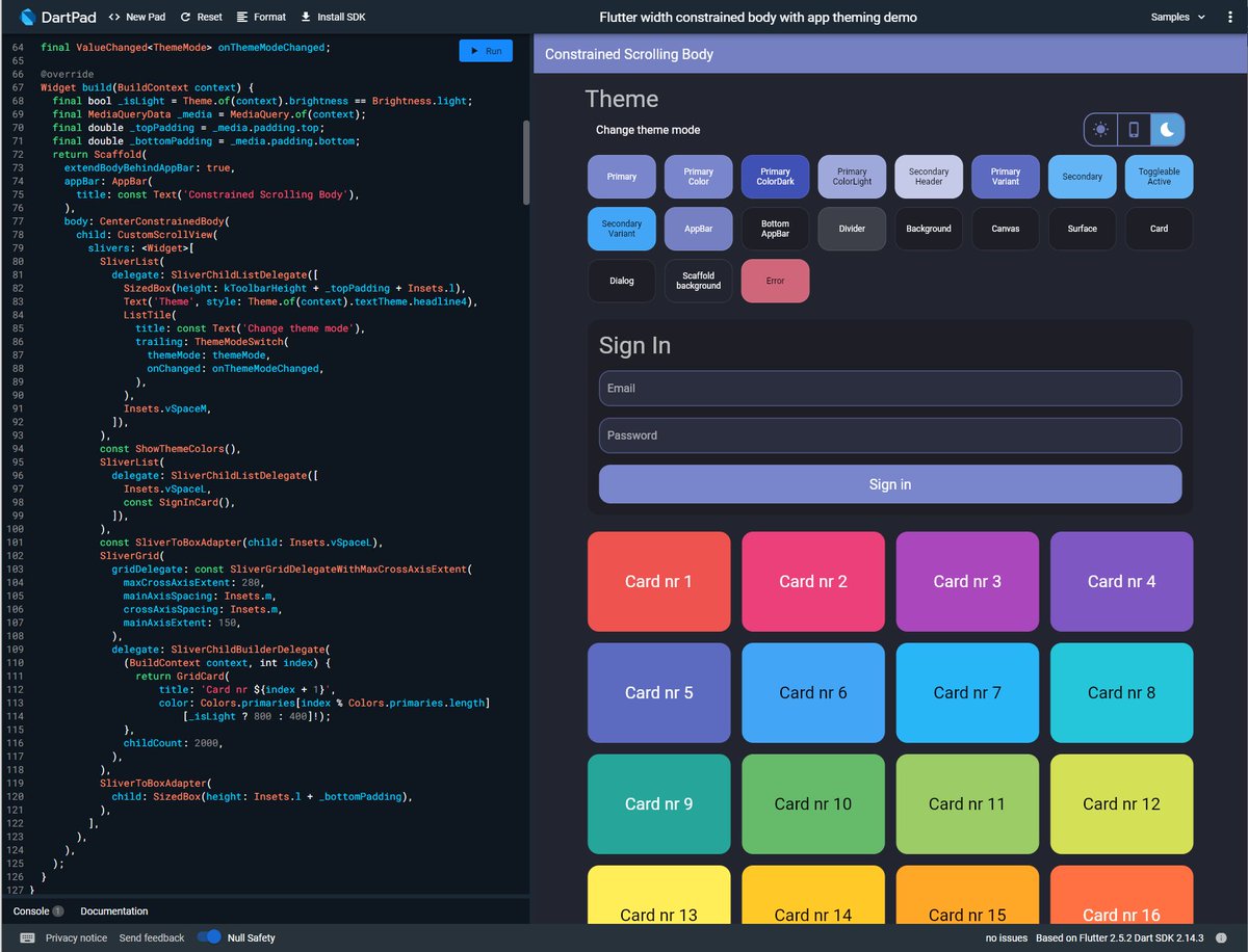
Meanwhile let us check out how this works with scrolling content. We keep Andrea's nice login card and add a bunch of other things to it and put it all in a scrolling view. Hmm scrollbars next to the body content, not so nice...
Can we fix this easily? Sure, let's disable the scrollbars for the child and put our own scrollbars outside of it all... 


This seems to work OK, right? The scrollbars are now on the edge, so that is good. But there is an issue, if you touch or mouse wheel scroll from the expanding margins that do not contain any content, it does not scroll!
Do you have a simple fix for this?
Let us know! 💙
Do you have a simple fix for this?
Let us know! 💙
The HomePage contains some other interesting features. First the the constrained body (1) having a custom scroll view (2), with sliver lists, sliver grids and sliver to box adapters. We can toggle theme mode (3), see theme colors (4) and Andrea's sign-in card (5) is there too😅 

The theme toggle is using #Flutter toggle buttons, you can make pretty cool stuff with it, and it is easy to use! 

So let's back up a bit, the theme looks a bit fancy pants! What is going here?
The MaterialApp setup is very basic, a light and a dark theme with a call back to toggle the mode, sure you can use system mode too. 

Using simple #Flutter theming, no magic. I wrapped themes in an AppTheme class with a suitable name.
The theming has some perhaps not entirely basic things going on. It is still using basic Material colors, but with some alpha blend flair and slight transparency on the app bar 😀

The theming has some perhaps not entirely basic things going on. It is still using basic Material colors, but with some alpha blend flair and slight transparency on the app bar 😀


We can also add needed helpers and some more elaborate sub-themes that we need to the same AppTheme class, and do some tuning to card and input decoration, as well elevated buttons and toggle buttons theme. As a few simple sub-theme examples 😇💙 


All in all, pretty straight forward! 🙏😃
You can play with this example in a DartPad here:
dartpad.dev/?id=f2f45a57d4… and find the source in a GIST here:
gist.github.com/rydmike/f2f45a…
Got a nice solution that also scrolls from the expanding side margins? 🤔
Please do let us know! 😇💙
You can play with this example in a DartPad here:
dartpad.dev/?id=f2f45a57d4… and find the source in a GIST here:
gist.github.com/rydmike/f2f45a…
Got a nice solution that also scrolls from the expanding side margins? 🤔
Please do let us know! 😇💙

• • •
Missing some Tweet in this thread? You can try to
force a refresh


