It is a top day for a top ten day...
We often do plots of the top emitters, especially for fossil CO₂ emissions. But, what about other GHGs? Is it the same distribution of top emitters?
We need a thread for that...
(I know about per capita, so no need to @ me)
1/
We often do plots of the top emitters, especially for fossil CO₂ emissions. But, what about other GHGs? Is it the same distribution of top emitters?
We need a thread for that...
(I know about per capita, so no need to @ me)
1/

CO₂ emissions from net LUC (one bookkeeping model). These are net numbers, some countries are net sources, others net sinks.
Current LUC sources are concentrated in several developing countries (the rich countries cut their forests down long ago).
2/
agupubs.onlinelibrary.wiley.com/doi/full/10.10…
Current LUC sources are concentrated in several developing countries (the rich countries cut their forests down long ago).
2/
agupubs.onlinelibrary.wiley.com/doi/full/10.10…


Don't over interpret the LUC numbers.
Different LUC datasets give different numbers. Here is the FAO data (from 2020). Indonesia is much less important in this dataset, Brazil dominates.
There is a lot of uncertainty at the country level, so be careful.
3/
Different LUC datasets give different numbers. Here is the FAO data (from 2020). Indonesia is much less important in this dataset, Brazil dominates.
There is a lot of uncertainty at the country level, so be careful.
3/

Just to emphasise the uncertainty is large, here are several estimates at the global level. Uncertainty at the country level is much larger...
There are also major definition issues with LUC, which you can read about here carbonbrief.org/guest-post-cre…
Take care!
4/
There are also major definition issues with LUC, which you can read about here carbonbrief.org/guest-post-cre…
Take care!
4/

Ok, if I add the fossil CO₂ emissions to the LUC CO₂ emissions, from Houghton and Nassikas, there are changes in ranking (Brazil and Indonesia mainly).
Just to note the obvious, this change is much less with the FAO data, so the ranking is not robust.
5/
Just to note the obvious, this change is much less with the FAO data, so the ranking is not robust.
5/

Let's get to something easier...
The top 10 for CH₄ emissions. Many developing countries move up onto the top 10 list, indicating a much larger share of agriculture in their economies.
6/
The top 10 for CH₄ emissions. Many developing countries move up onto the top 10 list, indicating a much larger share of agriculture in their economies.
6/

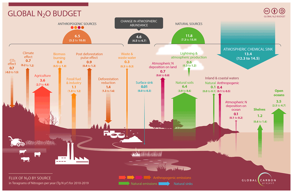
Finally, N₂O emissions. Again, developing countries move up the list in comparison to CO₂ emissions.
7/
7/

GHG emissions? You know that is misleading as the GWP is not such a good indicator of climate impacts?
But, here it is, without LUC, as that makes it more uncertain. Only the Top 6, and this is from the UNEP Emissions Gap Report 2020.
8/
But, here it is, without LUC, as that makes it more uncertain. Only the Top 6, and this is from the UNEP Emissions Gap Report 2020.
8/

By popular demand, here is GHG emissions per person, for the top 6 absolute emitters.
9/
9/

The main point of this thread was to point out the differences with CH₄ & N₂O emissions, which gives more emphasis to developing countries.
Addressing CO₂ emissions from LUC is really hard. It is easy to download a dataset & plot, but this masks the huge uncertainties.
/10
Addressing CO₂ emissions from LUC is really hard. It is easy to download a dataset & plot, but this masks the huge uncertainties.
/10
• • •
Missing some Tweet in this thread? You can try to
force a refresh