In preping for a lecture that I'll give at the end of the month, I've been looking into the more recent history of dataviz - mostly the 1970s. I just realized that celebrating the VISUAL in dataviz is totally a concept that could "only happen now" - a thread:
https://twitter.com/DataVizSociety/status/1447638285355044872
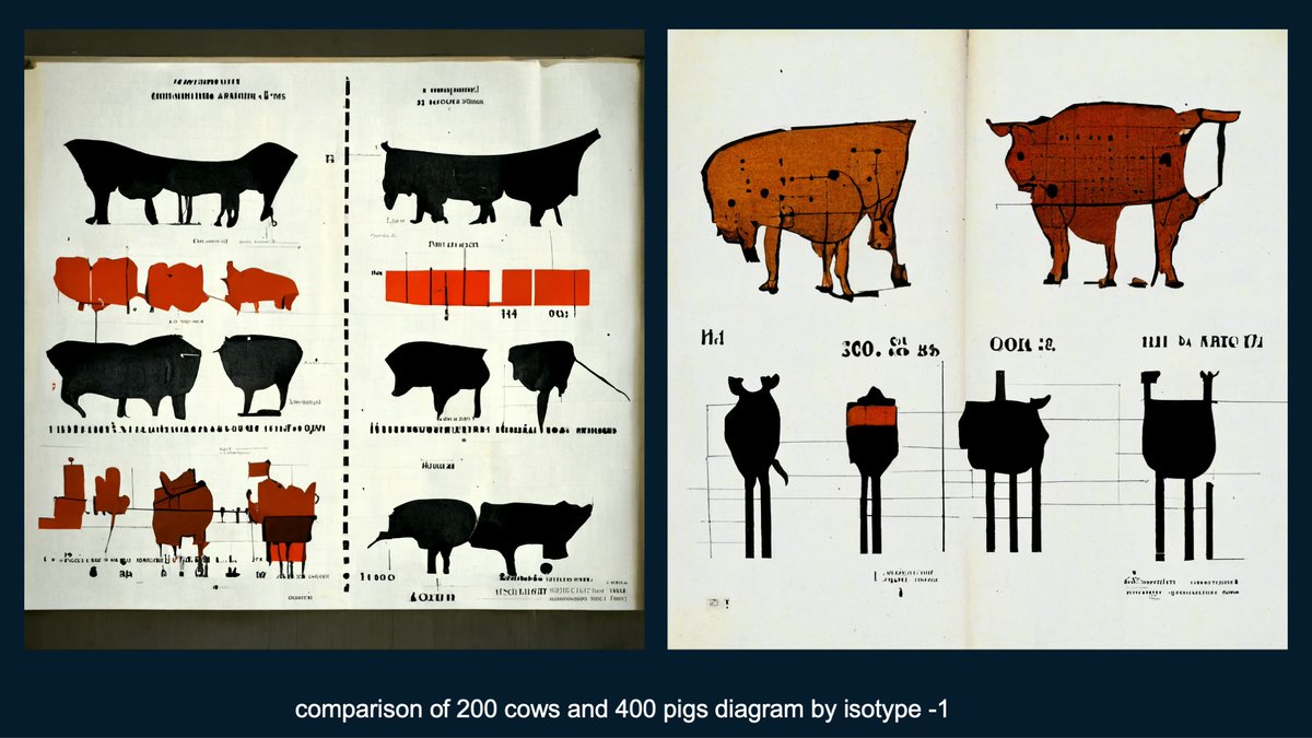
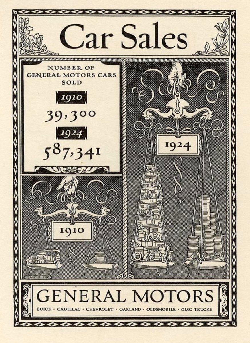
In the early 20th-century, data visualization rapidly moves away from statistics and towards advertising such as this: "Car sales" - Thomas Cleland, 1924 
In the 1930s printing technology continues to be better, cheaper, faster. As a result, designers pull in dataviz techniques for multitudes of publications, which I think is best embodied by Fortune Magazine. "Retaliatory Power" Max Gschwind, 1954

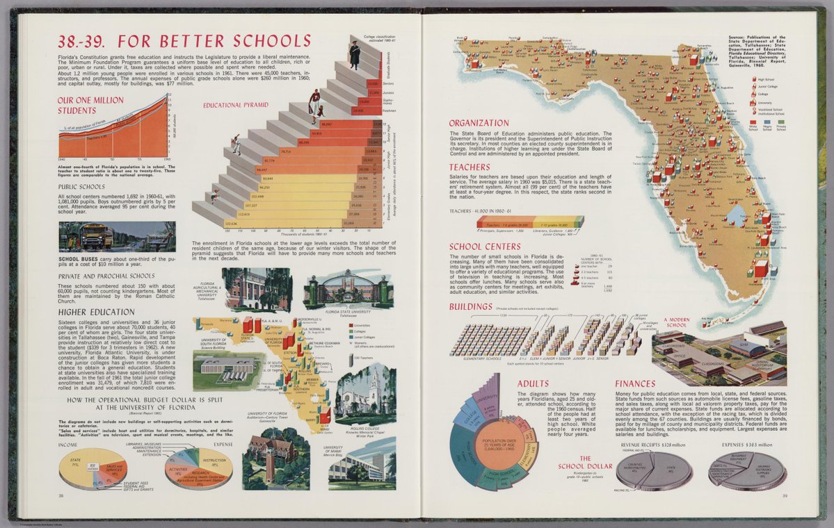
By the 1960's we see dataviz ideas used widely across educational materials of all types - used to make information more understandable and interesting. Many are colorful, illustrated, and all are hand-drawn. "Florida Atlas" Erwin Raisz, 1964
Then something interesting happens in the 1970s. Now rudimentary computers begin to collect data and programmers use those basic machines to then draw the visualizations as well. There are many examples:

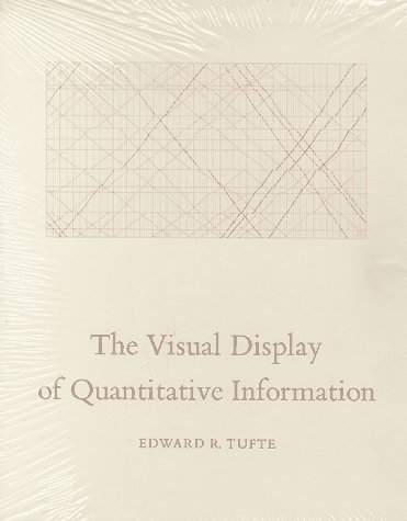
In 1975, Edward Tufte taught a statistics course to journalists who were studying economics. These lectures (and others in collaboration with renowned statistician John Tukey) became the foundation for The Visual Display of Quantitative Information. Its cover is... minimal.
Despite my deep misgivings on the interpretations of this landmark book, it has a singular focus on the use of dataviz to visually explore data. This is literally reinforced on each page and is typified by this chart by Paul and John Tukey, 1981.

What we see is a deep disregard for the graphics used in journalism. While this is warranted criticism, his tone throughout the book is that dataviz is best when focused on the fastest reading of the data, and any distraction from this is as best "junk" and at worst unethical.

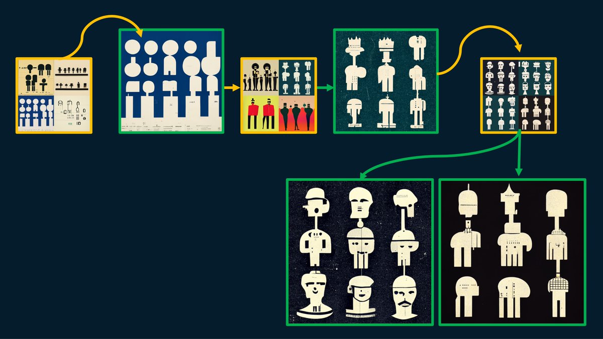
So, here's where things get interesting. Human Computer Interaction (HCI) becomes a thing. Compters are fun, they are intuitive, and we develop a relationship to them. Professional artists still draw amazing dataviz designs, but more and more people start clicking on computers.

The previous tweet was from a 1985 Apple IIe, and this is from 1992, the Amiga Workbench 3. We see massive advances in color and interface design. Throughout the interface we see icon design and informational systems. Our tools *become* a dataviz of how we are using them.

About the same time (80's, 90's) we also see the rise of the "Graphics desk" at a few newspapers/mags. This work ranges from Nigel Holmes illustrated charts and Peter Sullivan's investigative diagrams to John Grimwade's scientific illustrations (below is from Sullivan, mid-80s)
Computers continue to be refined. Powerpoint is invented in 1989. Photoshop and HTML are both invented in 1990. CSS in 1994, Javascript in 1995. Foundational concepts are established to meet a tacit need for creating visual designs digitally.

The iPhone is released in 2008. It is literally a revolution felt as much culturally as technologically. What was HCI becomes User Experience (UX) Design. Computer culture is reinvented/merged with business culture. Digital tools are full of icons, every interface is a system.

Digital photography and data visualization are central to how the technology is presented and marketed. Our lives become more further linked to our technology and our data. Our lives are accompanied by the digital dataviz twin in our pockets.

In 2011, D3 and Bootstrap are both introduced. D3's computational drawing makes it the foundation for many viz platforms while Bootstrap's broad adoption becomes a defacto template for web design. Tools are democratized widely and further standards are introduced.

Then humans do what humans do - they color outside the lines. Dataviz becomes even more human and stories become the focus of our communications. Data journalism leverages aspects of scientific illustration, Mike Bostock, co-inventor of D3, is at the NYT & boundaries are pushed.

So here we are ~10 years later. We focus on data ethics and literacy, employ amazing tools, and leverage best practices. Data humanism has become a truism. Data art has effectively merged with cryptocurrency (well, for the moment). Our tools are nuanced, malleable, and personal.

>THIS< is why we are publishing Nightingale in print! THIS history, THIS moment in time has to be documented (yes, we're not the only ones ). The creation of a community-oriented magazine like this could not have happened at a better time in its history: nightingaledvs.com/subscribe/
If you agree with me, then please do subscribe to Nightingale Magazine. We call it a "collectible community celebration" and this is exactly what we aim to make it - a celebration of all the various facets of what dataviz can be today and tomorrow. /end

Tagging you @mbostock out of respect for your place in this timeline! 🍻
@nigelblue tagging you on this thread as well. Please jump in and tell me what I got wrong! ha! Thanks! 🍻
Tagging @EdwardTufte out of respect to your amazing scholarship (albeit pretty grumpy, haha) 🍻
• • •
Missing some Tweet in this thread? You can try to
force a refresh