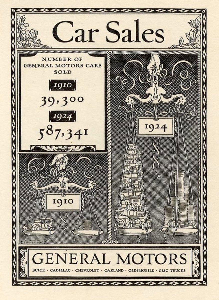
JasonForrest Profile picture
Associate Partner & Director of the McKinsey Data Visualization Lab, Editor-in-chief of Nightingale, Electronic Musician. Contact & more: https://t.co/6OqWYBRFs0
Feb 27, 2023 10 tweets 5 min read
Monroe. N. Work compiled most of the data on African Americans @TuskegeeUniv starting in 1908 to the 1940s. He was a data pioneer that helped fuel the cause of racial justice with facts. #BlackHistoryMonth /🧵: nightingaledvs.com/monroe-nathan-… Monroe N. Work was an African American sociologist, scholar, and researcher who spent his life collecting information and helping others to understand it. The highlight of his career, according to Work, was the nine editions of the Negro Year Book between 1912 and 1938.
Sep 9, 2022 14 tweets 7 min read
I lecture on topics related to dataviz, but last week I presented this at @InfographicsNL on my evolving thoughts on @midjourney (+ @OpenAI & @StabilityAI). I have a few interesting ideas on how we can use language and images to design AI pictures /🧵 The talk does 2 or 3 things. First, it explains how to use Midjourney. This is a diagram of the variations and upscaled images and shows how quickly ideas can morph: Image
Jul 29, 2022 12 tweets 6 min read
People are loving AI-fueled dataviz, so here's a thread on a project that I made in May but never shared. The prompt was "hyperdetailed illustration of economic prosperity, 1965, lenticular rainbow, by isotype". The design put this among the first responses: A few iterations later, all of a sudden a bunch of people show up at the bottom. The rainbows begin to curve and the city reciedes.
Dec 17, 2021 7 tweets 3 min read
Today we launched a novel dataviz project on a serious subject - the mental health of working parents. Our team (led by @adsevenfour) felt that the human side of the data really needed to be stressed - what better way than with 100 little people walking between the categories! /1 You can really explore the data in a variety of ways and view some demographic cuts as well
Dec 16, 2021 7 tweets 3 min read
I went to that Van Gogh immersive thing today and it was super interesting. Many thoughts: First off, it is not narrated, and the paintings are treated more like a visual remix. Elements if multiple paintings are collaged in a single animated scene
Dec 15, 2021 7 tweets 3 min read
I haven’t been sharing as much lately because I’ve been trying not to buy too many more books, but today I started looking through Karl G Karsten’s fantastic 1926 Charts and Graphs. Here’s what we says about our favorite chart type: Image I really like this pile of shells: Image
Oct 12, 2021 22 tweets 8 min read
In preping for a lecture that I'll give at the end of the month, I've been looking into the more recent history of dataviz - mostly the 1970s. I just realized that celebrating the VISUAL in dataviz is totally a concept that could "only happen now" - a thread: In the early 20th-century, data visualization rapidly moves away from statistics and towards advertising such as this: "Car sales" - Thomas Cleland, 1924