Scotland: 2021 mortality through week 40 (NRS)
1/ Overall
Actually shocked to see the jump this week, far above the 5 year average
By some margin this was the highest mortality rate of Week 40, in all the history back to 1974.
1/ Overall
Actually shocked to see the jump this week, far above the 5 year average
By some margin this was the highest mortality rate of Week 40, in all the history back to 1974.

2/ Excess mortality by cause of death
Deaths with covid remains a significant proportion, but coming dow. By far the majority of excess mortality continued to be non-covid.
Deaths with covid remains a significant proportion, but coming dow. By far the majority of excess mortality continued to be non-covid.

3/ Excess mortality by location of death
Deaths at home the main proportion, but as with recent weeks we continue to have excess mortality in hospital (despite lower than normal admissions to hospital), and last week saw for the first time some excess mortality at care home.
Deaths at home the main proportion, but as with recent weeks we continue to have excess mortality in hospital (despite lower than normal admissions to hospital), and last week saw for the first time some excess mortality at care home.

4/ Total mortality by age group
Primary excess continues to be in 85+, but sharp rise in 75-84. The 65-74 age group showing smaller excess, and also 45-64 ages.
Primary excess continues to be in 85+, but sharp rise in 75-84. The 65-74 age group showing smaller excess, and also 45-64 ages.

4b/ Mortality by age - Summer 2021 v’s 2020
This shows cumulative excess mortality of 2021 versus 2020. We continue to see this offset rise by age group, with 85+ sharply inflecting first, then 75-84, then 65-74 a little later etc.
Those trends worsening rather than flattening.
This shows cumulative excess mortality of 2021 versus 2020. We continue to see this offset rise by age group, with 85+ sharply inflecting first, then 75-84, then 65-74 a little later etc.
Those trends worsening rather than flattening.

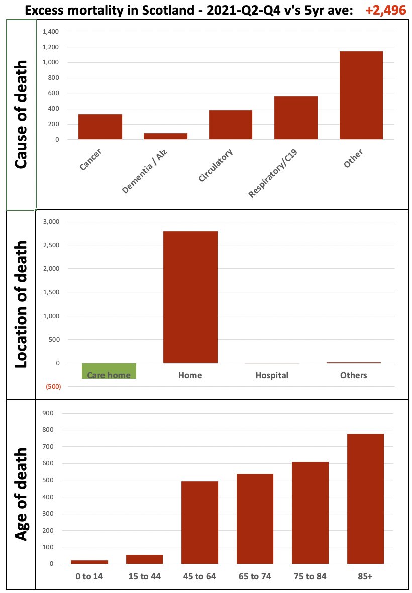
5/ Breakdown of excess mortality
Separating where we see excess mortality, it is
- Primarily ‘Others’, then cancer, circulatory, covid
- Occurring at home
- Higher excess, the higher the age group
Separating where we see excess mortality, it is
- Primarily ‘Others’, then cancer, circulatory, covid
- Occurring at home
- Higher excess, the higher the age group
6/ Child mortality
We see a huge spike in mortality in the <1 age group for Q4. Note that 2021-Q4 represents only one week (week 40). It was a very high week, tragically 9 infants recorded as passing away, but such peaks happen from time to time.😢
1-14 age group continues normal
We see a huge spike in mortality in the <1 age group for Q4. Note that 2021-Q4 represents only one week (week 40). It was a very high week, tragically 9 infants recorded as passing away, but such peaks happen from time to time.😢
1-14 age group continues normal


7/ Cumulative excess summer mortality by region
Thos shows cumulative excess mortality through the summer, by region. We continue to see the trend of “increasing excess mortality” across the regions
Thos shows cumulative excess mortality through the summer, by region. We continue to see the trend of “increasing excess mortality” across the regions

8/ Summer
This shows excess mortality of summer 2021 versus the same period last year.
2020 was normal, even with the week 40 spike overall was +1.2% from the 5 year average).
This year we can see the trend is worse and worse. Now 13.9% above the 5 year average, mortality +2,500
This shows excess mortality of summer 2021 versus the same period last year.
2020 was normal, even with the week 40 spike overall was +1.2% from the 5 year average).
This year we can see the trend is worse and worse. Now 13.9% above the 5 year average, mortality +2,500

8b/ Summer
To give context to HOW unusual that is, the below shows how each of the last 40 years differed from the 5 year average.
The highest is 3-4%. This summer is +14% deviation, so 3-4x more of a jump than we’ve ever seen before.
Exceptionally unusual trend now.
To give context to HOW unusual that is, the below shows how each of the last 40 years differed from the 5 year average.
The highest is 3-4%. This summer is +14% deviation, so 3-4x more of a jump than we’ve ever seen before.
Exceptionally unusual trend now.

• • •
Missing some Tweet in this thread? You can try to
force a refresh