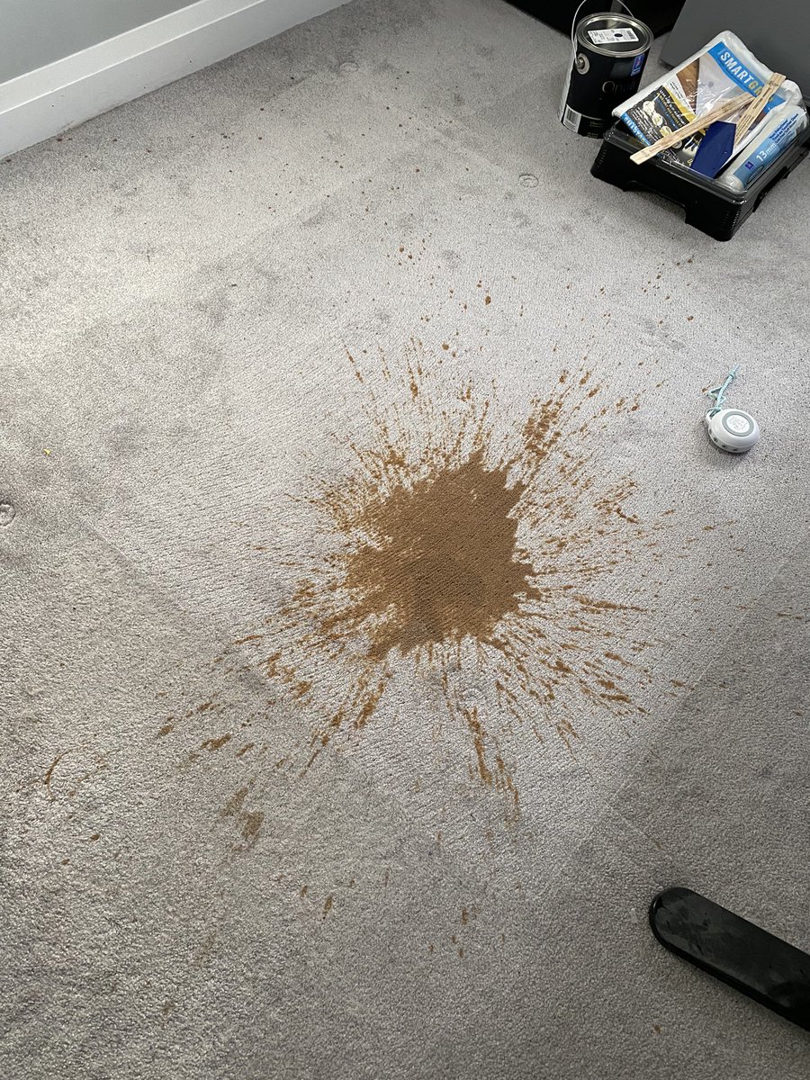
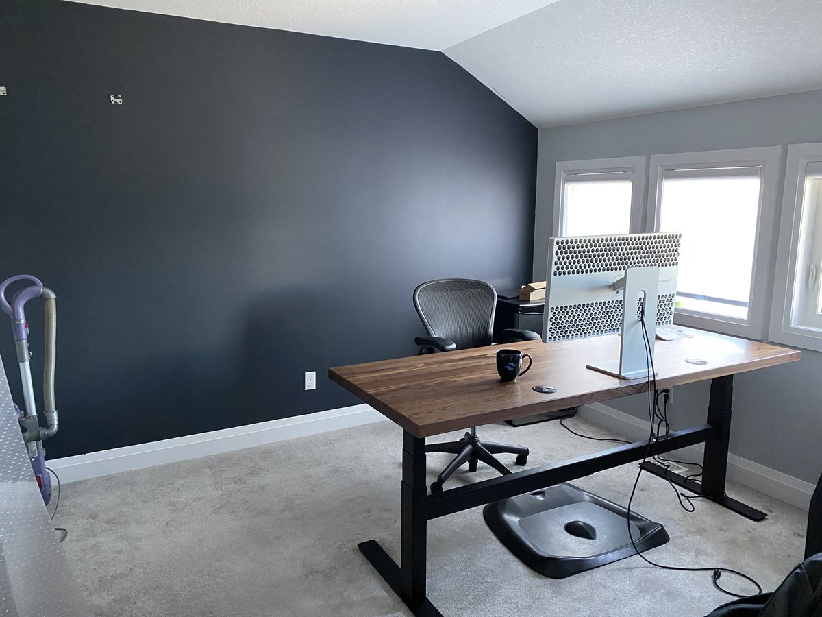
What's the actual best floor planning tool I can play around with for redoing my office? Hard to find the good stuff, this whole category is SEO'd into oblivion 😅
Here's where I got with Homestyler which was pretty quick and easy to play with... Wish I could come up with a good way to make it work with the desk in the middle but this doesn't seem terrible.
Hmm maybe this could work, desk not in the true middle but only need access from one side anyways...
Just not sure where to set up the ol' Rocket League station 😅
Just not sure where to set up the ol' Rocket League station 😅

Hmm maybe this bookcase behind my desk, throw a TV in there for gaming, then losing at Rocket League and ruining my mood for the rest of the day is only a spin away... 

Alright I think I've got it totally cracked now 👍🏻 My code is gonna be so much better for sure, how could it not. 


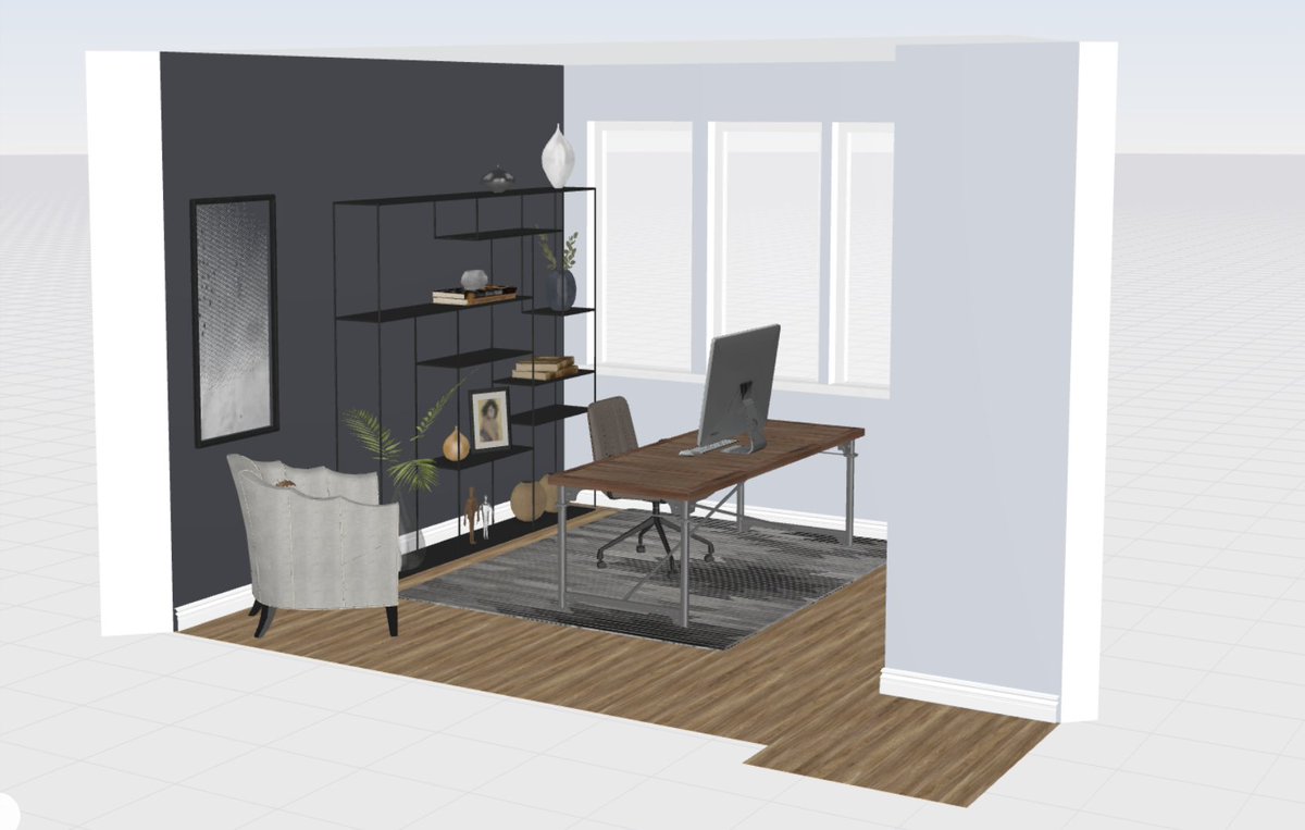


Went with this bookcase for behind my desk, will be able to fit my gaming monitor in the middle shelf 👍🏻
New desk arrives Wednesday, excited to remodel!
New desk arrives Wednesday, excited to remodel!

Gonna start redoing the office tonight!
New Uplift desk arrived today, 80x30 solid walnut top, thing is large 😅
New Uplift desk arrived today, 80x30 solid walnut top, thing is large 😅

Step 1: Take down acoustic panels and patch some holes — these are gonna get moved to the other wall.
End result of this patch job will likely look like shit because I am an absolutely useless handy man 🤘🏻

End result of this patch job will likely look like shit because I am an absolutely useless handy man 🤘🏻


(Probably the thing I’m most excited about with this home office reno is finally being able to put the back of this beauty on display 😍) 

Step 3: Sand down these patches now that they are dry.
As expected, the patch is not impressed with the service I provided.
As expected, the patch is not impressed with the service I provided.

Step 4: Taping and edging… If the baseboards aren’t black when I take the tape off I will be absolutely shocked. I don’t think there is anything in the world I am worse at than painting. 

Step 5: Fuck up your ceiling by accidentally tapping the corner of the paint roller on it, then trying to wipe it off with a damp cloth and wiping away the texture of the ceiling completely 🤙🏻 
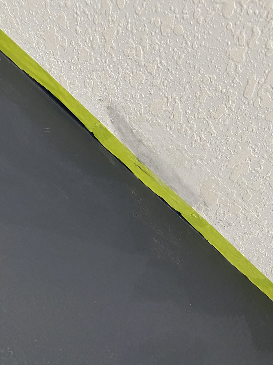
Second coat, expect I may want to do a light third when this is totally totally dry but coverage looks okay I think, if anything probably too thick 😵💫 

Took the tape off, as expected I am terrible at this shit 😎
Also I painted the edges before sanding the patches, as can be seen here. Another dumbass move 🧠
Also I painted the edges before sanding the patches, as can be seen here. Another dumbass move 🧠

My wife *really* enjoyed helping me carry this 1.75” solid walnut 80x30 desktop up our massive staircase 😅 

Where we’re at with everything dry…
Next step is to build the desk, which I’m gonna start after kid is asleep.
(Getting replacement top in January, gonna use this one until then.)
Next step is to build the desk, which I’m gonna start after kid is asleep.
(Getting replacement top in January, gonna use this one until then.)

Frame assembled! This thing has to weigh at least 200 pounds — no clue how I am going to get this flipped over, starting to wish I knew my neighbours 😅 

Trigger warning: No cable management 😜
Need to buy a couple longer Thunderbolt cables then will tidy this up. Another job I honestly wish I could just pay someone to come and do better than me 😅
Need to buy a couple longer Thunderbolt cables then will tidy this up. Another job I honestly wish I could just pay someone to come and do better than me 😅

Opted for ordering some 3D printed mounting brackets for my audio interface and Thunderbolt hub. Looked into lots of other options but I think this has the best chances of turning out clean.
etsy.com/ca/listing/980…
etsy.com/ca/listing/945…
etsy.com/ca/listing/980…
etsy.com/ca/listing/945…

Bookcase arrived, feels a little smaller than I was imagining but I think it's alright 👍🏻
Decor is a draft, will figure out something nice soon 🙃

Decor is a draft, will figure out something nice soon 🙃
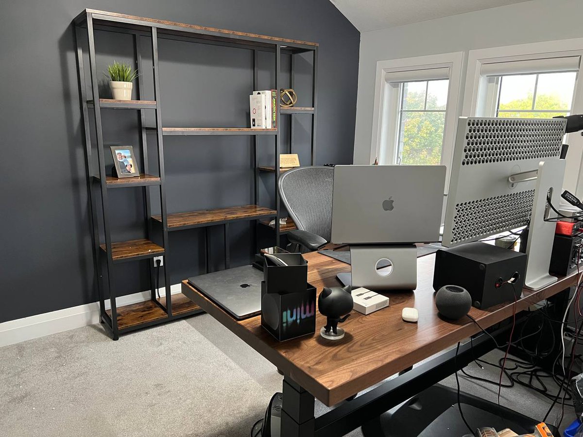

Gonna hang one of the guitars on the wall and put a nice chair in that corner long-term, but got the most important piece of decor on the shelf at least 😆
(Thanks to @austinstierler for helping me live my childhood dream 😄)
(Thanks to @austinstierler for helping me live my childhood dream 😄)

Got a couple of new black acoustic panels to better match the new wall. Not sure I'll actually have a good spot for the second one but this one looks a lot better there than the gray ones I bought to match the other paint color 👍🏻 

Ordered one of these to organize everything under the desk, think it’ll work better than the plastic thing included with the desk.
Hopefully mounting brackets for other stuff will be here soon and can get it all sorted out!
amazon.ca/dp/B01LN1TVCM?…
Hopefully mounting brackets for other stuff will be here soon and can get it all sorted out!
amazon.ca/dp/B01LN1TVCM?…
• • •
Missing some Tweet in this thread? You can try to
force a refresh


