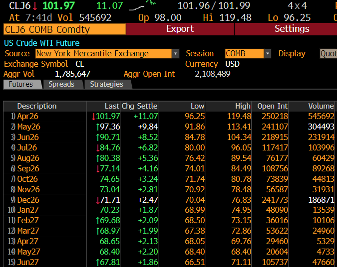
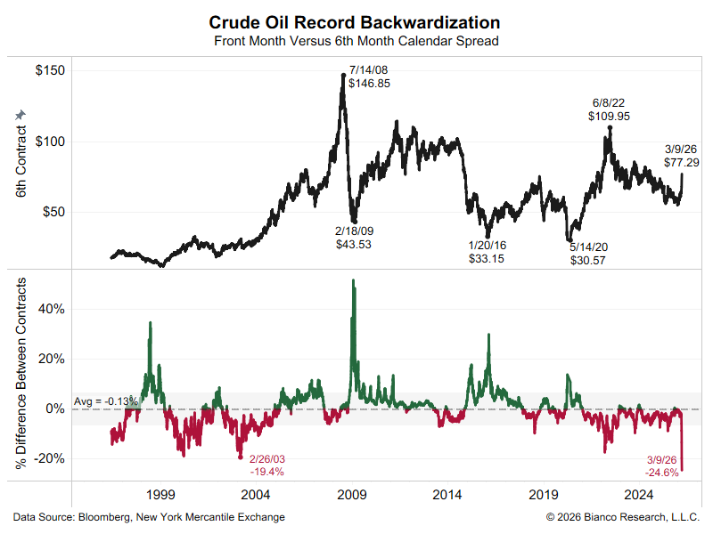
1/13
The supply chain is running at capacity and cannot keep up with overstimulated demand thanks to 18 mos of fiscal/mon priming.
This suggests the fix is not expanding supply, hard in the ST, but to raise prices high enough to reduce demand.
A thread to explain
@RaoulGMI
The supply chain is running at capacity and cannot keep up with overstimulated demand thanks to 18 mos of fiscal/mon priming.
This suggests the fix is not expanding supply, hard in the ST, but to raise prices high enough to reduce demand.
A thread to explain
@RaoulGMI
2/13
The Los Angeles and Long Beach ports collectively unload just under one million containers a month. For the last year, they have been running at/near a record pace.
In other words, they are running as fast as they can. The problem is they are at their limit.
The Los Angeles and Long Beach ports collectively unload just under one million containers a month. For the last year, they have been running at/near a record pace.
In other words, they are running as fast as they can. The problem is they are at their limit.

3/13
The much-heralded solution is to run the ports 24/7. The problem is the Long Beach terminals are already 24/7 and the LA terminals are already running 18 hours a day. These added hours at LA are only going to increase unloadings by 2%-3%. This is not going to matter much.
The much-heralded solution is to run the ports 24/7. The problem is the Long Beach terminals are already 24/7 and the LA terminals are already running 18 hours a day. These added hours at LA are only going to increase unloadings by 2%-3%. This is not going to matter much.
4/13
There are also problems getting these containers off the dock.
Unfortunately there is a trucking shortage, which has led to soaring trucking rates (chart).
Demanding more trucks at 3 AM to get these unloaded containers off the dock is going to be a taller order.
There are also problems getting these containers off the dock.
Unfortunately there is a trucking shortage, which has led to soaring trucking rates (chart).
Demanding more trucks at 3 AM to get these unloaded containers off the dock is going to be a taller order.

5/13
So even though the ports are running at capacity, the containers are going nowhere. This can be seen by the stagnate increase in rail car loadings.
The entire supply chain has to run beyond capacity at once for this to work. Good luck coordinating this.
So even though the ports are running at capacity, the containers are going nowhere. This can be seen by the stagnate increase in rail car loadings.
The entire supply chain has to run beyond capacity at once for this to work. Good luck coordinating this.

6/13
This is leading to a backlog of ships anchored off LA.
And since these containers are taking longer to unload, shippers now have to factor in this dead time anchored off shore.
This is a disincentive to ship, so the number of empty containers are piling up in the ports.
This is leading to a backlog of ships anchored off LA.
And since these containers are taking longer to unload, shippers now have to factor in this dead time anchored off shore.
This is a disincentive to ship, so the number of empty containers are piling up in the ports.


7/13
This is leading to a recent fall in container rates. No one is in a hurry to ship these containers back to China for reuse if they are going to just sit anchored off LA for many days. Then one has to struggle to find a truck to haul it away.
This is leading to a recent fall in container rates. No one is in a hurry to ship these containers back to China for reuse if they are going to just sit anchored off LA for many days. Then one has to struggle to find a truck to haul it away.

8/13
Many think the falling container rates mean the supply chain’s problems are being alleviated.
That would be true if these rates were falling along with the no. of ships anchored off LA, trucking rates, and the number of empty containers all falling as well. They are not.
Many think the falling container rates mean the supply chain’s problems are being alleviated.
That would be true if these rates were falling along with the no. of ships anchored off LA, trucking rates, and the number of empty containers all falling as well. They are not.
9/13
The impression by many in the financial markets is this supply chain problem will be fixed in a few months.
They also though the same this summer when Biden similarly convened a meeting in June to fix this problem. But today it is worse than ever.
Why?
The impression by many in the financial markets is this supply chain problem will be fixed in a few months.
They also though the same this summer when Biden similarly convened a meeting in June to fix this problem. But today it is worse than ever.
Why?
10/13
Simply, demand is booming. Below is personal consumption since 09, its trendline, and residuals (actual-trend).
Consumption is off the charts at $662B > trend.
Again, we want a record amount of stuff and the supply chain cannot handle it.
Too many stimmy checks.
Simply, demand is booming. Below is personal consumption since 09, its trendline, and residuals (actual-trend).
Consumption is off the charts at $662B > trend.
Again, we want a record amount of stuff and the supply chain cannot handle it.
Too many stimmy checks.

11/13
So by ‘fixed’ many assume increasing the throughput of the supply chain to meet overstimulated demand over the short term is doable.
But if the problem is the supply chain is at capacity now, expanding will be hard/impossible over the next several months.
So by ‘fixed’ many assume increasing the throughput of the supply chain to meet overstimulated demand over the short term is doable.
But if the problem is the supply chain is at capacity now, expanding will be hard/impossible over the next several months.
12/13
So to bring everything into balance, prices will rise until enough demand is destroyed to bring everything into line with the limits of the supply chain.
We might be seeing this happening as Q3 growth expectations are crumbling as prices are soaring.
So to bring everything into balance, prices will rise until enough demand is destroyed to bring everything into line with the limits of the supply chain.
We might be seeing this happening as Q3 growth expectations are crumbling as prices are soaring.


13/13
This is otherwise known as stagflation ... which simply means higher than average prices rises (inflation) accompanied by lower than average growth.
Wall Street viscerally hates this word. But that does not mean it is wrong. Just inconvenient if true.
This is otherwise known as stagflation ... which simply means higher than average prices rises (inflation) accompanied by lower than average growth.
Wall Street viscerally hates this word. But that does not mean it is wrong. Just inconvenient if true.
• • •
Missing some Tweet in this thread? You can try to
force a refresh