Is Ireland using RIP.ie to provide weekly mortality figures to @EU_Eurostat?
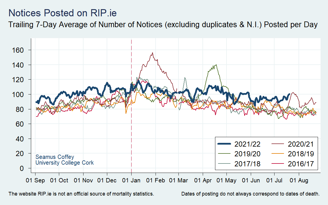
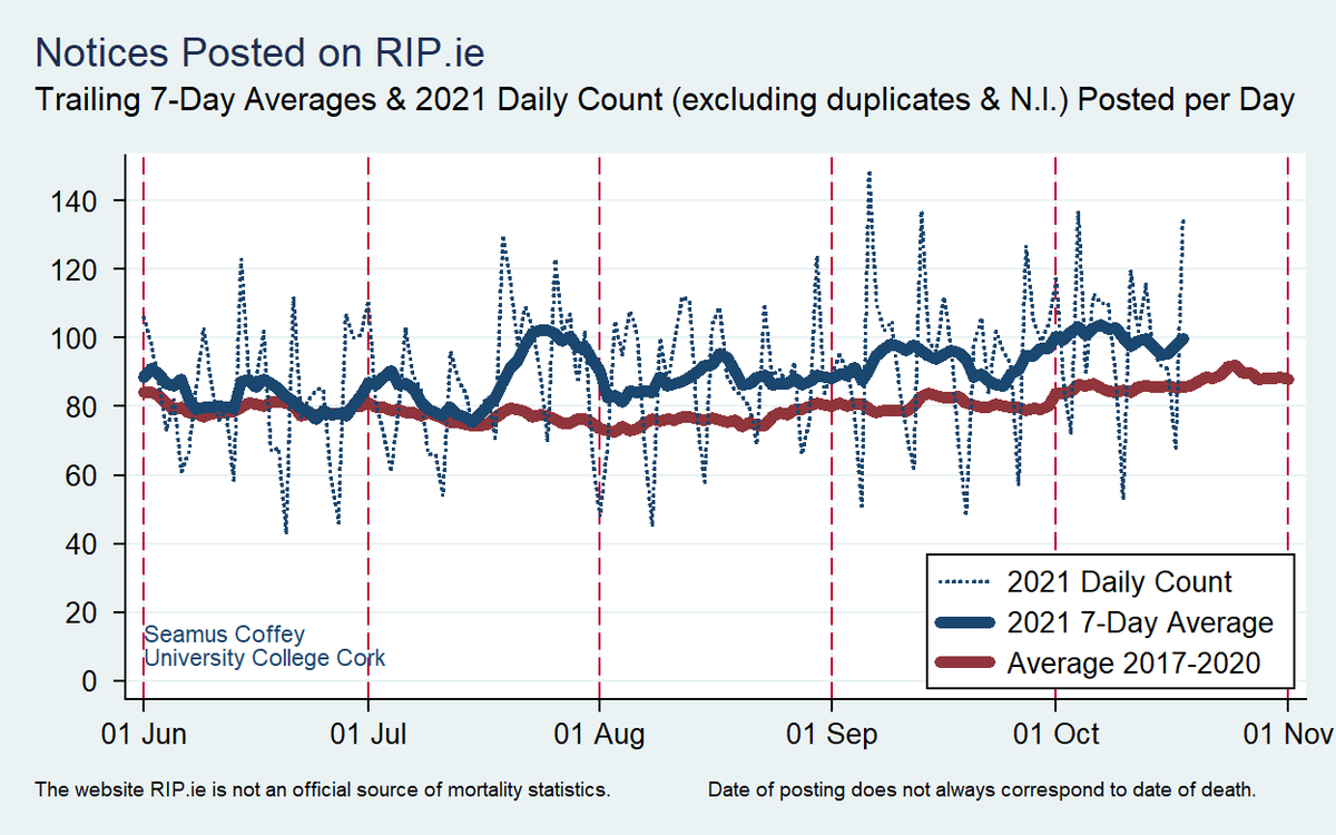
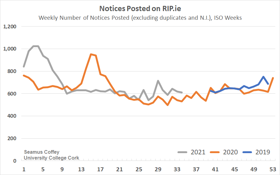
First, here’s the regular update on the recent level of posts on https://t.co/O5V34UTYV7. It remains above what might typically be expected for this time of year.
First, here’s the regular update on the recent level of posts on https://t.co/O5V34UTYV7. It remains above what might typically be expected for this time of year.
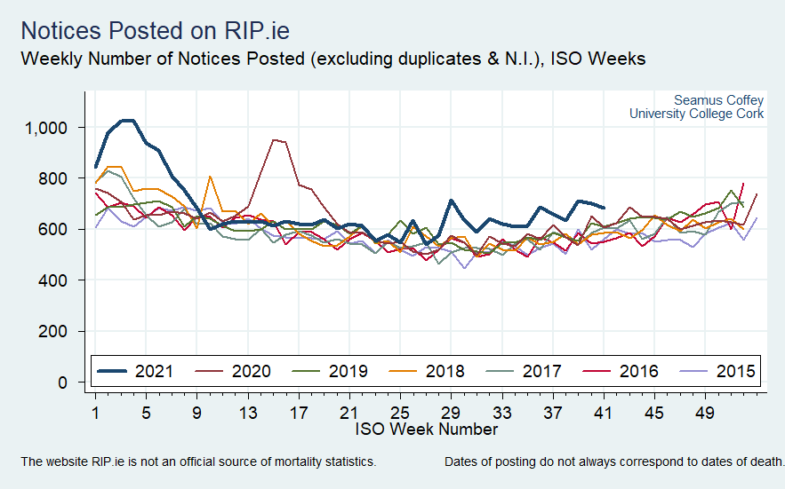
@EU_Eurostat And here are the full series in weekly form for the past seven years.
Since Week 29 (roughly the middle of July), 2021 has had a higher level of posts than all recent years.
Since Week 29 (roughly the middle of July), 2021 has had a higher level of posts than all recent years.
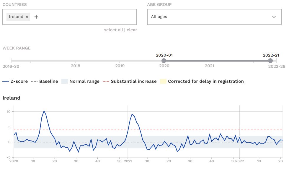
@EU_Eurostat One issue with the informal RIP.ie data was that it stood in isolation. There are few sources of timely statistics on mortality in Ireland. @euroMomo use estimates derived from registrations which show recent mortality in Ireland to be below normal. #cyberattack
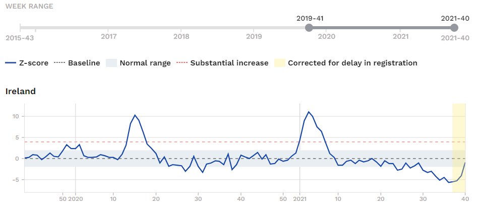
@EU_Eurostat @euroMomo But Ireland has been added to separate data published by @EU_Eurostat who have been producing a special experimental series on weekly deaths since mid-2020. Initially, Irish data was not available but it is now (with the series beginning in late 2019)
appsso.eurostat.ec.europa.eu/nui/show.do?qu…
appsso.eurostat.ec.europa.eu/nui/show.do?qu…

@EU_Eurostat @euroMomo For comparison, here is the same chart but now with one that shows the figures for equivalent weeks from the informal series derived from RIP.ie.
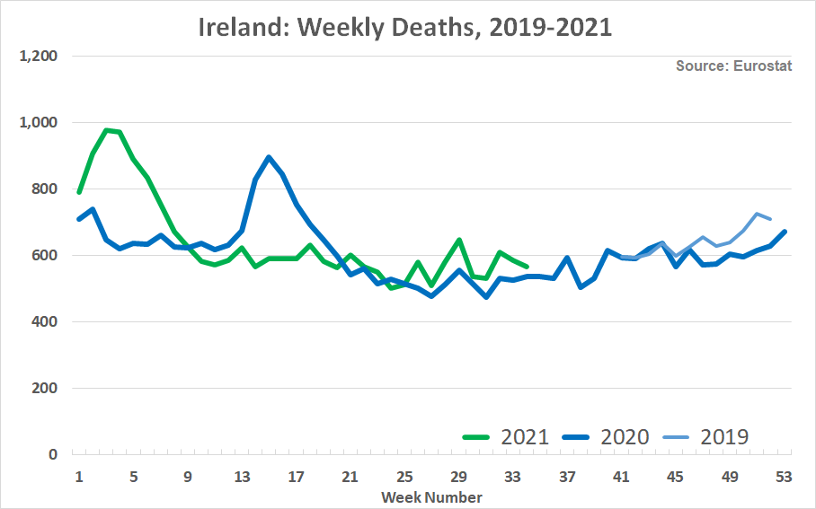
@EU_Eurostat @euroMomo To confirm the impression of the previous charts, here is a single chart that combines both series.
The strong correlation is clear (rho = 0.98). The level of the informal RIP.ie series is, on average, about 5% higher but the pattern of changes are very close.
The strong correlation is clear (rho = 0.98). The level of the informal RIP.ie series is, on average, about 5% higher but the pattern of changes are very close.
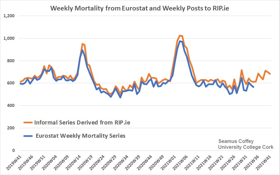
@EU_Eurostat @euroMomo The @EU_Eurostat data shows recent mortality in Ireland has been higher than last year, in line with the informal RIP.ie series.
It also seems likely https://t.co/O5V34UTYV7, albeit a better-cleaned version, is the source for the data transmitted to Eurostat.
It also seems likely https://t.co/O5V34UTYV7, albeit a better-cleaned version, is the source for the data transmitted to Eurostat.
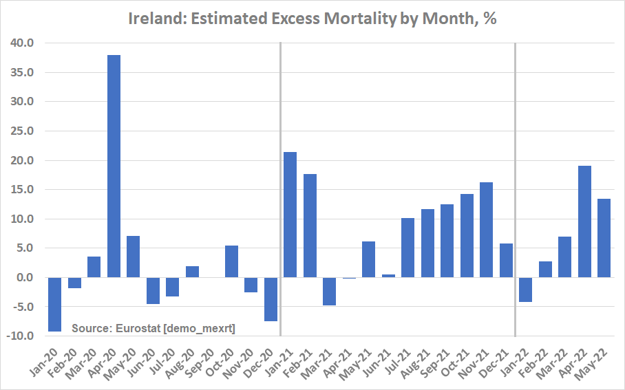
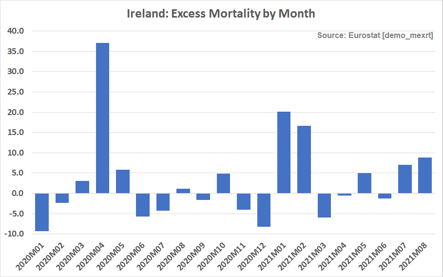
@EU_Eurostat @euroMomo Data for Ireland has also been added to an @EU_Eurostat series of monthly excess mortality estimates in percentage terms.
The figures for July and August '21 are +7.0% and +8.8% which is comparable to the higher level of posts to RIP.ie during these months. /end
The figures for July and August '21 are +7.0% and +8.8% which is comparable to the higher level of posts to RIP.ie during these months. /end
• • •
Missing some Tweet in this thread? You can try to
force a refresh