Listening to insane House Democrats hector Big Oil CEOs on climate.
Really something.

Really something.
Republicans doing a surprisingly good job defending the oil & gas industry at the House #BigOilShowTrial.
Democrats looking stupid, as expected, trying to play gotcha.
CEOs, playing both sides.... mouthing climate concern but emphasizing reality -- society needs oil & gas.
Democrats looking stupid, as expected, trying to play gotcha.
CEOs, playing both sides.... mouthing climate concern but emphasizing reality -- society needs oil & gas.
Stark raving mad @RashidaTlaib accuses Chevron CEO of making $29 million for 'poisoning the planet.'
Also raves Chevron owes $51 billion to indigenous people in Latin America.
Puzzled CEO responds he has no idea what she is talking about.
Rave on, crazy person.
Also raves Chevron owes $51 billion to indigenous people in Latin America.
Puzzled CEO responds he has no idea what she is talking about.
Rave on, crazy person.
Ex-waitress now quizzing Big Oil CEOs.
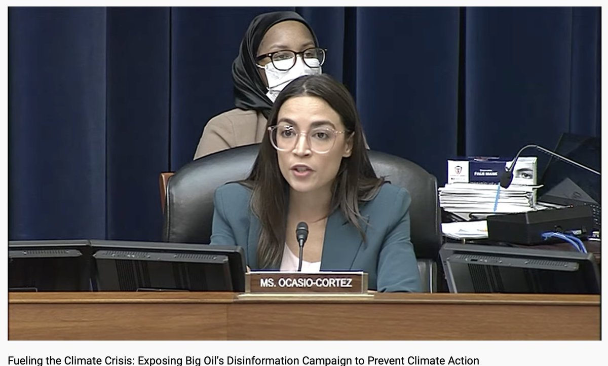
.@AOC to ExxonMobil CEO:
'Some of us have to live the future that you are setting on fire.' 😜
Very unimpressive questions and comments.
'Some of us have to live the future that you are setting on fire.' 😜
Very unimpressive questions and comments.
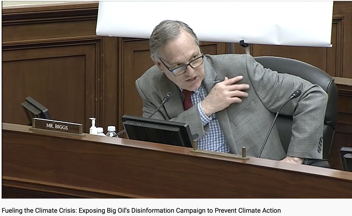
Kudos to @RepAndyBiggsAZ for lecturing Big Oil CEOs on their appeasement of climate idiocy.
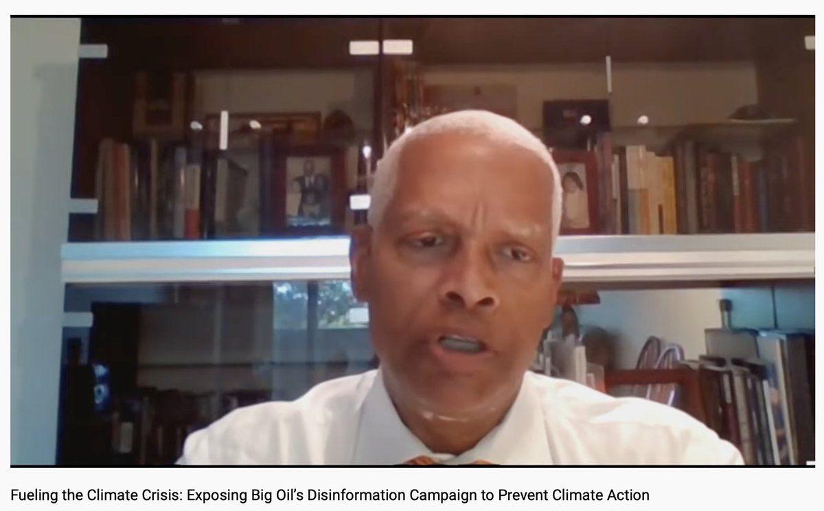
Georgia Congressman Hank Will-the-Navy-Capsize-Guam Johnson quizzes Big Oil CEOs at the #HouseBigOilShowTrial.
Hard to believe this is what democracy has come to after 2,500 years.
Hard to believe this is what democracy has come to after 2,500 years.
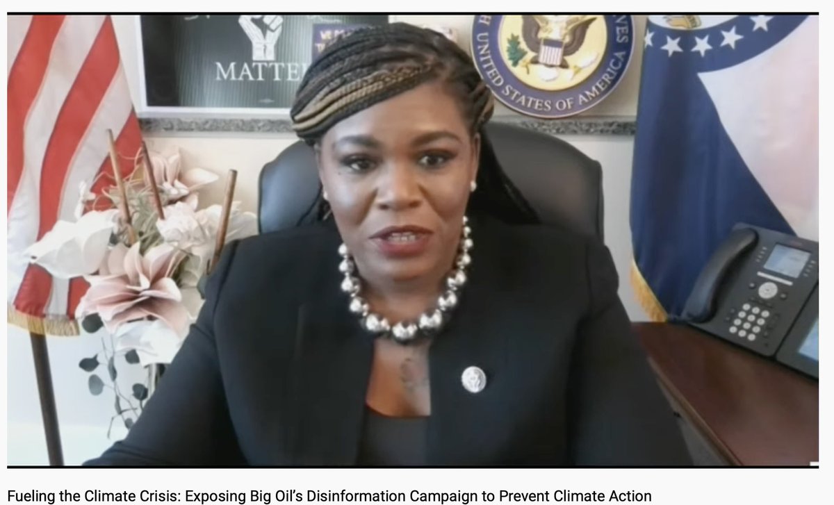
Crazy @CoriBush accuses Big Oil CEOs of white supremacy for making tear gas, causing violent crime and killing millions of people.
The clear leader in today's Most Lunatic Congressman Sweepstakes.
#HouseBigOilShowTrial.
The clear leader in today's Most Lunatic Congressman Sweepstakes.
#HouseBigOilShowTrial.
• • •
Missing some Tweet in this thread? You can try to
force a refresh