
JavaScript tips you won't see in most tutorials.
🧵
🧵
1. Copy to clipboard
You can use the `Clipboard` API to create the “Copy to clipboard” functionality:
You can use the `Clipboard` API to create the “Copy to clipboard” functionality:

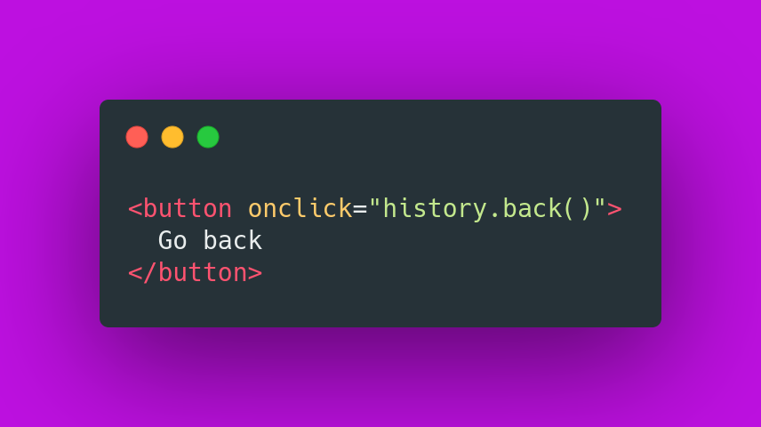
2. "Go back" button
Use the `history.back()` to create a “Go Back” button.
Use the `history.back()` to create a “Go Back” button.
3. `console.table()`
You can use the `console.table()` method to display tabular data as a table:
You can use the `console.table()` method to display tabular data as a table:

4. You can wrap your console.log() arguments with curly brackets to see the variable names.

5. Capture right clicks (user attempts to open a context menu).

6. Get min/max value from an array
You can use `Math.min()` or `Math.max()` combined with the spread operator to find the minimum or maximum value in an array.
You can use `Math.min()` or `Math.max()` combined with the spread operator to find the minimum or maximum value in an array.
![```javascript const numbers = [6, 8, 1, 3, 9]; console.log(](https://pbs.twimg.com/media/FC3Dz7MWUAIpGc6.jpg)
7. Run event listener only once
If you want to add an event listener but have it run only once, you can use the ` once` option:
If you want to add an event listener but have it run only once, you can use the ` once` option:

8. Numbers separators
To improve readability for numbers, you can use underscores as separators:
To improve readability for numbers, you can use underscores as separators:

9. Use the `window.print()` to create a "print page" functionality.

10. Use the `Fullscreen API` to open any element in full-screen mode.

11. Use the `dataset` property to access the element's custom data attributes (data-*):

12. You can use `Set` to remove duplicate elements from an array:
![```javascript const numbers = [2, 3, 4, 4, 2]; console.log(](https://pbs.twimg.com/media/FC3FsYrXsAA34F8.png)
If you're learning HTML, CSS or JavaScript be sure to follow me and never miss tips like this.
• • •
Missing some Tweet in this thread? You can try to
force a refresh


![```javascript const words = ['HTML', 'CSS', 'JavaScript'];](https://pbs.twimg.com/media/FA7MSprWUAE_zed.jpg)


