Orwell2024🏒 Profile picture
Nov 1, 2021 11 tweets 8 min read Read on X
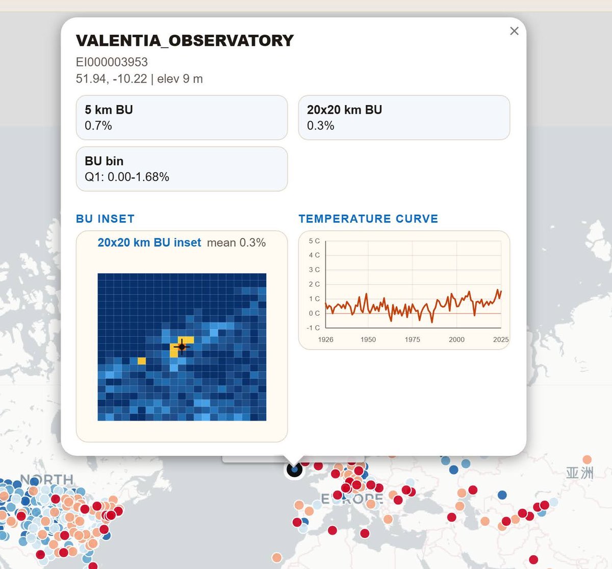
1/ Expected rate of vaccinated in ICU.

(Correcting here the spotted mistake in the explanation part.)

Here is the formula explained. It depends on vaccination rate and vaccine efficiency.

The special case for 90% vaccinated is shown on the right as function of VE-ICU.
2/ For Austria and NL where 90% of the at risk group is vaccinated we expect 30%-50% of the ICU patients to be vaccinated if assuming a VE-ICU of ~90%.
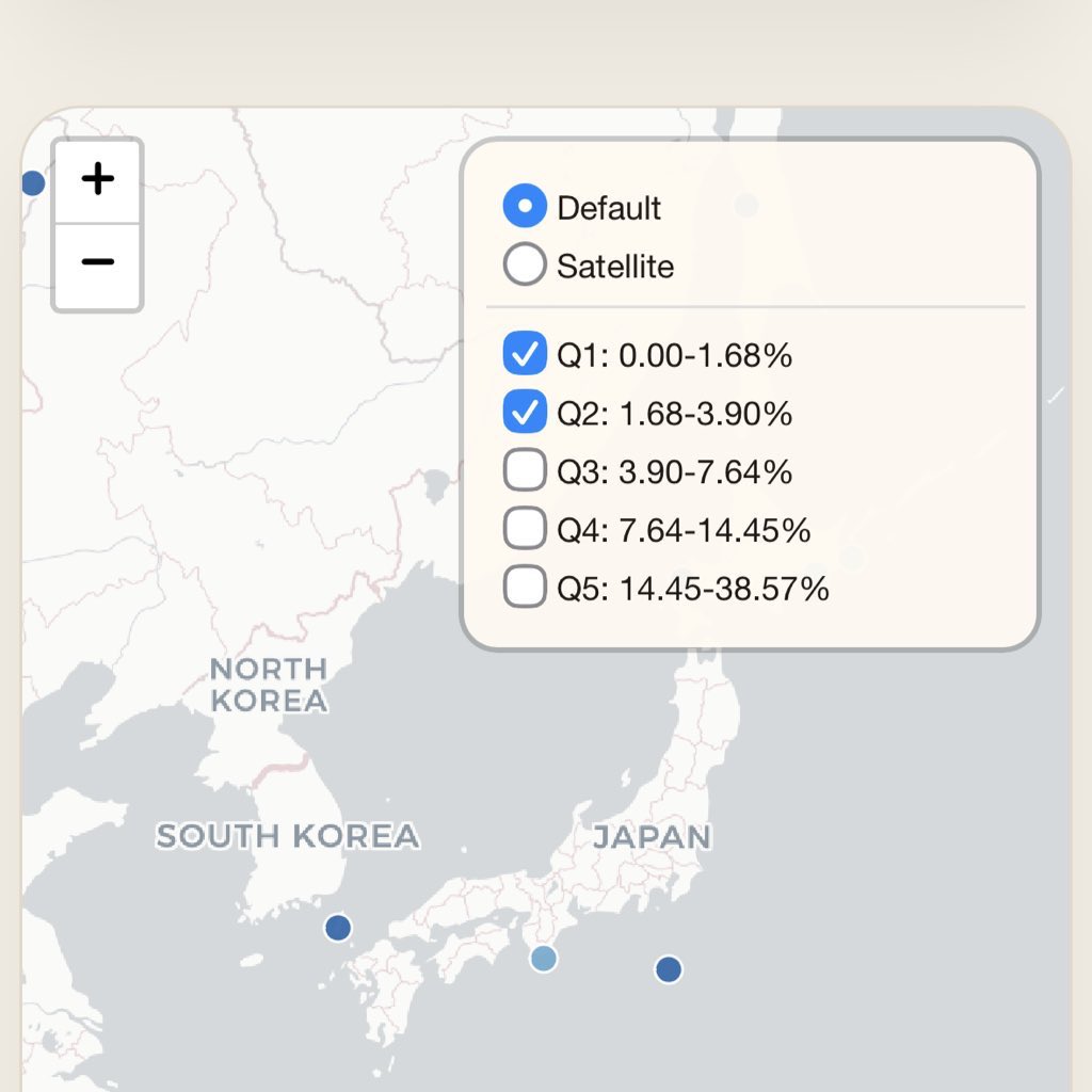
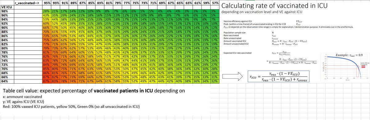
3/ Let's show the results of the formula in 2D as function of

x) vaccination level
y) VE agains ICU

The resulting rate (calculation on right) of vaccinated in ICU is shown in the cell.

It can be used as look-up table to estimate (roughly) the VE.
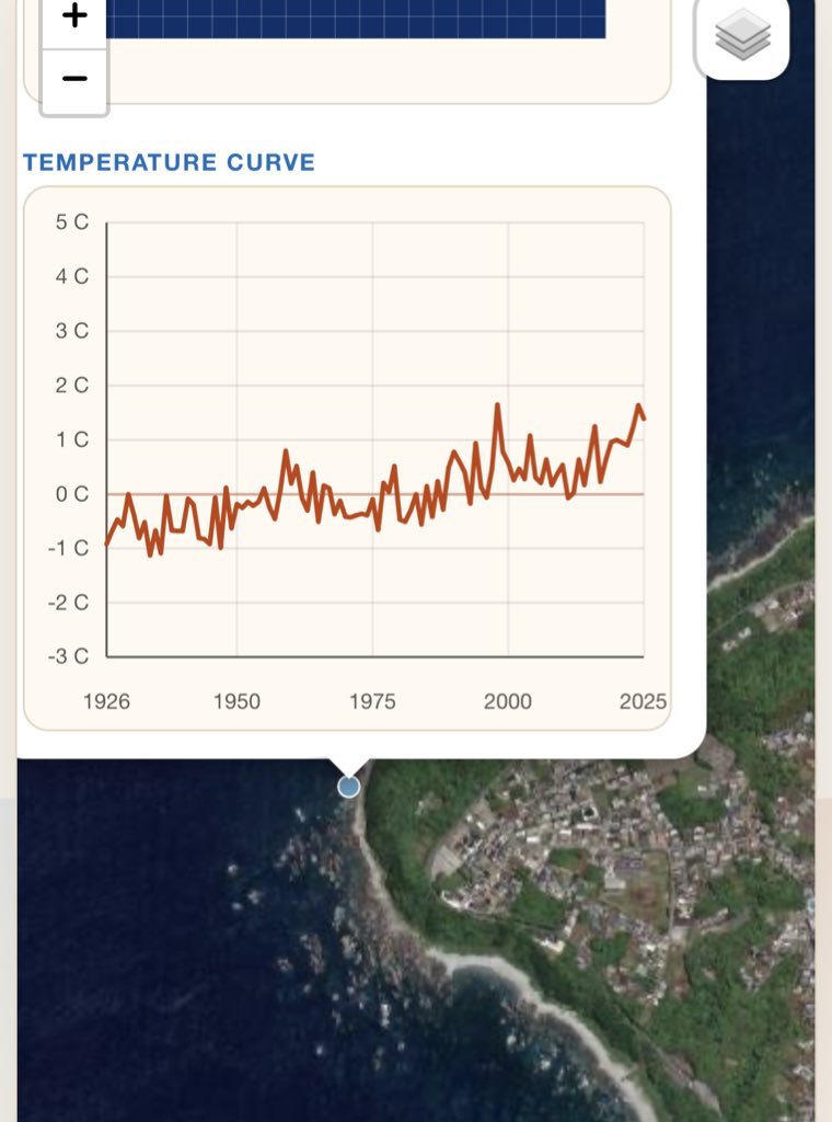
4/ Example The Netherlands: With around 90% vaccinated we expect something between 15%-50% vaccinated in ICU depending on the VE-ICU.

RIVM reported around 15% (right). In order for this to work with 90% vaccinated, VE-ICU needs to be above 95%.
5/ VE look up example using UK PHE report week 43

assets.publishing.service.gov.uk/government/upl…

using the data from Table 5:

We look up the expected VE-emergency-care for 4 different age groups with different vaccination levels and resulting emergency care rates.

Result: VE ~ 96% in each case.
6/ Discussion: The relative number of vaxxed-patients in ICU is irrelevant (increasing with vax level).

Only the absolute total reduction of ICU patiens matters (shown below).

1-(𝑟_𝑣𝑎𝑥∙(1−𝑉𝐸_𝐼𝐶𝑈)+𝑟_𝑢𝑛𝑣𝑎𝑥)

Here we have >90% reduction! Nothing more to gain.
7/ Another way to look to the same data:

VE-ICU as function of % vaccinated in ICU. Each line for a different vaccination level.

public.tableau.com/app/profile/or…
8/ Use example: estimate VE-ICU based on latest numbers "percent vaccinated in ICU" from NL (from @BertMulderCWZ ).
9/ Here the link to the article by Prof. Suess in @KURIERat today
10/ Assuming March as the date where most elderly were fully vaccinated in NL, I compared the derived NL VE versus (time) with the Swedish study on waning efficiency.

Result assuming AUG ~ day 150.

• • •

Missing some Tweet in this thread? You can try to force a refresh
 

Keep Current with Orwell2024🏒

Orwell2024🏒 Profile picture

Stay in touch and get notified when new unrolls are available from this author!

Read all threads

This Thread may be Removed Anytime!

PDF

Twitter may remove this content at anytime! Save it as PDF for later use!

Try unrolling a thread yourself!

how to unroll video
  1. Follow @ThreadReaderApp to mention us!

  2. From a Twitter thread mention us with a keyword "unroll"
@threadreaderapp unroll

Practice here first or read more on our help page!

More from @orwell2022

Jul 1
London is glowing today. Wide urban heat plume. Not “climate change.” Just real estate and concrete. The effect is visible. Quantifiable. Known. This should be a good study day to quantify UHI in more detail once the IR satellite pictures come in. Image
Image
2/ We start low tech. Actually nothing more is needed. There is over 6°C urban heat. It's embarrassing to pretend today's 33°C are comparable to 100 years ago. Subtract 6–8°C for UHI and you get... 25–27°C. Welcome back to reality. Image
3/ Nighttime, Tmin. Watch how they flatten the colors. You’re not supposed to notice the 7°C UHI. We unflatten the colors. Look again: you see it now? Image
Read 6 tweets
Jun 29
Stockholm downtown: Where’s the UHI correction?

QCU = raw data
QCF = adjusted data

Same numbers.

C A N -- Y O U -- S E E -- IT

Fredrik? Show us.
We can’t see it.

Where exactly is the downward adjustment of 2C-4C? That's the bias you have in 2025. Image
We can also do from SE raw. And we can also show how rural stations look. Frederik does like them. Climate agenda is measured in downtowns of the capitals? Image
Not sure if it’s normal that amateurs now have to lecture academics…?

The downtown station logs hourly=no need for even Ekholm, no need for re-sampling. Does Frederik even know what we mean? Nothing is adjusted. Also PHA leaves it as is as it only detects breakpoints (not UHI). Image
Read 5 tweets
Jun 27
1/ +++🚨BREAKING🚨+++

Yes. Hausfather & Berkeley Earth are pushing it.
But it’s not a measurement. Not one station shows that.
It’s what you get when you aggregate rot over time.

On the left: 8 pristine USCRN sites. Same y-scale.
Now look what they did.👇 Image
2/ 🚨 BREAKING 🚨

We overlay. Do you see it now?

👉 They erased the real past.
👉 They had no data to do so.
👉 It's pure statistical deception—and wrong.

How? All exposed in the Wickham et al. (2013) audit thread.🧵

Image
3/ AI to fraud is what DNA was to criminals.

Not optional. Not stoppable.

🧠 Fraud — exposed
📺 MSM — vanished
📄 Journals — obsolete
🎓 Academia — imploded
🏰 Ivory towers — rubble

Resistance is pointless.

github.com/orwell2024/usc…
orwell2024.github.io/GHCN-tools/Wic…
Read 6 tweets
Jun 23
1/ Weil’s beliebt ist: Hohenpeissenberg-Daten – fallen zwar schon nach BU-Filter raus, aber gut: Dr. Connolly war schlau.

Oben: Wie stark sich die Temperatur verändert hat.
Unten: Wie „unrund“ die Messwerte wurden – Entropie der Kommazahlen (h/t Connolly) Image
2/ Was wir hier sehen: Die Datenreihe ist ein Komposit (sehr beliebt, wenig seroes, in der Klima-„Wissenschaft“).
Die Messmethode (und mehr) hat sich verändert – von analogen zu digitalen Sensoren. Die Entropie der Nachkommastellen zeigt das – deutlich.
Image
3/ Diese Wetterstation ist NICHT standortstabil:
praktisch 100 % vom Menschen genutzte Fläche.

🟥 MODIS Urban (Klasse 13)
🟧 MODIS Agrarfläche (12 + 14)
🩸 GHSL Bebauung (2020)

Wer hier „Klima messen“ sagt, betreibt Täuschung.
Blamage für DWD.

Image
Read 12 tweets
Jun 22
1/ The result is simply wrong.
There are 2 stations there — we can compare.
🟥Red: Carlwood
🟩Green: Gatewick
We clearly see the overshoot.
Moreover: They’re using subhourly spikes (error) from a single, low-inertia sensor.
Total incompetence. Image
2/ Using TMAX from a low-quality single urban sensor is already peak incompetence.

But they go further — they take the spikes.
Even top-tier stations like USCRN show 2–3°C error at peak forcing.
USCRN uses triple sensors — worst spikes get voted out.

Image
3/ The UK has nothing like the USCRN triple-sensor setup.

So when two nearby stations disagree, the right move is simple:
Discard the implausible one — in this case, Charlwood.
What does the agenda-captured @metoffice do?
They run with the error.
They hoax the public.
ISO9001🤡 Image
Image
Read 6 tweets
Jun 12
1/ Back to Japan temperature trends.

We now add a smaller town: Suttsu. Still not truly rural nor stable site, but better.

We now show:
🟥 Kyoto
⬛️ Tokyo
🟦 Suttsu

Can you see it?

They then aggregate urban-biased data (rot) like this and call it “global temperature.” Image
2/ Here it is: Suttsu.

Not a high-quality reference site like
Valentia Observatory (Ireland) or h-USCRN sites.

But: Lower urban bias than cities like Kyoto or Tokyo. It starts to show the well known flatliner we see at stable sites. Image
Image
3/ To see it better, here’s 4 months side by side:

🟥 Kyoto
⬛️ Tokyo
🟦 Suttsu

This is man-made. The T trend is just unrelated to climate. It measures the site and environment change. Suttsu as expected least impacted. But it still is. Image
Read 17 tweets

Did Thread Reader help you today?

Support us! We are indie developers!


This site is made by just two indie developers on a laptop doing marketing, support and development! Read more about the story.

Become a Premium Member ($3/month or $30/year) and get exclusive features!

Become Premium

Don't want to be a Premium member but still want to support us?

Make a small donation by buying us coffee ($5) or help with server cost ($10)

Donate via Paypal

Or Donate anonymously using crypto!

Ethereum

0xfe58350B80634f60Fa6Dc149a72b4DFbc17D341E copy

Bitcoin

3ATGMxNzCUFzxpMCHL5sWSt4DVtS8UqXpi copy

Thank you for your support!

Follow Us!

:(