
If it disagrees with the expert, it’s wrong. In that simple statement is the key to consensus.
 2/ NL data. We now plot the total forcing 🔴, including the measured SSR and CO₂ contribution 🟢. The black curve ⚫ shows the temperature response, the blue curve 🔵 shows the upper physics estimate (dry Stefan–Boltzmann) for the expected temperature response.
 2/ MODIS uses a binary classification with a high threshold to flip to “urban,” so many urban sites are labeled “rural.” That compares urban to urban. BE also uses fragmented records and a changing station ensemble = 🚮. Apply one basic filter—data must exist ≥9 months/year👇
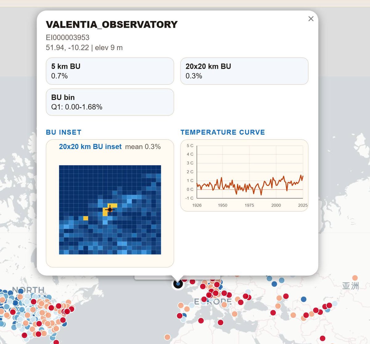 2/ This map shows all stations with 100 years of data and at least 9 valid months per year.
 Flagged this two years ago, and it’s still absurd.
 2/ Maybe it works for Blackville — another of the few pristine hUSCRN sites.
 2/ The analysis is already done. DWD and peer-reviewed literature.

 Japan has one of the best measurement data. The analysis is clear. The brightening amount to almost 20 W. That is a lot. But the main and dominant effect is still urbanization, which makes up to 6°.


 2/ We start low tech. Actually nothing more is needed. There is over 6°C urban heat. It's embarrassing to pretend today's 33°C are comparable to 100 years ago. Subtract 6–8°C for UHI and you get... 25–27°C. Welcome back to reality.
 We can also do from SE raw. And we can also show how rural stations look. Frederik does like them. Climate agenda is measured in downtowns of the capitals?
 2/ 🚨 BREAKING 🚨
 2/ Was wir hier sehen: Die Datenreihe ist ein Komposit (sehr beliebt, wenig seroes, in der Klima-„Wissenschaft“).
 2/ Using TMAX from a low-quality single urban sensor is already peak incompetence.
 2/ Here it is: Suttsu.

 Imagine a field looks like it does on the left…alive.


 Thanks to this trick, they labeled urban sites as “rural”—then obviously saw no difference.
 2/ Here's what that stable rural site looks like. 130 years of data, side-by-side sensor overlap, no urban noise.
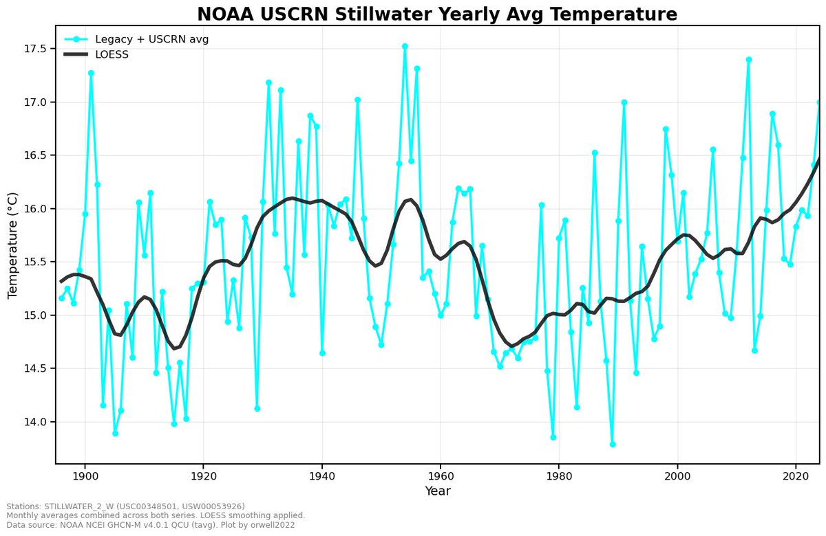
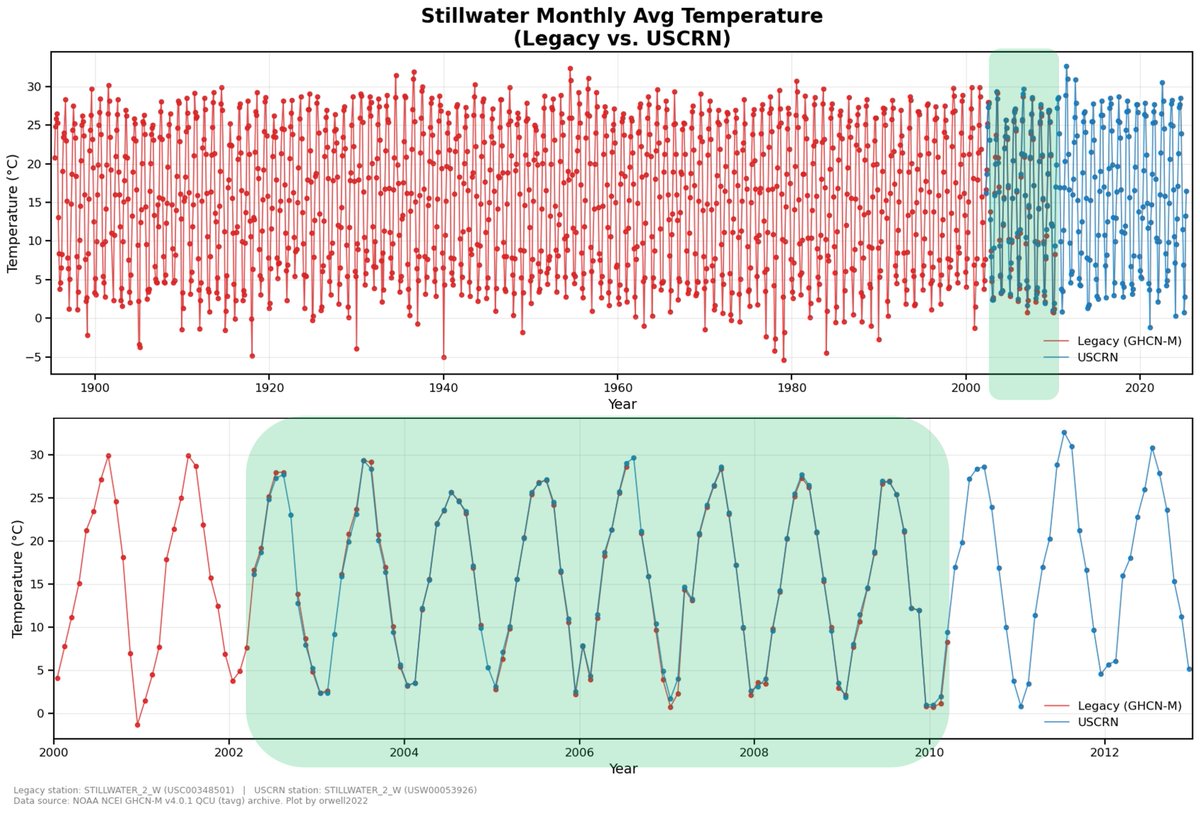
 2/ We check ourselves. The ClimDiv curve is even cooling 1.37C compared with the stable USCRN sites.

 2/ Last week of April 2025. Rural Nagano. ~700m elevation. Full bloom.


 2/ And here it is—the DOUBLE-adjusted COMPOSITE.

 2/ Class 1 is “bare minimum” for climate-grade weather station suitability. One means maybe ok.