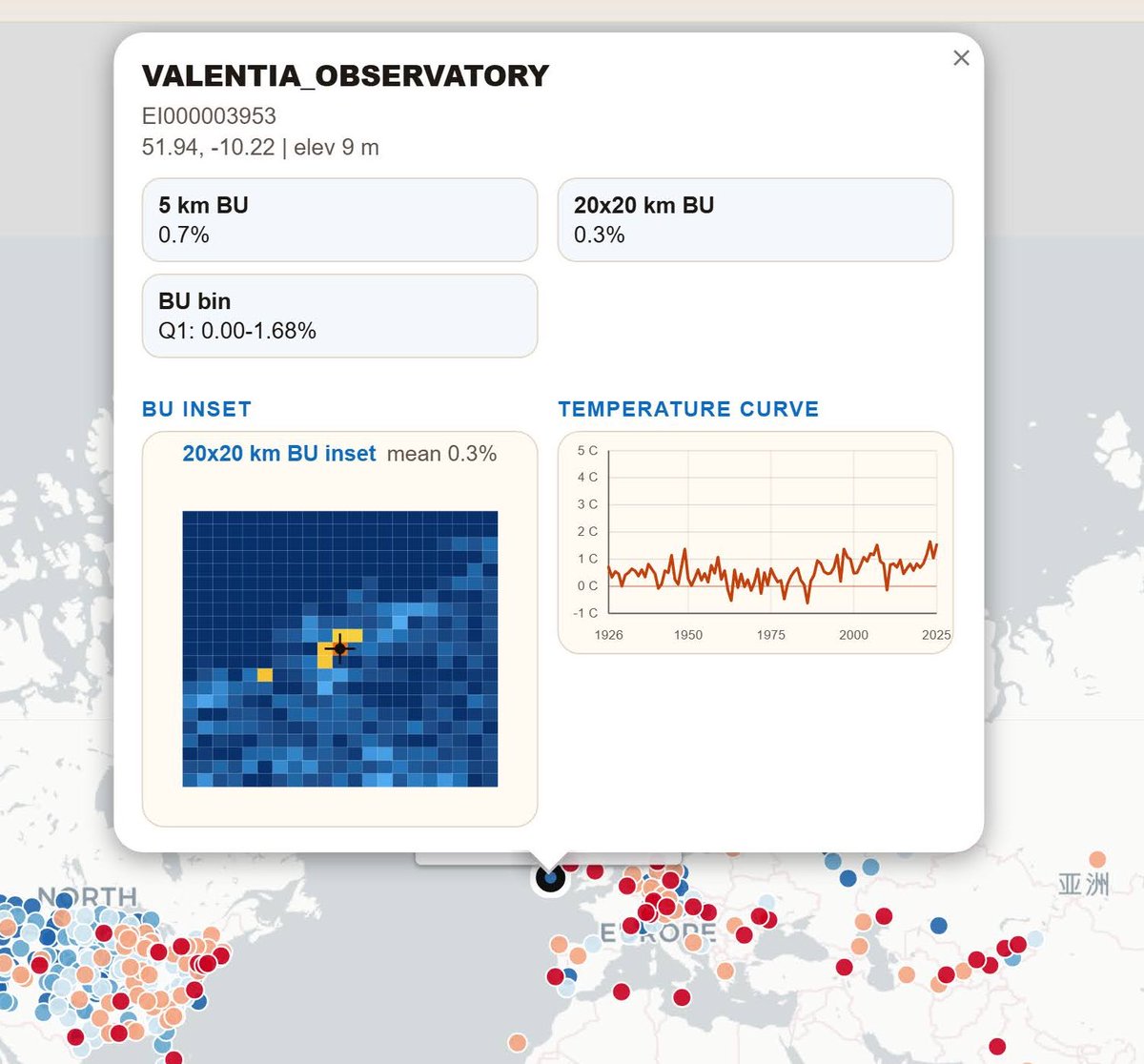
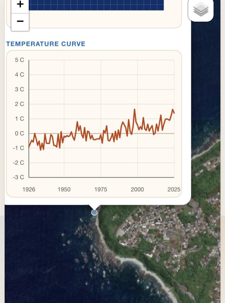
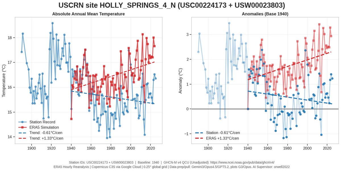
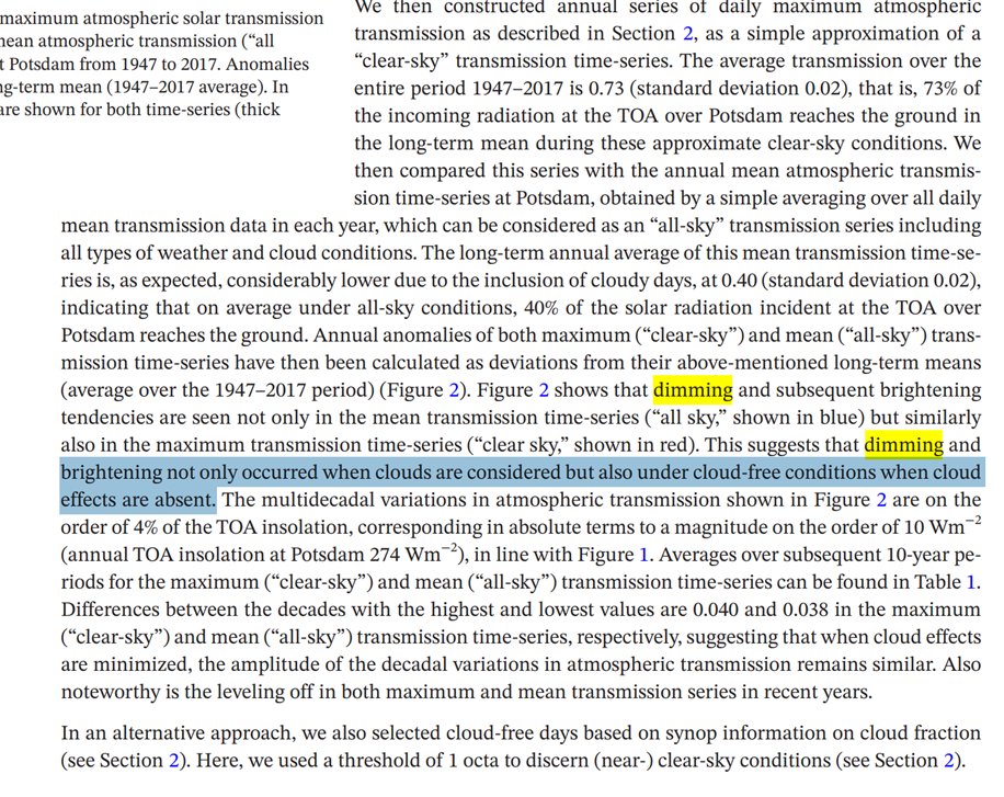
1/ What is wrong in NL?
so many lockdowns
so many test for entry
so many school closures
so mutch fear
masking 1.5 years
teleworking 1.5 years
alcohol bans
months of curfew
police beating demonstrators
QR fundamentalism
and now this ??
Bottom figures: panic why?
so many lockdowns
so many test for entry
so many school closures
so mutch fear
masking 1.5 years
teleworking 1.5 years
alcohol bans
months of curfew
police beating demonstrators
QR fundamentalism
and now this ??
Bottom figures: panic why?
https://twitter.com/bloemen_meis/status/1459050349529030660

2/ NL will now punish the unvaxxed with 2G to protect them.
Those are mainly below 35. The healthy young future of NL. Do you see how they need to be protected?
Those are mainly below 35. The healthy young future of NL. Do you see how they need to be protected?
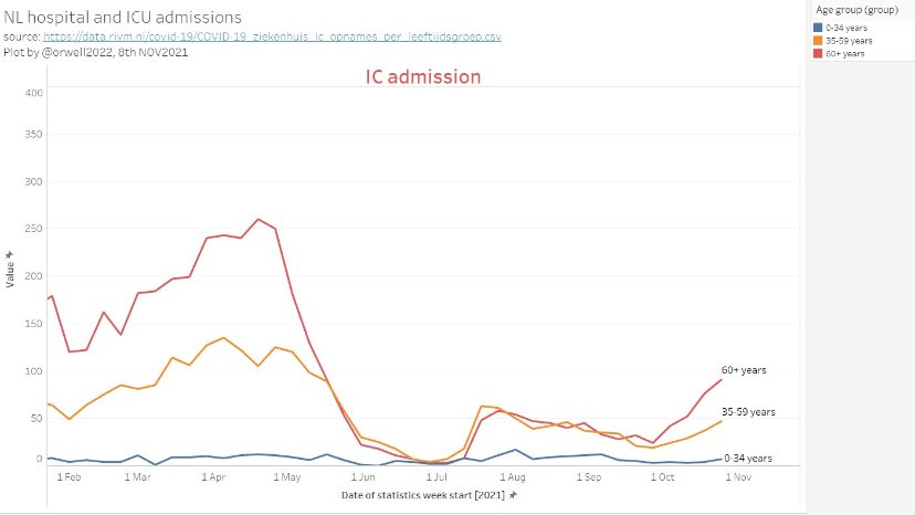
3/ Therefore the young and children need to "urgently" be vaccinated, although this data should make you wonder why.


4/ But NL was rewarded for all this or not?
I fail to see it. I don't read news nor watch TV. I read data. That's my destiny as scientist. I fail to understand what people are thinking around me.
I fail to see it. I don't read news nor watch TV. I read data. That's my destiny as scientist. I fail to understand what people are thinking around me.

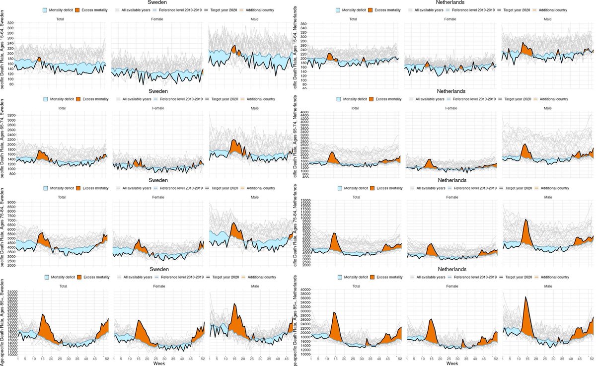
5/ But SWE must have failed totally?
Without lockdowns, everything should have collapsed. 10x deaths forecast!
I fail to see it. NL is worse.
2020 SWE (left) versus 2020 NL (right). Age adjusted mortality rate by age group.
15-64y top
65-74
75-84
85+ bottom
Without lockdowns, everything should have collapsed. 10x deaths forecast!
I fail to see it. NL is worse.
2020 SWE (left) versus 2020 NL (right). Age adjusted mortality rate by age group.
15-64y top
65-74
75-84
85+ bottom
6/ NL: It was the worst pandemic since 100 years. We needed to lock down the children and the healthy to protect them. Is this plausible?
I fail to see it.
I fail to see it.
https://twitter.com/orwell2022/status/1456933093475028992?s=20
7/ But Sweden killed people. Their neighbours did much better. No they did not.
The neighbours like DNK need to ask themselves: why do "kill" people 3 years earlier on average?
The neighbours like DNK need to ask themselves: why do "kill" people 3 years earlier on average?


8/ But Finland. See above. 2 years worse life expectancy. You need to have people in the elderly bin in order to make the all age excess possible with the Simpson's illusion (btw. the reason for most panic). Even worse, use z-scores to compare countries.
https://twitter.com/orwell2022/status/1457342887373463563?s=20


10/ About z-scores
What is z-score? Does it have a unit? And any real meaning?
https://twitter.com/orwell2022/status/1440236107686289414?s=20
What is z-score? Does it have a unit? And any real meaning?
https://twitter.com/orwell2022/status/1448972111796707342?s=20
11/ But let's also look to the "holy land" of this new lockdown religion. USA. They must have done better?
No, Sweden outperformed everyone. Without radical measures. No masking. Not blaming children. Not depriving them from school. Not masking them.
https://twitter.com/orwell2022/status/1436694989052973057?s=20
No, Sweden outperformed everyone. Without radical measures. No masking. Not blaming children. Not depriving them from school. Not masking them.


12/ But Portugal did the MOST stick measures, are 98% vaxxed, and finally did better was a remark from a Dutch gentleman. @Theunis48
He did not like being falsified.
They want lockdown. Are they (the old vaxxed) scared of children and young citizens?
He did not like being falsified.
They want lockdown. Are they (the old vaxxed) scared of children and young citizens?
https://twitter.com/orwell2022/status/1457790360801845254?s=20


13/ Related "pandemic of the unvaccinated" panic blog, and how MSM and politics fail in math.
https://twitter.com/orwell2022/status/1458576273698136068?s=20

14/ Could this be an issue in NL?
left: NL population increase since 1970 in the 75+ group: 300%
right: ICU capacity NL since 1970: -50%
Could it be a problem? @hugodejonge
left: NL population increase since 1970 in the 75+ group: 300%
right: ICU capacity NL since 1970: -50%
Could it be a problem? @hugodejonge

• • •
Missing some Tweet in this thread? You can try to
force a refresh