
NEW: To understand how the pandemic is evolving, it's crucial to know how death rates from COVID differ by vaccination status.
In this post we explain why rates are the key metric to use for this, and we show the latest data for the US, England, and Chile: ourworldindata.org/covid-deaths-b…
In this post we explain why rates are the key metric to use for this, and we show the latest data for the US, England, and Chile: ourworldindata.org/covid-deaths-b…
You may sometimes see headlines like “Half of those who died from the virus were vaccinated”.
But it would be very wrong to draw conclusions about the vaccines based on this headline, because we also need to know how many people in this population were vaccinated & unvaccinated.
But it would be very wrong to draw conclusions about the vaccines based on this headline, because we also need to know how many people in this population were vaccinated & unvaccinated.


In the post, we walk you through an example to illustrate how to think about these statistics in a hypothetical case.
The same logic also applies in the pandemic. Comparisons of absolute numbers, as some headlines do, ignore the fact that one group is much larger than the other.
The same logic also applies in the pandemic. Comparisons of absolute numbers, as some headlines do, ignore the fact that one group is much larger than the other.

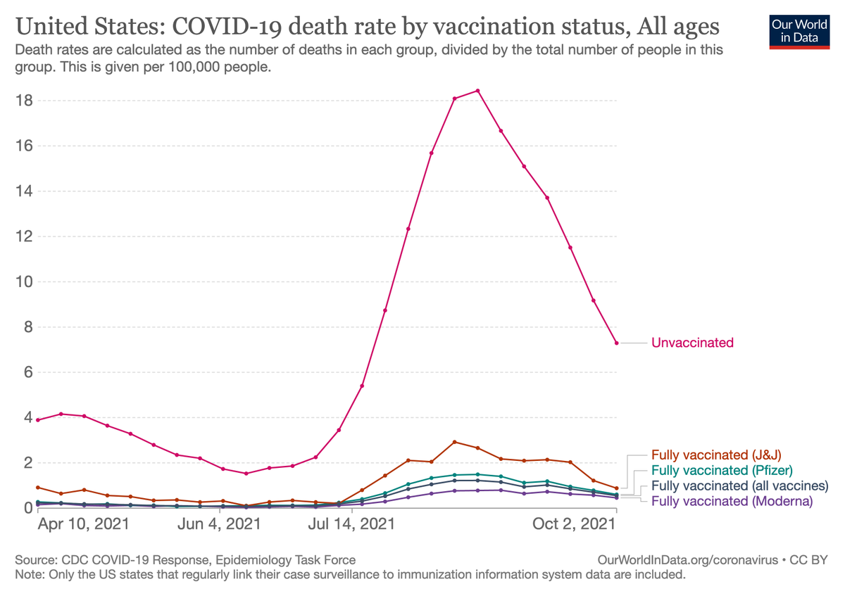
🇺🇸 The United States has fully vaccinated 58% of its population, mostly with the mRNA vaccines produced by Pfizer and Moderna.
This chart presents the COVID-19 death rate among unvaccinated people and among fully-vaccinated people (per 100,000 people in each group).
This chart presents the COVID-19 death rate among unvaccinated people and among fully-vaccinated people (per 100,000 people in each group).

🏴 England has fully vaccinated 68% of its population, mostly with the vaccines produced by AstraZeneca and Pfizer.
This chart presents the COVID-19 death rate among unvaccinated people and among fully-vaccinated people.
(In our post, you can also explore the data by age group.)
This chart presents the COVID-19 death rate among unvaccinated people and among fully-vaccinated people.
(In our post, you can also explore the data by age group.)

🇨🇱 Chile has fully vaccinated 83% of its population, mostly with the Sinovac vaccine.
This chart presents the COVID-19 death rate among people who are unvaccinated (or not fully vaccinated), among fully-vaccinated people, and among those who additionally received a booster dose.
This chart presents the COVID-19 death rate among people who are unvaccinated (or not fully vaccinated), among fully-vaccinated people, and among those who additionally received a booster dose.

These charts are based on real-world data reported by governments.
All show large differences between the death rates of vaccinated people and fully-vaccinated people.
They also show the extra protection provided by boosters in Chile, and differences *between* vaccines in the US.
All show large differences between the death rates of vaccinated people and fully-vaccinated people.
They also show the extra protection provided by boosters in Chile, and differences *between* vaccines in the US.
Finally, at the end of our post, we've started compiling a list of links to similar datasets for many other countries. If you are aware of an official source of disaggregated data that is not listed here, please send us feedback here on Twitter, or on our website.

• • •
Missing some Tweet in this thread? You can try to
force a refresh


