Edouard Mathieu Profile picture
Head of Data & Research at @OurWorldinData • Open data and research on the world's largest problems • Currently off Twitter, please reach out via my website
Aric Profile picture 1 subscribed
Feb 13, 2022 7 tweets 3 min read
Denmark is getting a lot of attention at the moment, with many people debating if the data shown on @OurWorldInData should be worrying or not.
While I won't comment on this precise question, it's important to remember that all we show on our charts is the *official* data.
(1/6) The issue at stake is the distinction between people dying "with" COVID vs "from" COVID.
This distinction wasn't a huge problem in 2020–2021. But with case counts exploding with Omicron, these "incidental" cases have come to represent a higher share of patients in some countries.
Jan 10, 2022 5 tweets 2 min read
Technical note: we've removed the weekly hospital admissions shown for Portugal – it seems that the source publishing it (@ECDC_EU) is making some error during their processing of the data, resulting in a time series that is much too low.
(And we'll also notify the ECDC) FYI, as far as I can see, all the rest of the Portuguese data (cases, hospitalized patients, ICU patients, deaths) is fine. It's just the hospital *admissions* that the ECDC is getting very wrong (possibly they're reporting daily admissions instead of weekly – but not sure yet).
Jan 10, 2022 4 tweets 2 min read
NEW: We now have daily-updated charts for the UK, Israel, and Spain, to compare key COVID-19 metrics to previous waves.

In this new post, I explain why they're so useful in monitoring the protection that vaccination provides against severe outcomes. ourworldindata.org/covid-metrics-… 🇬🇧 To this day, the UK has administered:

- At least 1 vaccine dose to 76% of its population
- All doses of the original protocol to 70% of its population
- 52 booster doses per 100 people

(In the post you can explore this data for England, Scotland, Wales, and Northern Ireland)
Dec 29, 2021 4 tweets 2 min read
(1) The massive number of infections in European countries is "real".
Yes, more people got tested for Christmas, and there have been some backlog issues in many countries.
But the 7-day positive rates have been rising rapidly, and nothing indicates that cases are "over-counted". (2) It's also true that the number of deaths remains very low right now.
Today, the global CFR has actually gone below 1% for the first time ever.
It's an imperfect metric, but it still means that the millions of cases we've seen haven't led to a *proportional* number of deaths.
Dec 20, 2021 4 tweets 2 min read
The Dutch vaccination data is one of the worst in Europe.
After almost a full year, there still aren't any files to download, and the coverage time series only include weekly figures.
The booster campaign started in November, but there still isn't any time series at all on that. Or have I missed the hidden website where they publish their data in a good format?
I've browsed coronadashboard.government.nl/landelijk/vacc… and rivm.nl/en/covid-19-va… many times now.
Nov 25, 2021 6 tweets 2 min read
South African cases in the JHU data show a big spike on Nov 23. This is likely to be a simple artifact or an error, rather than the number of cases detected that day. For now, we've removed that data point from the 7-day average on our charts. (Issue: github.com/CSSEGISandData…) In case that's not obvious, this doesn't mean the conversation & concerns around B.1.1.529 aren't relevant. It simply means that the cases specifically reported by JHU on November 23 shouldn't be linked to that conversation – because we don't know yet if those cases are "real".
Nov 25, 2021 6 tweets 2 min read
Media reporting on COVID vaccination should focus much less on fully-vaccinated people, especially when comparing countries.
It's a metric that has many more flaws than the rest of the vaccination figures, and we now know that it doesn't have as much epidemiological relevance. Flaw 1: the original definition of the protocols was sometimes very arbitrary. J&J doses give you a full vaccination, but only because that's what the company tested. But since J&J seems to give lower protection, many countries recommend people get a 2nd dose of another vaccine.
Nov 23, 2021 8 tweets 4 min read
NEW: To understand how the pandemic is evolving, it's crucial to know how death rates from COVID differ by vaccination status.
In this post we explain why rates are the key metric to use for this, and we show the latest data for the US, England, and Chile: ourworldindata.org/covid-deaths-b… Image 
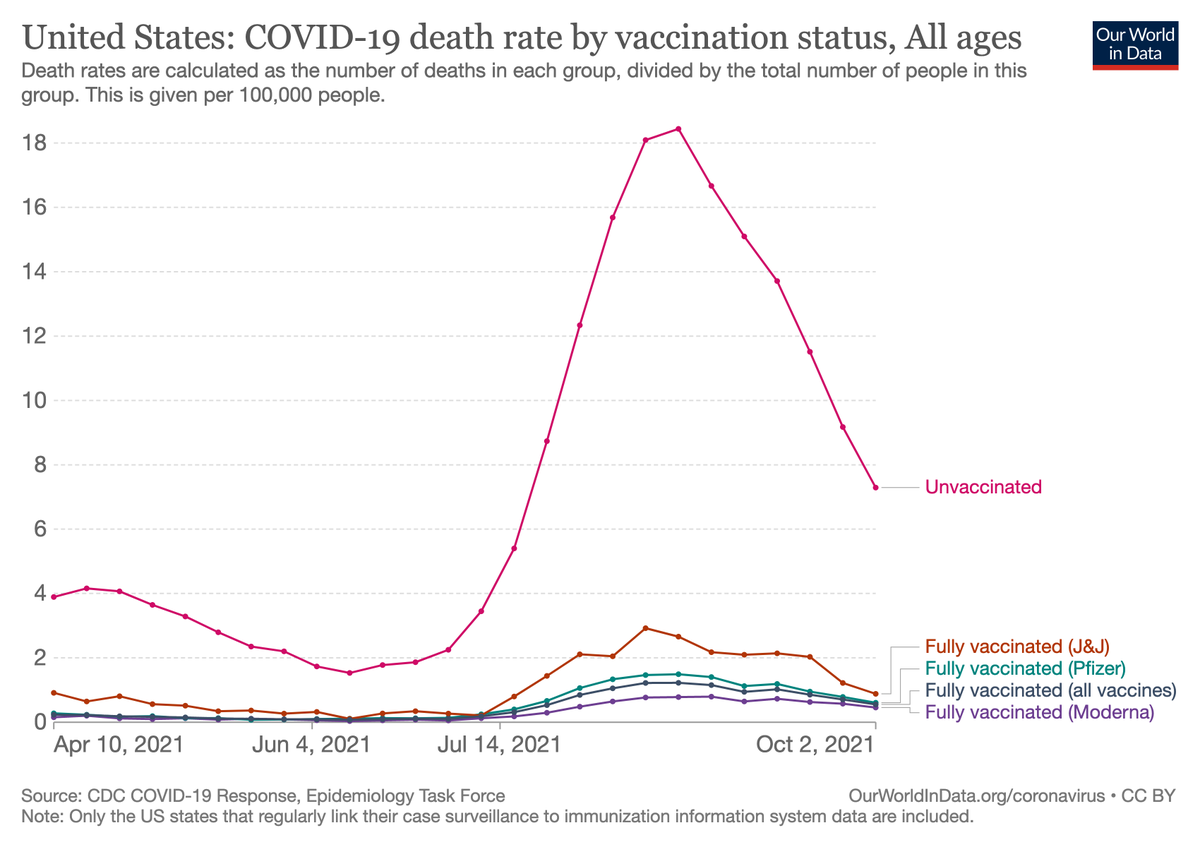
You may sometimes see headlines like “Half of those who died from the virus were vaccinated”.
But it would be very wrong to draw conclusions about the vaccines based on this headline, because we also need to know how many people in this population were vaccinated & unvaccinated. ImageImage
Sep 13, 2021 4 tweets 3 min read
We've added charts on country-by-country donations to COVAX: ourworldindata.org/covid-vaccinat…

Donations are broken down by whether they have been only announced, actually donated, or delivered to the recipient countries.

Chart 1 shows absolute numbers; chart 2 shows donations by GDP. ImageImage In absolute numbers, the largest pledges have come from:
🇺🇸 US: 290 million doses announced
🇬🇧 UK: 80 million
🇫🇷 France: 54 million

But so far only a fraction of these doses have been delivered:
🇺🇸 US: 77 million doses donated & delivered
🇬🇧 UK: 5 million
🇫🇷 France: 4 million Image
Aug 13, 2021 4 tweets 1 min read
There is a rising debate in Spanish Twitter following this tweet by Pedro Sanchez.

The question being: is it true that Spain is first in the world in vaccinations, or is it just the first country in the default selection on this chart?
Due to limited space on our charts and the number of countries in our data, we can't show all countries. We make a default selection based on a mix of criteria, the main one being population (if you can't show everyone, the second-best thing is to show as many people as possible)