Orwell2024🏒 Profile picture
Nov 23, 2021 7 tweets 4 min read Read on X
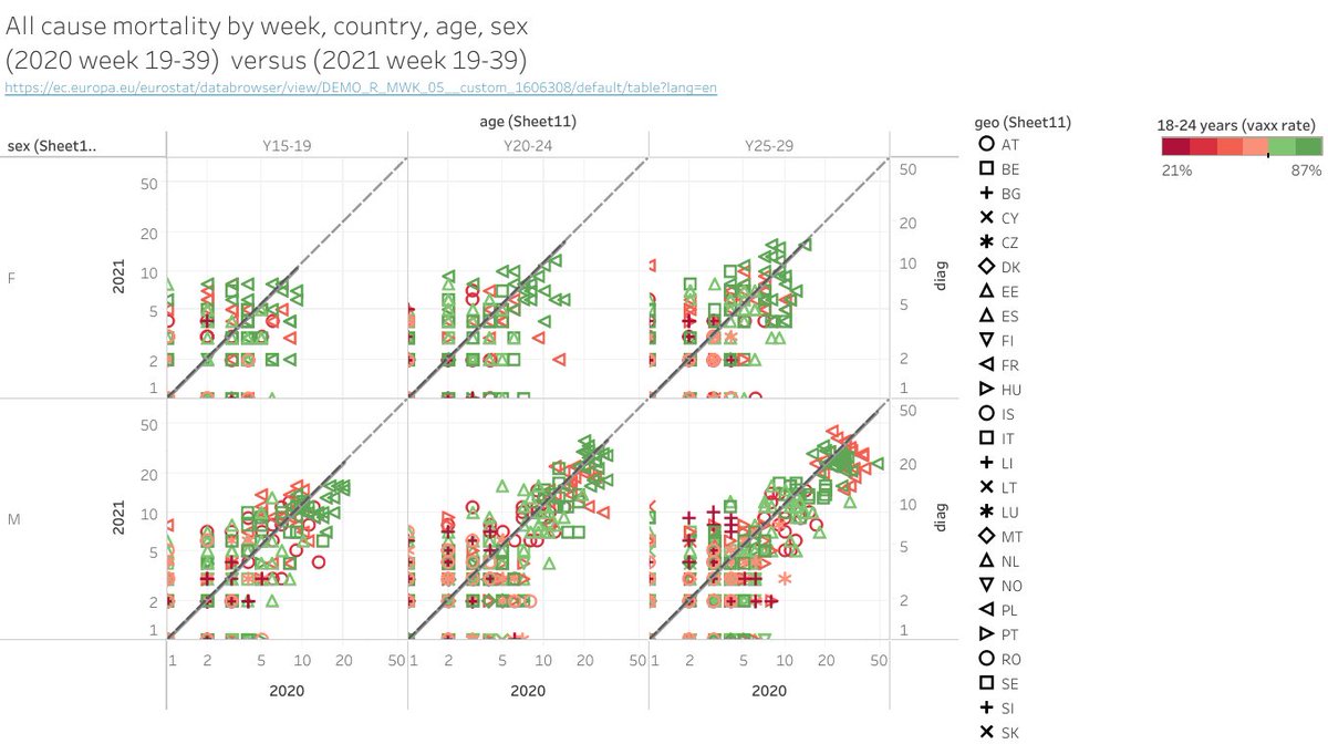
First: raw data correlation 2020 vs. 2021.

left: lin-lin
right: log-log
symbol: country
Colour: vaxx rate (%) for the 18-24 age
each point is one week

Looks ok now. So let's aggregate.
We sum mortality of weeks 19-39 for 2020 and 2021.

Then plot SUM(2020 W19:W39) vs. SUM(2021 W19:W39) by age, sex.

symbol: country
colour: vaxx rate (%) for the 18-24 age

Diagonal (with some excursion), as expected.

Now let's do more and define an "excess".
Now let's define a "2021 excess" as

SUM(mortality 2021 W19:39) - SUM(mortality 2020 W19:39)

We now plot excess vs vaxx rate by country, age, sex.

Finally: the correct answer was
A ✅
B ❌
C ❌
I cannot see any correlation.
Closer look on the 20-24 year old boys. I can't see any correlation.

We should normalize by the population size to get a relative excess which is not distorted by the country bin size, but that shouldn't change a lot.
Find here the dashboard with the joint dataset (after joining 3 sets: vaxx rate, mort. 2020, mort. 2021).
public.tableau.com/authoring/Mort…
Next time: same game for the elderly age bins. At some point, this magic, so important serum should give a pos. signal or not?😅
This may help to understand what I plotted. It’s basically the difference over a time window of @OS51388957 cumulative graphs. His graphs are a bit older, so they stop at week 30. But it nevertheless helps to understand I hope.
Upon request on latitude.


Here are the vaxx rate (left) and excess (right) maps for males 20-24

👉No excess correlation with latitude nor vaxx rate.

Note that DE is not in the EC data base. 🧐

• • •

Missing some Tweet in this thread? You can try to force a refresh
 

Keep Current with Orwell2024🏒

Orwell2024🏒 Profile picture

Stay in touch and get notified when new unrolls are available from this author!

Read all threads

This Thread may be Removed Anytime!

PDF

Twitter may remove this content at anytime! Save it as PDF for later use!

Try unrolling a thread yourself!

how to unroll video
  1. Follow @ThreadReaderApp to mention us!

  2. From a Twitter thread mention us with a keyword "unroll"
@threadreaderapp unroll

Practice here first or read more on our help page!

More from @orwell2022

May 22
1/ Let's do some checks: Compare the SST data model to water (ground) truth, thermometers in the water.

The green dots are the available @CDIPBuoys, a well maintained network. Probably the best buoy network (by @USACEHQ). Haven't seen any better one.

cdip.ucsd.edu/m/deployment/s…

Image
2/ Florida: the gulf area showing up red at the anomaly chart. The buoy shows nominal at average values. 25C versus +26-27C in the SST model. That's a +1C heat bias. Image
3/ Next - Hawaii. Buoys are below average. SST product is showing heat anomalies there.

14th May: buoy 24.5C vs. 25.5C SST.
+1C heat bias

Interesting. It's apparently too warm, as long as you don't stick a real thermometer into the water to measure and realize: it's cold. Image
Read 7 tweets
May 13
1/ Let's revisit this result from AIRS satellite measurements over 17 years, showing a +0.36W increase in forcing alongside a 40 ppm rise in CO2 concentration.

Does this align with the "observed" (questionable) increase in global temperature anomaly (+0.6C)?

Let’s do a check.
Image
2/The IPCC reports a calculated CO2 forcing of +0.5W, as detailed on the NOAA AGGI page, which you can find here:


The SW calculation overestimates by 40% compared to the +0.36W derived by the AIRS satellite, marking the first significant discrepancy. gml.noaa.gov/aggi/aggi.html
Image
3/ Now we return to Happer's paper, showing that doubling CO2 from 400 --> 800 ppm results in +3W of forcing.


This is consistent with +3.5W reported by the NOAA AGGI (+3.5W).

arxiv.org/pdf/2006.03098

gml.noaa.gov/aggi/aggi.html

Image
Read 7 tweets
Apr 25
Imagine claiming the trial was correct, deploying it to 95% in NZ/AUT, and then—boom!—the incidence explodes instead of the virus being eliminated which should already happen at ~70% rate, and was calculated mathematically to happen based on that very promise. False. Study ➡️🚮
Moreover, mortality rises instead of falling. Who are these people still lying about its mortality effectiveness? It’s a failure, and rightfully, Pfizer's stock is plummeting. Keep grieving; won’t help. We want the money back. Those who wanted it can still buy it with own money.
Image
Image
They think that they will get out of this? Desperation. Or did he just admit that everybody (including the CEO Fauci CDC…) were involved in deceptive advertising claims? I doubt that it is going to have a better outcome. Keep digging the hole 👍

Image
Image
Read 4 tweets
Oct 9, 2023
1/ Important. ERA5 is a weather model, not a measurement. This summer field tests revealed: rural areas suffer heat bias due to urban heat pollution, making models/interpolations heat biased.

Here a demo that ERA5 is wrong on the tested location.

Truth ~24C. ✅
ERA5: 28C. ❌
Image
2/ This implies that all temperature aggregations in climate aggregations incorporate the heat bias prevalent in rural areas. This outcome is hardly surprising given that the majority of weather stations are situated in urban or airport environments.
3/ Code to create custom location ERA5 graph: based on:
github.com/planet-os/note…
Image
Read 23 tweets
Oct 1, 2023
Men are women.
Plants don’t need CO2.

Brought to us by the unscientific cult.

Try to grow water plants without adding CO2. Try to grow plants in a fully air sealed greenhouse. And biological men: get pregnant.


Image
Image
Image
Image
They seem to rewrite history. Removing articles. 404 not found.
Image
Image
They also changed the headline now. Added „for now“. Obviously it was not narrative compliant.

Before and after.
Image
Image
Read 4 tweets
Sep 11, 2023
1/ Let's use the linear connection between Mortality and Life expectancy to illustrate the real implications of #netzero.

Energy scarcity will escalate mortality rates as there is no such thing as low energy consumption and high life expectancy.
Image
2/Context: When aiming to determine the Age-Standardized Mortality Rate (ASMR) rather than Life Expectancy (LE), we employ a straightforward relationship:

ASMR = 90 - LE
(valid for ESP2013 population)

However, for those who find it more relevant, we can maintain the LE-CO2 Image
3/ It's important to mention that money is an abstraction of promised future work (energy future). This is why the US dollar is linked to oil; US have grasped this concept.

Rather than $ inflation adjustments, you can express your wealth / income as tons CO2 (or MWh) instead.
Read 12 tweets

Did Thread Reader help you today?

Support us! We are indie developers!


This site is made by just two indie developers on a laptop doing marketing, support and development! Read more about the story.

Become a Premium Member ($3/month or $30/year) and get exclusive features!

Become Premium

Don't want to be a Premium member but still want to support us?

Make a small donation by buying us coffee ($5) or help with server cost ($10)

Donate via Paypal

Or Donate anonymously using crypto!

Ethereum

0xfe58350B80634f60Fa6Dc149a72b4DFbc17D341E copy

Bitcoin

3ATGMxNzCUFzxpMCHL5sWSt4DVtS8UqXpi copy

Thank you for your support!

Follow Us!

:(