Orwell2024🏒 Profile picture
Nov 25, 2021 9 tweets 6 min read Read on X
1/ Can we (theoretically) see vaccination deaths in all cause mortality? Difficult...

Let's take NL as example.

Even with a vaxx mortality of 1:10k (which is very high), we expect it to be buried in the background of mortality.

👉Maybe for <30y @OS51388957 @connolly_s
2/ The problem is that the vaccination will be diluted over many weeks.

I assumed that e.g. 10% of the population in an age group will vaccinate per week. Then this gives the expected weekly vaxx death background (red for 1:10k vaxx CFR-->1:100k, and blue 1:50k CFR-->1:500k).
3/ So we could maybe see it for the below 30y. But here, also the vaxx CFR is rather >>1:100k. So difficult. Maybe in cases when a lot of people vaccinated in the same week.

That's what @OS51388957 is hunting. He knows what he is doing. 😎🤙💪
4/ Sources for creating the population adjusted age graph for NL:

Mortality: ec.europa.eu/eurostat/datab…
Population: ec.europa.eu/eurostat/datab…
Derived 5 years bins for population:
public.tableau.com/app/profile/or…
Result:
public.tableau.com/app/profile/or…
5/ Correction for the 1:50k line (red). If 10% get vaxx per week, this gives 0.2 per 100k. So it would be buried in noise.

That doesn't mean that 1:50k is acceptable for healthy children wo have a lower C19 IFR than this!! Let's be clear on this!! 1:50k--> not OK even.
6/ To put things in perspective (for those not used to log scales): here a linear y-axis version of the plot.

But again: even a vaxx CFR of 1/500k would not be OK. This is not a small number for children!!
7/ Diclaimer: the CFR examples are theoretical(!!). I'm not saying that this is what we have for a healthy person. This value remains UNKNOWN. We have no data allowing to inferring what it is. The VAERS, PEI, Lareb, EMA reported deaths are to my view mostly co-morbidities.
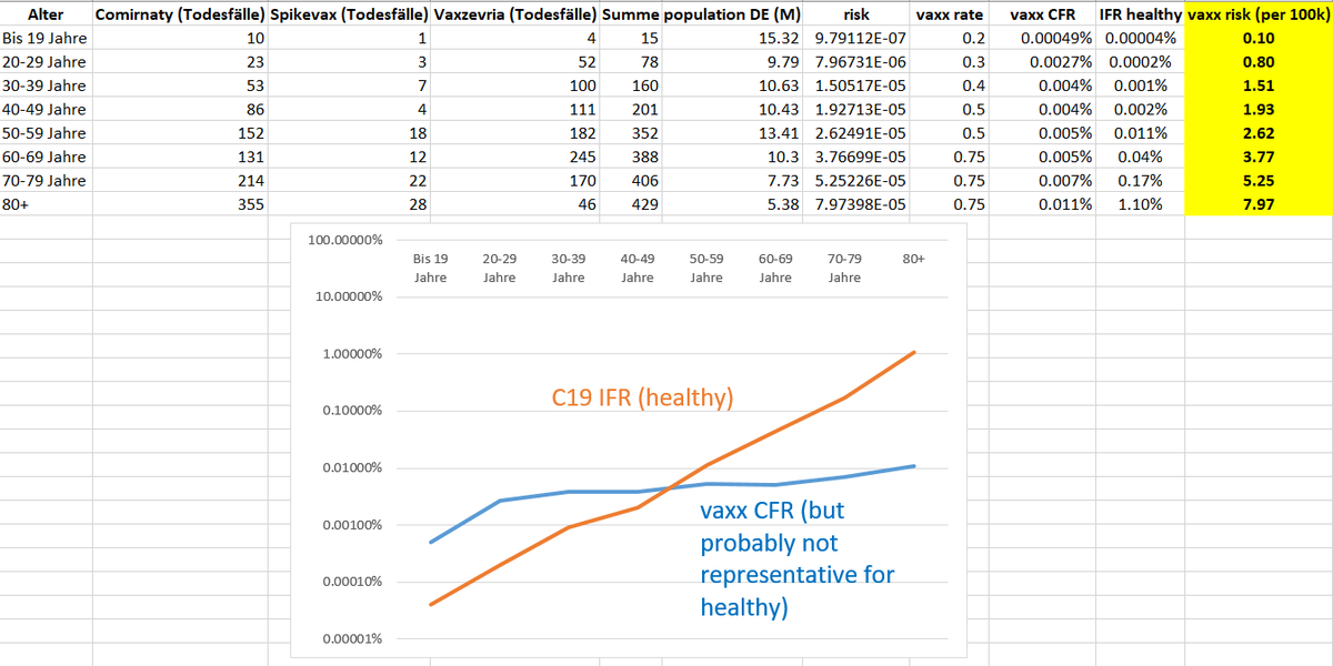
8/ Similar as C19 pushes the "weak" over the edge, the Spike vaxx may behave in the same way.

This was the vaxx CFR by age as extracted from the PEI report July 2021. Most likely, the vaxx CFR curve for healthy is far below this level. But I have no data to estimate what it is.

• • •

Missing some Tweet in this thread? You can try to force a refresh
 

Keep Current with Orwell2024🏒

Orwell2024🏒 Profile picture

Stay in touch and get notified when new unrolls are available from this author!

Read all threads

This Thread may be Removed Anytime!

PDF

Twitter may remove this content at anytime! Save it as PDF for later use!

Try unrolling a thread yourself!

how to unroll video
  1. Follow @ThreadReaderApp to mention us!

  2. From a Twitter thread mention us with a keyword "unroll"
@threadreaderapp unroll

Practice here first or read more on our help page!

More from @orwell2022

Jun 29
Stockholm downtown: Where’s the UHI correction?

QCU = raw data
QCF = adjusted data

Same numbers.

C A N -- Y O U -- S E E -- IT

Fredrik? Show us.
We can’t see it.

Where exactly is the downward adjustment of 2C-4C? That's the bias you have in 2025. Image
We can also do from SE raw. And we can also show how rural stations look. Frederik does like them. Climate agenda is measured in downtowns of the capitals? Image
Not sure if it’s normal that amateurs now have to lecture academics…?

The downtown station logs hourly=no need for even Ekholm, no need for re-sampling. Does Frederik even know what we mean? Nothing is adjusted. Also PHA leaves it as is as it only detects breakpoints (not UHI). Image
Read 5 tweets
Jun 27
1/ +++🚨BREAKING🚨+++

Yes. Hausfather & Berkeley Earth are pushing it.
But it’s not a measurement. Not one station shows that.
It’s what you get when you aggregate rot over time.

On the left: 8 pristine USCRN sites. Same y-scale.
Now look what they did.👇 Image
2/ 🚨 BREAKING 🚨

We overlay. Do you see it now?

👉 They erased the real past.
👉 They had no data to do so.
👉 It's pure statistical deception—and wrong.

How? All exposed in the Wickham et al. (2013) audit thread.🧵

Image
3/ AI to fraud is what DNA was to criminals.

Not optional. Not stoppable.

🧠 Fraud — exposed
📺 MSM — vanished
📄 Journals — obsolete
🎓 Academia — imploded
🏰 Ivory towers — rubble

Resistance is pointless.

github.com/orwell2024/usc…
orwell2024.github.io/GHCN-tools/Wic…
Read 6 tweets
Jun 23
1/ Weil’s beliebt ist: Hohenpeissenberg-Daten – fallen zwar schon nach BU-Filter raus, aber gut: Dr. Connolly war schlau.

Oben: Wie stark sich die Temperatur verändert hat.
Unten: Wie „unrund“ die Messwerte wurden – Entropie der Kommazahlen (h/t Connolly) Image
2/ Was wir hier sehen: Die Datenreihe ist ein Komposit (sehr beliebt, wenig seroes, in der Klima-„Wissenschaft“).
Die Messmethode (und mehr) hat sich verändert – von analogen zu digitalen Sensoren. Die Entropie der Nachkommastellen zeigt das – deutlich.
Image
3/ Diese Wetterstation ist NICHT standortstabil:
praktisch 100 % vom Menschen genutzte Fläche.

🟥 MODIS Urban (Klasse 13)
🟧 MODIS Agrarfläche (12 + 14)
🩸 GHSL Bebauung (2020)

Wer hier „Klima messen“ sagt, betreibt Täuschung.
Blamage für DWD.

Image
Read 12 tweets
Jun 22
1/ The result is simply wrong.
There are 2 stations there — we can compare.
🟥Red: Carlwood
🟩Green: Gatewick
We clearly see the overshoot.
Moreover: They’re using subhourly spikes (error) from a single, low-inertia sensor.
Total incompetence. Image
2/ Using TMAX from a low-quality single urban sensor is already peak incompetence.

But they go further — they take the spikes.
Even top-tier stations like USCRN show 2–3°C error at peak forcing.
USCRN uses triple sensors — worst spikes get voted out.

Image
3/ The UK has nothing like the USCRN triple-sensor setup.

So when two nearby stations disagree, the right move is simple:
Discard the implausible one — in this case, Charlwood.
What does the agenda-captured @metoffice do?
They run with the error.
They hoax the public.
ISO9001🤡 Image
Image
Read 6 tweets
Jun 12
1/ Back to Japan temperature trends.

We now add a smaller town: Suttsu. Still not truly rural nor stable site, but better.

We now show:
🟥 Kyoto
⬛️ Tokyo
🟦 Suttsu

Can you see it?

They then aggregate urban-biased data (rot) like this and call it “global temperature.” Image
2/ Here it is: Suttsu.

Not a high-quality reference site like
Valentia Observatory (Ireland) or h-USCRN sites.

But: Lower urban bias than cities like Kyoto or Tokyo. It starts to show the well known flatliner we see at stable sites. Image
Image
3/ To see it better, here’s 4 months side by side:

🟥 Kyoto
⬛️ Tokyo
🟦 Suttsu

This is man-made. The T trend is just unrelated to climate. It measures the site and environment change. Suttsu as expected least impacted. But it still is. Image
Read 17 tweets
May 27
The red areas are fully man-made—built or cultivated.
You cannot measure climate anywhere near them.
And MODIS still misses a lot.
In reality, it’s worse.

When we inspected what @BerkeleyEA calls “rural”?
Almost all those stations are worthless Image
Imagine a field looks like it does on the left…alive.
And later, like the right. Dead and brown.
Still think you'll measure the same 2m temperature?
Or might that just—possibly—have a major impact as the surroundings changed? GPT estimates 3C. It's not wrong. Image
Image
Image
We now combine MODIS 🟥 and P2023A 🟪 (10m resolution).

Look: MODIS misses entire urban zones— Ireland. Or Liverpool.

And yet @hausfath and @BerkeleyEarth built their “rural” claims on MODIS junk.
Shameful deception.
The paper needs a retraction.
Image
Read 6 tweets

Did Thread Reader help you today?

Support us! We are indie developers!


This site is made by just two indie developers on a laptop doing marketing, support and development! Read more about the story.

Become a Premium Member ($3/month or $30/year) and get exclusive features!

Become Premium

Don't want to be a Premium member but still want to support us?

Make a small donation by buying us coffee ($5) or help with server cost ($10)

Donate via Paypal

Or Donate anonymously using crypto!

Ethereum

0xfe58350B80634f60Fa6Dc149a72b4DFbc17D341E copy

Bitcoin

3ATGMxNzCUFzxpMCHL5sWSt4DVtS8UqXpi copy

Thank you for your support!

Follow Us!

:(