1/ "Age adjusted all cause mortality trends 2000-2021 in Europe"
This was quite some work, so I hope you appreciate the article. I don't think that this kind of analysis using 5 year age bin granularity over 20 year trends has been done elsewhere.
orwell2024.substack.com/p/age-adjusted…
This was quite some work, so I hope you appreciate the article. I don't think that this kind of analysis using 5 year age bin granularity over 20 year trends has been done elsewhere.
orwell2024.substack.com/p/age-adjusted…
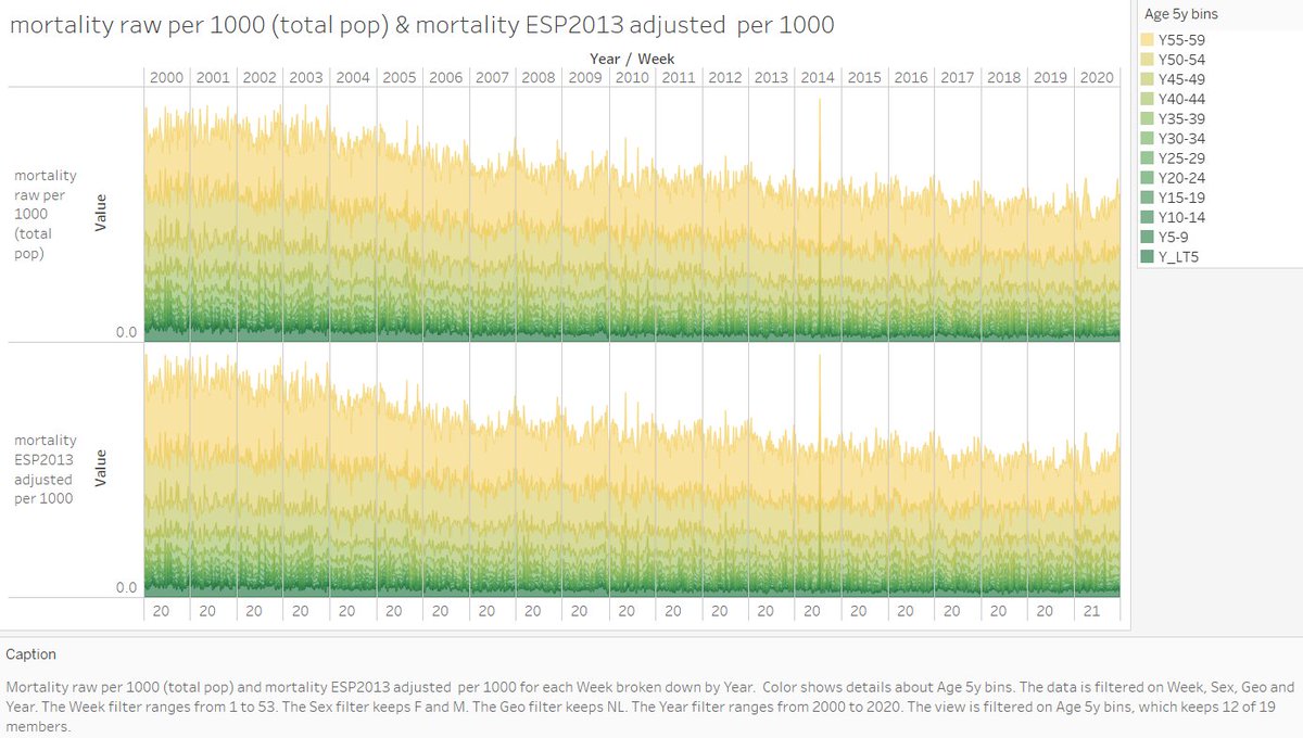
2/ The age adjustement was done on 5 year age bins.
Some groups @CebmOxford cebm.net/covid-19/exces… report age adjusted mortality for 2020. But the method is inaccurate as too wide age bins are used.
Some groups @CebmOxford cebm.net/covid-19/exces… report age adjusted mortality for 2020. But the method is inaccurate as too wide age bins are used.

3/ For teaching purpose, we also applied the WHO2015-2025 standard population in some graphs to demonstrate the problem if applying this to an old population.

4/ For 2020, this is the ESP2013 age adjusted full year mortality country ranking obtained.

5/ For reference, the below shows the full pandemic 96 weeks (2020 W1-2021 W44) ESP2013 age adjusted mortality country ranking. Many countries had to be excluded due to limited availability of mortality data for 2021.

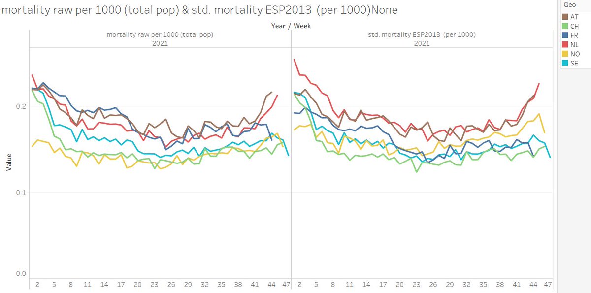
6/ An in depth look on the current year 2021 was done as there seems to be some concern about higher excess. To my view, this is mainly a random seasonal effect and maybe the price for lockdowns


7/ We further looked in depth to the NL situation in 2021. Nothing particular is happening in the age group <65. The excess is dominated by the elderly group (like in 2020). Covid is not visible <65.

8/ We further noticed, that using symmetric standard populations for sex is “old men friendly”. It will be less sensitive towards elderly female deaths. EC and @who standardisation groups are advised to adapt and remove this artefact.

9/ We further see that the open approach of Sweden lead to outperforming their lockdown neighbours on the 96 weeks 2020-2021 timeframe.
This is likely an anti-correlation with the cumulative stringency of lockdowns.
Sweden was right.
DNK and FI wrong.
NO is simply rich.
This is likely an anti-correlation with the cumulative stringency of lockdowns.
Sweden was right.
DNK and FI wrong.
NO is simply rich.


10/ 2021: Neither a positive nor negative impact of the vaccine can be seen. At least it’s not of any relevant dominance. Other causes dominate. Probably lockdown, or random seasonality as also lockdown hardliners like France is doing ok for now.
11/ The observed excess mortality in AT and NL, is dominated by mortality in the elderly age bins. But those are 95 % vaccinated like in SWE and FR. The vaccine doesn’t reduce nor increase all cause mortality. QR passports and the one dimensional C19 health focus has to stop.
@jens_140081 @FrankfurtZack @holmenkollin @SHomburg @mauricedehond @DrJBhattacharya @MartinKulldorff @MLevitt_NP2013 @connolly_s @profnfenton @prof_freedom @mr_Smith_Econ @dimgrr @USMortality @OS51388957 @CebmOxford @OurWorldInData @MaxCRoser @redouad @prof_shahar @plaforscience
12/ I'm adding 2021 interim result for the first 44 weeks. That will certainly change once we look to this in some month or two. The raw mortality data even for the available weeks may still change due to delayed reporting.
France.😀 Didn't have them on the radar. Bah oui 👋
France.😀 Didn't have them on the radar. Bah oui 👋

13/ The French paradox. Is it BMI? Anyone who has lived there and in other countries knows their outperformance on food culture although I do prefer the high fat/carb Italian / Spanish kitchen.
🇫🇷 France wins on food category, like it or not. We know their secret now.
🇫🇷 France wins on food category, like it or not. We know their secret now.

For comparison, 2020-2021 96 weeks and the vaccination map in the 60+ age group.
mortality (left)
C19 vaxx 60+ level (mid)
BMI (right).
There is no real correlation with vaccination levels. But there seems to be with BMI. Surprised? Not me.
mortality (left)
C19 vaxx 60+ level (mid)
BMI (right).
There is no real correlation with vaccination levels. But there seems to be with BMI. Surprised? Not me.

14/ I downloaded more data.
Here the age standardised mortality on a map next to the obesity map. 2015 - 2020 (Covid "tragedy")
I'm very angry now seeing it like this.
The obese old society is blaming healthy people like me (BMI 20) and my kids = malfeasance.
Here the age standardised mortality on a map next to the obesity map. 2015 - 2020 (Covid "tragedy")
I'm very angry now seeing it like this.
The obese old society is blaming healthy people like me (BMI 20) and my kids = malfeasance.

• • •
Missing some Tweet in this thread? You can try to
force a refresh