WCAG 3 will use a new color contrast method called APCA (Advanced Perceptual Contrast Algorithm).
It's a big improvement over the current system but there are a lot of changes to get your head around.
🧵
It's a big improvement over the current system but there are a lot of changes to get your head around.
🧵
1. The most obvious change is the new scoring system.
The ratios are replaced by a level out of 100(ish).
The higher the number, the higher the contrast.
The ratios are replaced by a level out of 100(ish).
The higher the number, the higher the contrast.

Here's what they mean:
15 - 🚫 Minimum for non-text elements
30 - ⚠️ Absolute min for any text
45 - ‼️ Min for large text (the old 3:1)
60 - ❗Min for body text (the old 4.5:1)
75 - ✅ Preferred level for body text
15 - 🚫 Minimum for non-text elements
30 - ⚠️ Absolute min for any text
45 - ‼️ Min for large text (the old 3:1)
60 - ❗Min for body text (the old 4.5:1)
75 - ✅ Preferred level for body text


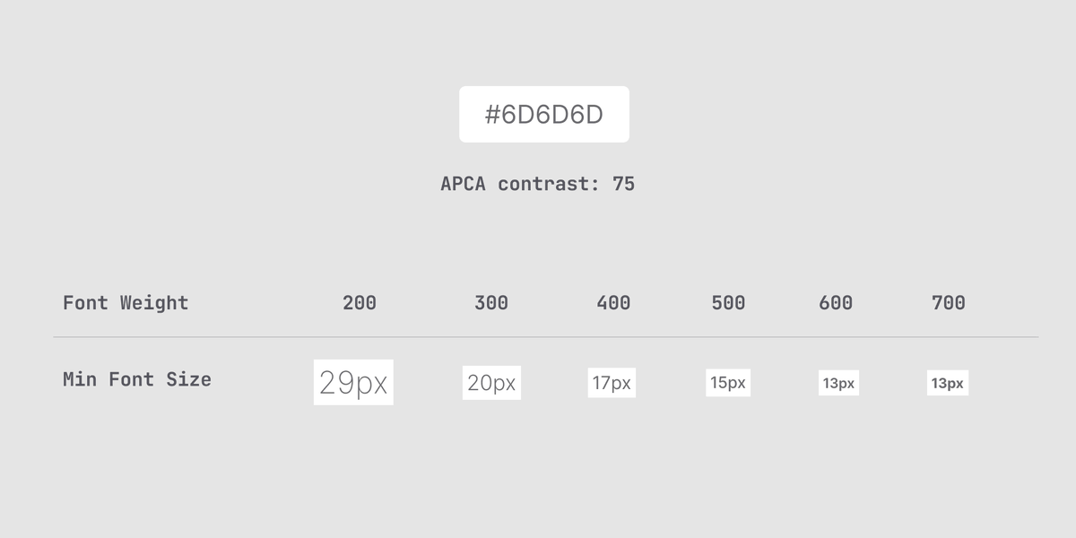
2. The new standard takes text size and weight into account.
The score changes depending on the size and weight - meaning much less guess work for you.
The thinner the font, the worse the score.
The score changes depending on the size and weight - meaning much less guess work for you.
The thinner the font, the worse the score.

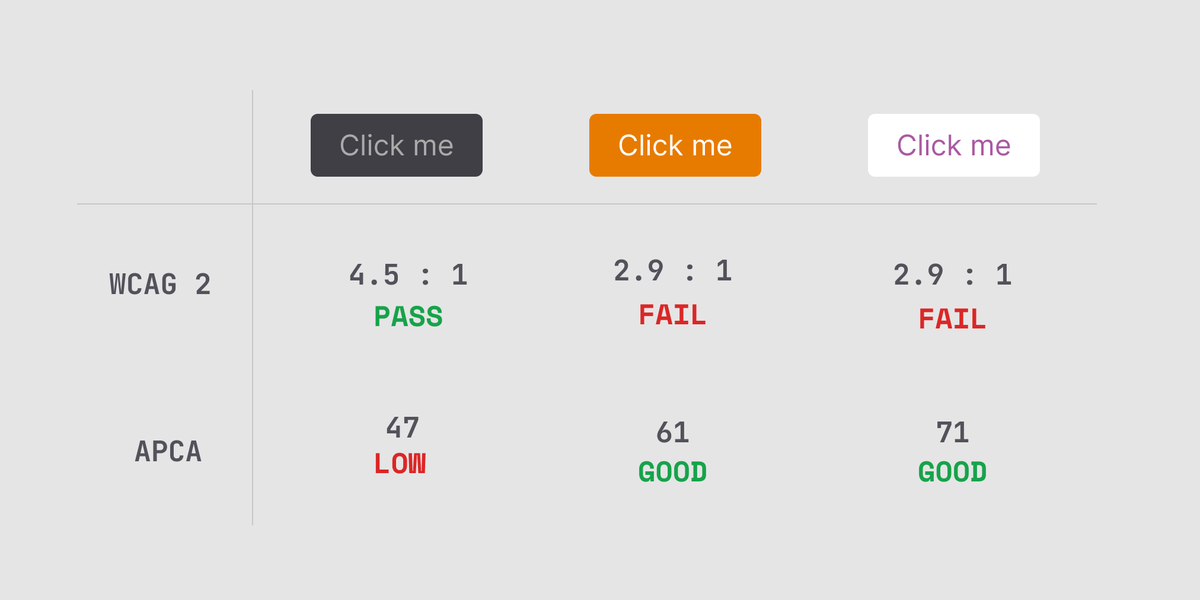
3. Unlike WCAG 2, swapping text and background color affects the result.
This makes sense when you think about it - text has a lower visual area and thus lower contrast.
This makes sense when you think about it - text has a lower visual area and thus lower contrast.


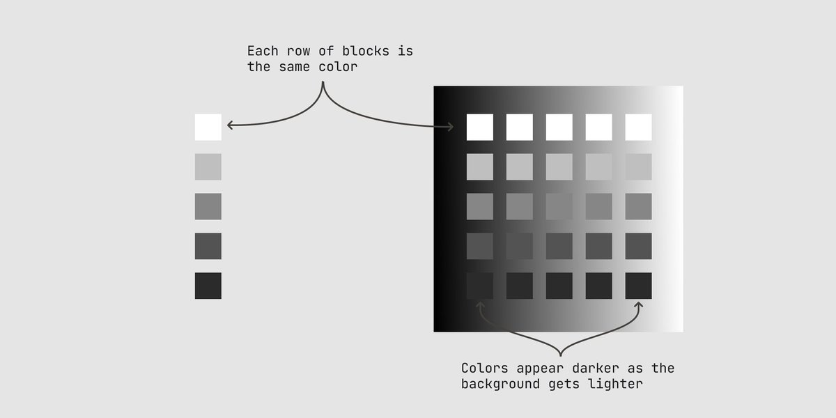
4. The APCA contrast calculation is perceptually uniform.
Humans don't perceive contrast linearly across hue and lightness and APCA takes this into account.
WCAG 2 modelled contrast mathematically.
Humans don't perceive contrast linearly across hue and lightness and APCA takes this into account.
WCAG 2 modelled contrast mathematically.

This takes care of those weird issues WCAG 2 would struggle with, like orange buttons.


tl:dr
WCAG 3 will make your life easier as a designer. It isn't out yet but you can (and should) use APCA now.
@MyndexResearch has a great tool here:
myndex.com/APCA/simple
WCAG 3 will make your life easier as a designer. It isn't out yet but you can (and should) use APCA now.
@MyndexResearch has a great tool here:
myndex.com/APCA/simple
Also their piece explaining the benefits of APCA is great reading:
github.com/Myndex/SAPC-AP…
github.com/Myndex/SAPC-AP…
If you want to read a bit more about the problems with WCAG 2, I made a tweet thread about that here:
https://twitter.com/DanHollick/status/1417895151003865090
You can read the unrolled version of this thread here:
typefully.app/u/DanHollick/t…
typefully.app/u/DanHollick/t…
• • •
Missing some Tweet in this thread? You can try to
force a refresh