I went to that Van Gogh immersive thing today and it was super interesting. Many thoughts:
First off, it is not narrated, and the paintings are treated more like a visual remix. Elements if multiple paintings are collaged in a single animated scene
As you prob know, audiences are flocking to the show(s) and I wonder if it is because the visuals use the language of film rather than the language of painting.
The other surprise was how arty it was. The beginning was very discordant and glitchy. I guess a premonition of his mental state- but nothing was explicit. The music was a mix of abstract electronic and classic but in a surprising way for such a popular reaction.
I also wondered if the overwhelmingly positive reaction was related to our need to reconnect with something more authentic, as if the animated paintings represented a more shared understanding of truth/beauty.
But if that were so, what does that say about the format that so clearly resonates? Maybe we are entering the age if the immersive remix? If so it proves that a general audience can certainly be pushed aesthetically and narratively.
One last comment - staying through the end included credits for all the technical folks, and then the merchandise team, a group of investors, and then the groups that staged the show. While fairly “inclusive”, it is many steps away from the cult if the curator.
• • •
Missing some Tweet in this thread? You can try to
force a refresh
Monroe N. Work was an African American sociologist, scholar, and researcher who spent his life collecting information and helping others to understand it. The highlight of his career, according to Work, was the nine editions of the Negro Year Book between 1912 and 1938.
He collaborated with W.E.B. Du Bois and Booker T. Washington, positioning him at the intersection of Black leadership and education in the US for most of his life. He started the Dept. of Records and Research at the Tuskegee (@TuskegeeUniv) to collect facts:
I lecture on topics related to dataviz, but last week I presented this at @InfographicsNL on my evolving thoughts on @midjourney (+ @OpenAI & @StabilityAI). I have a few interesting ideas on how we can use language and images to design AI pictures /🧵
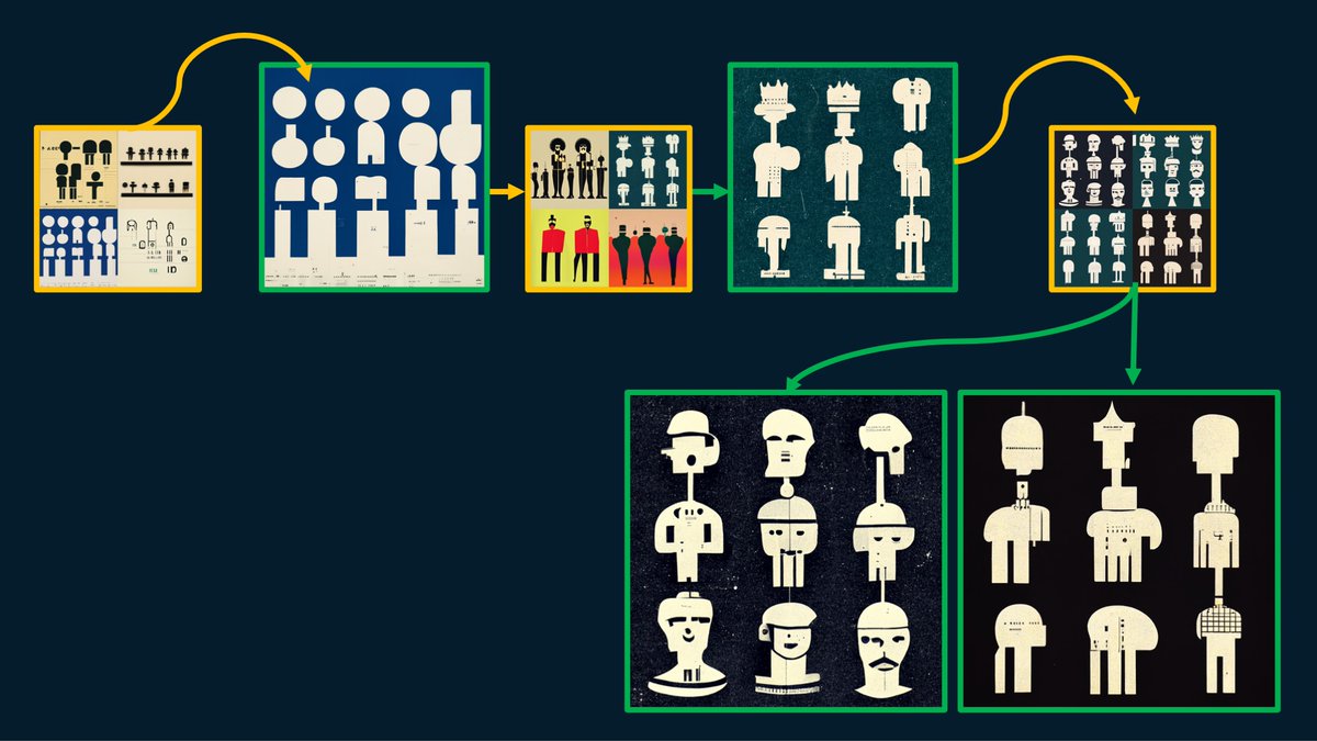
The talk does 2 or 3 things. First, it explains how to use Midjourney. This is a diagram of the variations and upscaled images and shows how quickly ideas can morph:
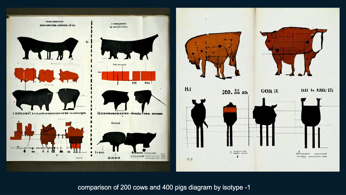
The lecture also walks through my story of using these new tools. When I started I was focused exclusively on using Midjourney to explore new design patterns in Isotype research.
People are loving AI-fueled dataviz, so here's a thread on a project that I made in May but never shared. The prompt was "hyperdetailed illustration of economic prosperity, 1965, lenticular rainbow, by isotype". The design put this among the first responses:
A few iterations later, all of a sudden a bunch of people show up at the bottom. The rainbows begin to curve and the city reciedes.
Among the following versions, was this one pulling the bars into buildings. The texture at the bottom may have been the people?
Today we launched a novel dataviz project on a serious subject - the mental health of working parents. Our team (led by @adsevenfour) felt that the human side of the data really needed to be stressed - what better way than with 100 little people walking between the categories! /1
You can really explore the data in a variety of ways and view some demographic cuts as well
One of the most interesting findings is in the days off work, as most people didn't take more than 5 days off.
I haven’t been sharing as much lately because I’ve been trying not to buy too many more books, but today I started looking through Karl G Karsten’s fantastic 1926 Charts and Graphs. Here’s what we says about our favorite chart type:
I really like this pile of shells:
I have no idea what this is, but I feel like a drew a sketch of this earlier this afternoon!
In preping for a lecture that I'll give at the end of the month, I've been looking into the more recent history of dataviz - mostly the 1970s. I just realized that celebrating the VISUAL in dataviz is totally a concept that could "only happen now" - a thread:
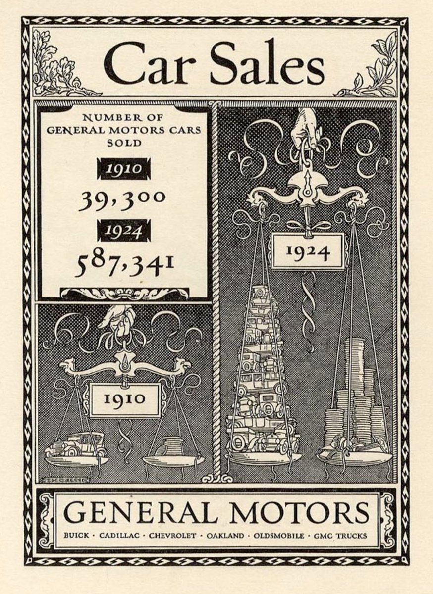
In the early 20th-century, data visualization rapidly moves away from statistics and towards advertising such as this: "Car sales" - Thomas Cleland, 1924
In the 1930s printing technology continues to be better, cheaper, faster. As a result, designers pull in dataviz techniques for multitudes of publications, which I think is best embodied by Fortune Magazine. "Retaliatory Power" Max Gschwind, 1954