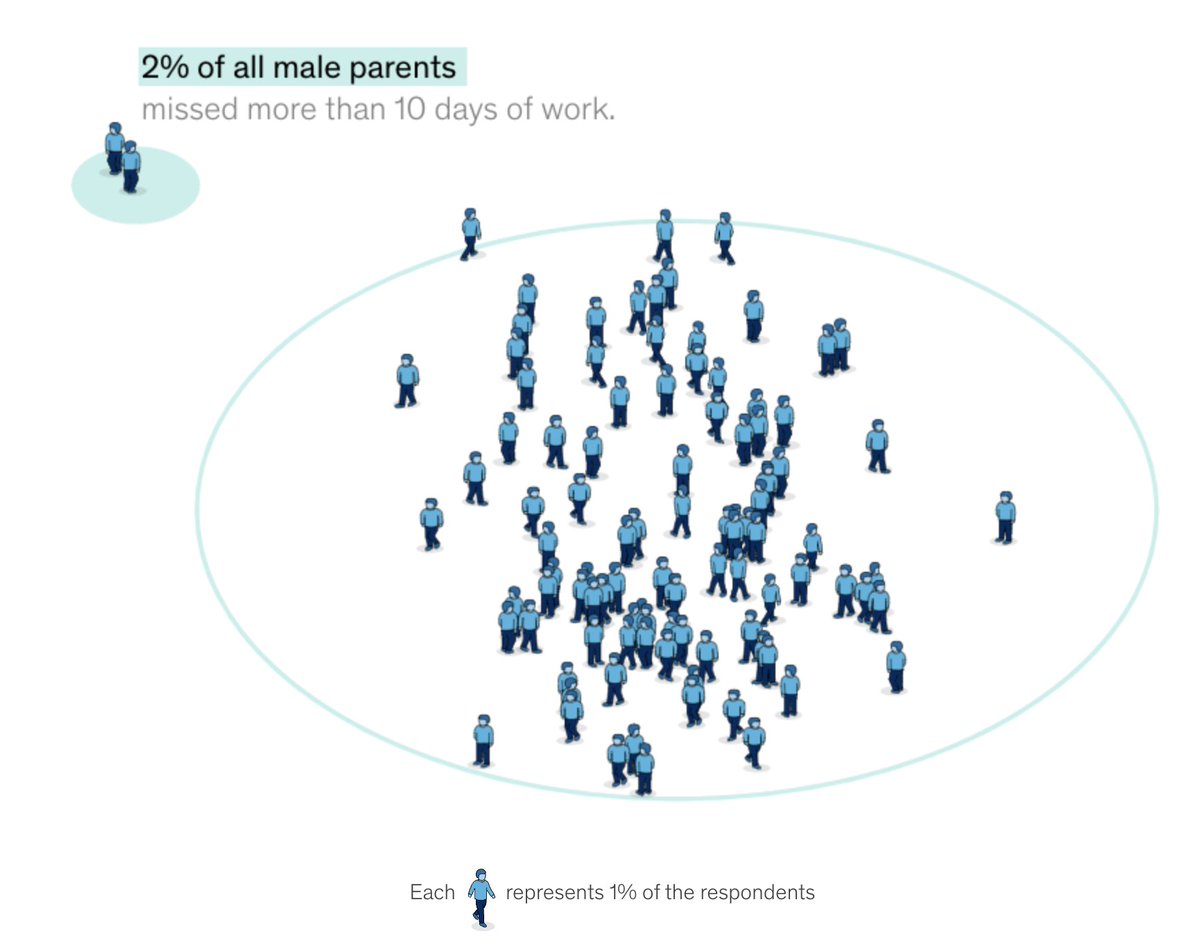
Today we launched a novel dataviz project on a serious subject - the mental health of working parents. Our team (led by @adsevenfour) felt that the human side of the data really needed to be stressed - what better way than with 100 little people walking between the categories! /1
You can really explore the data in a variety of ways and view some demographic cuts as well
One of the most interesting findings is in the days off work, as most people didn't take more than 5 days off.
Only 2% needed to take more than 10 days off - but visualizing in this way shows small % changes in a very human way
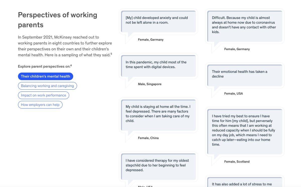
We also pull in quotes from working parents around the world. What I found especially interesting was how I identified with almost every comment. We're all in this together!
And we wrap up the project with a view of the employer offerings. Great design here again from Andy Davies and the team.
Here's the interactive page - please share your thoughts! This project was really a labor of love and the complexity of the code was really something! covid-tracker.mckinsey.com/working-parents
• • •
Missing some Tweet in this thread? You can try to
force a refresh
I went to that Van Gogh immersive thing today and it was super interesting. Many thoughts:
First off, it is not narrated, and the paintings are treated more like a visual remix. Elements if multiple paintings are collaged in a single animated scene
As you prob know, audiences are flocking to the show(s) and I wonder if it is because the visuals use the language of film rather than the language of painting.
I haven’t been sharing as much lately because I’ve been trying not to buy too many more books, but today I started looking through Karl G Karsten’s fantastic 1926 Charts and Graphs. Here’s what we says about our favorite chart type:
I really like this pile of shells:
I have no idea what this is, but I feel like a drew a sketch of this earlier this afternoon!
In preping for a lecture that I'll give at the end of the month, I've been looking into the more recent history of dataviz - mostly the 1970s. I just realized that celebrating the VISUAL in dataviz is totally a concept that could "only happen now" - a thread:
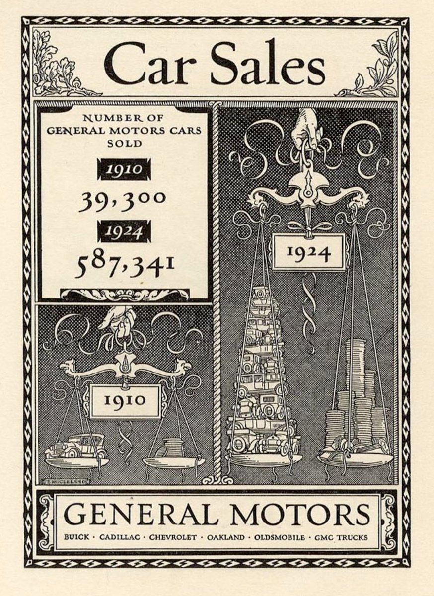
In the early 20th-century, data visualization rapidly moves away from statistics and towards advertising such as this: "Car sales" - Thomas Cleland, 1924
In the 1930s printing technology continues to be better, cheaper, faster. As a result, designers pull in dataviz techniques for multitudes of publications, which I think is best embodied by Fortune Magazine. "Retaliatory Power" Max Gschwind, 1954