
Short THREAD on log scales and why I tend not to use them.
I've been criticised at times for not plotting case numbers etc on a log scale. I want to explain why.
TLDR: essentially it's because the burden of covid ill health and on NHS is people not log people. 1/8
I've been criticised at times for not plotting case numbers etc on a log scale. I want to explain why.
TLDR: essentially it's because the burden of covid ill health and on NHS is people not log people. 1/8
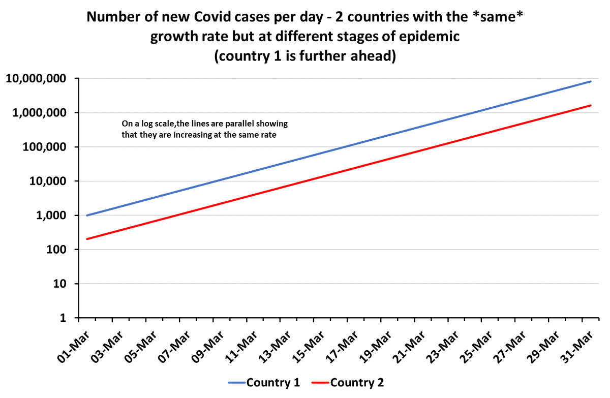
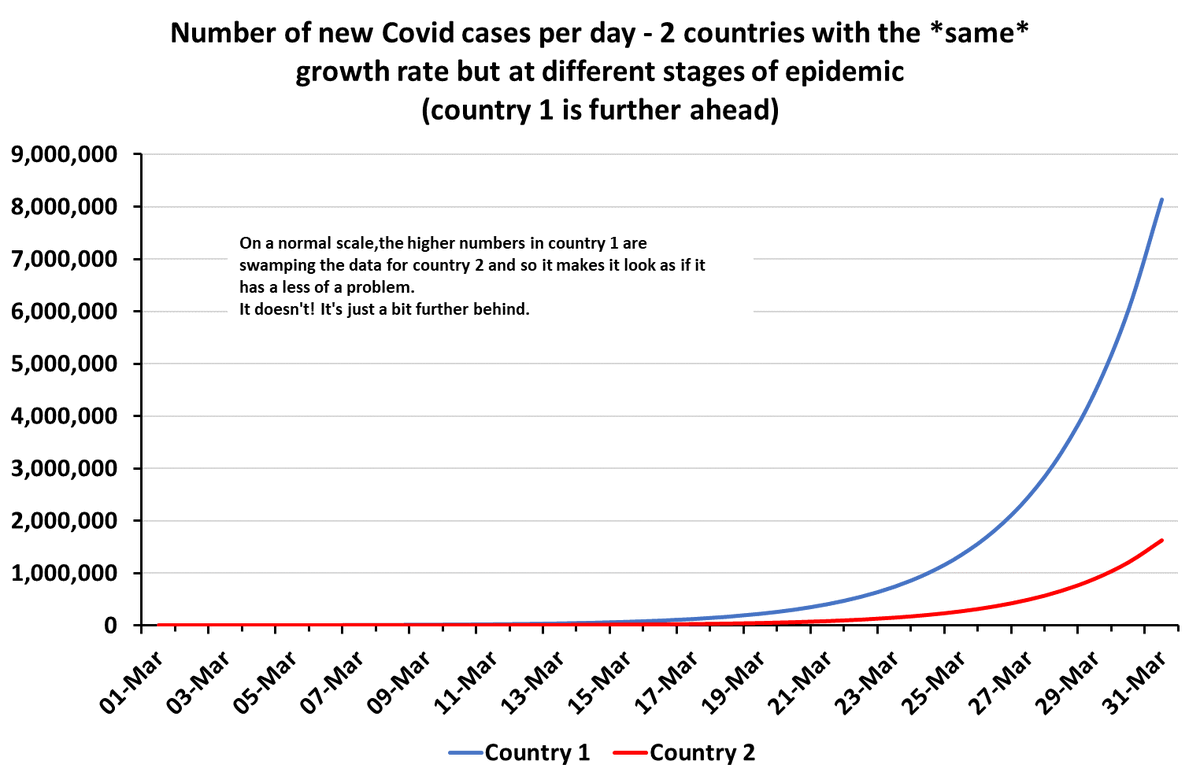
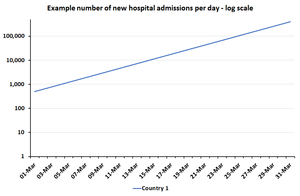
When you've got exponential growth (e.g. in new covid cases or hospital admissions, it will be a straight line if you put the vertical axis on a "log scale" (normally equally spaced powers of 10).
Charts show same exponential growth on a normal scale and a log scale. 2/8
Charts show same exponential growth on a normal scale and a log scale. 2/8


Log scales are really useful for e.g:
a) seeing if growth is exponential (straight line?)
b) looking for acceleration or slow down in growth
c) comparing growth between countries at different stages of epidemic 3/8
a) seeing if growth is exponential (straight line?)
b) looking for acceleration or slow down in growth
c) comparing growth between countries at different stages of epidemic 3/8
And if I'm trying to do those things I will use log scales and (sometimes) share log scale plots.
But often I stick to normal ("linear") scales and explain that growth rates are equal or that growth is exponential etc in words instead.
Why? 4/8
But often I stick to normal ("linear") scales and explain that growth rates are equal or that growth is exponential etc in words instead.
Why? 4/8
Firstly, most people don't look at data charts very often.
So I try to make mine as intuitive & foolproof as possible. Most people haven't done logs since they were teenagers & don't remember how they work.
Logs are also NOT intuitive. Our brains don't work that way really. 5/8
So I try to make mine as intuitive & foolproof as possible. Most people haven't done logs since they were teenagers & don't remember how they work.
Logs are also NOT intuitive. Our brains don't work that way really. 5/8
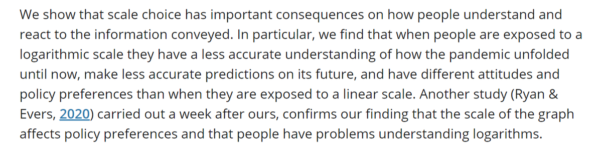
You can label your charts brilliantly on log scales, but often people react as if they are still showing you *linear* effects - not exponential ones. This means that people might instinctively underestimate the scale of the problem.
E.g.onlinelibrary.wiley.com/doi/full/10.10… 6/8
E.g.onlinelibrary.wiley.com/doi/full/10.10… 6/8
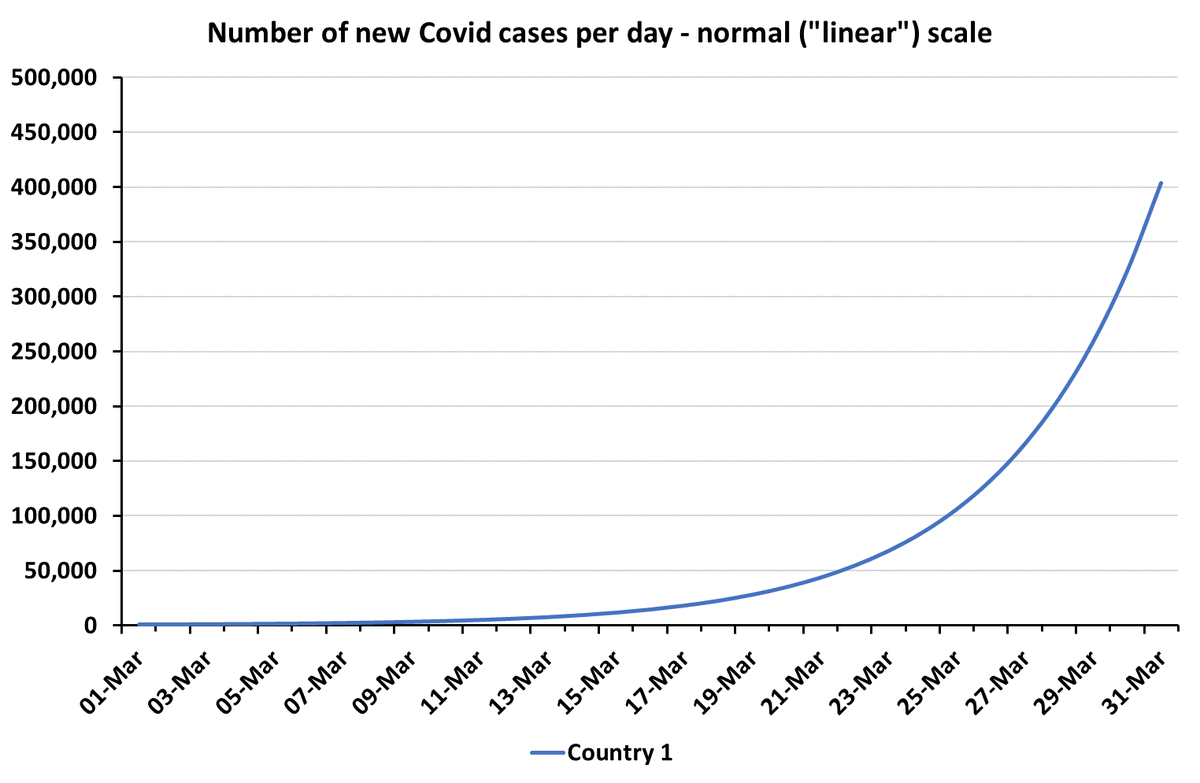
Finally, the *impact* of exponential growth in ill health is on people. They don't come in logs.
Impact is exponentially worse the longer exponential growth continues. Acting early makes a HUGE difference.
Linear scales do a better job of showing that than log scales. 7/8
Impact is exponentially worse the longer exponential growth continues. Acting early makes a HUGE difference.
Linear scales do a better job of showing that than log scales. 7/8
If your audience is people who have adapted to log scales then logs are fantastic. I avidly follow many people here who use them because I find them very informative.
But for a general audience who might spend 10 seconds looking at your chart, I much prefer linear. 8/8
But for a general audience who might spend 10 seconds looking at your chart, I much prefer linear. 8/8


• • •
Missing some Tweet in this thread? You can try to
force a refresh


