Tonight, I'm going to talk about Temperature Anomaly maps and how they are constructed, used, misused and abused for weather and climate including science and advocacy. This should be fun. 

Using weather models or historical observation data, grids are formed of daily, monthly and annual temperatures over a given time period maybe 20 years or 100 years+.
This Period of Record (POR) dataset is then used to select or construct the baseline climatology e.g. 1991-2020.
This Period of Record (POR) dataset is then used to select or construct the baseline climatology e.g. 1991-2020.
This map is month-to-date gridded Japanese reanalysis data -- a type of weather model output from forecasts run consecutively using a modern model but the original data from decades ago. This is meant to faithfully represent the true state of 3D atmosphere & ocean.

The baseline used here is 1991-2020 called the Climate Normal period. You may often see 1981-2010 or 1961-1990 or even 1951-1980. These 3 decade chunks are designed to represent the climate regardless if there are rapid changes or not.
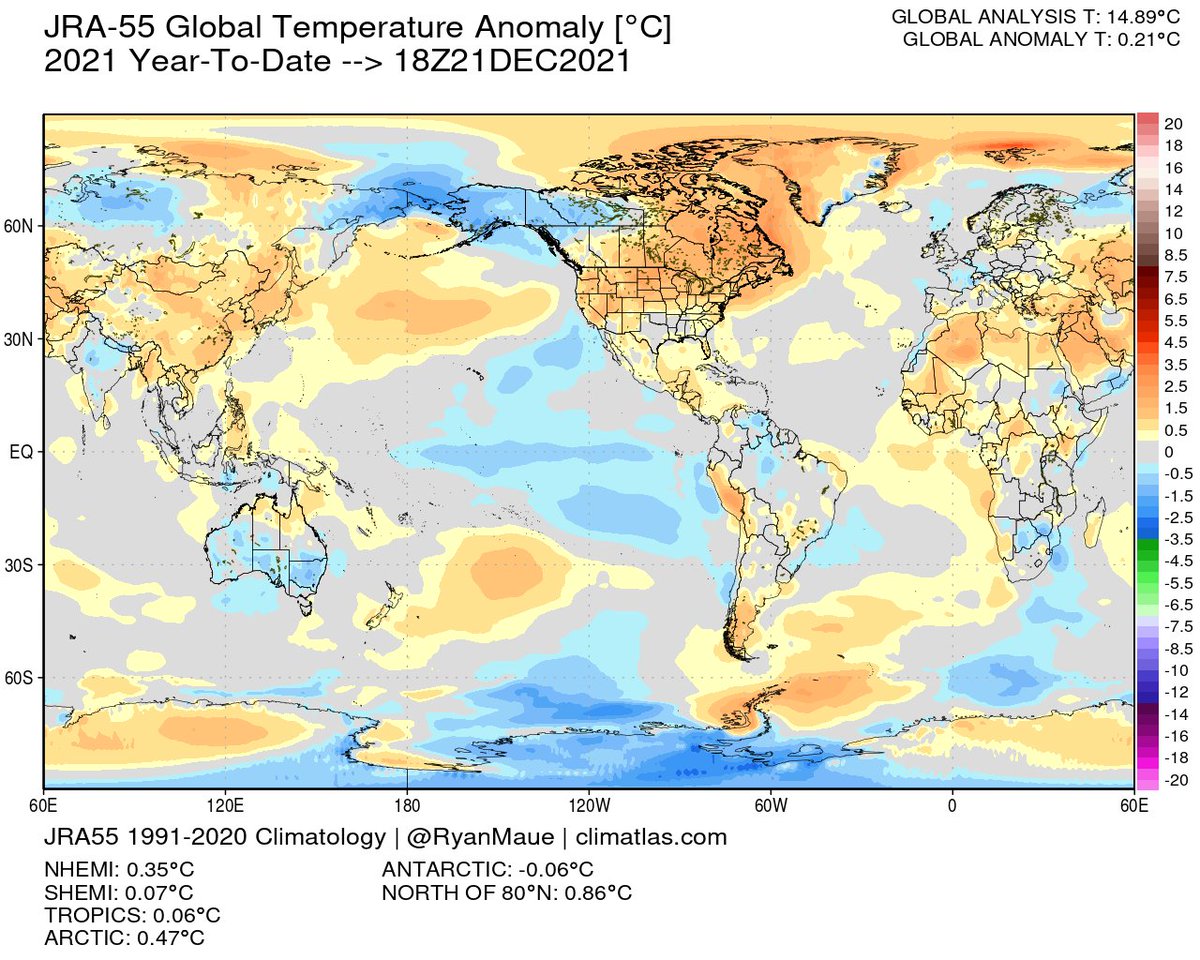
Let's compare with a previous December 2015 during El Niño. The global anomaly is +0.53°C over the 1991-2020 mean, while this December 2021 is +0.27°C. Yes, that is a cooling of 0.25°C if compared directly.
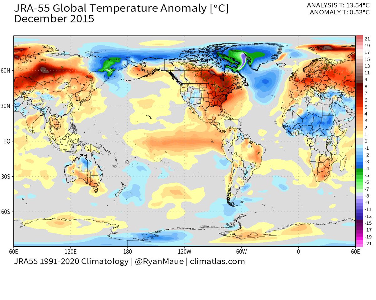

But you wouldn't say global warming stopped because December 2021 is cooler than December 2015. That would be misinformation w/o proper context -- and that is the long-term data trend convincingly upward.
Here's every day T anomaly since 1990 from same Japanese dataset.
Here's every day T anomaly since 1990 from same Japanese dataset.

This is the daily global temperature anomaly smoothed by running 30 day mean. You should see dramatic spikes on weekly and monthly time scales against backdrop of slow trend of background global warming.
What causes spikes? Ocean and atmosphere primarily thru weather.
What causes spikes? Ocean and atmosphere primarily thru weather.

Let's zoom in closer to see the sub-daily changes in global temperature meaning capturing 4x daily the temperature anomaly when Earth is half dark / half sunlight.
Check out the wild swing from -0.4°C to +0.4°C from March 2021 to April 2021. That's +0.8°C in a month. Whoa!
Check out the wild swing from -0.4°C to +0.4°C from March 2021 to April 2021. That's +0.8°C in a month. Whoa!

Here's a current example from ECMWF operational weather model. Global T anomaly drops from +0.21°C to -0.12°C in 10 days, a dramatic global cooling by 0.33°C. Yeah, that's entirely weather related on such short time scales -- and this is b/c of how cold/warm air affects land.


But I see more red than blue, it's obvious which one is warmer. I'd say that's misleading as the maps are flat projections, and the most extreme values are most assuredly concentrated in narrow or small regions. Plus, this is a snapshot instant while 24-hours different story.
But, I see extremely warm temperatures in United States and the global anomaly is +0.20°C so that's proof of climate change.
That's misleading for 2 reasons:
You can't point to 1% of the Earth and say "climate change" when there's obviously balancing cold elsewhere.
That's misleading for 2 reasons:
You can't point to 1% of the Earth and say "climate change" when there's obviously balancing cold elsewhere.
And, you can't compare raw temperature anomalies on different parts of the globe at the same time!
Why? The background variance or typical temperature change on a given day may be +/- 50°F in Alberta or Minnesota vs. only +/- 1°F in the tropics.
You must normalize!
Why? The background variance or typical temperature change on a given day may be +/- 50°F in Alberta or Minnesota vs. only +/- 1°F in the tropics.
You must normalize!
Together, comparing small areas of temperature anomalies on different parts of the globe is doubly misleading, a cardinal sin.
Remember you need to look at the global anomaly on long time scales, not compare daily weather maps.
Next, the color scale 🎨🖌
Remember you need to look at the global anomaly on long time scales, not compare daily weather maps.
Next, the color scale 🎨🖌

If you colored the daily temperature anomaly map by only 1 color representing the global anomaly of -0.12°C it would be gray, no signal. A blank gray map. All of the anomalies ranging from -24°C to +30°C all average out globally to gray. Amazing!


Let's do the same thing for Year to Date. The color scale is chopped in half so gray is +/- 0.25°C but the global temperature anomaly fits just the same.
You can certainly pick out the dominance of La Niña in the Tropical Pacific (colder blue).
You can certainly pick out the dominance of La Niña in the Tropical Pacific (colder blue).

By now, you may have picked up on the overarching thing that's fouling up this whole temperature anomaly map business. The baseline climatology is 1991-2020! There is no information on any 2021 map from before 1991 to show global trends or context. But ...
If I show you December 1962 with the 1991-2020 baseline, it is much colder at -0.63°C. Now, look at the 1981-2010 baseline, it's -0.49°C and it's very difficult to see the difference between the maps.
Why? The gray scale is washing out -1° to +1°C.
Why? The gray scale is washing out -1° to +1°C.
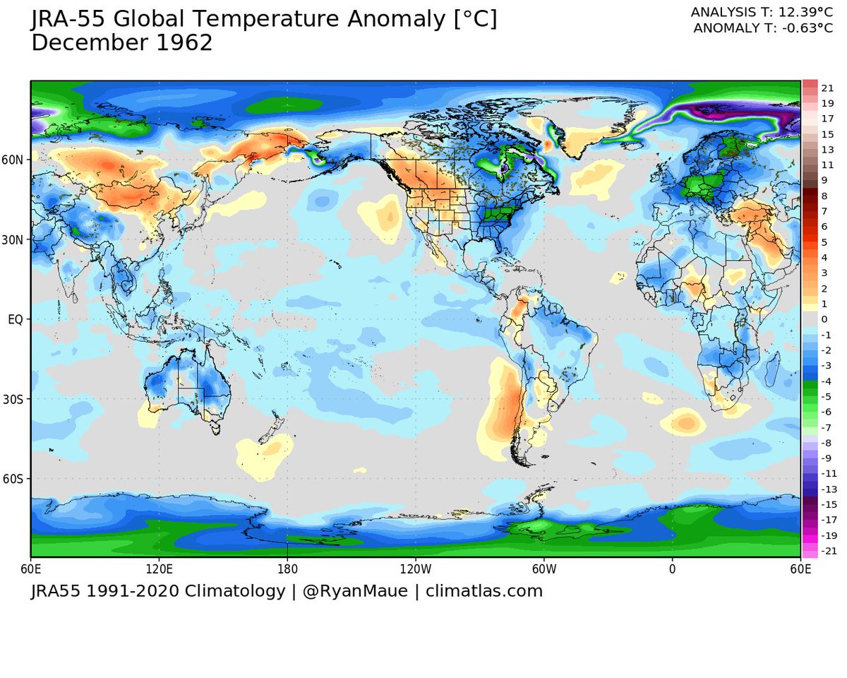

Thus, to show climate change [w/o misleading the audience] daily weather maps w/recent climate baselines are the worst option -- and the purveyor is engaging in cherry picking 🍒 every time.
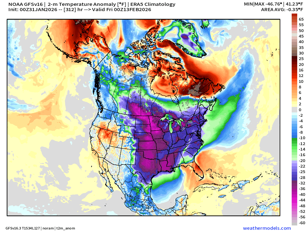
Here is an example of using global temperature anomaly maps from weather models. The model is GFS and baseline climatology is 1979-2000 from CFSR reanalysis.
"big, anomalous red blob"
global anomaly +0.4°C averages to "white space" on color key
"big, anomalous red blob"
global anomaly +0.4°C averages to "white space" on color key

• • •
Missing some Tweet in this thread? You can try to
force a refresh