A long blog post in which I:
- explain how to turn a sequence of images (maps, but could be anything) into a video, as in the example here
- give away all sorts of trade secrets
- share some image sets to play with
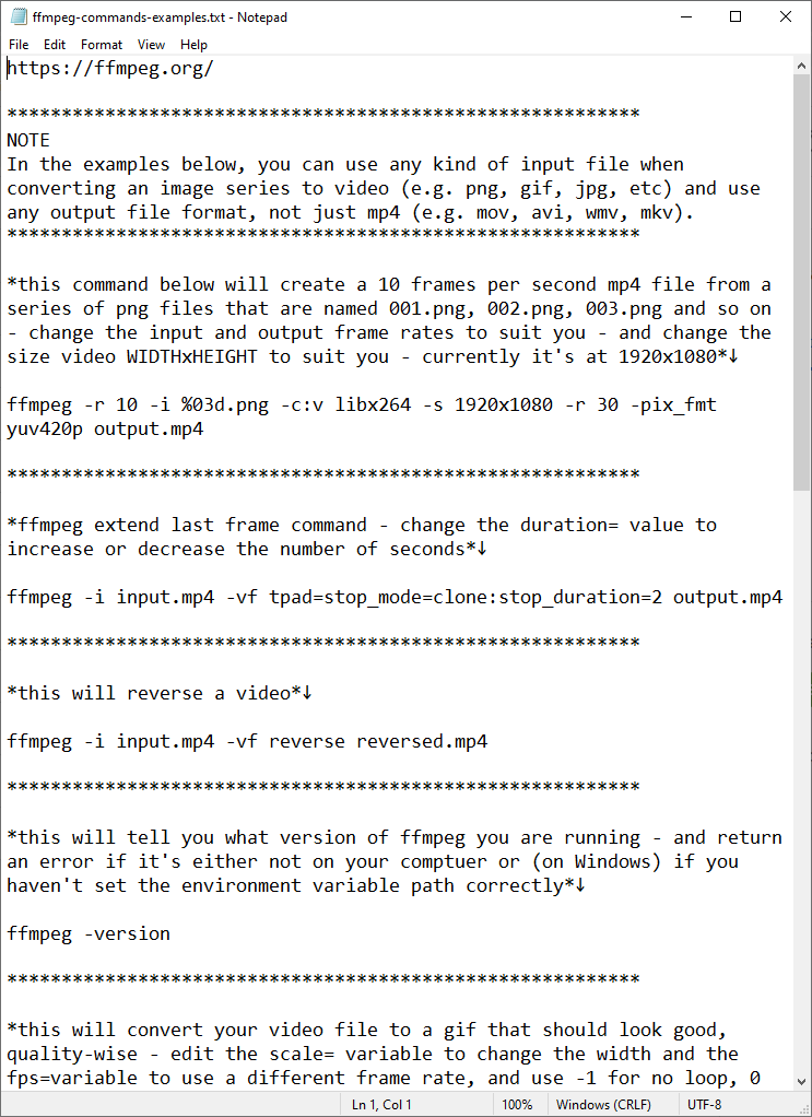
- provide lots of example commands
statsmapsnpix.com/2021/12/map-an…
- explain how to turn a sequence of images (maps, but could be anything) into a video, as in the example here
- give away all sorts of trade secrets
- share some image sets to play with
- provide lots of example commands
statsmapsnpix.com/2021/12/map-an…
I cover installation of #ffmpeg on Mac (easy), Linux (easy) and Windows (easy, but can seem horrendously complex for new users) and ...
I also try to break things down into chunks so that they make sense to the new user - and then you can have all sorts of fun with animating the map files I provided 


I've shared image sets for
- LHR to JFK flight
- LHR to Rome flight
- A9 road animation (shown here)
- Highland contours
- UK population density scanner thingy
- US contours
I made all these in QGIS Atlas, but you can make individual frames many ways
- LHR to JFK flight
- LHR to Rome flight
- A9 road animation (shown here)
- Highland contours
- UK population density scanner thingy
- US contours
I made all these in QGIS Atlas, but you can make individual frames many ways
I've shared the individual frames from this UK population density video as well, so if you are keen to try it you can play around with it and have fun and live a happy life
I also show you how to convert a video file (such as an mp4) to a gif - that doesn't look like it's been roughed up by a gang of pixelmonsters
but if you just want to know how to convert a .mov file to a .mp4 file, that's covered too
if you want to make your own map frames - like the ones I've shown here - then you can do that in QGIS, by following my tutorial booklet
automaticknowledge.org/training/workb…
(works on Mac, Linux and Windows)
automaticknowledge.org/training/workb…
(works on Mac, Linux and Windows)

oh, and I've also added instructions on how to add a sound file to your video (like in the one here and in the first video)
anyone who uses Google Earth Studio may also find it useful, or any other software or tool that spits out a series of images - e.g. I used it to patch together this 'places I have lived' image series from Google Earth Studio
you won't always be able to see things super-clearly on videos on twitter (I find it's normally better on mobile than on desktop) so the little 'convert to gif' snippet in the blog is useful for when you need that
this is all part of my sneaky plan to lure you in, if you're thinking of dabbling with this kind of thing but not sure where to begin - some low stakes fun is sometimes a good entry point
statsmapsnpix.com/2021/12/map-an…
statsmapsnpix.com/2021/12/map-an…

(and if anyone who is good at maths or math can calculate the speed of the plane in the first tweet that'd be great)
all this stuff can be useful for visual storytelling in all kinds of ways - here we can see a familiar form emerging from the darkness (I've shared these frames too)
will end this thread by adding in the #ffmpeg hashtag so that I can find it again more easily, and by saying that I'll leave this little text file of commands online in the web folder (linked to in the blog) for anyone to use 


• • •
Missing some Tweet in this thread? You can try to
force a refresh


