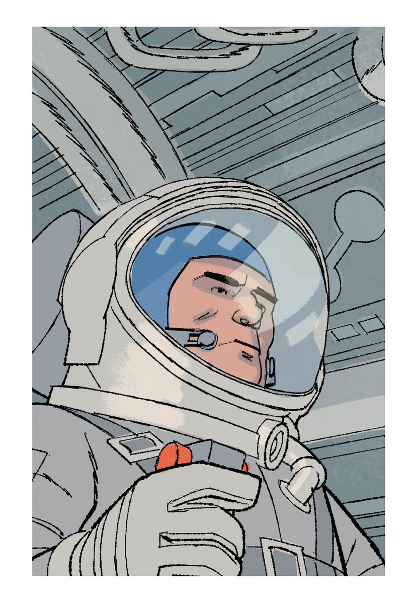
A lot of artists have inspired my interiors on Human Target. Here's a thread of the big ones - maybe they can inspire you on your next project 


The most obvious influence is Darwyn Cooke. A lot from his Parker books. New Frontier, too. But the work of his I draw the most from for Human Target is issue 3 of THE SPIRIT, colored by Dave Stewart. 


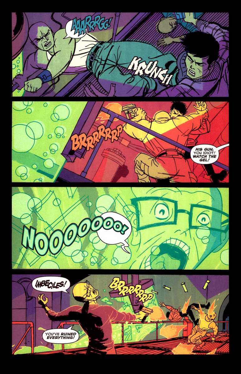
I explored some of this style in the final page of a Nick Fury story I wrote and drew for MARVEL. This was my first attempt at what I would later refine for HT. 

Another major influence on Human Target (and all of my work in general) is Loose Ends by Chris Brunner and @whoisrico . The art in this book was a revelation for me when it came out. 


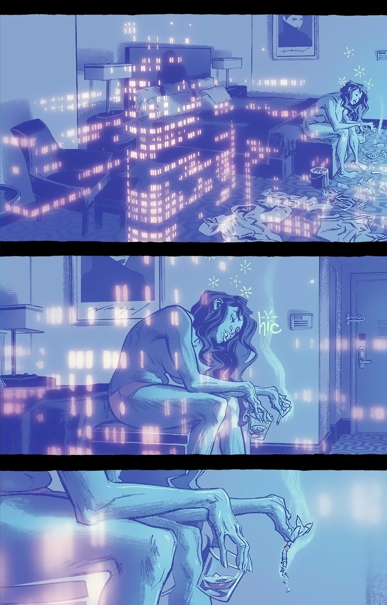


The visual complexity was off the charts but most importantly, it had a VIBE. I'm still awestruck by it all these years later. 


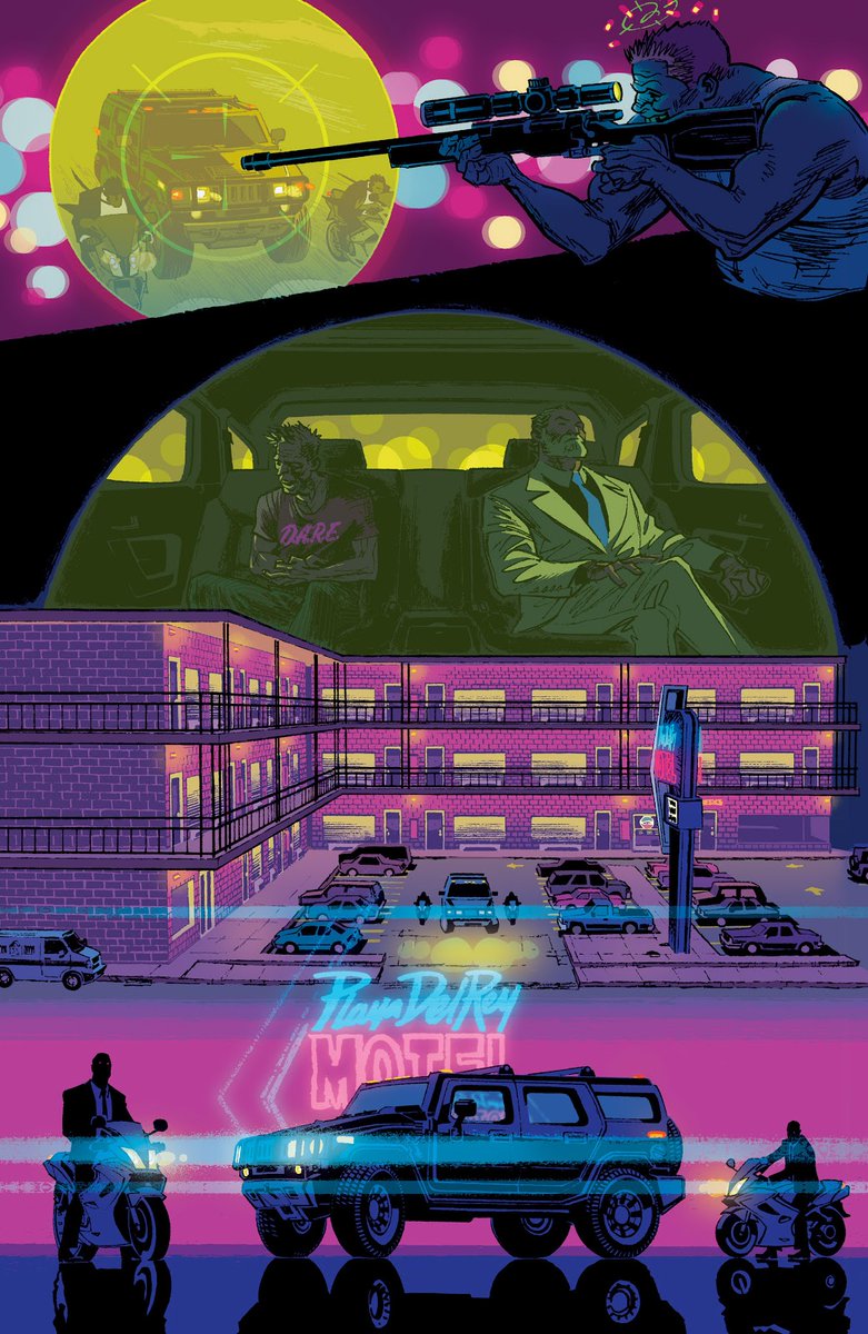

@Leo__Romero & Jordie Bellaire on THE KILLJOYS: NATIONAL ANTHEM is another big one for me. They perfectly capture a distinct pop aesthetic and I learned a lot studying their art here. Gorgeous work. 


Kyle Baker on anything. I love Baker's use of color holds. I also love his willingness to embrace digital tools and combine them with traditional techniques. 


Steranko and Kirby inspire me in the same way. Neither one of them stopped experimenting and neither one shied away from exploring new tools. They used everything they had and I want to make sure I do the same. 


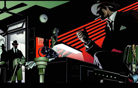
Its tempting to draw a straight pastiche of classic comic art but I try to emulate what they aspired to be instead. 

Another big influence is @tozozozo 's work on SKULLDIGGER & SKELETON BOY. Tonči draws from a variety of American, European, and Asian influences so his work is like nothing else out there. My go-to when I'm stuck and need a brain reset. 


@MitchGerads is the mid century modern pioneer of comics so MISTER MIRACLE is always within reach. Mitch did a lot of R&D so it would be pretty dumb not to steal it. Like I mentioned with Steranko/Kirby, Mitch uses every tool he's got (the Batman page is a great example of this). 


BTW, it's also incredibly helpful to study how other artists interpret the work of a writer you're collaborating with. The Mister Miracle Director's Cut helped cue me in and find the rhythm of Tom's writing. 


In relation to that, it's always smart to study the artists who've worked on the character(s) you're tackling. HT by Javier Pulido and @cliffchiang was an invaluable resource. So was the early stuff by Infantino & Giordano. Lots of little things sourced from these comics. 


Speaking of looking back, the flashbacks in issue 2 of HT were directly inspired by Ángel Badia Camps's covers for Serenade magazine. 


Mid century animation backgrounds and concept work are another source of inspiration. I've mentioned 101 Dalmatians before. Here's a whole thread about the film's art.
https://twitter.com/wardomatic/status/1081217545179406339?s=20
Mid century illustrators began exploring more naturalistic/unconventional compositions (think candid photo vs studio portrait) and I tried to incorporate this approach into HT. These two Austin Briggs pieces are great examples - faces obscured, backs to the reader, etc. 


Chance is playing detective so it helps put the reader in his shoes - noticing details that might otherwise be ignored if a standard panel composition was used. Also keeps the reader on their toes. 

Alex Toth explored this as well. Lots of unusual cropping and compositions. Keeps things interesting. 


And we'll end this on Toth. Human Target cover art is a whole separate thread so I'll save that for another time. Also stay tuned for a thread on contrast and how I use it in HT. It's a big part of my approach and it deserves it's own thread, too (or at least I hope).
And because you made it to the end, here's the title page for the next issue of THE HUMAN TARGET. Don't tell anyone I'm showing you this. 

• • •
Missing some Tweet in this thread? You can try to
force a refresh
