As someone who has dedicated a lot of time to studying and making #dataviz, let me explain why I dislike this NYT COVID graphic so much.
1/
1/
https://twitter.com/nickmmark/status/1479340577854398466
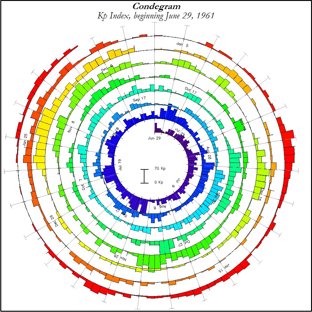
It’s not that it’s a spiral - one of my favorite types of graphs is the Condegram spiral. (Named after Mark Conde)
It’s used in astronomy/meteorology to show changes the Earths magnetic fields (Kp index) & is used to visualize space weather.
2/
It’s used in astronomy/meteorology to show changes the Earths magnetic fields (Kp index) & is used to visualize space weather.
2/
Another awesome spiral graph - and one of the best examples of #dataviz ever IMO - is the Rose plots by Florence Nightingale.
These 1858 plots show the causes of mortality in Crimean war & make a compelling case that for improving conditions (particularly shelter in winter).
3/
These 1858 plots show the causes of mortality in Crimean war & make a compelling case that for improving conditions (particularly shelter in winter).
3/

I also really like circular or spiral dendrograms. Take a look at this beautiful 🌀 graphic showing the evolution/domestication of yeast.
4/
4/

So if I like 🌀graphics so much why do I viscerally dislike this NYT COVID spiral?
5/
5/


The beauty of Nightingale & Conde’s spirals is they show *granular* data. You can clearly see the sudden changes in deaths or solar activity.
The NYT graphic *averages* the data - this makes it look smooth but it also makes the surges in cases more subtle & harder to see.
6/
The NYT graphic *averages* the data - this makes it look smooth but it also makes the surges in cases more subtle & harder to see.
6/


Another problem is how the NYT graphic plots cases: above & below the spiral.
Compare to the Condegram, which only goes above the spiral.
Humans are better at perceiving height than width. Just look at these two lines of identical length. Which case is easier to discern?
7/
Compare to the Condegram, which only goes above the spiral.
Humans are better at perceiving height than width. Just look at these two lines of identical length. Which case is easier to discern?
7/


To illustrate this point: Compare the NYT COVID spiral to the same data presented linearly.
Is it obvious that the green🟩line is more than twice as wide as the blue 🟦 line?
8/
Is it obvious that the green🟩line is more than twice as wide as the blue 🟦 line?
8/


Bottom line: this plot from the NYT distorts the data through unnecessary smoothing & plotting on both the inside & outside of the spiral. This has the effect of making it hard to see the true increase in cases. A missed #dataviz opportunity.
9/9
9/9
As a bonus - here are few more of my favorite spiral #dataviz:
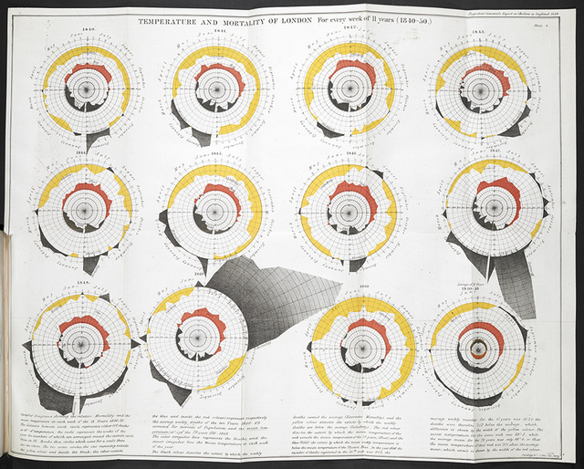
A 1850 plot by William Farr showing a (spurious) relationship between temperature & cholera cases in London. Correlation doesn't equal causation but it's still a compelling spiral graphic.
A 1850 plot by William Farr showing a (spurious) relationship between temperature & cholera cases in London. Correlation doesn't equal causation but it's still a compelling spiral graphic.
Not a spiral but another of my all time favorite ID dataviz examples: a plot showing polio cases in the US from 1931 to 1955.
Look how it combines granular data from each state/each week, along with monthly averages, and a heatmap for emphasis. 😍
journals.plos.org/plosbiology/ar…
Look how it combines granular data from each state/each week, along with monthly averages, and a heatmap for emphasis. 😍
journals.plos.org/plosbiology/ar…

• • •
Missing some Tweet in this thread? You can try to
force a refresh