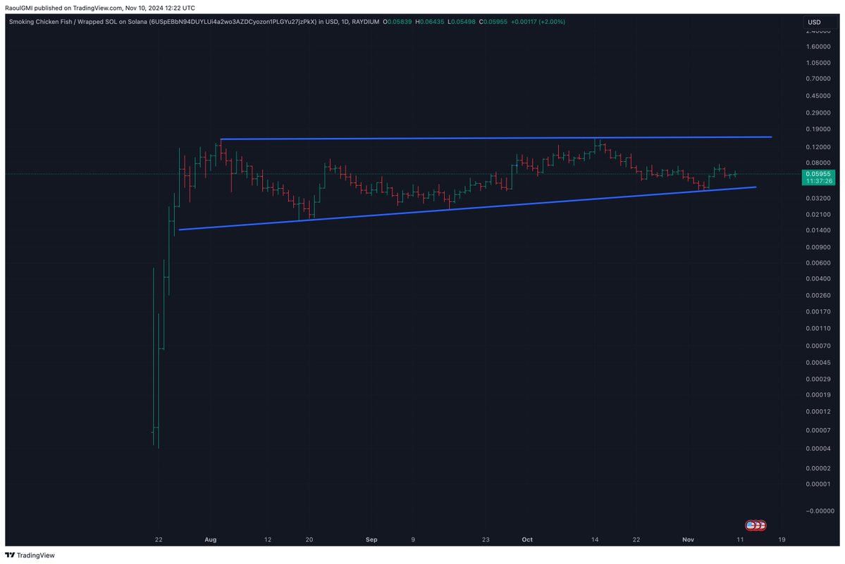
Just a reminder - You cant use daily or weekly charts if your time horizon is years. You're either in this for network adoption over time or you are a trader. I am not a trader in crypto. I can't care less about 50% swings in a 70 vol asset.
In the end, the only technicals that matter (Metcalfe's Law matters more) are:
Log chart
48 month Exponential Moving Average?
Maybe the trend since 2015 (but same as EXPMA).
I seriously doubt the bull market ends at regression trend, it should see higher (1 standard deviation+)
Log chart
48 month Exponential Moving Average?
Maybe the trend since 2015 (but same as EXPMA).
I seriously doubt the bull market ends at regression trend, it should see higher (1 standard deviation+)

BTC is cheap vs Metcalfe's Law....(and has been for a long time - my guess is because there is less network applications on BTC currently than ML would prefer). 

Maybe the macro weighs on BTC and digital assets as liquidity isg reduced but never listen to consensus in terms of rates, it's usually wrong and network model assets generally do fine with rates rise anyway... This is Amazon. 

It's usually when rates have gone too far stocks get hurt, along with other assets. Thus any initial sell off's are usually temporary (on initial fears). And when rates finally have gone too far (and YC inverts), rates get cut and the low in growth stocks/assets is put in again.
It is also not clear now if the slowing economy will stop rate hikes. This has happened almost after every recession since the 1960's. It takes a few years for the economy to normalise. This time around Im sympathetic to the idea that econ cycles will be more violent and shorter.
But that means that real rates likely stay negative or low so risk assets over time remain attractive (barring the noise). If inflation is here to stay which many believe (I don't) then you want to own inflation-projected assets with fundamental drivers (DA's), over time.
I'll leave you with an interesting comparison. Amazon is a Metcalfe's Law stock. Back in 2003 to 2011 it looked like this: 

It suggests BTC might even possibly test 30,000 but I doubt it ( I think the sell off is near done) but who the hell knows! Its similar enough for context but never rely on fractals. They are for context only. The BTC fractal is longer in time than AMZN and more volatile.
After this Amazon went up....fast.
As BTC is more volatile is goes up more and falls more in corrections. But as AMZN and other have proven Network Stocks over time see shorter cycles and less downside. I think we are going to see that in BTC & ETH too
As BTC is more volatile is goes up more and falls more in corrections. But as AMZN and other have proven Network Stocks over time see shorter cycles and less downside. I think we are going to see that in BTC & ETH too

In the end, it's all noise. The log chart is The Truth and that is in itself an approximation of Metcalfe's Law.
If it isn't noise to you, your position is too big for your time horizon.
Good luck and take a chill pill.
If it isn't noise to you, your position is too big for your time horizon.
Good luck and take a chill pill.
• • •
Missing some Tweet in this thread? You can try to
force a refresh


