Mike Honey Profile picture
Jan 9, 2022 11 tweets 4 min read Read on X
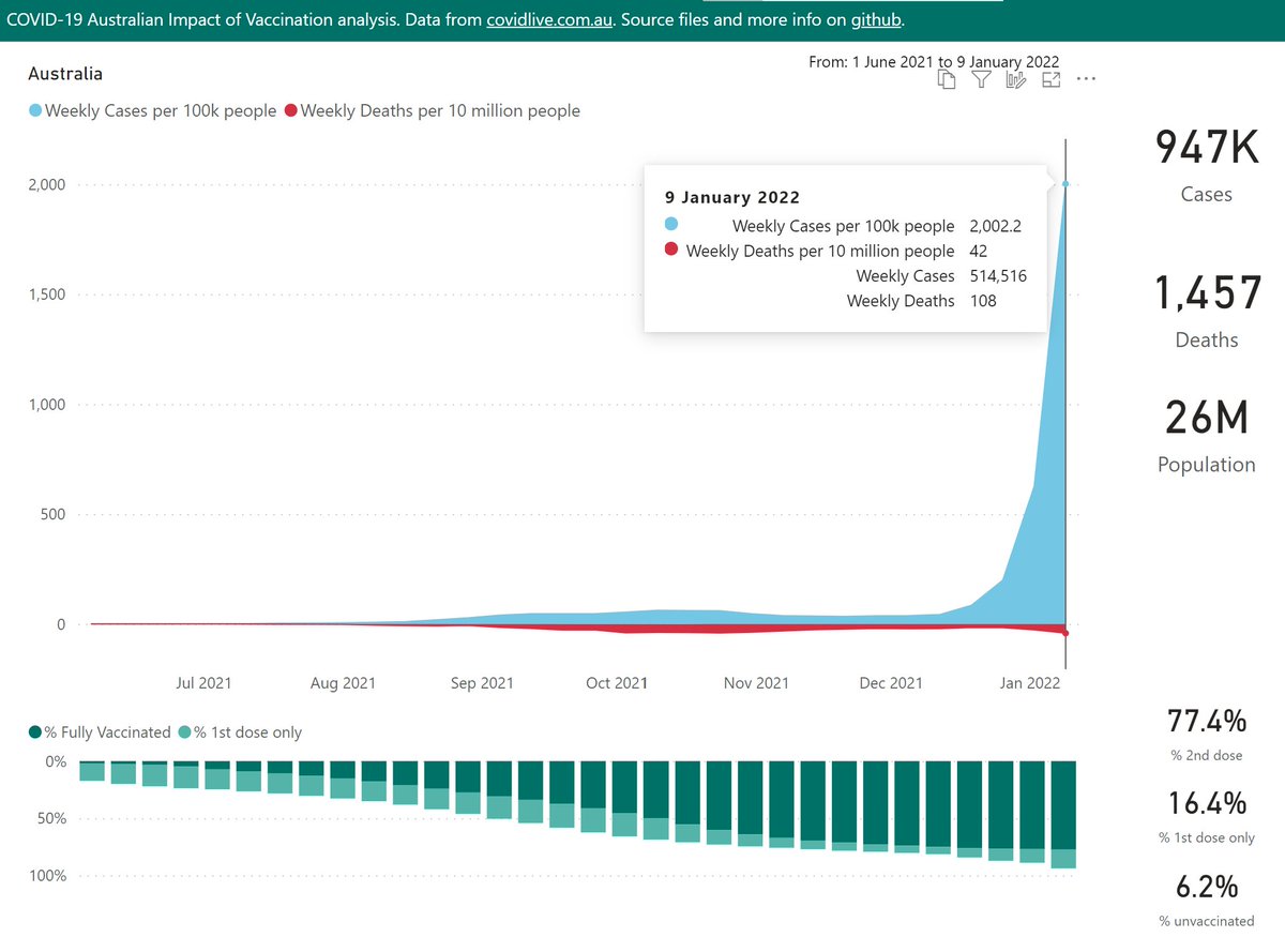
Here's an analysis of cases, deaths and vaccinations, for Australia, broken down by state/territory.

First at the national level. Cases have more than tripled in the latest week, as "let it rip" policies have allowed rampant Omicron spread in most regions.
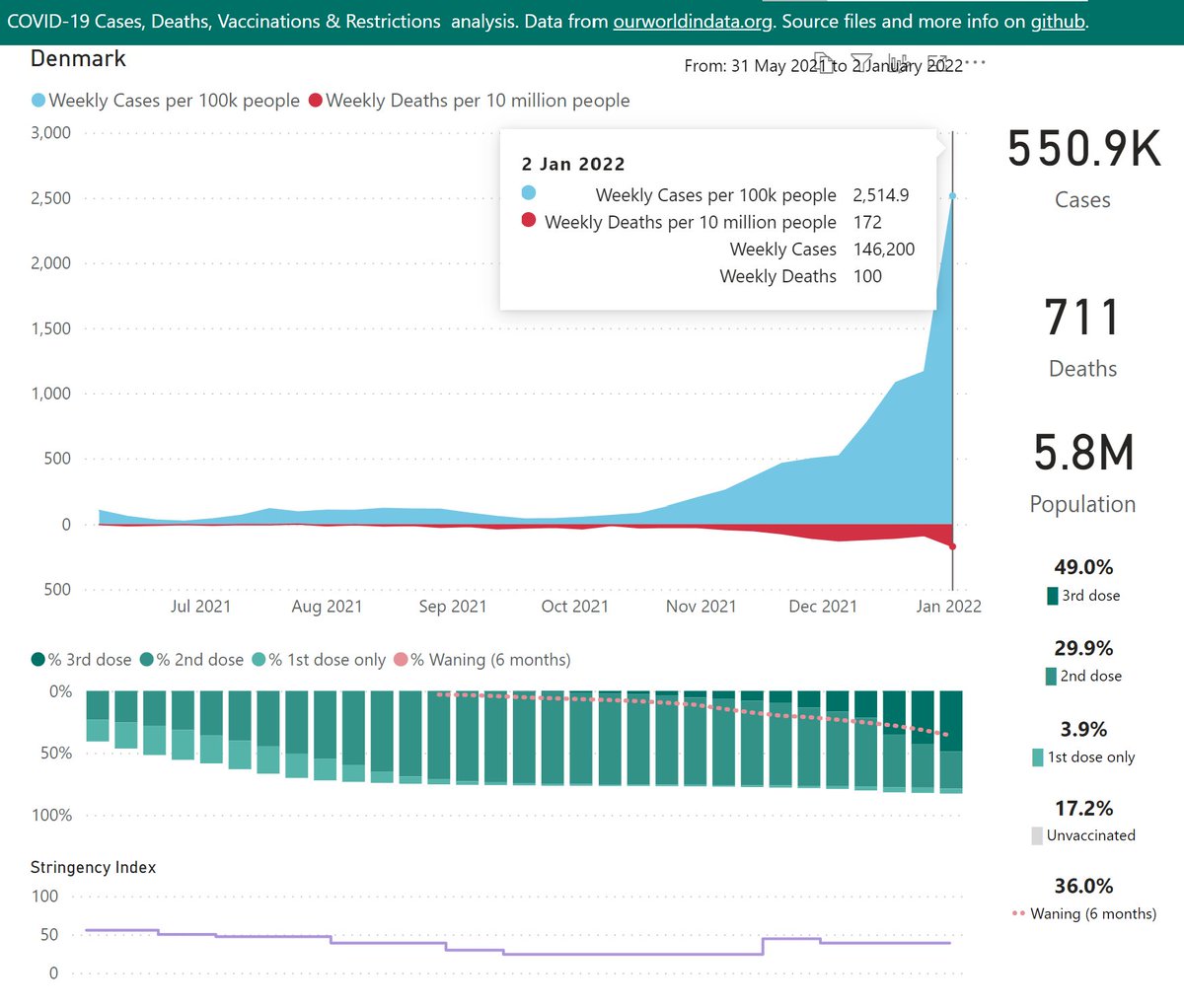
Denmark was the only comparable country with a higher case rate in the prior week.

Their Omicron outbreak built on many weeks of Delta spread, which was not the case in much of Australia.
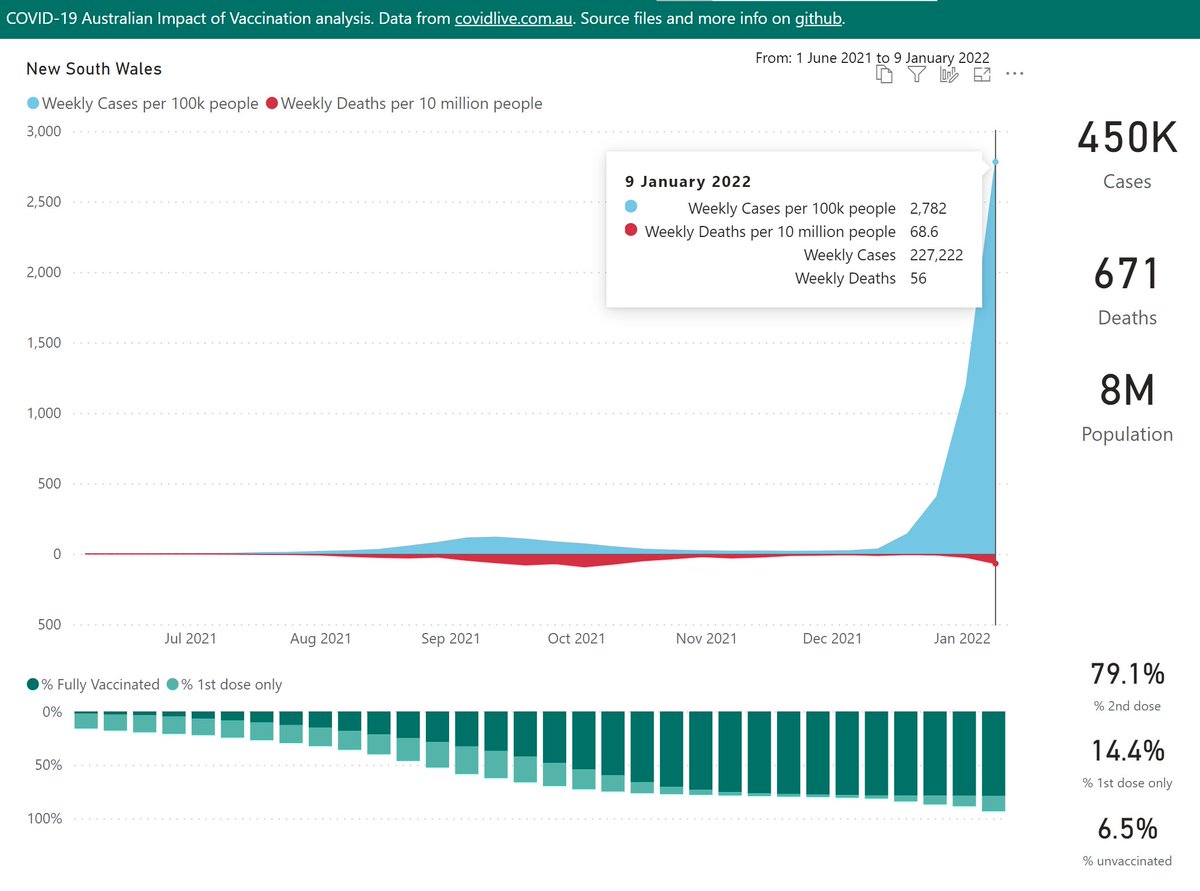
New South Wales has led the "let it rip" / "live with the virus" charge. They have not yet started including RAT counts, so the cases are only what could be processed by their overwhelmed PCR testing capacity.

Deaths typically lag cases by 3 weeks, so are starting to increase.
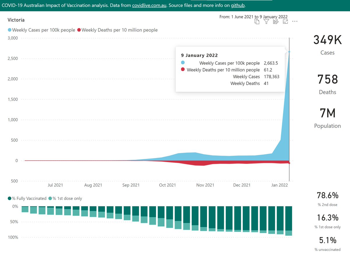
Victoria's case counts include almost a full week of (self-reported) RAT test results, which made up ~40% of this weeks' cases. RAT supply is still utterly inadequate everywhere in Australia.

The Omicron spike is a few weeks behind NSW, so has not yet impacted death rates.
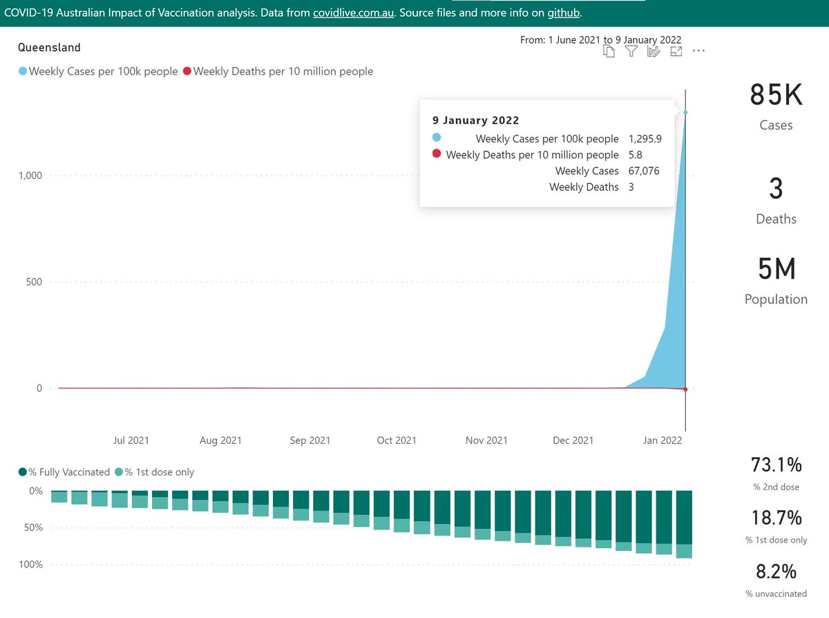
Queensland's Omicron spike is just astonishing. After months of near-zero cases, they threw open their borders to neighbouring NSW, where Omicron super-spreader events had just occurred.

Deaths are just getting started - 3 weeks ago there were only 129 cases for an entire week.
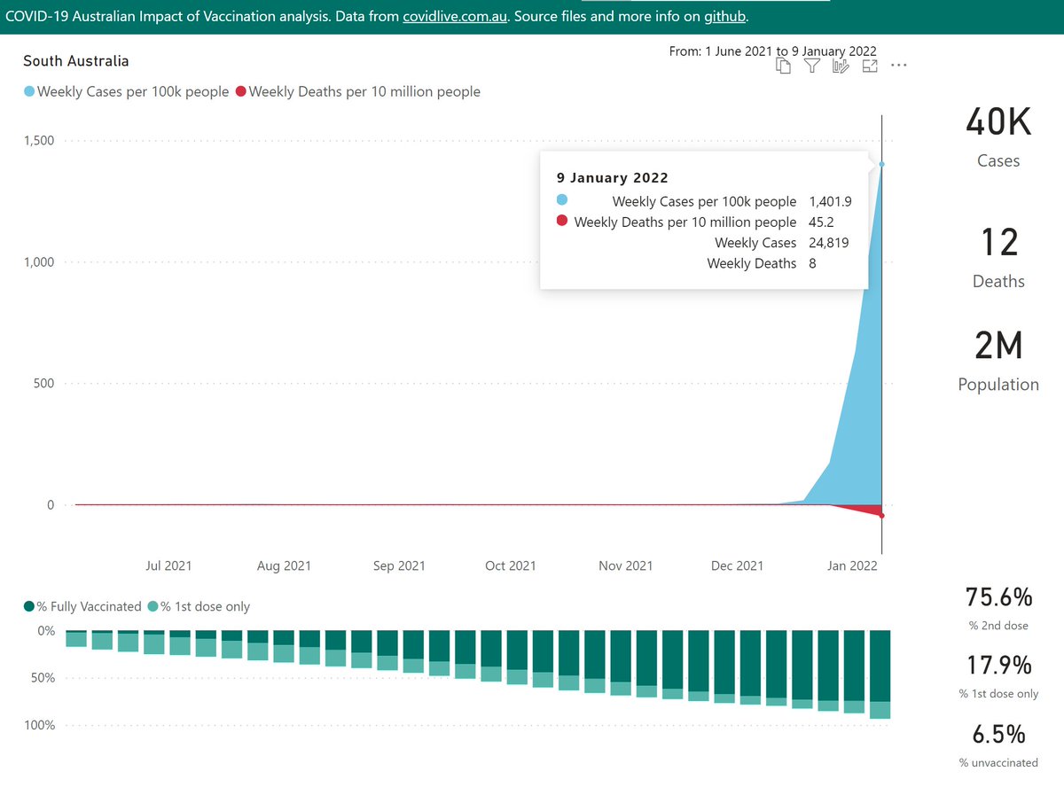
South Australia is another former "zero-COVID" state that opened it's internal borders to Omicron. From sequencing data, they have the purest Omicron outbreak in the world - close to 100%.

Notably, deaths are already climbing, at a faster pace than Delta.
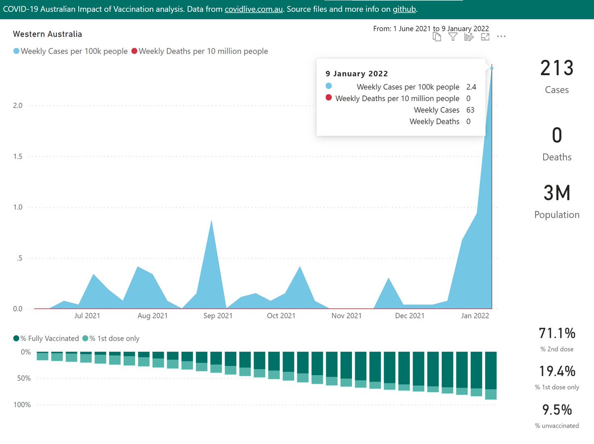
In Western Australia, there has been some Delta and Omicron community spread this week, however, that might now be under control.

It's a mystery to me why the other zero-COVID states did not follow the same course, or at least postpone re-opening a few weeks to assess risk.
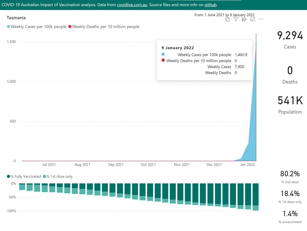
Tasmanian cases have shot up in just a few weeks to rival the worst-affected countries in Europe.

Very high vaccination rates might keep deaths low.
The Northern Territory is now facing the familiar steep Omicron wave.
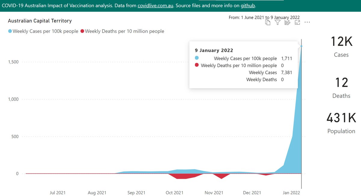
The Australian Capital Territory (surrounded by NSW) has been battling a long Delta outbreak, but now Omicron has certainly arrived.
The QLD, SA & TAS case counts include 1 day of self-reported RAT results.

COVID-19 stats from @covidliveau.

Interactive DataViz here:
github.com/Mike-Honey/cov…

• • •

Missing some Tweet in this thread? You can try to force a refresh
 

Keep Current with Mike Honey

Mike Honey Profile picture

Stay in touch and get notified when new unrolls are available from this author!

Read all threads

This Thread may be Removed Anytime!

PDF

Twitter may remove this content at anytime! Save it as PDF for later use!

Try unrolling a thread yourself!

how to unroll video
  1. Follow @ThreadReaderApp to mention us!

  2. From a Twitter thread mention us with a keyword "unroll"
@threadreaderapp unroll

Practice here first or read more on our help page!

More from @Mike_Honey_

Dec 20, 2025
A recent scientific paper compared long-term mortality by vaccination status.

I noticed that Table 2 drew a lot of attention, but was actually included in the paper as a static image. So I built a quick dataviz project to explore.
🧵 Image
On the first page, I've added a % Incidence change (vaccinated vs unvaccinated) and emphasised that with data bars. This is quicker for general readers to grasp than hazard ratios.
🧵
You can click on any column header to sort the rows, e.g. as shown by % Incidence change. The starkest difference was deaths from COVID-19 at +372%.

Other causes with significant differences were diseases of the skin & blood, pregnancy and childbirth.
🧵 Image
Read 19 tweets
Dec 19, 2025
A recent scientific paper included an antigenic map, comparing the immune status of individuals vaccinated with a range of vaccines "… vaccinated sera", against a collection of significant variants "Virus …".

The map was very informative, so I built a quick dataviz project.
🧵 Image
The map shows starkly that BA.3.2 "Cicada" is a wild outlier, way out on its own in the south-west corner. This suggests the current vaccines and/or disease-acquired immunity will not offer strong protection against infection.
🧵
Another point of note is how the XFG "Stratus" variant is the furthest away from BA.3.2, at the extreme south, compared to other recent variants.

This might help explain how BA.3.2 has been able to drive significant waves in Europe, following their recent waves of XFG
🧵
Read 12 tweets
Dec 14, 2025
Here's the latest variant picture for Europe (excluding the UK), to late November.

BA.3.2.* "Cicada" is showing a very strong growth advantage of 7.9% per day (55% per week) over XFG.* "Stratus", which predicts a crossover in late December.

#COVID19 #EUR #BA_3_2 #Cicada #XFG
🧵 Image
To include the latest BA.3.2.* samples, I have rolled my reporting window forward an extra week or so. So the most recent data is even less representative than usual. The picture for those dates might change as more data is shared.
🧵
Here are the leading European countries reporting BA.3.2.* .

The Netherlands leapfrogged Germany to report the highest frequency at 31%. Germany also grew sharply to 25%. Denmark grew to 16%.
🧵 Image
Read 6 tweets
Dec 14, 2025
Here's the latest variant picture for the United Kingdom, to late November.

For the UK, BA.3.2.* "Cicada" is showing a strong growth advantage of 5% per day (35% per week) over XFG.* "Stratus", which predicts an imminent crossover.

#COVID19 #SARSCoV2 #UK #BA_3_2 #Cicada
🧵 Image
To include the latest BA.3.2.* samples, I have rolled my reporting window forward an extra week. So the most recent data is even less representative than usual. The picture for those dates might change as more data is shared.
🧵
BA.3.2.* accelerated sharply in Scotland to 16% of recent samples.
🧵 Image
Read 7 tweets
Dec 8, 2025
A recent scientific paper explored the impact of mass SARS-CoV-2 infections on Lymphocytes (crucial to the body’s immune system).

I noticed the authors had shared the data behind their charts in the Appendix Supplementary materials, so I built a quick dataviz project.
🧵 Image
Above, I’ve re-cast the data behind their Figures 3 and 5 in terms of % change from the baseline. Hopefully this is useful to help compare the subsets, whose results vary in scale.
🧵
I added interactive filter controls and a trend line (dashed pink). You can use those to explore for example the trends in the last 12 months measured in the paper, for the CD3, 4 & 8 series.
🧵 Image
Read 8 tweets
Dec 7, 2025
Australian Influenza update:

It became clear during November that a unusual second wave is underway in Australia, driven by the new "clade K" (H3N2 clade 2a.3a.1, subclade K).

Tasmania, New South Wales and South Australia are currently the hardest-hit.

#Influenza #Australia
🧵
Western Australia had been spared the worst of this second wave until the last week or so. But now there’s a signal of a sharp change in case momentum there also.
🧵
The latest Australian Respiratory Surveillance Report confirms my earlier speculation that the new "clade K" (H3N2 clade 2a.3a.1, subclade K) is driving the "unusual" second wave of influenza in Australia.

🧵 health.gov.au/resources/publ…Image
Read 11 tweets

Did Thread Reader help you today?

Support us! We are indie developers!


This site is made by just two indie developers on a laptop doing marketing, support and development! Read more about the story.

Become a Premium Member ($3/month or $30/year) and get exclusive features!

Become Premium

Don't want to be a Premium member but still want to support us?

Make a small donation by buying us coffee ($5) or help with server cost ($10)

Donate via Paypal

Or Donate anonymously using crypto!

Ethereum

0xfe58350B80634f60Fa6Dc149a72b4DFbc17D341E copy

Bitcoin

3ATGMxNzCUFzxpMCHL5sWSt4DVtS8UqXpi copy

Thank you for your support!

Follow Us!

:(