1/ I actually don't like working with VAERS. One would need a data-prep tool, which CDC has, but me not (out of scope to develop). Still, I took a look.
The issues with lot IDs and VEARS deaths/AE are:
-Age confounded (average administered dates).
-Different batch sizes.
The issues with lot IDs and VEARS deaths/AE are:
-Age confounded (average administered dates).
-Different batch sizes.
https://twitter.com/MntyP1/status/1480183565593808899
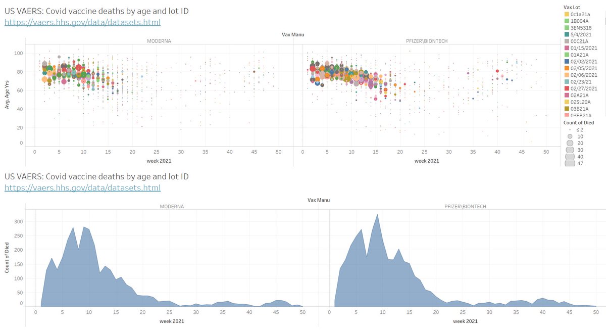
2/ We immediately see the high age of most deaths and related batches. We do have confounding to resolve. Deaths, both C19 and vaxx, is an elderly business and includes a lot of comorbidities in both cases. The young don't die in relevant numbers from Covid not vaxx.

3/ One thing that looks strange are the low death batches / weeks in many cases for the very old groups. It should follow an exponential life table to my view. There should be no points in the red circled area (high age, low deaths).

4/ Those lots here look strange. Almost like if they were placebo. But even then, we should expect to see the age confounding (so died "with" vaxx). But maybe the lot size was small. Without batch sizes...very difficult to say much.

5/ Filtering to the first 30 weeks, we get a quite decent exponential trend, like expected in the case of age confounding (died “with” or died from vaxx due to higher risk when old and fragile).
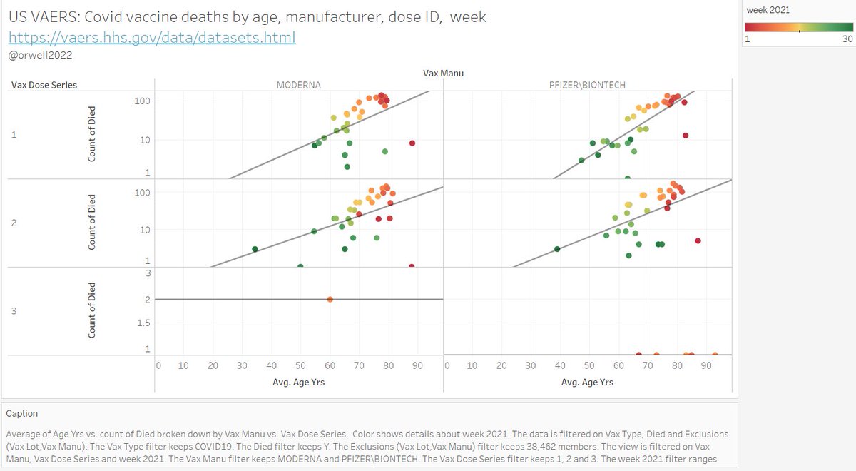
6/ The death age relation follows an exponential trend. It would be clearer if normalizing by doses per age bin. We also see Moderna having same count similar as Biontech, despite a 20% lower number of doses.
This is likely a true signal: the 3x higher dose in Moderna.
This is likely a true signal: the 3x higher dose in Moderna.


7/ To do this better we need to merge in:
Doses by lot, manufacturer and age (lso sex).
Categories: pre-existing conditions.
Population sizes.
As this is not straightforward, I dislike to work with VAERS. It's still much better than having nothing (like in EMA, PEI, Lareb).😌
Doses by lot, manufacturer and age (lso sex).
Categories: pre-existing conditions.
Population sizes.
As this is not straightforward, I dislike to work with VAERS. It's still much better than having nothing (like in EMA, PEI, Lareb).😌
• • •
Missing some Tweet in this thread? You can try to
force a refresh