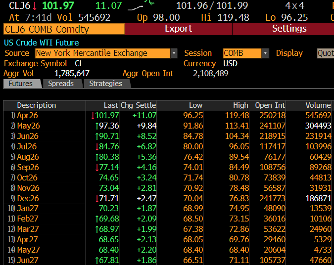
1/14
In some respects, what happened in bond markets last week was epic, something we might be talking about for many years.
A thread to explain
In some respects, what happened in bond markets last week was epic, something we might be talking about for many years.
A thread to explain
2/14
When discussing bond market moves, I believe the best metric is total return. It encompasses both price change and the level of yields (accrued interest).
The next set of charts show calendar week total returns. That is, the week ending Friday (Thursday if a holiday).
When discussing bond market moves, I believe the best metric is total return. It encompasses both price change and the level of yields (accrued interest).
The next set of charts show calendar week total returns. That is, the week ending Friday (Thursday if a holiday).
3/14
The 30-year data goes back to 1973 and last week was the worst calendar week total return in at least 49-year history! The long-bond lost 9.35%!!
If this was a year, a 9.35% total return loss would be the 5-year worst year ever.
Impressive for five days of work.
The 30-year data goes back to 1973 and last week was the worst calendar week total return in at least 49-year history! The long-bond lost 9.35%!!
If this was a year, a 9.35% total return loss would be the 5-year worst year ever.
Impressive for five days of work.

4/14
The 10-year note finished it worst week in 42 years, with a total return loss of 4.24%.
Only Feb 1980 saw a bigger loss for a calendar week loss (Volcker inflation panic, funds rate headed to 21%)
-4.24% would also be the fifth worst YEAR ever.
The 10-year note finished it worst week in 42 years, with a total return loss of 4.24%.
Only Feb 1980 saw a bigger loss for a calendar week loss (Volcker inflation panic, funds rate headed to 21%)
-4.24% would also be the fifth worst YEAR ever.

5/14
Finally,
The calendar week total return for the Bloomberg 10+ TIPS Index was -6.09%.
This marks the third worst week ever.
Finally,
The calendar week total return for the Bloomberg 10+ TIPS Index was -6.09%.
This marks the third worst week ever.

6/14
Note above each one of the other marked weeks were significant.
*3/13/20, -14.39% = peak COVID Panic Fed buying $100B/day of bonds
* 9/13/19, -5.19% = The week the repo mkt blew up
* 6/21/13, -5.12% = The height of the taper tantrum
* 10/10/08, -7.13% = Lehman failed.
Note above each one of the other marked weeks were significant.
*3/13/20, -14.39% = peak COVID Panic Fed buying $100B/day of bonds
* 9/13/19, -5.19% = The week the repo mkt blew up
* 6/21/13, -5.12% = The height of the taper tantrum
* 10/10/08, -7.13% = Lehman failed.
7/14
Why was last week so epic?
I believe the whole bond market finally realized that easy money is over/QT is coming.
For weeks many bond players argued this table was wrong, the Fed would go less than 4 hikes/no QT. Not after last week's FOMC minutes.
Why was last week so epic?
I believe the whole bond market finally realized that easy money is over/QT is coming.
For weeks many bond players argued this table was wrong, the Fed would go less than 4 hikes/no QT. Not after last week's FOMC minutes.

8/14
What about TIPS and narrowing break evens?
As the right chart shows, the Fed took over this market. They now own 25% of this market, up from less than 10% pre-pandemic.
The left chart shows the Fed has bought more TIPS than the Treasury issued the last two years!!
What about TIPS and narrowing break evens?
As the right chart shows, the Fed took over this market. They now own 25% of this market, up from less than 10% pre-pandemic.
The left chart shows the Fed has bought more TIPS than the Treasury issued the last two years!!


9/14
TIPS are no longer a market signal about inflation expectations, the Fed ruined this with its big footprint.
TIPS are flow driven and flows are dominated by expectations of the speed of the Fed printer.
TIPS are no longer a market signal about inflation expectations, the Fed ruined this with its big footprint.
TIPS are flow driven and flows are dominated by expectations of the speed of the Fed printer.
10/14
So, 3 or 4 hikes coming? QT coming? The most vulnerable market to the Fed printer gets killed. TIPS yields soar and BE's fall.
Again, not a signal about inflation. A signal about a loss of Fed liquidity coming.
So, 3 or 4 hikes coming? QT coming? The most vulnerable market to the Fed printer gets killed. TIPS yields soar and BE's fall.
Again, not a signal about inflation. A signal about a loss of Fed liquidity coming.


11/14
Simply put, the bond market saw one of its worst weeks in history because bond market players finally "got it" that the Fed is going to end liquidity.
This kicked off a big the scramble to get out and not be the "bond bag holder" when the Fed printer is turned off.
Simply put, the bond market saw one of its worst weeks in history because bond market players finally "got it" that the Fed is going to end liquidity.
This kicked off a big the scramble to get out and not be the "bond bag holder" when the Fed printer is turned off.
12/14
This naturally begs the question, what about the stock market? The S&P was down -1.9%, hardly an epic week. What is going on here?
Hate to say it, but the stock market is NOT a leading indicator among FINANCIAL MARKETS.
This naturally begs the question, what about the stock market? The S&P was down -1.9%, hardly an epic week. What is going on here?
Hate to say it, but the stock market is NOT a leading indicator among FINANCIAL MARKETS.
13/14
Or the stock mkt the "slow kid" as it turns last.
2002 it bottomed AFTER the recession ended (Nov 2001) for the first time in 100 years
2007 it peaked after housing/bond market peaked in 2006
2009 stocks bottomed after the bond market in credit bottomed in late 2008.
Or the stock mkt the "slow kid" as it turns last.
2002 it bottomed AFTER the recession ended (Nov 2001) for the first time in 100 years
2007 it peaked after housing/bond market peaked in 2006
2009 stocks bottomed after the bond market in credit bottomed in late 2008.
14/14
So, if the bond market is having epic convulsions in the wake Fed printer getting turned off, do not take solace that the stock market "doesn't get it."
This is how financial markets turn, the stock market often stays too long and turns last.
So, if the bond market is having epic convulsions in the wake Fed printer getting turned off, do not take solace that the stock market "doesn't get it."
This is how financial markets turn, the stock market often stays too long and turns last.
• • •
Missing some Tweet in this thread? You can try to
force a refresh