Some may recall I got into a brief disagreement with @jfeldman_epi a few weeks back about whether or not it's *always* appropriate to adjust for age when running COVID death rate numbers. Having said that, he makes some valid points here: jmfeldman.medium.com/a-year-in-how-…
For me, the single biggest mistake made by the Biden Administration (or at least the CDC...but the buck stops w/the WH) was on May 13th when @CDCDirector Walensky issued her "fully-vaxxed can take of their masks!" guidance, which was a TERRIBLE change. abcnews.go.com/Politics/fully…
Many people, including myself, roasted the @CDCgov at the time for this change at the time (I wrote a whole thread about it), but the moment the words left her mouth it was too late anyway; genie out of the bottle/etc:
Having said that, I think he also does a lot of hand-waving away of the political realities with statements like this:
He *does* acknowledge the political/polarization factor later on, but again, I think he vastly understates just how "entrenched" that Republican opposition is:
I've posted the graph below many times over the past 8 months or so, but I don't think people fully understand that it's not just how steep the slope is NOW, it's how it's CHANGED over time:
This animation only runs from February 2021 - August 2021, but you can clearly see that the Red/Blue vaccination divide only started AFTER most senior citizens had gotten vaxxed:
THESE graphs tell the story all the way from February through the end of December. The first is the R^2 (correlation strength). The second is the slope itself (the angle of the trend line).
Notice what happened the moment the vaccines became available to all adults?
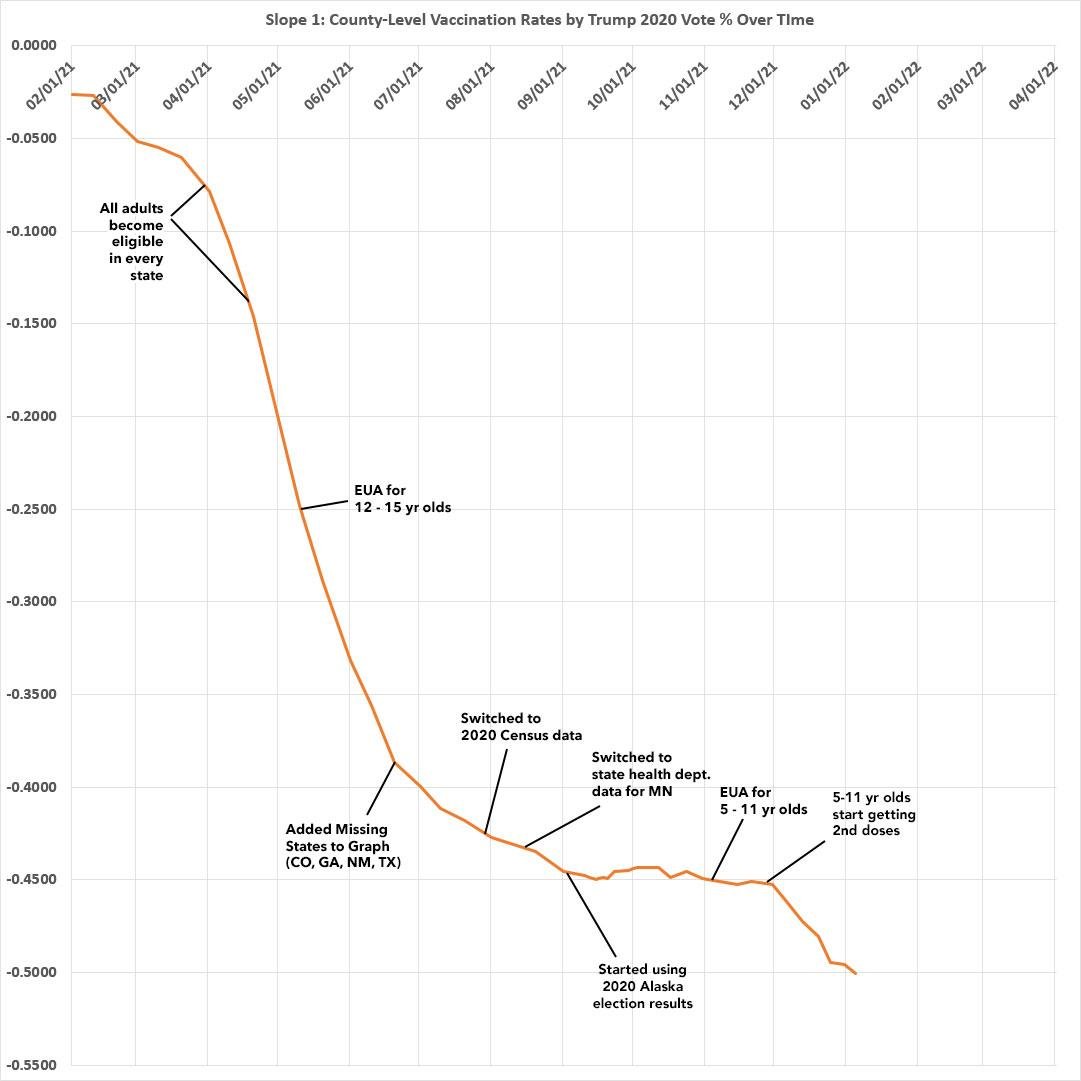
The moment grandma & grampa were fully vaxxed, the GOP/MAGA/FOX went into overdrive on a robust anti-vaxx campaign. It worked like a charm, though the effect started to flatten out around mid-September...only to start up again as soon as 5-11 yr olds were approved.
• • •
Missing some Tweet in this thread? You can try to
force a refresh
I just returned from my 4th road trip from Detroit to DC & back over the past 2 years. Since it's the same route each time I have a pretty apples to apples comparison on EV public chargers over time. 1/
The good news is that it looks like Electrify America, which makes up most of the chargers along the route (I-275/280, I-80/90 (OH Turnpike), I-70/270 (PA Turnpike), seems to be in the process of upgrading their charging stations; the newer ones seem to be more reliable. 2/
The bad news is that they've raised their prices substantially, at least at the stations along this route--they were usually $0.35/kWh 2 years ago; now they're charging $0.56/kWh.
By comparison, residential electricity in Oakland Cty, MI is around $0.18/kWh. 3/
Since partisan COVID death rates are back in the news again today, a reminder that ~150,000 *more* Trump voters died of COVID between the 2020 - 2022 elections than Biden voters due *specifically* to GOP/FOX/MAGA pushing antivax/anti-mitigation narratives. acasignups.net/22/09/17/eleph…
Re. electoral impact, there was only one statewide race in which the GOP COVID Death Cult factor made a decisive difference:
In AZ, 900 - 4,100 more Trump voters died of COVID between Nov. 2020 - Nov. 2022.
🎉 MAY DEM FUNDRAISING PROJECT REPORT: Donations up 341% for the month & 89% overall vs. the same point in 2020!! 🧵 blue24.org/24/06/01/may-2…
As I teased the other day, by the end of May 2020 I had raised $303,000 for Democrats up & down the ballot. For the 2024 cycle, as of last night, I had raised over $573,000! 2/
Just as noteworthy is the *breakout* of donations: At this point in 2020, STATE LEGISLATIVE races only made up 10% of the total I had raised.
This cycle state legislative races make up *40%* of the total! 3/
Let's see...Trump is 6' 3" tall. Putting him sideways it looks like the stage is perhaps 15' long, but I'll be generous and call it 16'. It also looks like it's only 6' deep but I'll call it 8' for the heck of it.
So that's ~92 stages or so...call it an even 100 to account for the stragglers at the outer edges.
That's 128 sq. feet x 100 = 12,800 sq. feet. Let's assume they're all tightly packed.
Let's see here...a semi trailer (lower right) is roughly 50' long, so the venue is roughly 9 trailers x 4 trailers, or 450' x 200', or 90,000 sq. feet.
Of course the rear 1/3 is almost empty, but there's also some people lined up in the upper left, so call it ~80% full...
So, that's perhaps ~72,000 square feet of "tightly packed" people. According to this article, in a tightly-packed crowd the avg. person takes up ~4.5 sq. feet.
Now, the trailers I used are slightly closer to the camera than the people in the crowd, so I may have to adjust for scale a bit. If we bump it up by, say, 25% you get 20,000 people or so.
🧵 People have asked me why I started an organized project to raise money *directly* for Democratic candidates up & down the ballot when there's already so many other organizations out there doing this. There's a couple of reasons. 1/
The first is that most of the existing organizations/PACs/etc seem to (in my view) *either* focus ONLY on the true swing districts *or* they raise money for races which are clearly unwinnable without being up front about how long the odds in those races are. 2/
I try to walk the line between these--for district-level races I cast my net wider than most "tossup only!" advocates, but not absurdly wide; for statewide races I *do* include deep red states but also make it absolutely clear that those races are *very* long shots. 3/