How many people have died in this country since the beginning of the pandemic?
How does the toll compare with history?
And was 2021 any “better” for mortality than 2020?
Now that we have nearly all the data from 2021 it’s time for an update🧵
How does the toll compare with history?
And was 2021 any “better” for mortality than 2020?
Now that we have nearly all the data from 2021 it’s time for an update🧵
Let’s begin with the official death toll, as portrayed on the @UKHSA gov.uk dashboard.
This recently passed 150k and while the numbers are much lower day-by-day than in previous periods, the seven day avg hasn’t dropped below 100 since August. Ugh
This recently passed 150k and while the numbers are much lower day-by-day than in previous periods, the seven day avg hasn’t dropped below 100 since August. Ugh

But the official toll (150k) is not the only one.
There’s also the ONS toll, based on the no of death certificates where Covid is mentioned: 175k
This overstates it since 10%ish are primarily from other causes.
Then there’s excess deaths (deaths from all causes vs 5yr avg): 151k
There’s also the ONS toll, based on the no of death certificates where Covid is mentioned: 175k
This overstates it since 10%ish are primarily from other causes.
Then there’s excess deaths (deaths from all causes vs 5yr avg): 151k

Finally there’s age-adjusted excess deaths. This adjusts for the fact that the population is ageing (which all else equal would mean more deaths each year).
As you can see when you adjust for this you get excess deaths of 120k.
But however you skin it these are big numbers.
As you can see when you adjust for this you get excess deaths of 120k.
But however you skin it these are big numbers.

Next question: how did 2021 compare with 2020?
Depends on which dataset you use. The official death toll (left) implies 2021 wasn’t much better than 2020.
But age-adjusted excess deaths tells a v different story: 2021 bad but not quite as bad.
Depends on which dataset you use. The official death toll (left) implies 2021 wasn’t much better than 2020.
But age-adjusted excess deaths tells a v different story: 2021 bad but not quite as bad.


Why the disparity? In short excess deaths picked up a lot of care home deaths which didn’t get counted in the official toll in 2020. In 2021 official covid deaths were high but deaths from other causes eg flu were a bit lower than normal. Useful chart from @actuarynews here:

But how does the past year (and the one before) compare with previous episodes of mortality?
Was it bad or BAD?
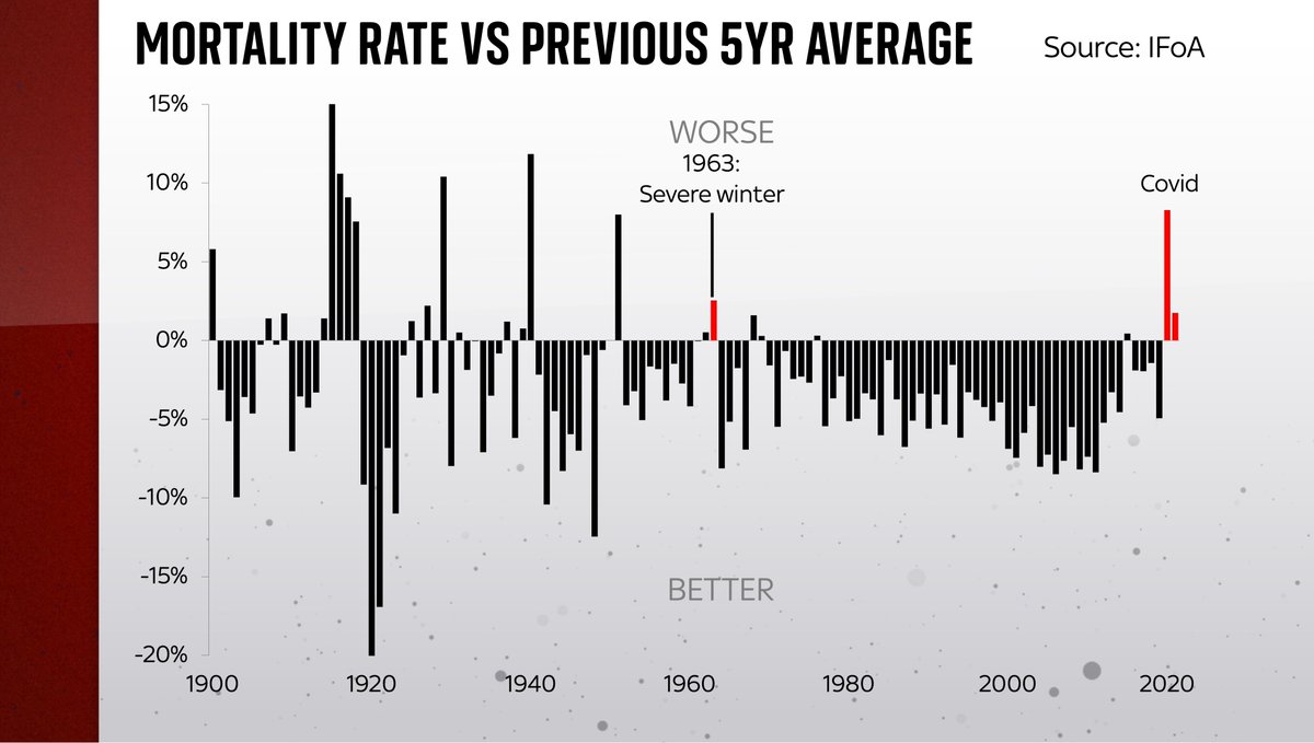
Perhaps the best way of measuring this is by looking at age (and population)-adjusted excess mortality over time. That’s what you see in this chart…
Was it bad or BAD?
Perhaps the best way of measuring this is by looking at age (and population)-adjusted excess mortality over time. That’s what you see in this chart…

Anything above the line shows an increase in mortality vs the preceding 5yr avg.
Anything below the line is mortality going down: fewer dying vs previous years.
As you can see, most years it improves (eg goes down). We’re living longer.
But 2020/21 stick out like a sore thumb.
Anything below the line is mortality going down: fewer dying vs previous years.
As you can see, most years it improves (eg goes down). We’re living longer.
But 2020/21 stick out like a sore thumb.

In fact you have to go a long way back, to 1963, to find another year when mortality increased as much vs the 5yr avg as it did in 2021 (1.8%).
1963 was the worst winter in 200 years. It was terrible for mortality (2.5%).
But actually 2021 might have been even worse than that…
1963 was the worst winter in 200 years. It was terrible for mortality (2.5%).
But actually 2021 might have been even worse than that…
…because comparing 2021 to the previous 5yrs includes 2020, one of the worst years for mortality changes ever.
If you compare 2021 with a more “normal” period (eg 2015-19) you get a mortality increase of 2.7%.
In which case it was the worst year since 1951 (v v bad flu epidemic)
If you compare 2021 with a more “normal” period (eg 2015-19) you get a mortality increase of 2.7%.
In which case it was the worst year since 1951 (v v bad flu epidemic)
The point is that even though 2021 looks a lot less bad than 2020 it was still pretty awful by historic standards. You have to go back to 1940 to find another period when the 2yr avg change in mortality was as bad as this. And back to WWI to find another multi-year period was bad

Of course no numbers can do justice to the thousands of families who have lost loved ones.
But hopefully these might help provide historical context about what we’re living through.
It really is a historic pandemic, worse in mortality terms than nearly anything in living memory
But hopefully these might help provide historical context about what we’re living through.
It really is a historic pandemic, worse in mortality terms than nearly anything in living memory
The good news is with any luck 2022 might be an end to this miserable period. Deaths are running at far, far lower levels now than last year thanks in large part to the 💉.
In fact the official figs may end up overstating the toll in the coming months. We’ll keep an eye on that.
In fact the official figs may end up overstating the toll in the coming months. We’ll keep an eye on that.
Many thanks to @actuarynews for providing us with their age-adjusted figures and a dataset allowing us to peer back through time and @ActuaryByDay for his help guiding us through them. Hopefully it’s the last time we have to do this exercise (no offence!)
More on this on @skynews
More on this on @skynews
Here's my long read running through the numbers on #covid mortality: Four different death tolls, but the scale of the tragedy depends on which numbers you choose news.sky.com/story/four-dif…
One more chart, but this is an important one.
The longer the bars, the bigger the increase in mortality (age and population-adjusted) vs the previous 5yr average.
These are the very worst years for mortality in modern history.
In red you can see 2020 & 2021 and how they compare.
The longer the bars, the bigger the increase in mortality (age and population-adjusted) vs the previous 5yr average.
These are the very worst years for mortality in modern history.
In red you can see 2020 & 2021 and how they compare.

• • •
Missing some Tweet in this thread? You can try to
force a refresh