Mike Honey Profile picture
Jan 11, 2022 11 tweets 4 min read Read on X
Here's my weekly analysis of cases, deaths, vaccinations and restrictions.

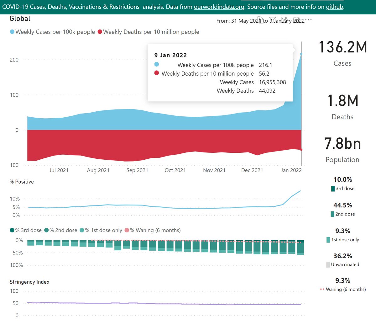
At the global level, Omicron has driven an amazing surge in the last 2 weeks.

I've added a % Positive chart - this helps to spot when testing is overwhelmed (so infections are likely under-reported).
🧵
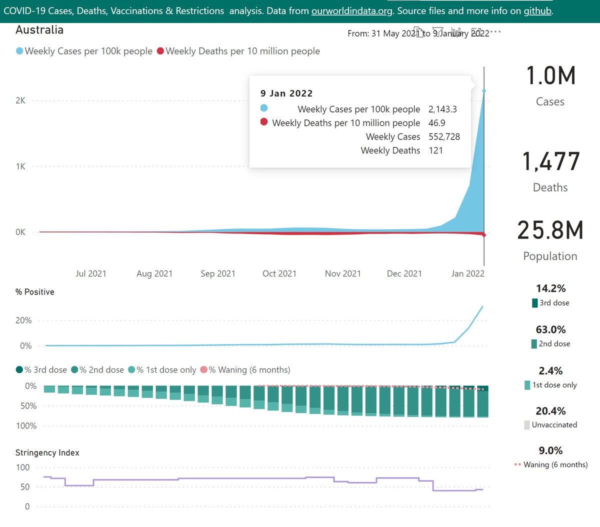
Australia is one of the worst affected countries (on a population basis). Restrictions were dropped in mid-December, ignoring the risk from multiple Omicron super-spreader events.

Testing has effectively collapsed - % Positive has soared to 31%, many infections are undiscovered.
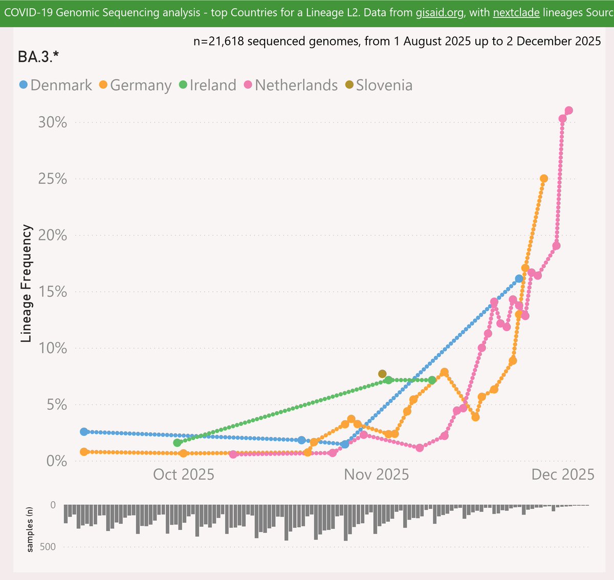
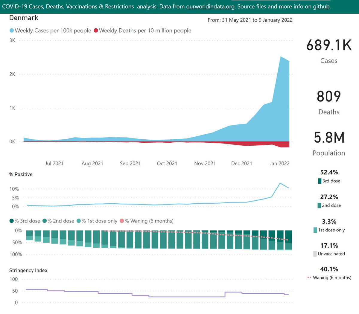
In Denmark, both the cases and % positive appear to have peaked.

Deaths are at ~100 per week or ~170 per 10M. But as they typically lag cases by 3 weeks, we can expect them to increase, sadly.
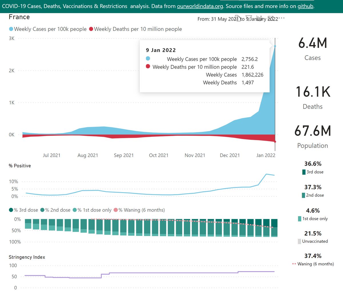
France has seen cases soar in recent weeks to one of the highest rates globally for any large country - ~2,700 cases per 100K people.

Sadly deaths are beginning to rise also.
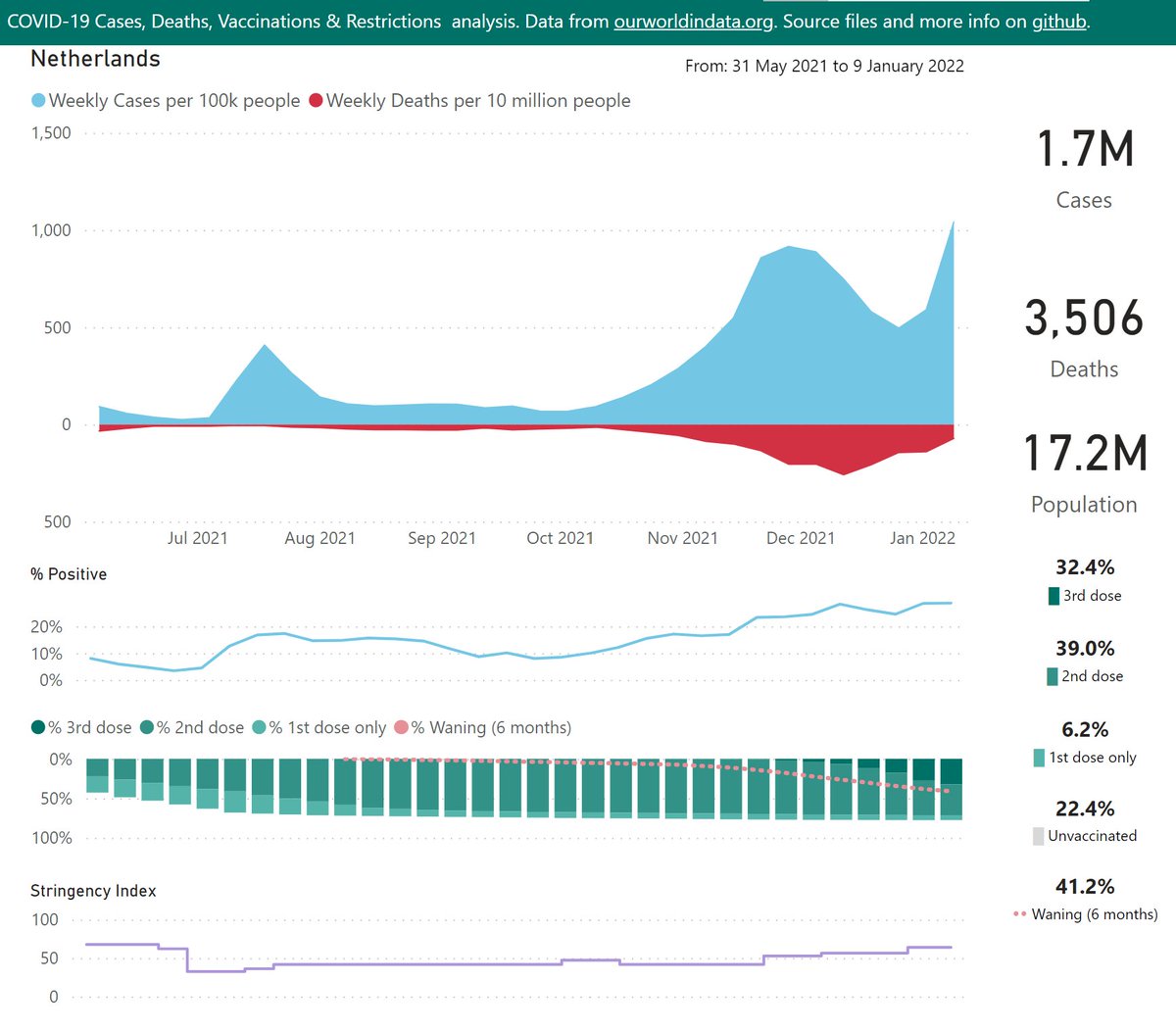
With relatively low vaccination rates and delayed 3rd dose rollout, the Netherlands has had to rely on restrictions and a lockdown.

These have been quite effective so far, keeping their case rates ~1,000 per 100K or less, but the recent trend is upwards.
In the UK, the curve of cases is showing signs of peaking, and the % Positive is relatively low.

3rd dose rates have closed the gap with the waning effect.
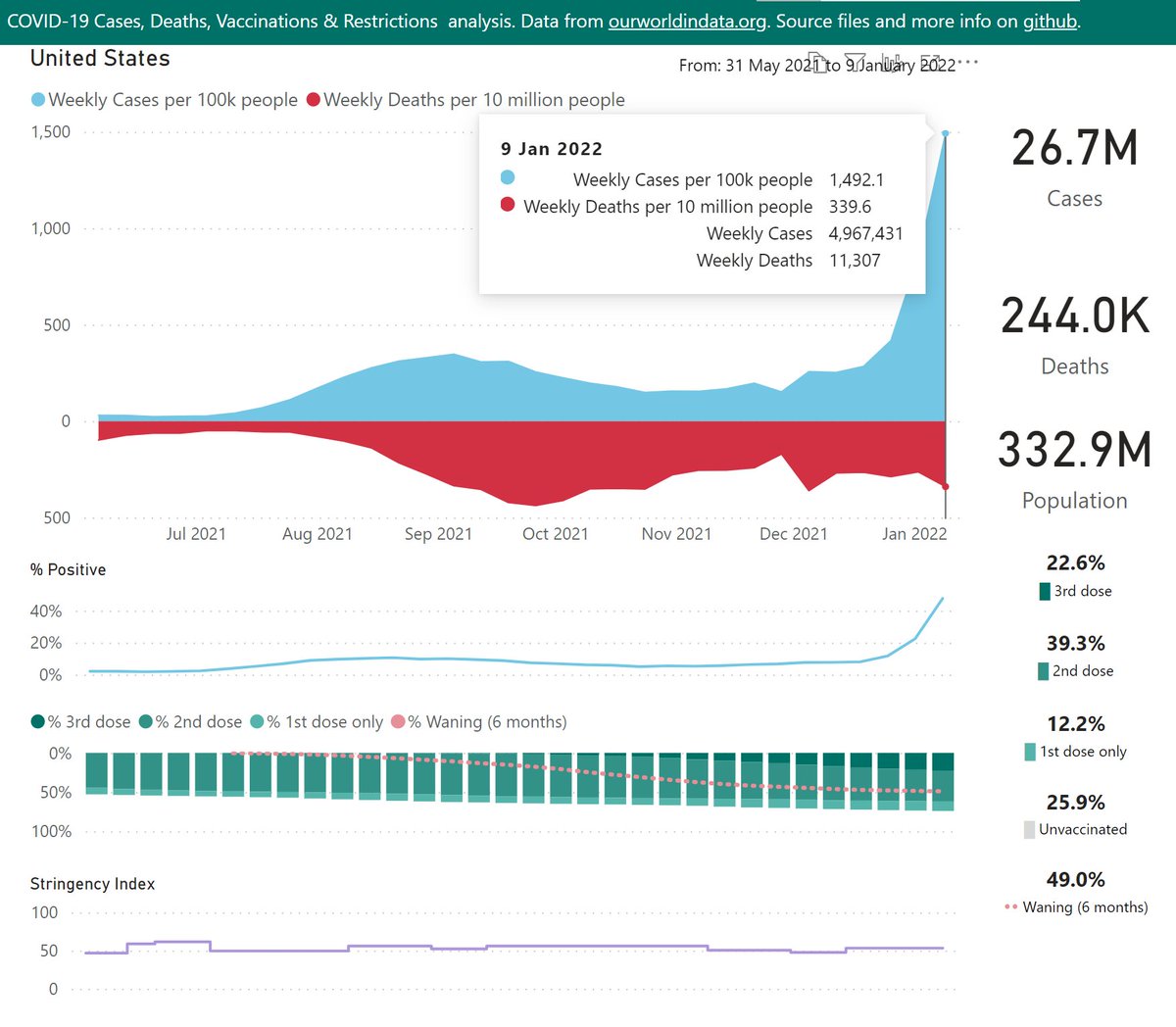
The situation in the US looks disastrous - a very high death rate probably resulting from the low vaccination rates.

The % Positive rate is up to almost 50%, so many infections are unreported.

3rd doses lag the waning effect by a wide margin, and over 25% remain unvaccinated.
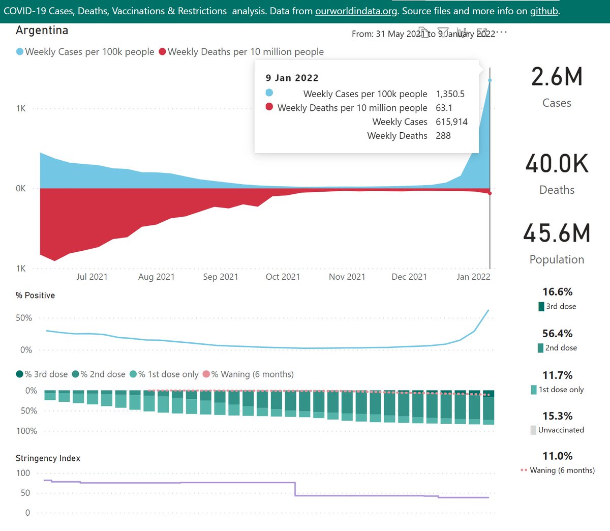
Argentina seems the worst-affected country in South America. While the case rate does not look extreme at first glance, not the the % Positive is now over 60%
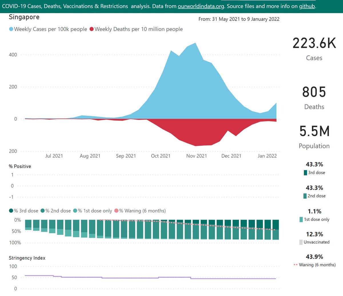
Singapore recently beat back a serious Delta wave, and while Omicron is spreading the case rates are relatively low so far.

Vaccination rates are impressive.
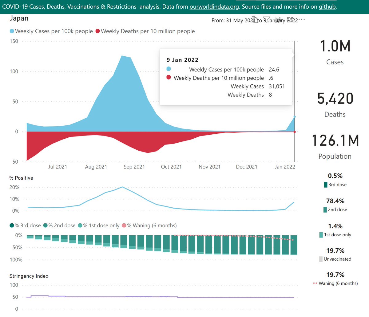
Japan successfully suppressed their Delta wave around the Olympics and have enjoyed very low case rates for several months.

An Omicron wave has started to build in the latest week, despite tight border restrictions.

3rd dose rates are far behind the waning effect.
COVID-19 stats from @OurWorldInData.

Interactive DataViz here:
github.com/Mike-Honey/cov…

• • •

Missing some Tweet in this thread? You can try to force a refresh
 

Keep Current with Mike Honey

Mike Honey Profile picture

Stay in touch and get notified when new unrolls are available from this author!

Read all threads

This Thread may be Removed Anytime!

PDF

Twitter may remove this content at anytime! Save it as PDF for later use!

Try unrolling a thread yourself!

how to unroll video
  1. Follow @ThreadReaderApp to mention us!

  2. From a Twitter thread mention us with a keyword "unroll"
@threadreaderapp unroll

Practice here first or read more on our help page!

More from @Mike_Honey_

Dec 20, 2025
A recent scientific paper compared long-term mortality by vaccination status.

I noticed that Table 2 drew a lot of attention, but was actually included in the paper as a static image. So I built a quick dataviz project to explore.
🧵 Image
On the first page, I've added a % Incidence change (vaccinated vs unvaccinated) and emphasised that with data bars. This is quicker for general readers to grasp than hazard ratios.
🧵
You can click on any column header to sort the rows, e.g. as shown by % Incidence change. The starkest difference was deaths from COVID-19 at +372%.

Other causes with significant differences were diseases of the skin & blood, pregnancy and childbirth.
🧵 Image
Read 19 tweets
Dec 19, 2025
A recent scientific paper included an antigenic map, comparing the immune status of individuals vaccinated with a range of vaccines "… vaccinated sera", against a collection of significant variants "Virus …".

The map was very informative, so I built a quick dataviz project.
🧵 Image
The map shows starkly that BA.3.2 "Cicada" is a wild outlier, way out on its own in the south-west corner. This suggests the current vaccines and/or disease-acquired immunity will not offer strong protection against infection.
🧵
Another point of note is how the XFG "Stratus" variant is the furthest away from BA.3.2, at the extreme south, compared to other recent variants.

This might help explain how BA.3.2 has been able to drive significant waves in Europe, following their recent waves of XFG
🧵
Read 12 tweets
Dec 14, 2025
Here's the latest variant picture for Europe (excluding the UK), to late November.

BA.3.2.* "Cicada" is showing a very strong growth advantage of 7.9% per day (55% per week) over XFG.* "Stratus", which predicts a crossover in late December.

#COVID19 #EUR #BA_3_2 #Cicada #XFG
🧵 Image
To include the latest BA.3.2.* samples, I have rolled my reporting window forward an extra week or so. So the most recent data is even less representative than usual. The picture for those dates might change as more data is shared.
🧵
Here are the leading European countries reporting BA.3.2.* .

The Netherlands leapfrogged Germany to report the highest frequency at 31%. Germany also grew sharply to 25%. Denmark grew to 16%.
🧵 Image
Read 6 tweets
Dec 14, 2025
Here's the latest variant picture for the United Kingdom, to late November.

For the UK, BA.3.2.* "Cicada" is showing a strong growth advantage of 5% per day (35% per week) over XFG.* "Stratus", which predicts an imminent crossover.

#COVID19 #SARSCoV2 #UK #BA_3_2 #Cicada
🧵 Image
To include the latest BA.3.2.* samples, I have rolled my reporting window forward an extra week. So the most recent data is even less representative than usual. The picture for those dates might change as more data is shared.
🧵
BA.3.2.* accelerated sharply in Scotland to 16% of recent samples.
🧵 Image
Read 7 tweets
Dec 8, 2025
A recent scientific paper explored the impact of mass SARS-CoV-2 infections on Lymphocytes (crucial to the body’s immune system).

I noticed the authors had shared the data behind their charts in the Appendix Supplementary materials, so I built a quick dataviz project.
🧵 Image
Above, I’ve re-cast the data behind their Figures 3 and 5 in terms of % change from the baseline. Hopefully this is useful to help compare the subsets, whose results vary in scale.
🧵
I added interactive filter controls and a trend line (dashed pink). You can use those to explore for example the trends in the last 12 months measured in the paper, for the CD3, 4 & 8 series.
🧵 Image
Read 8 tweets
Dec 7, 2025
Australian Influenza update:

It became clear during November that a unusual second wave is underway in Australia, driven by the new "clade K" (H3N2 clade 2a.3a.1, subclade K).

Tasmania, New South Wales and South Australia are currently the hardest-hit.

#Influenza #Australia
🧵
Western Australia had been spared the worst of this second wave until the last week or so. But now there’s a signal of a sharp change in case momentum there also.
🧵
The latest Australian Respiratory Surveillance Report confirms my earlier speculation that the new "clade K" (H3N2 clade 2a.3a.1, subclade K) is driving the "unusual" second wave of influenza in Australia.

🧵 health.gov.au/resources/publ…Image
Read 11 tweets

Did Thread Reader help you today?

Support us! We are indie developers!


This site is made by just two indie developers on a laptop doing marketing, support and development! Read more about the story.

Become a Premium Member ($3/month or $30/year) and get exclusive features!

Become Premium

Don't want to be a Premium member but still want to support us?

Make a small donation by buying us coffee ($5) or help with server cost ($10)

Donate via Paypal

Or Donate anonymously using crypto!

Ethereum

0xfe58350B80634f60Fa6Dc149a72b4DFbc17D341E copy

Bitcoin

3ATGMxNzCUFzxpMCHL5sWSt4DVtS8UqXpi copy

Thank you for your support!

Follow Us!

:(