
{ECOM People}
Wanna see an example of a conversion-oriented landing page you can mimic?
Let’s break this page down section by section and explain what makes it so great
This page was created by me @me1ies and the team over at @LPbruv where I acted as a CRO consultant
Wanna see an example of a conversion-oriented landing page you can mimic?
Let’s break this page down section by section and explain what makes it so great
This page was created by me @me1ies and the team over at @LPbruv where I acted as a CRO consultant
Above the fold
Recall, in almost all my threads I emphasize how important it is for the space above the fold to be optimized as much as possible.
As you can tell this is exactly what was done, let’s dive right into it.
Recall, in almost all my threads I emphasize how important it is for the space above the fold to be optimized as much as possible.
As you can tell this is exactly what was done, let’s dive right into it.

Product Benefits: Having this section above the fold is massive.
As you can see it's not in a clunky paragraph form, it’s in easy-to-understand sentences. Most of these benefits are mentioned in customer reviews! Use your customer reviews to craft and prioritize your benefits
As you can see it's not in a clunky paragraph form, it’s in easy-to-understand sentences. Most of these benefits are mentioned in customer reviews! Use your customer reviews to craft and prioritize your benefits

Social Proof:
There are two instances of social proof. Both are equally important.
Social proof #1 shows QUANTITY “7,376 reviews.” Social proof #2 shows QUALITY: “As featured in.”
Customers get the best of both worlds.
There are two instances of social proof. Both are equally important.
Social proof #1 shows QUANTITY “7,376 reviews.” Social proof #2 shows QUALITY: “As featured in.”
Customers get the best of both worlds.

Product Features: Nicely placed and described in a very easy-to-understand manner. With skincare or any consumable, product features are HUGE. Do not forget to include them above the fold.

Bundles: One of the main goals of this LP is to inform customers so we made sure to mention the bundles but not have them ATF
This keeps visitors on the page so they can learn more about the product
If they're ready to purchase they have the CTA which takes them to the bundles
This keeps visitors on the page so they can learn more about the product
If they're ready to purchase they have the CTA which takes them to the bundles

CTA + Guarantee:
“Try it risk free” + “Moneyback guarantee.”
Test your CTA.
Customers may be more receptive to
“Try it risk free” as opposed to “Buy it now.”
The top e-commerce store owners are testing their CTA’s and offers constantly. Just look at Curology and Lumin.
“Try it risk free” + “Moneyback guarantee.”
Test your CTA.
Customers may be more receptive to
“Try it risk free” as opposed to “Buy it now.”
The top e-commerce store owners are testing their CTA’s and offers constantly. Just look at Curology and Lumin.

Section 2 - More Social Proof
Customer photos work so well. They:
1- Keep visitors engaged on the page. People like seeing people. It’s been tested hundreds of times.
Customer photos work so well. They:
1- Keep visitors engaged on the page. People like seeing people. It’s been tested hundreds of times.
2- You have to see it to believe it. With skincare, you can talk all you want about benefits but if you have customers result you’re gold. Some skincare companies, like moonxcosmetics ENTIRE Instagram’s are just customer before and afters.

Section 3- Product Details
Feeling ready to buy? Here’s a product details section. Just like with the first section, we added all the most important things to this product details section.
Feeling ready to buy? Here’s a product details section. Just like with the first section, we added all the most important things to this product details section.

There is one that I want you to notice.
The customer call-out: “For the un-even, dark spotted and acne prone skin.”
Again, look at your reviews, see what problems customers are facing and use those in customer call-outs instead of always reverting to using the product title
The customer call-out: “For the un-even, dark spotted and acne prone skin.”
Again, look at your reviews, see what problems customers are facing and use those in customer call-outs instead of always reverting to using the product title

Another thing to notice. The product photos are not all product photos. Mix these up with customer pics, ingredients, before and after pics, etc. Who wants to see 5 different angles of the same product.

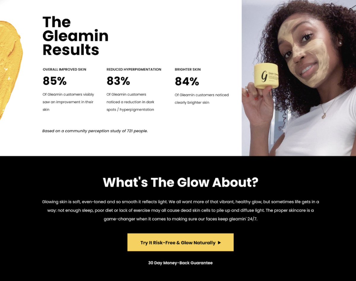
Section 4 - Data backed results
Women lie. Men lie. Numbers don’t.
Try to include survey or experiment-backed results that prove your product works. Don’t link to some Harvard research article no one is going to read.
Keep it on the page and keep it simple.
Women lie. Men lie. Numbers don’t.
Try to include survey or experiment-backed results that prove your product works. Don’t link to some Harvard research article no one is going to read.
Keep it on the page and keep it simple.
Section 5 - Ingredients
Having an ingredients section is massively important especially with cosmetics.
When creating this try to use as many high-quality images as possible. For this section, we used real photos, not icons or drawings + bolded benefits of the main ingredients
Having an ingredients section is massively important especially with cosmetics.
When creating this try to use as many high-quality images as possible. For this section, we used real photos, not icons or drawings + bolded benefits of the main ingredients

Section 6 - Why Choose us?
I’ve preached about this many times and in my opinion it’s easily one of the most important parts of a landing page.
Create this section to highlight the most important differences. No need to go crazy here, just convey what’s important.
I’ve preached about this many times and in my opinion it’s easily one of the most important parts of a landing page.
Create this section to highlight the most important differences. No need to go crazy here, just convey what’s important.

Section 7 - How to apply + Risk free + More CTA’s
Pretty self explanatory, but adding another CTA here is big as the page is halfway complete and customer have plenty of information on the product by now.
For the how to apply, keep it simple. Use photos, gif’s or illustrations.
Pretty self explanatory, but adding another CTA here is big as the page is halfway complete and customer have plenty of information on the product by now.
For the how to apply, keep it simple. Use photos, gif’s or illustrations.

Section 8 - Bundles Section
Bundles are one the easiest ways to increase AOV.
If they'll buy one chances are they will buy 2 or 3.
Bundles are one the easiest ways to increase AOV.
If they'll buy one chances are they will buy 2 or 3.

So many people try to get new customers to subscribe instead of selling bundles.
First-time buyers are going to be MUCH more hesitant to commit to a subscription than a bundle. Test a bundle instead of a subscription on a landing page for cold traffic.
First-time buyers are going to be MUCH more hesitant to commit to a subscription than a bundle. Test a bundle instead of a subscription on a landing page for cold traffic.
Section 9 &10 - More Social proof and reviews
For these two sections, we took a UGC video from a credible figure (licensed aesthetician) and then placed the customer reviews directly under it.
For these two sections, we took a UGC video from a credible figure (licensed aesthetician) and then placed the customer reviews directly under it.

Notice how the customer reviews are broken down by “top skin concern”! Many of these concerns are in customer call-outs, product benefits, etc! You can break down customer reviews with Yotpo and Stamped.
Last few sections - FAQ and an additional CTA at the bottom are a must-have. The last thing on the page should be a CTA, even if it’s to submit an email.

Hope this thread was helpful for everyone when thinking about how their products' landing pages should look.
I am giving anyone who RT’s and likes this thread a FREE landing/product page audit (must be getting 10k+ store visits p/m)
DM me “ FREE AUDIT” after you’re done.
I am giving anyone who RT’s and likes this thread a FREE landing/product page audit (must be getting 10k+ store visits p/m)
DM me “ FREE AUDIT” after you’re done.
Shoot me a DM if you're interested in Conversion Rate Optimization or would like to bring back the AMMARxLPBROS collab to create a landing page for you 🚀
• • •
Missing some Tweet in this thread? You can try to
force a refresh


